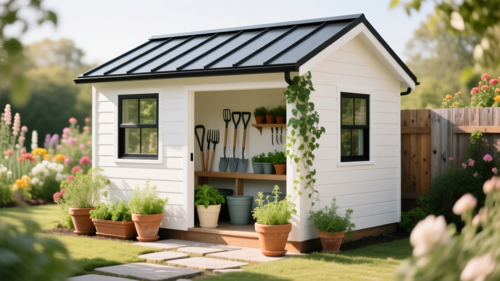
How to Choose Colors for a Potting Shed - The Decor Mag
A potting shed is one of the few spaces in a home that can be both beautifully styled and wonderfully messy. It’s where terracotta dust settles, potting soil gets under your nails, and seedlings turn into something you’ll proudly carry into the garden. Because it’s a utility space with heart, the paint colors you choose matter more than most homeowners expect.
The right color scheme can make a small shed feel airy, help tools look organized, and create a calm backdrop for all the visual “noise” that comes with gardening supplies. Color also affects how you feel when you step inside—energized to tackle a weekend repotting session, or soothed enough to linger with a cup of tea and a seed catalog.
Whether your potting shed is a standalone backyard structure or a small garden room attached to the house, this guide will help you pick paint colors with confidence. You’ll find practical color recommendations, brand-specific paint names, and real application scenarios so your shed looks intentional—inside and out.
Start with the Shed’s Role: Utility, Retreat, or Showcase?
Before looking at paint swatches, decide what you want the potting shed to be. Color works best when it supports function and mood.
- Utility-first shed: Prioritize light reflectance, durability, and calm, dirt-friendly colors.
- Garden retreat: Lean into color psychology—soothing greens, airy whites, or nostalgic pastels.
- Showpiece shed: Use bolder exterior paint colors and curated interior color schemes that echo your garden design.
Color psychology in a potting shed:
- Green feels restorative and “garden-aligned,” helping the space feel cohesive with plants.
- Blue tends to calm and cool—great for hot climates and sun-drenched sheds.
- Yellow adds optimism and energy but needs careful balancing to avoid visual fatigue.
- White and off-white maximize brightness and showcase greenery, flowers, and pottery.
- Warm neutrals (taupe, clay, beige) hide soil scuffs and feel grounded.
Evaluate Light, Location, and Surroundings
1) Natural light: north vs. south exposure
Lighting changes how paint colors read—especially in small spaces.
- North-facing sheds: Light is cooler and can make colors look grayer. Consider warmer whites and soft, warm greens. Try Benjamin Moore White Dove (OC-17) for trim or walls, or Sherwin-Williams Alabaster (SW 7008) for a gentle, warm base.
- South/west-facing sheds: Strong sunlight can wash colors out. Slightly deeper shades hold up better, like Farrow & Ball Green Smoke (No. 47) or Benjamin Moore Saybrook Sage (HC-114).
- Low-light interiors: Choose higher-LRV (light-reflectance value) shades, and keep ceilings light. A clean white like Benjamin Moore Simply White (OC-117) can brighten without feeling stark.
2) Landscape palette: plants, fencing, hardscape
Look at what surrounds your shed: evergreen hedges, cedar fences, stone pavers, brick walls, or the color of your home’s exterior. The best exterior paint colors for sheds often echo a tone already present in the yard.
- Lots of green foliage: Consider contrast—creamy whites, soft blacks, or muted blues.
- Brick or warm stone nearby: Try earthy greens, clay tones, or warm whites.
- Modern landscaping (gravel, metal, black fencing): Charcoal, inky blue, and crisp white look intentional and contemporary.
Pick a Simple Color Framework (So Decisions Don’t Spiral)
A potting shed doesn’t need a complicated interior color design. Use one of these proven frameworks:
- Monochromatic: One color in varying strengths (light walls, deeper trim, medium cabinetry).
- Analogous: Neighboring hues (green + blue-green + soft blue). Calm and garden-friendly.
- Complementary: Opposites on the color wheel (green + soft red/clay accents). Energetic but best in small doses.
- Neutral base + accent: Warm white walls with one bold door color or shelving color.
A practical rule for small spaces: Aim for 70% base color, 20% secondary color, 10% accent. In a potting shed, accents can be a door, window sash, pegboard, or even a painted potting bench.
Exterior Paint Colors for Potting Sheds (With Specific Recommendations)
Your shed’s exterior is part of the garden view. These color schemes balance charm, longevity, and curb appeal.
Classic garden green (timeless and calming)
- Main color: Farrow & Ball Pigeon (No. 25) or Benjamin Moore Gloucester Sage (HC-100)
- Trim: Benjamin Moore White Dove (OC-17)
- Door accent: Farrow & Ball Studio Green (No. 93) for depth
Application scenario: A cedar-shingled shed in a lush backyard. The muted green integrates with foliage, while crisp trim sharpens windows and makes the structure feel cared for.
Soft white and warm neutral (bright, clean, and plant-forward)
- Main color: Sherwin-Williams Alabaster (SW 7008) or Benjamin Moore Swiss Coffee (OC-45)
- Trim: Same color in a higher sheen for subtle contrast
- Accent: Benjamin Moore Wrought Iron (2124-10) for hardware/door, or Sherwin-Williams Iron Ore (SW 7069)
Application scenario: A small urban garden where light is precious. A warm white exterior reflects daylight, making the shed feel larger and boosting the brightness of nearby plantings.
Coastal blue-gray (fresh, serene, and stylish)
- Main color: Benjamin Moore Boothbay Gray (HC-165) or Sherwin-Williams Smoky Blue (SW 7604)
- Trim: Benjamin Moore Simply White (OC-117)
- Door accent: Farrow & Ball Hague Blue (No. 30) for a richer focal point
Application scenario: A potting shed near a pool or patio. Blue-gray feels cooling in summer and coordinates with stone, concrete, and metal planters.
Moody charcoal (modern, dramatic, and dirt-forgiving)
- Main color: Farrow & Ball Railings (No. 31) or Sherwin-Williams Iron Ore (SW 7069)
- Trim: Benjamin Moore White Dove (OC-17) or keep monochrome for a sleek look
- Accent: Natural wood door or copper hardware
Application scenario: A newer build with black-framed windows and modern fencing. Dark paint colors recede visually, letting the greenery stand out while hiding rain splatter and garden wear.
Interior Color Schemes That Make Potting Sheds Work Harder
Interior paint colors should support visibility and organization. You want to see labels, spot pests on plants, and find tools quickly.
Bright-and-functional: warm white walls + durable finishes
- Walls: Sherwin-Williams Alabaster (SW 7008) or Benjamin Moore White Dove (OC-17)
- Ceiling: A crisp white like Benjamin Moore Chantilly Lace (OC-65) to bounce light
- Cabinetry/bench: A soft gray-green like Benjamin Moore Saybrook Sage (HC-114)
Why it works: White makes the room feel larger, while a sage work surface visually “hides” soil smudges better than pure white.
Greenhouse-inspired: pale green + white trim
- Walls: Farrow & Ball Mizzle (No. 266) (a soft green-gray)
- Trim/shelving: Farrow & Ball All White (No. 2005) or Benjamin Moore Simply White (OC-117)
- Accent: Terracotta, brass, and natural wood
Why it works: Soft green supports a restorative mood and looks natural alongside plants, while white keeps the space crisp.
Cheerful vintage: buttercream + dusty blue accents
- Walls: Farrow & Ball Dorset Cream (No. 68) (warm and sunny without neon intensity)
- Accent shelving/door interior: Benjamin Moore Palladian Blue (HC-144)
- Trim: Benjamin Moore White Dove (OC-17)
Why it works: Yellow adds optimism—excellent for a creative workspace—while dusty blue balances it so the palette doesn’t feel overpowering.
Real Application Scenarios: What to Paint (and What to Leave Natural)
Color isn’t only for walls. In a potting shed, strategic paint placement can create order and style.
Scenario 1: Small shed with one window
- Paint walls: warm white (e.g., BM Swiss Coffee) to maximize brightness
- Paint potting bench: mid-tone green-gray for practicality (e.g., BM Gloucester Sage)
- Paint pegboard: same as walls in a satin finish so tools stand out
- Add accent color with a painted door interior (e.g., SW Smoky Blue)
Scenario 2: Larger garden room used for arranging flowers
- Walls: soft neutral (e.g., SW Alabaster)
- One focal wall: muted blue-gray for depth in photos (e.g., BM Boothbay Gray)
- Trim: clean white for a tailored look
- Tip: keep the backdrop calm so flower colors read true
Scenario 3: A shed that’s visible from the kitchen window
- Choose an exterior color that relates to your home’s palette (undertone matters)
- If your house is warm-toned (cream, tan brick), try earthy green like BM Saybrook Sage
- If your house is cool-toned (gray siding, black trim), try a charcoal like SW Iron Ore
Practical Tips: Paint Finishes, Durability, and Sampling
- Choose the right sheen:
- Walls: satin or eggshell for wipeability
- Trim/doors: semi-gloss for durability
- Work surfaces: consider a tougher cabinet/trim enamel
- Prioritize exterior-rated paint for outdoor structures: sheds take weather directly. Use quality exterior paint lines from Benjamin Moore, Sherwin-Williams, or Farrow & Ball suited to your climate.
- Sample in context: Paint large swatches on foam boards and move them around. Check morning, midday, and evening light.
- Mind undertones: A “simple” white can read pink, yellow, gray, or green depending on surroundings. Compare two or three whites side-by-side.
- Let materials do some of the work: Natural wood shelves, galvanized bins, terracotta, and wicker add warmth so you don’t need a complicated color scheme.
Common Color Mistakes to Avoid
- Picking exterior paint color without considering the roof and trim: A perfect green can look wrong against a red-brown roof or bright white windows. Always test the full combination.
- Using bright, high-chroma colors on every surface: Saturated yellow or teal can feel chaotic in a small shed filled with tools and labels. Use bold colors as accents.
- Choosing stark white in a dim shed: In low light, bright white can read cold and dull. Warm whites like SW Alabaster or BM White Dove are usually more flattering.
- Ignoring how dirt shows up: Very dark floors show dust; pure white benches show every soil smear. Mid-tones (sage, warm gray, taupe) are forgiving.
- Forgetting flow with the garden: A potting shed is part of an outdoor “room.” If the color fights your planting palette, it can distract rather than elevate.
FAQ: Choosing Paint Colors for a Potting Shed
What are the best paint colors for a potting shed interior?
Warm whites and soft greens are the most versatile. Try Benjamin Moore White Dove (OC-17) for walls and Benjamin Moore Saybrook Sage (HC-114) for cabinetry or a potting bench. These shades keep the space bright while staying forgiving.
Should a potting shed match the house?
It doesn’t have to match exactly, but it should relate. Use the home’s exterior palette as a guide—repeat a trim color, echo the roof tone, or choose a complementary shade that feels intentional from the main views.
What paint finish is best for a potting shed?
Use eggshell or satin on walls for cleanability, semi-gloss on trim and doors for durability, and a hard-wearing enamel on any work surface. In humid climates, choose products formulated for moisture resistance.
How do I choose an exterior shed color that looks good year-round?
Muted, nature-based hues age well across seasons. Consider Farrow & Ball Pigeon, Benjamin Moore Boothbay Gray, or Sherwin-Williams Iron Ore. These shades look just as good against summer greens as they do with winter branches.
What colors make a small potting shed look bigger?
Higher-LRV colors—warm whites, pale greige, and soft misty greens—reflect light and expand the feel of the space. Keep the ceiling and trim light, and use one mid-tone accent to add depth without shrinking the room.
Can I use bold color in a potting shed?
Yes—use bold color where it adds character without overwhelming function. A deep door color (like Farrow & Ball Hague Blue) or a charcoal bench base can look striking while keeping the walls light and practical.
Next Steps: A Simple Plan to Choose Your Shed Colors
- Take a quick inventory: roof color, window trim, nearby fencing, and the dominant greens and blooms in your garden.
- Pick your framework: neutral base + accent is the easiest and most reliable for potting sheds.
- Select 2–3 candidates: one main exterior color, one trim color, and one accent color.
- Sample and observe: check in different light and next to garden materials (terracotta, stone, wood).
- Choose finishes intentionally: durable sheens where hands and tools will touch most.
Your potting shed can be more than a place to store tools—it can be a designed garden destination. For more paint color ideas, color schemes, and interior color design guidance, explore the color guides at thedecormag.com.
More Articles
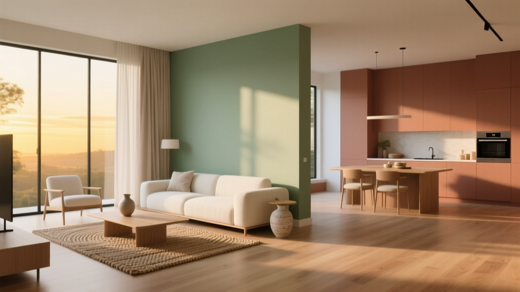 Open Floor Plan Color Transitions (2026)
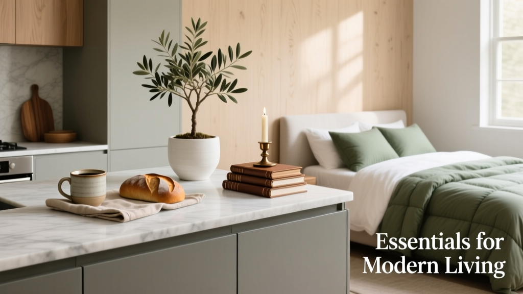 Kitchen & Bedroom Inspiration Essentials: Functional Design, Proven Color Systems, and Space-Smart Layouts
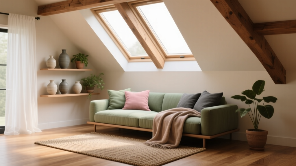 How to Choose Colors for an Attic Room - The Decor Mag
 How to Use Color to Create Balance - The Decor Mag
 How to Choose Colors for a Basement - The Decor Mag
 How to Create a Minimalist Color Palette - The Decor Mag
 How to Match Colors to Furniture and Fabrics - The Decor Mag
 Best Fire Engine Red Paint Colors - The Decor Mag
 How to Use Color to Create Unity - The Decor Mag
 How to Choose Colors for South-Facing Rooms - The Decor Mag