How to Use Color to Create Rhythm - The Decor Mag
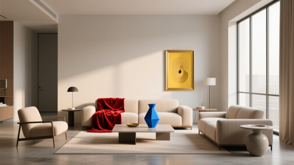
Walk into a room that feels “designed,” and you’ll notice something beyond pretty paint colors: a sense of movement. Your eye knows where to go. There’s a gentle pulse from one area to the next—art echoes a rug, a pillow nods to cabinetry, a trim color repeats down the hallway. That visual beat is rhythm, and color is one of the most powerful ways to create it.
Rhythm matters because it’s the difference between a home that looks assembled and a home that feels intentional. When color repeats and varies in a thoughtful way, spaces feel cohesive, balanced, and alive—without needing a full renovation. Rhythm also helps solve real-world design problems: open-concept layouts that feel chaotic, long hallways that feel endless, or rooms that feel flat and disconnected.
If you’ve been collecting paint swatches, saving color palettes, and still wondering why your space doesn’t feel “pulled together,” learning to use color to create rhythm is the missing link. The best part: it’s a principle you can apply at any budget level, whether you’re repainting a whole house or styling with accessories.
What Rhythm Means in Interior Color Design
In design principles, rhythm is the visual pattern created by repeating and varying elements to guide the eye. In interior color design, rhythm shows up as:
- Repetition: repeating a color family (or exact paint color) across a room or home
- Gradation: shifting from light to dark (or warm to cool) in a controlled progression
- Alternation: a predictable back-and-forth of two or three colors
- Contrast: intentional stops and starts that keep a palette from feeling monotonous
Rhythm is also deeply tied to color psychology. Repeated calming hues (soft blues, muted greens, warm whites) create steadiness and comfort. Repeated energizing notes (terracotta, saffron, coral) create liveliness and sociability. The key is not just choosing a color scheme—but distributing it so it creates a pleasing beat.
Start with a Color “Score”: Your Palette and Proportions
Before you paint, define your palette and how it will show up throughout the space. A classic guideline is the 60-30-10 rule:
- 60% dominant color (often walls or large rugs)
- 30% secondary color (upholstery, drapery, a feature wall, cabinetry)
- 10% accent color (pillows, art, lampshades, small decor)
Practical tip: Use one “hero neutral” to unify the home
Choosing one main neutral and repeating it across connected spaces is the easiest way to create color rhythm. Popular options that work in many lighting conditions:
- Benjamin Moore White Dove (OC-17): warm, versatile white with soft depth
- Sherwin-Williams Alabaster (SW 7008): creamy white that softens contrast
- Farrow & Ball Skimming Stone (No. 241): greige with an elegant warmth
4 Ways to Create Rhythm with Color (and How to Use Each)
1) Repetition: Repeat a Color Family Across Surfaces
Repetition creates cohesion. The trick is to repeat color in different sizes and materials so it looks designed, not matchy.
How to do it:
- Repeat your secondary color at least 3 times in a room (for example: art, textile, and an accessory).
- Repeat your accent color in smaller “notes” (for example: a vase, a book spine, and a throw).
- Vary texture: paint + velvet + ceramic reads intentional.
Example color scheme: warm white + dusty blue + aged brass
- Walls: Sherwin-Williams Alabaster (SW 7008)
- Cabinetry or built-ins: Benjamin Moore Boothbay Gray (HC-165)
- Accent details: aged brass hardware, frames, or lighting
Real room scenario: In an open living/dining space, paint the walls Alabaster, use Boothbay Gray on a dining sideboard or built-in shelves, then echo the blue-gray again in dining chairs and living room pillows. Add brass through lighting and picture frames to keep the rhythm moving.
2) Gradation: Shift Light-to-Dark for a Smooth Visual Flow
Gradation is a sophisticated way to create rhythm, especially in hallways, stairwells, and open-plan homes. Your eye naturally follows a progression—light to dark, pale to saturated, soft to bold.
How to do it:
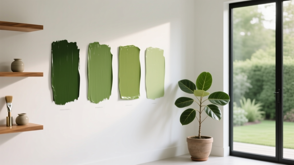
- Choose one hue family (blue, green, taupe) and pick 3 related shades.
- Use the lightest in the brightest room, medium in transitional spaces, and the deepest in cozy rooms.
- Keep trim consistent for continuity (often a clean white or a matching wall color in a different sheen).
Paint progression idea (soft green rhythm):
- Light: Benjamin Moore Healing Aloe (1562) in a kitchen or sunroom
- Medium: Sherwin-Williams Sea Salt (SW 6204) in a hallway or living room
- Deep: Farrow & Ball Green Smoke (No. 47) in a den or dining room
Real room scenario: A long hallway can feel like a tunnel. Paint the hallway Sea Salt, then carry the rhythm into a nearby powder room in Green Smoke for a deeper “beat.” Use Healing Aloe in the adjacent kitchen to keep the flow light and airy.
3) Alternation: Create a Predictable Pattern with Two or Three Colors
Alternation is rhythm with structure—ideal for kitchens, bathrooms, kids’ rooms, and spaces with repeating elements like cabinets, panels, or shelving.
Where alternation shines:
- Two-tone cabinetry
- Striped or color-blocked walls
- Grid-style shelving (alternating back panels)
- Tile layouts that alternate hues
Two-tone kitchen paint pairing:
- Upper cabinets: Benjamin Moore Simply White (OC-117)
- Lower cabinets or island: Sherwin-Williams Evergreen Fog (SW 9130)
- Walls: Benjamin Moore Classic Gray (OC-23)
Real room scenario: In a kitchen with an island, use Simply White on perimeter cabinets and Evergreen Fog on the island. Repeat Evergreen Fog in bar stools or a Roman shade. The alternating colors build rhythm, and repeating the island color elsewhere keeps it from feeling isolated.
4) Contrast: Use Strategic “Pauses” to Keep Rhythm Interesting
Rhythm isn’t constant sameness—music needs rests. Contrast provides punctuation: a dark door in a light hallway, a bold ceiling in a neutral room, or crisp trim that defines architecture.
High-impact contrast ideas:
- Paint interior doors a deep tone while keeping walls light.
- Use a moody color on built-ins to create depth.
- Try a colored ceiling (“fifth wall”) to pull the eye upward.
Paint colors that create elegant contrast:
- Deep neutral: Benjamin Moore Kendall Charcoal (HC-166)
- Classic navy: Sherwin-Williams Naval (SW 6244)
- Earthy brown: Farrow & Ball Mouse’s Back (No. 40)
Real room scenario: In a mostly neutral bedroom (warm white walls and beige textiles), paint the ceiling a soft, muted color like Farrow & Ball Borrowed Light (No. 235) to create a gentle contrast. Then repeat that ceiling tone in bedside accessories or artwork to maintain rhythm.
Room-by-Room Color Rhythm Ideas You Can Copy
Living Room: Layer Neutrals + One Color Family
A common living room challenge is choosing a color scheme that feels calm but not bland. Rhythm comes from repeating a hue across multiple pieces.
- Walls: Benjamin Moore White Dove (OC-17)
- Anchor color (repeat 3–5 times): Sherwin-Williams Smoky Blue (SW 7604) in pillows, art, a throw, and a ceramic lamp
- Accent: cognac leather or walnut wood tones to warm it up
Dining Room: Make the Rhythm More Dramatic
Dining rooms benefit from richer saturation because the purpose is focused—gathering, hosting, lingering. Rhythm can be created with repeated dark elements.
- Walls: Sherwin-Williams Iron Ore (SW 7069) for a modern, intimate mood
- Repeat: black/iron tones in frames, chandelier, and chair legs
- Break the darkness: crisp white trim and lighter linen drapery
Bedroom: Use Analogous Colors for a Gentle Flow
Analogous color schemes (neighbors on the color wheel) create natural rhythm and relaxation—ideal for sleep spaces.
- Walls: Benjamin Moore Palladian Blue (HC-144)
- Secondary: soft green in bedding or an upholstered bench
- Accent: warm brass + creamy whites to keep it cozy
Bathroom: Repeat One Color in Multiple Finishes
Bathrooms are perfect for rhythmic repetition because they contain many compact elements.
- Walls: Sherwin-Williams Sea Salt (SW 6204)
- Repeat the hue: green-tinted glass, eucalyptus stems, and a patterned towel
- Add contrast: matte black fixtures for crisp definition
Hallways and Staircases: Use Color to Guide the Eye
Transitional spaces are where rhythm is most noticeable. Repeating trim color, artwork palettes, and runner tones creates a strong visual “beat.”
- Keep walls a consistent neutral (White Dove or Alabaster work well)
- Repeat a single accent color in frames, art mats, and runner pattern
- Consider a stair runner that includes your home’s main palette
Practical Tips for Building Color Rhythm (Without Overthinking It)
- Choose one undertone direction: warm (creamy whites, taupes, terracottas) or cool (crisp whites, blue-grays, charcoals). Mixing undertones is a top reason rhythm falls apart.
- Repeat colors at different heights: floor (rug), mid-level (furniture), eye-level (art), above (curtains/ceiling). This creates a full-body rhythm.
- Use sheen as part of the pattern: eggshell walls + satin trim + matte ceiling creates subtle variation even in one color.
- Sample in context: paint large swatches and observe morning, afternoon, and evening light. Rhythm depends on consistency across lighting shifts.
- Connect rooms with one “traveling color”: a single hue repeated in adjacent spaces (even just in accessories) makes the whole home feel coordinated.
Common Color Mistakes That Break Rhythm
- Too many unrelated accent colors: If every room has a different bright “pop,” your eye has nowhere to rest. Limit accents to 1–2 core colors that repeat throughout the home.
- Ignoring undertones: A pink-beige and a green-beige can clash even if both are “neutral.” Compare paint samples side-by-side to see undertones clearly.
- Matching everything exactly: Rhythm is not a showroom set. If the sofa, curtains, and pillows are the same blue, it reads flat. Mix tints, shades, and textures.
- Forgetting transitions: Doorways, halls, and sightlines are where rhythm is felt. Plan what you see from one room into the next.
- Overusing high contrast: Too many bold feature walls or black-and-white moments can feel choppy. Use contrast as punctuation, not constant noise.
FAQ: Creating Rhythm with Color
How many colors should a whole-house color scheme include?
A reliable approach is one main neutral, one secondary color (often a muted blue/green/greige), and one accent (metallic, wood tone, or a bolder hue). You can add variations (lighter/darker) of those colors to create rhythm without adding clutter.
What’s the easiest way to make an open-concept space feel cohesive?
Use a consistent wall color (or consistent undertone) across the main area, then repeat the same secondary color in multiple zones—kitchen island, dining textiles, living room pillows. This creates a predictable visual beat across the entire footprint.
Can I create rhythm if I rent and can’t paint?
Yes. Build rhythm through repeated color in textiles (curtains, rugs, pillows), art, and decor. Choose one “traveling” color—like dusty blue or olive—and repeat it from room to room in small doses.
How do I choose between warm and cool paint colors?
Start with fixed elements: flooring, countertops, and large upholstery. If they lean warm (honey oak, cream stone), choose warm whites and earthy accents. If they lean cool (gray tile, white quartz with blue-gray veining), pick cooler whites and blue/green-grays. Keeping undertones consistent strengthens rhythm.
What paint finish helps color rhythm look more polished?
For most homes, eggshell on walls, satin or semi-gloss on trim/doors, and flat on ceilings creates a clean, intentional hierarchy. Even if colors repeat, changing sheen provides subtle variation and depth.
How do I know if my accent color is too loud?
If the accent appears in large blocks (a bright sofa, bold wall, vivid rug) and there’s no repetition elsewhere, it can feel like a visual interruption instead of rhythm. Either reduce it to smaller doses or repeat it at least two more times in the room.
Next Steps: Turn Your Palette into a Rhythmic Plan
Choose a hero neutral, identify one secondary color you love, then decide where that secondary will repeat—at least three moments per room. Add an accent for contrast and energy, and make sure it appears in multiple small touches rather than one random pop. Start with the spaces you see most often (entry, living room, kitchen sightlines), and let the rhythm travel outward from there.
For more paint color ideas, whole-house color schemes, and room-by-room interior color design guides, explore the latest resources on thedecormag.com.
More Articles
 Match Buying Guide: Safety, Performance, and Practical Selection Criteria
 How to Choose Colors for a Library - The Decor Mag
 How to Choose Colors for a Balcony - The Decor Mag
 Best Gray Paint Colors for 2026 - The Decor Mag
 How To Organize Island: A Practical, Space-Smart Guide for Kitchens of All Sizes
 Best Brown Paint Colors for Cozy Rooms - The Decor Mag
 Best Lemon Paint Colors - The Decor Mag
 Best Apple Green Paint Colors - The Decor Mag
 Best Chartreuse Paint Colors - The Decor Mag
 How to Incorporate Bold Colors Subtly - The Decor Mag