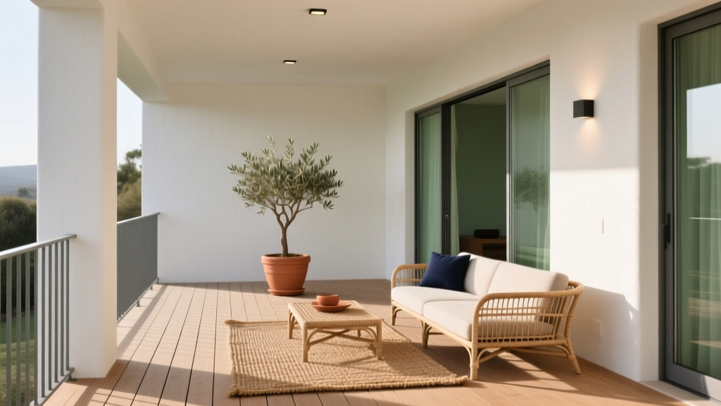
How to Choose Colors for a Loggia - The Decor Mag
A loggia sits in a sweet spot between indoors and outdoors—protected, architectural, and full of atmosphere. It’s where morning light filters through columns, where plants thrive with a bit of shelter, and where your home gets an extra “room” without needing new walls. Because a loggia lives on this threshold, color choices matter more than they do in a fully interior space: the palette must feel connected to the home while also holding its own against sky, greenery, and shifting daylight.
Color is also what turns a loggia from “nice” to “intentional.” The right paint colors can make a narrow loggia feel wider, a shaded loggia feel brighter, or a large echoing loggia feel intimate. Thoughtful color schemes help you highlight architectural details, make furnishings look curated, and create a mood—cool and calm for reading, warm and social for evening meals, or crisp and coastal for a breezy retreat.
This guide breaks down practical color theory, real-world application tips, and specific paint colors to help you choose a loggia palette that looks beautiful from every angle (including from inside your home looking out).
Start with the Loggia’s “Fixed Elements”
Before choosing paint colors, take inventory of what isn’t changing—or won’t change soon. Loggias often include materials that strongly influence color perception.
Checklist of fixed elements to match
- Flooring: terracotta, limestone, concrete, tile, wood decking
- Architecture: columns, arches, ceiling beams, railings
- Surroundings: garden greens, nearby buildings, ocean/sky views
- Adjacent rooms: the interior paint color seen through doors/windows
- Hard finishes: metal furniture, outdoor rugs, stone countertops
Design principle: Anchor your color scheme to the most dominant fixed surface—usually the floor. Terracotta reads warm and earthy, limestone reads creamy and soft, gray concrete reads cool and modern. Let that undertone guide your paint colors so the space feels cohesive rather than “fighting” itself.
Understand Light: The Biggest Color-Changer in a Loggia
Loggias are defined by light patterns—direct sun bands, deep shade, reflected bounce from the floor. The same paint color can read dramatically different here than inside.
How exposure affects paint colors
- North-facing (cooler, consistent light): Colors can look grayer and flatter. Consider warmer whites, soft beiges, and gentle warm greens.
- South-facing (bright, warm light): Colors intensify. Muted shades and softer whites often look more elegant than highly saturated paint colors.
- East-facing (bright mornings, softer afternoons): Great for airy pastels and warm neutrals.
- West-facing (golden afternoons, dramatic evenings): Warm hues glow; cooler shades can look muddy at sunset.
Practical testing tip
- Buy samples and paint two 12" x 12" swatches on different walls (one in shade, one in partial sun).
- Observe at three times: morning, midday, evening.
- View from inside the home looking out—the loggia is part of your interior “visual field.”
Choose a Color Direction Based on the Mood You Want
Color psychology helps translate your lifestyle into a palette. A loggia can be restorative, social, romantic, or energizing—your colors should support that purpose.
Four mood-based directions
- Calm retreat: soft greens, dusty blues, warm whites (reduces visual noise, supports relaxation)
- Sun-washed Mediterranean: creamy whites, terracotta accents, olive greens (invites warmth and conviviality)
- Modern and architectural: crisp whites, stone grays, charcoal accents (emphasizes structure, feels tailored)
- Garden room: layered greens, mushroom neutrals, natural wood tones (harmonizes with plants, feels immersive)
Color Schemes That Work Beautifully in Loggias
A strong color scheme is usually more successful than a single “perfect color.” These combinations are reliable for exterior-adjacent spaces and play well with natural light.
1) Warm white + soft green (timeless, nature-friendly)
This is a classic interior color design approach for transitional spaces: warm white brightens shade, and green bridges to foliage.
- Walls: Benjamin Moore White Dove (OC-17) or Sherwin-Williams Alabaster (SW 7008)
- Trim/columns: Benjamin Moore Simply White (OC-117) for a clean contrast
- Accent (door, shutters, built-ins): Farrow & Ball Card Room Green (No. 79) or Sherwin-Williams Evergreen Fog (SW 9130)
Application scenario: A shaded loggia with stone flooring and lots of potted plants. Use warm white on the ceiling and upper walls to bounce light; use muted green on a bench, door, or railing to create depth.
2) Cream + terracotta + iron black (Mediterranean warmth)
Terracotta is emotionally warm and welcoming. Paired with a soft cream and a grounded dark accent, it reads intentional rather than theme-y.
- Walls: Farrow & Ball School House White (No. 291) or Benjamin Moore Swiss Coffee (OC-45)
- Accent wall or niche: Benjamin Moore Terra Cotta Tile (2090-30) (or use terracotta through textiles if you prefer a lighter commitment)
- Metalwork/railings: Sherwin-Williams Tricorn Black (SW 6258)
Real room example: A loggia overlooking a courtyard with arched openings. Cream walls keep it luminous, terracotta on a small feature (like a recessed wall or planter surround) echoes clay pots, and black details sharpen the architecture.
3) Stone greige + crisp white + navy (coastal but sophisticated)
This palette balances cool breeziness with enough contrast to feel polished. Greige (a gray-beige) works well when your floor is cool stone or concrete.
- Walls: Benjamin Moore Edgecomb Gray (HC-173) (a warm greige that doesn’t go icy)
- Trim/ceiling: Sherwin-Williams Pure White (SW 7005)
- Accent (front door, cabinetry, bistro set): Benjamin Moore Hale Navy (HC-154)
Application scenario: A bright south-facing loggia near water. Keep walls quiet (greige), then add navy in smaller doses—seat cushions, a door, or an outdoor rug border—to avoid overpowering sunlight.
4) Monochromatic whites (architectural, airy, and expansive)
A white-on-white loggia can look breathtaking—if you manage undertones and sheen. This scheme emphasizes columns and shadow play, making the architecture the star.
- Main walls: Benjamin Moore White Dove (OC-17) (soft, forgiving)
- Ceiling: Benjamin Moore Simply White (OC-117) (slightly brighter to lift)
- Doors/trim: Sherwin-Williams Extra White (SW 7006) for crisp definition
Pro tip: Introduce contrast through materials—teak furniture, black lanterns, woven textures, and green foliage—so the palette doesn’t feel sterile.
Where to Put Color: Walls, Ceiling, Trim, and Accents
Choosing paint colors is only half the work; placement is what makes the design feel elevated.
Guidelines for a balanced loggia palette
- If the loggia is narrow: Keep side walls lighter and push deeper color to the far end to visually “pull” it forward.
- If the ceiling is low: Paint it the lightest color in your scheme to increase perceived height.
- If you have bold flooring (patterned tile): Use quieter paint colors—warm whites, soft greiges, pale sages—so the floor remains the feature.
- If columns/arches are ornate: Consider a subtle trim contrast (same color family, 10–20% lighter) to show detail without striping.
Sheen matters outdoors and in transitional spaces
- Walls: Matte or low-sheen (often labeled matte or eggshell) hides imperfections and reduces glare.
- Trim/doors: Satin or semi-gloss for durability and easy cleaning.
- Ceiling: Matte to minimize reflective hotspots in strong sun.
Real Loggia Color Scenarios (Room-by-Room Thinking)
Scenario A: A plant-filled reading loggia
Goal: soft, restorative, green-forward without feeling dark.
- Walls: Sherwin-Williams Alabaster (SW 7008)
- Accent (built-in bench or one wall): Sherwin-Williams Evergreen Fog (SW 9130)
- Textiles: oatmeal linens, tan leather, botanical prints
Why it works: Green supports calm (color psychology: associated with balance and renewal), while a warm white keeps the space bright even in shade.
Scenario B: An entertaining loggia with a dining table
Goal: welcoming at night, flattering to skin tones, lively but not loud.
- Walls: Benjamin Moore Swiss Coffee (OC-45)
- Door/feature: Farrow & Ball Hague Blue (No. 30) or Benjamin Moore Hale Navy (HC-154)
- Lighting: warm bulbs (2700K) to enhance the creamy palette
Why it works: Creamy neutrals feel sociable and cozy; deep blue adds sophistication and holds up under sunset light.
Scenario C: A modern loggia with concrete floors
Goal: crisp, clean lines, architectural contrast.
- Walls: Benjamin Moore Edgecomb Gray (HC-173)
- Trim: Sherwin-Williams Pure White (SW 7005)
- Metal accents: Sherwin-Williams Tricorn Black (SW 6258)
Why it works: Greige softens concrete’s coolness, while black accents give structure and a modern edge.
Common Color Mistakes to Avoid
- Choosing paint colors indoors, then committing without testing outside. Natural light shifts undertones; a neutral that reads warm inside can go greenish outdoors.
- Going too bright or too saturated on large surfaces. Sunlight boosts intensity; consider muted versions of the color you love.
- Ignoring the floor’s undertone. Warm terracotta + cool gray walls often looks discordant. Match warm with warm, cool with cool (or bridge with a true neutral greige).
- Using stark, icy whites in shaded loggias. They can look gloomy or bluish. Warm whites (creamy or slightly beige) typically perform better.
- Over-contrasting trim. High-contrast trim can create a “striped” effect in arched spaces. Consider softer contrast for elegance.
- Forgetting the view from inside. The loggia color scheme is part of your interior color design—make sure it complements adjacent rooms.
Actionable Steps to Choose the Right Loggia Paint Colors
- Photograph your loggia at morning, midday, and evening to see how light behaves.
- Identify fixed elements and decide whether your palette will harmonize (similar undertones) or contrast (carefully controlled).
- Pick a scheme type: warm white + green, cream + terracotta, greige + navy, or monochromatic whites.
- Test 2–3 paint colors with large swatches in multiple spots.
- Decide placement (walls vs. ceiling vs. trim) and select sheens for durability.
- Finish with textiles and materials that echo your palette: rugs, cushions, planters, lanterns.
FAQ: Choosing Colors for a Loggia
What are the best paint colors for a small loggia?
Light-reflective, warm-leaning neutrals tend to expand the space visually. Try Benjamin Moore White Dove (OC-17) or Sherwin-Williams Alabaster (SW 7008), then add depth with a muted accent like Sherwin-Williams Evergreen Fog (SW 9130).
Should a loggia match the interior paint color?
It doesn’t need to match exactly, but it should coordinate. A good rule is to stay within the same undertone family (warm with warm, cool with cool). If your adjacent interior room is a warm neutral, a warm white or soft greige in the loggia will feel seamless.
What colors look best with terracotta floors?
Terracotta loves warm whites, creams, and earthy greens. Consider Farrow & Ball School House White (No. 291) on walls and a muted olive accent like Farrow & Ball Card Room Green (No. 79). Black metal accents (Sherwin-Williams Tricorn Black) add definition.
How do I keep white paint from looking too bright in direct sun?
Choose a softer white with warmth and avoid ultra-bright, blue-based whites. Benjamin Moore White Dove (OC-17) and Sherwin-Williams Alabaster (SW 7008) are popular for a reason: they stay creamy, not glaring, under strong daylight.
Can I use dark paint colors on a loggia?
Yes—use them strategically. Dark shades work well on doors, railings, or a single feature wall where they create depth without absorbing too much light. Deep blues like Benjamin Moore Hale Navy (HC-154) or near-blacks like Sherwin-Williams Tricorn Black (SW 6258) are durable-looking, high-impact choices.
What’s the easiest foolproof color scheme for most loggias?
A warm white base with a green accent is the most adaptable across flooring types and exposures. It aligns with color psychology (green = balance) and naturally connects to outdoor landscaping.
If you’re ready to refine your palette, start by sampling two warm whites and one accent color, then observe them through a full day of light. For more paint color ideas, color schemes, and interior color design guides, explore the latest articles on thedecormag.com.
More Articles
 Best Pink Paint Colors That Aren't Juvenile - The Decor Mag
 Best Apricot Paint Colors - The Decor Mag
 How to Choose Colors for a Garden Room - The Decor Mag
 How to Choose Colors for a Basement - The Decor Mag
 Best Fern Green Paint Colors - The Decor Mag
 How to Incorporate Bold Colors Subtly - The Decor Mag
 Best Teal Paint Colors for Calm Spaces - The Decor Mag
 Best Pine Green Paint Colors - The Decor Mag
 How to Use Desaturated Colors for Elegance - The Decor Mag
 Best Cucumber Paint Colors - The Decor Mag