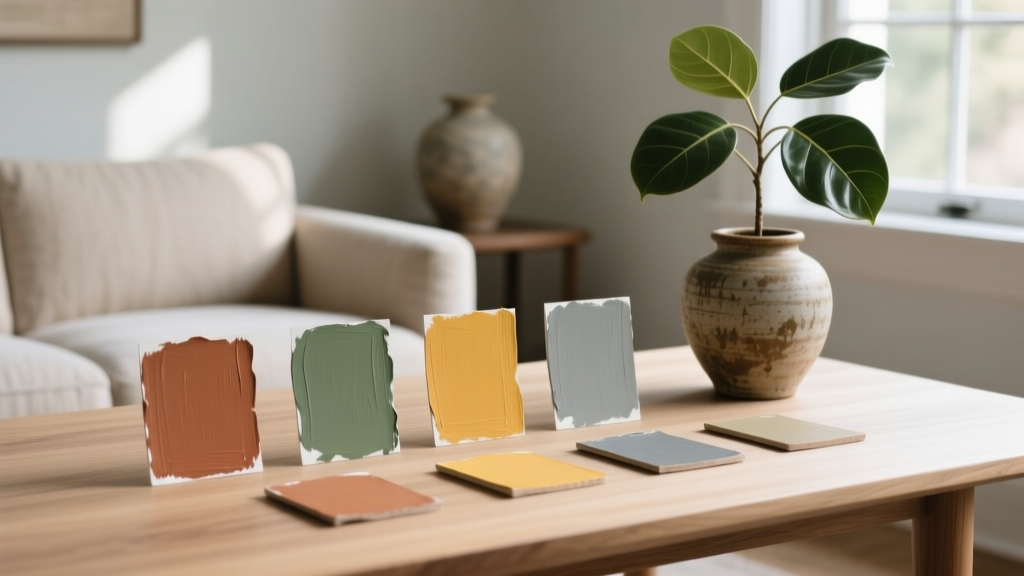
How to Create a Traditional Color Palette - The Decor Mag
A traditional color palette is one of the easiest ways to make a home feel welcoming, finished, and quietly confident. While trends come and go, traditional color schemes have staying power because they’re grounded in nature, history, and the way our eyes prefer to read a space: calm backgrounds, thoughtful contrast, and a few richer accents that add depth.
For homeowners, this matters for a practical reason, too. Traditional paint colors are often more forgiving in real-world lighting, they pair well with existing furnishings, and they create a cohesive flow from room to room. If you’ve ever painted a wall only to find the color turns icy, neon, or oddly flat, you’ll appreciate that a traditional interior color design approach is less about chasing the “perfect” swatch and more about building a balanced, livable paint color palette.
Below, you’ll find clear traditional color principles, specific paint color recommendations (with well-known brand references), and real room scenarios—so you can confidently choose a classic color scheme that feels personal rather than predictable.
What Makes a Color Palette “Traditional”?
Traditional interiors don’t rely on a single era or one strict formula. They’re unified by proportion and harmony—colors that feel established, layered, and connected. In color theory terms, traditional palettes often use:
- Warm or neutral-leaning undertones (creamy whites, greige, camel, warm gray)
- Muted mid-tones inspired by natural pigments (sage, dusty blue, clay, tobacco)
- Deep anchors that ground the room (navy, forest green, oxblood, espresso)
- Balanced contrast (light walls + crisp trim; deep walls + lighter textiles)
- Layered finishes: paint + wood tones + metals + textiles for richness
From a color psychology perspective, traditional palettes tend to support feelings of stability, comfort, and ease—ideal for living rooms, dining rooms, entryways, and bedrooms where you want guests (and you) to exhale.
Start with the Three-Layer Framework (Base, Mid-Tone, Accent)
If you want a traditional color palette that works in multiple rooms, build it in three layers. This keeps your paint color scheme cohesive without looking matched.
1) Base Color: Your Background Neutral
Your base is typically used on most walls, open-concept areas, or connecting spaces (hallways, stairwells). Traditional neutrals are rarely stark; they have a soft warmth that flatters wood floors and classic millwork.
Classic base paint colors to sample:
- Benjamin Moore White Dove (OC-17) – creamy, versatile; a go-to for traditional interiors
- Sherwin-Williams Alabaster (SW 7008) – warm off-white that avoids looking yellow
- Farrow & Ball Skimming Stone (No. 241) – a gentle greige that feels historic
- Benjamin Moore Edgecomb Gray (HC-173) – warm greige; excellent for open plans
2) Mid-Tone Color: The “Room Color” That Adds Personality
Mid-tones are where traditional schemes become memorable. Think soft blues, sage greens, muted golds, or warm taupes. These shades read as refined and grounded rather than trendy.
Timeless mid-tone paint colors:
- Benjamin Moore Palladian Blue (HC-144) – airy blue-green; beautiful in dining rooms and bedrooms
- Sherwin-Williams Sea Salt (SW 6204) – soft green-gray; calm and easy to live with
- Benjamin Moore Revere Pewter (HC-172) – classic greige; works with warm and cool elements
- Farrow & Ball Mizzle (No. 266) – complex gray-green; reads quietly traditional
3) Accent Color: Your Depth and Contrast
Accents show up on cabinetry, built-ins, interior doors, a powder room vanity, or even a library-like statement wall. The psychology here is simple: deeper colors create a sense of shelter, formality, and focus.
Traditional accent colors that age well:
- Benjamin Moore Hale Navy (HC-154) – classic navy; strong without feeling harsh
- Sherwin-Williams Urbane Bronze (SW 7048) – deep brown-gray; rich and modern-traditional
- Benjamin Moore Essex Green (HC-188) – historic deep green; ideal for libraries and dining rooms
- Farrow & Ball Railings (No. 31) – inky blue-black; elegant on trim and cabinetry
Traditional Color Schemes That Work Room-to-Room
When homeowners search for “traditional paint colors” or “classic color schemes,” they’re usually looking for combinations that feel coordinated without being boring. Here are reliable pairings you can adapt to your home’s light and finishes.
Palette 1: Warm White + Navy + Brass
- Walls: Benjamin Moore White Dove (OC-17)
- Accent/Built-ins: Benjamin Moore Hale Navy (HC-154)
- Trim: Same White Dove in a higher sheen (semi-gloss)
- Metals: aged brass or unlacquered brass
Why it works: White + navy is high-contrast, crisp, and inherently traditional. Brass warms the palette and adds the “collected” look.
Palette 2: Greige + Sage + Cream
- Walls: Benjamin Moore Edgecomb Gray (HC-173)
- Accent: Sherwin-Williams Sea Salt (SW 6204) or a deeper sage in textiles
- Trim/Ceiling: Sherwin-Williams Alabaster (SW 7008)
Why it works: Greige and sage are nature-based and soothing. This palette is especially flattering with oak floors, linen upholstery, and warm stone.
Palette 3: Cream + Muted Blue + Walnut
- Walls: Sherwin-Williams Alabaster (SW 7008)
- Dining room/office: Benjamin Moore Palladian Blue (HC-144)
- Wood tones: walnut, mahogany, or espresso-stained pieces
Why it works: Muted blue lowers visual “noise” and feels classic in both formal and casual rooms.
Palette 4: Taupe + Oxblood + Antique Gold
- Walls: Benjamin Moore Revere Pewter (HC-172)
- Accent color: deep wine/oxblood in rugs, drapery, or an upholstered chair
- Metals: antique gold, aged bronze
Why it works: This is traditional with a heritage feel—perfect if you love vintage art, Persian rugs, and darker woods.
Real Room Examples: How to Apply a Traditional Palette
Entryway: Make the First Impression Feel Intentional
An entry sets the tone. Traditional entryways benefit from contrast and polish.
- Walls: Benjamin Moore White Dove (OC-17)
- Trim: White Dove in semi-gloss for a crisp, tailored edge
- Front door (interior side): Benjamin Moore Hale Navy (HC-154)
- Styling: a brass lantern light, a vintage runner, and a warm wood console
Living Room: Use Neutrals for the Walls, Color in the Layers
Traditional living rooms feel best when walls stay calm and the palette builds through textiles and art.
- Walls: Farrow & Ball Skimming Stone (No. 241) or BM Edgecomb Gray (HC-173)
- Accent through decor: navy throw pillows, olive drapery, a rust-toned rug
- Optional subtle ceiling: a softened white to reduce glare (same wall color at 50% strength, if your painter can tint accurately)
Application tip: If your sofa is patterned or your rug is ornate, keep your wall paint closer to a warm neutral so the room reads layered—not busy.
Dining Room: Traditional Color Loves a Slightly Moodier Move
Dining rooms handle deeper colors beautifully because they’re often used in the evening, under warm lighting. Rich hues also make artwork and wood furniture look more elevated.
- Walls: Benjamin Moore Essex Green (HC-188) for a classic, enveloping look
- Trim: Benjamin Moore White Dove (OC-17) for sharp contrast
- Dining chairs: camel leather or oatmeal linen
- Metals: aged brass chandelier
Color psychology: Deep greens signal balance and restoration—great for long meals and conversation.
Kitchen: Classic Cabinet Colors That Won’t Date Quickly
Traditional kitchens often use white or cream cabinetry, but painted islands and perimeter cabinets in deeper shades can still feel timeless when the undertones are right.
- Cabinets: Benjamin Moore White Dove (OC-17) or Sherwin-Williams Alabaster (SW 7008)
- Island: Benjamin Moore Hale Navy (HC-154) or SW Urbane Bronze (SW 7048)
- Walls: a soft greige like BM Revere Pewter (HC-172)
- Counters/backsplash: marble-look quartz or classic subway tile for a traditional finish
Application tip: If you have a lot of warm wood (floors or ceiling beams), avoid icy whites. A warm white keeps the whole kitchen feeling cohesive.
Bedroom: Soft, Restful Mid-Tones Win
Bedrooms benefit from colors that lower energy and reduce contrast—especially at night.
- Walls: Benjamin Moore Palladian Blue (HC-144) or SW Sea Salt (SW 6204)
- Trim: SW Alabaster (SW 7008)
- Bedding: crisp white with a quilted texture, plus a classic stripe or floral accent
Color psychology: Muted blue-green tones support relaxation and steady breathing—ideal for sleep-focused spaces.
Design Principles That Keep Traditional Palettes Looking Elevated
Use Undertones to Prevent Clashes
Traditional paint colors can still go wrong if undertones fight each other. A quick rule: warm with warm, cool with cool—then add contrast intentionally.
- Warm undertones: creamy whites, beige, warm greige, camel, terracotta
- Cool undertones: crisp whites, blue-grays, some sages, charcoal
Follow a Flexible 60-30-10 Ratio
This classic interior design guideline creates balance:
- 60% base (walls, large rugs)
- 30% mid-tone (upholstery, drapery, secondary walls)
- 10% accent (art, lampshades, small furniture, pillows)
In traditional spaces, that 10% accent is where you can go richer—burgundy, hunter green, or inky black—without overwhelming the room.
Choose a Trim Strategy (It Changes Everything)
- Crisp contrast: light trim against deeper walls for a tailored, historic feel
- Soft contrast: trim one to two shades lighter than the walls for quieter elegance
- Monochrome trim: walls and trim the same color in different sheens for an updated traditional look
Common Traditional Color Mistakes to Avoid
- Picking paint from a tiny swatch only. Traditional colors are nuanced; sample on multiple walls and check them morning, afternoon, and evening.
- Using a stark white with warm finishes. Bright whites can make wood floors look orange and stone look dull. Try White Dove or Alabaster instead of ultra-cool whites.
- Ignoring sheen. Flat can look chalky on trim; high-gloss can feel too modern. A classic approach: eggshell on walls, satin or semi-gloss on trim.
- Over-committing to one color family. Too much beige can feel lifeless. Add depth with navy, forest green, or a warm tobacco tone.
- Forgetting “color travel” in open plans. A traditional whole-home color scheme needs continuity. Use one base neutral, then vary mid-tones room by room.
FAQ: Traditional Color Palettes
What are the best traditional paint colors for a whole house?
Look for a warm white or greige as your base (Benjamin Moore White Dove, Sherwin-Williams Alabaster, Benjamin Moore Edgecomb Gray). Then choose two to three mid-tone hues (sage, muted blue, warm taupe) and one deep accent (navy or deep green) to repeat throughout.
How do I make a traditional palette feel fresh, not dated?
Keep the palette classic but update the contrast and finishes: pair warm whites with an inky accent (Hale Navy or Railings), use simpler drapery, and add cleaner-lined lighting. Traditional color schemes feel current when the room isn’t overly “theme-y.”
Can I use black in a traditional color scheme?
Yes—black works beautifully as an accent. Use it in small, high-impact areas: picture frames, iron hardware, a painted interior door, or a fireplace surround. If you want a softer traditional look, try a near-black like Farrow & Ball Railings.
What’s the easiest traditional color combination to start with?
Warm white walls + navy accents + natural wood tones is one of the most reliable classic color schemes. It works across architectural styles and pairs well with both antique and newer furniture.
How do I choose between warm and cool traditional neutrals?
Start with what’s fixed: flooring, countertops, and large upholstery. If you have warm woods or beige stone, choose warm whites/greiges. If you have cooler gray tile or lots of stainless and charcoal, a slightly cooler neutral may look more seamless.
What lighting is best for traditional paint colors?
Warm, soft lighting (around 2700K) tends to flatter traditional palettes, especially creams, taupes, and deep greens. Very cool LEDs can make classic colors look flat or sterile.
Next Steps: Build Your Traditional Palette with Confidence
To create a traditional color palette that feels cohesive and personal, start with one dependable base neutral, add one or two nature-inspired mid-tones, and choose a deep accent that you can repeat in small ways. Then test paint samples in your actual lighting, commit to a trim sheen plan, and let your textiles do some of the color work—patterned rugs, linen drapes, and layered art bring traditional color schemes to life.
If you’re ready to keep refining your home’s paint colors and color schemes, explore more color guides and room-by-room ideas on thedecormag.com.
More Articles
 How to Mix Warm and Cool Tones Successfully - The Decor Mag
 Best Lapis Blue Paint Colors - The Decor Mag
 Best Eucalyptus Paint Colors - The Decor Mag
 The Ultimate Reading Guide: Science-Backed Strategies for Faster Comprehension, Retention, and Lifelong Engagement
 Best Papaya Paint Colors - The Decor Mag
 How to Choose Colors for a Nursery - The Decor Mag
 How To Organize Island: A Practical, Space-Smart Guide for Kitchens of All Sizes
 Best Slate Blue Paint Colors - The Decor Mag
 Reading for Options: How Visual Literacy Drives Strategic Decision-Making in Design and Branding
 Best Oxblood Paint Colors - The Decor Mag