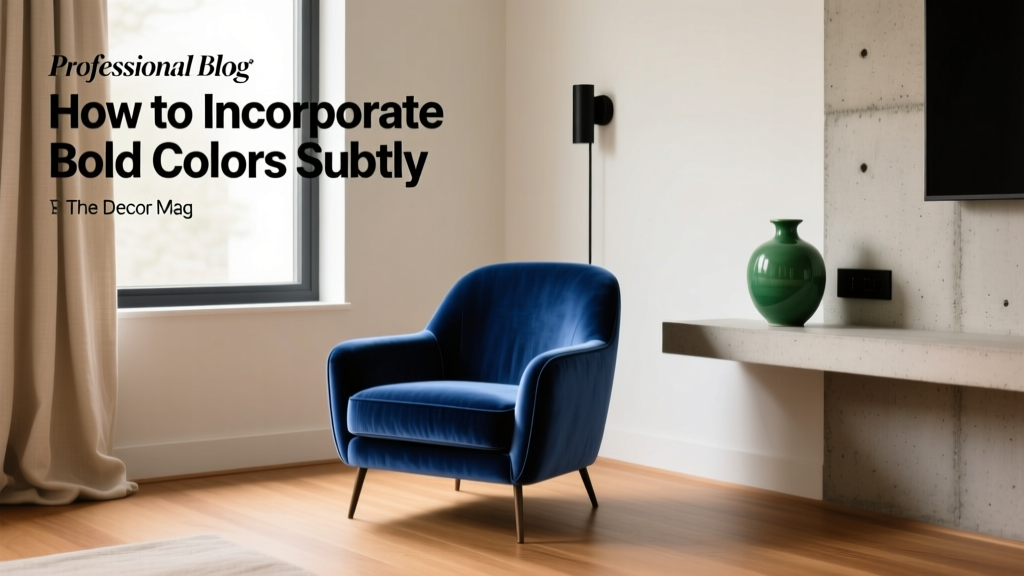
How to Incorporate Bold Colors Subtly - The Decor Mag
Bold color has a reputation: dramatic, risky, “I’ll regret it in a year.” Yet in the hands of a thoughtful homeowner, saturated hues can feel surprisingly timeless—adding warmth, depth, and personality without overwhelming a room. The secret isn’t avoiding vivid color; it’s controlling where it goes, how much of it you use, and what you pair it with.
Subtle bold color is one of the most effective tools in interior color design because it shapes mood and perception. Rich blues can calm and focus, energizing reds can animate a space, and deep greens connect us to nature—color psychology at work. When those hues are applied with intention and balanced with neutrals, the result is a home that feels elevated rather than loud.
This guide breaks down practical ways to work bold paint colors and strong accents into real rooms—using approachable color schemes, proven design principles, and specific paint color recommendations to help you choose confidently.
What “Subtle Bold” Actually Means (and Why It Works)
Subtle bold color isn’t about “tiny pops only.” It’s about using saturation strategically so your eye reads the room as cohesive. Think of bold color as a spice: a little changes everything, and the right supporting ingredients make it taste intentional.
Design principles that keep bold colors from feeling overwhelming
- Balance: Pair saturated hues with calmer neutrals (warm whites, soft greiges, gentle taupes).
- Distribution: Repeat a bold hue in 2–4 places so it looks planned, not accidental.
- Value control: If the color is intense, keep the overall room value (lightness/darkness) consistent—either grounded and moody or airy and light.
- Finish selection: Matte and eggshell feel quieter than glossy finishes; higher sheen draws attention.
- Negative space: Give strong color breathing room with uncolored walls, open shelving gaps, and light textiles.
Start with the Right Neutral: Your Bold Color’s Best Friend
The most successful bold color schemes begin with a neutral “base note.” This isn’t the bland part—it’s the framework that helps saturated hues look sophisticated.
Go-to neutral paint colors that pair well with bold accents
- Benjamin Moore White Dove (OC-17): A soft warm white that makes jewel tones feel rich, not harsh.
- Sherwin-Williams Alabaster (SW 7008): Creamy and calming, excellent with earthy reds, olives, and navy.
- Farrow & Ball Skimming Stone: A warm greige that complements deep greens and inky blues.
- Benjamin Moore Classic Gray (OC-23): A pale greige that reads light and clean with bolder trim or cabinetry.
Quick rule for undertones
Match undertones so the room doesn’t fight itself:
- Warm neutrals (creamy whites, beige, warm greige) flatter terracotta, olive, mustard, warm navy.
- Cool neutrals (crisp whites, cooler grays) pair best with cobalt, emerald, blue-based reds.
7 Subtle Ways to Use Bold Colors (That Still Feel High-Impact)
1) Paint a single “quiet” surface: the easiest bold color entry point
A classic accent wall can work, but the most modern approach is painting a surface that’s naturally interrupted—like a wall with a fireplace, built-ins, or large windows. The visual breaks make the color feel integrated.
Room scenario: In a living room with white walls (BM White Dove), paint the fireplace wall Sherwin-Williams In the Navy (SW 9178) in matte. Add a charcoal rug and brass accents for warmth.
- Best for: living rooms, dining rooms, home offices
- Tip: Keep the surrounding walls a softer neutral so the bold wall reads like a focal point, not a takeover.
2) Color drenching—done lightly
Color drenching (painting walls, trim, and sometimes ceiling the same color) doesn’t have to mean neon. With deeper hues in a softer finish, it can feel enveloping and surprisingly subtle—because there’s less contrast.
Try: Farrow & Ball Hague Blue (deep blue-green) on walls and trim in eggshell, paired with ivory linen curtains and a warm wood dresser. The single-color envelope looks refined and calm.
- Best for: powder rooms, libraries, small bedrooms
- Tip: Choose one sheen family (matte/eggshell) to reduce glare and keep it velvety.
3) Paint the ceiling for a “designed” look without losing wall space
A bold ceiling reads like a custom detail—especially when walls stay light. It also changes the room’s perceived proportions (darker ceilings feel cozy; lighter bright hues can feel airy but playful).
Room scenario: In a white kitchen with simple shaker cabinets, paint the ceiling Benjamin Moore Palladian Blue (HC-144) for a gentle, coastal-leaning color statement that still reads soft.
- Best for: bedrooms, kitchens, hallways, kids’ rooms
- Tip: If you’re nervous, choose a bold hue in a lighter tint (ask the paint store to mix 50% strength).
4) Use bold color on trim, doors, or interior shutters
Painting trim is an insider move: it frames architecture and adds depth without dominating. A bold door color is also a small commitment with big payoff.
Try:
- Sherwin-Williams Tricorn Black (SW 6258) on interior doors for crisp drama with nearly any wall color.
- Benjamin Moore Hale Navy (HC-154) on window trim to sharpen bright white walls.
- Benjamin Moore Caliente (AF-290) on a single interior door for a warm, energizing accent that feels intentional.
Tip: Higher sheen (semi-gloss) on trim makes color look cleaner and more durable; keep walls in eggshell to avoid competing shine.
5) Anchor the room with one bold “heavy” piece
Instead of painting, you can incorporate bold color through a single grounding element: a sofa, area rug, large art piece, or upholstered headboard. This is a classic approach in interior color design because it’s easy to edit later.
Room scenario: A neutral living room (SW Alabaster walls) gets a saturated emerald velvet sofa. Echo the green with:
- a small ceramic vase
- a throw pillow with green threading
- a botanical print with similar tones
Tip: Keep the supporting accents in the same color family but vary texture (velvet + ceramic + linen) so it doesn’t look matchy.
6) Build a subtle bold palette using the 60-30-10 rule
This classic color scheme guideline keeps rooms balanced:
- 60% dominant: walls, large rugs (usually neutral)
- 30% secondary: upholstery, curtains, cabinetry
- 10% accent: bold color punch (pillows, lamps, art, paint detail)
Example palette:
- 60%: Benjamin Moore White Dove
- 30%: warm oak + camel leather
- 10%: Sherwin-Williams Cayenne (SW 6881) in small moments (art mat, one pillow, a planter)
7) Use “near-bold” colors: deep, complex, and slightly muted
If pure primary brights feel too intense, choose saturated colors that are shaded with gray or black. They read bold, but with built-in sophistication.
- Deep green: Sherwin-Williams Ripe Olive (SW 6209) for moody depth that still feels natural.
- Inky blue: Benjamin Moore Gentleman’s Gray (2062-20) for dramatic elegance.
- Warm terracotta: Benjamin Moore Terra Cotta Tile (2090-30) for a sunbaked, earthy statement.
Real-Room Color Pairings That Look Bold—Not Busy
Living room: navy + warm white + cognac
- Walls: Benjamin Moore White Dove
- Accent: Sherwin-Williams In the Navy (built-ins or fireplace)
- Supporting tones: cognac leather, walnut, brushed brass
Why it works: Navy brings calm authority (color psychology: stability and focus), while warm neutrals keep it inviting.
Bedroom: dusty rose + oatmeal + espresso
- Walls: warm greige (Farrow & Ball Skimming Stone or a similar tone)
- Bold accent: Benjamin Moore Raspberry Blush (2008-30) used sparingly (headboard wall, art, or bedding)
- Grounding: espresso nightstands, black metal lighting
Why it works: The bold hue shows up as warmth and romance, while deeper furniture tones keep it from feeling sugary.
Kitchen: deep green lower cabinets + creamy uppers
- Lowers: Sherwin-Williams Ripe Olive (SW 6209) or a similar deep olive
- Uppers: Sherwin-Williams Alabaster (SW 7008)
- Hardware: aged brass or matte black
- Counter/backsplash: warm white with soft veining
Why it works: Green reads grounded and restorative, while the light uppers maintain brightness and visual space.
Bathroom/powder room: charcoal + white + one saturated surprise
- Base: Benjamin Moore Kendall Charcoal (HC-166) on vanity or wainscot
- Walls: crisp warm white
- Accent: a bold artwork featuring cobalt or fuchsia, or a painted ceiling in a jewel tone
Why it works: Small rooms can carry more drama; contrast makes it feel designed rather than chaotic.
Sampling Like a Pro: How to Test Bold Paint Colors Without Regret
- Test on multiple walls: Bold colors shift dramatically with light exposure.
- Check day and night: LEDs can change undertones; warm bulbs soften, cool bulbs sharpen.
- Use large samples: Aim for at least 12"x12" (bigger is better) or use peel-and-stick samples.
- Compare against fixed finishes: Hold your sample next to flooring, stone, and upholstery you’re keeping.
- Decide your “hero”: Choose one bold element (paint OR rug OR sofa) to lead; let the others support.
Common Color Mistakes to Avoid
- Using too many bold hues at once: Multiple saturated colors can feel busy. Limit to one dominant bold color plus one supporting accent.
- Ignoring undertones: A blue-based red next to a yellow-based cream can clash. Compare undertones in the same lighting.
- Over-contrasting without repetition: A random bright pillow looks accidental unless the hue appears elsewhere (art, books, a vase).
- Choosing the wrong sheen: High gloss amplifies color and highlights wall texture—great for doors, risky for large walls.
- Forgetting about transition spaces: Hallways and adjacent rooms should share at least one linking neutral or repeated tone for flow.
- Going too bright when you meant “rich”: If you want sophisticated, look for complex colors (deep, slightly muted) rather than pure brights.
FAQ: Subtle Ways to Use Bold Color
What are the best bold paint colors for beginners?
Begin with deep, complex shades that behave like neutrals: Benjamin Moore Hale Navy, Sherwin-Williams In the Navy, Sherwin-Williams Ripe Olive, or Benjamin Moore Kendall Charcoal. They read bold but pair easily with common finishes.
Should I use warm or cool bold colors?
Let your fixed materials decide. If you have warm woods, beige stone, or brass, warm bold colors (olive, terracotta, warm navy) typically feel harmonious. With cool gray tile, bright white counters, or chrome, cool bold colors (cobalt, emerald, blue-based reds) tend to look cleaner.
How do I make a bold accent wall look sophisticated?
Choose a wall with architectural interest (fireplace, built-ins, windows), use a flatter sheen (matte/eggshell), and repeat the accent color in at least two smaller places—like art and textiles—for a cohesive color scheme.
Can I use bold colors in an open-concept home?
Yes—treat bold color as a “zone marker.” Keep the main neutral consistent throughout, then assign bold color to one area (a dining room wall, kitchen island, or built-ins). Repeat the hue subtly in adjacent spaces to maintain flow.
What’s the simplest way to add bold color without repainting?
Add one large bold element (a rug, curtains, or a statement chair) and support it with 2–3 smaller accents in the same hue family. This approach creates impact while keeping the room editable.
Actionable Next Steps: Your Subtle Bold Color Plan
- Pick your neutral base: Start with a warm white or greige you love (BM White Dove or SW Alabaster are reliable).
- Choose one bold “hero” color: Navy, deep green, terracotta, or charcoal are versatile entry points.
- Decide the application: One painted surface, a ceiling, trim/doors, cabinetry, or one anchor piece of furniture.
- Repeat the color 2–4 times: Use textiles, art, and decor to make the scheme feel intentional.
- Sample and confirm under your lighting: Daylight and nighttime bulbs should both flatter the choice.
If you’re craving a home with more personality, bold color is the fastest route—and subtle application is the most livable. Explore more paint color ideas, color schemes, and interior color design guides on thedecormag.com.
More Articles
 Best Sage Green Paint Colors for Serenity - The Decor Mag
 Color Psychology in Living Rooms: Mood & Function (2026)
 Best Wisteria Paint Colors - The Decor Mag
 How to Use Color to Create Contrast - The Decor Mag
 Warm vs Cool Color Temperatures Explained - The Decor Mag
 Best Navy Paint Colors for Every Style - The Decor Mag
 Jewel Tone Color Scheme Ideas - The Decor Mag
 Best Maroon Paint Colors - The Decor Mag
 Complementary Color Pairing Ideas - The Decor Mag
 Best Avocado Green Paint Colors - The Decor Mag