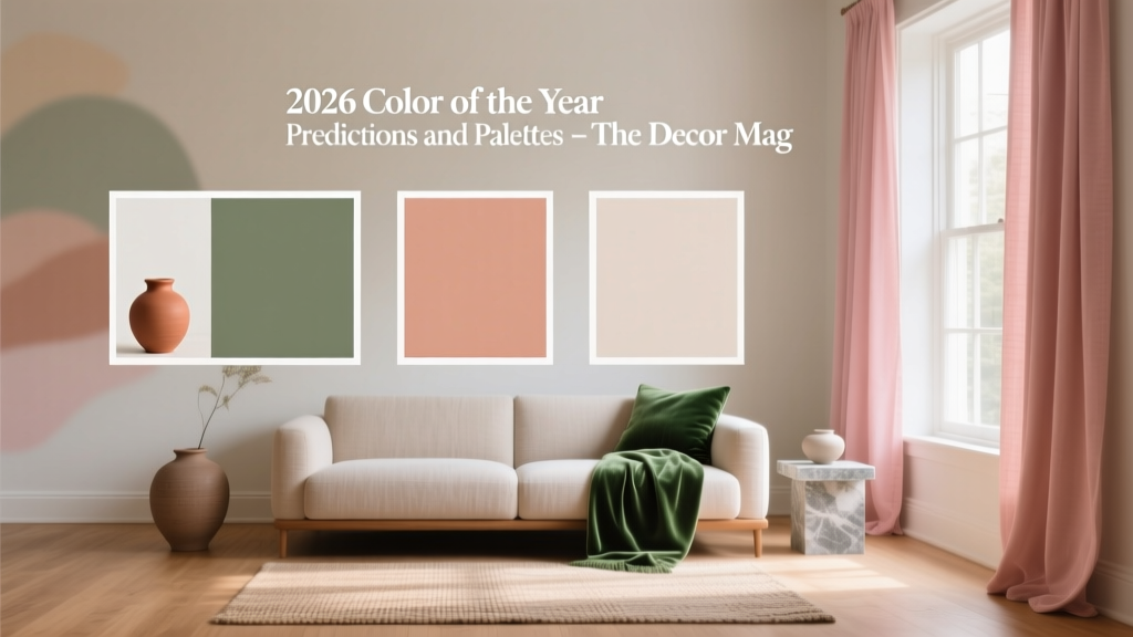
2026 Color of the Year: Predictions & Palettes
Every year, “Color of the Year” announcements ripple through the design world—and they matter more than ever for homeowners. Color influences how a room feels, how large it reads, how light behaves across surfaces, and even how well your furniture and finishes work together. When you understand the direction color is heading, you can make smarter paint choices that look current without feeling trendy (or dated in 18 months).
For 2026, the emerging story isn’t one single hero shade—it’s a shift toward comforting, nature-rooted color schemes with a polished edge. Think earth pigments refined into livable neutrals, plus a few expressive accents that add personality without overwhelming a space. If you’ve been craving rooms that feel calm but not bland, warm but not yellow, and expressive without shouting, these 2026 color predictions will help you plan your next refresh.
This guide breaks down the most likely 2026 Color of the Year contenders, the palettes that support them, and the practical “where and how” of using these paint colors in real homes—living rooms, kitchens, bedrooms, bathrooms, and exteriors included.
What 2026 Color Trends Are Signaling (and Why)
Across interiors, fashion, and product design, the same color cues keep showing up: grounded warmth, softened saturation, and a return to materials that feel human—clay, linen, wood, stone, and patinaed metals. In paint terms, that translates into “complex color”: hues with subtle undertones that shift throughout the day and play well with natural light.
2026 color movement: comfort + clarity
- Nature-based neutrals (warm whites, mushroom taupes, putty beiges) continue to replace stark grays.
- Mineral greens and blue-greens look fresh, restorative, and timeless—especially in matte finishes.
- Modern earth tones (terracotta, clay, cinnamon, umber) return with more sophistication and less orange.
- Berry-browns and softened reds act as “new neutrals” for dining rooms, libraries, and cozy dens.
- Inky accents (charcoal, deep navy, near-black green) sharpen the palette for trim, doors, and cabinetry.
Color psychology behind the predictions
Homeowners are still prioritizing spaces that regulate mood: calmer bedrooms, welcoming kitchens, and living rooms that feel social but soothing. From a color psychology lens:
- Greens signal balance and restoration—excellent for high-traffic family areas.
- Warm neutrals create a sense of safety and ease—ideal for open-plan interiors.
- Earth reds and clays encourage connection and appetite—strong choices for dining rooms and kitchens.
- Deep blue-greens and charcoals add focus and quiet drama—perfect for studies and bedrooms.
Top 2026 Color of the Year Predictions
Major paint brands tend to pick a color that’s both aspirational and widely usable. Based on current launches and where interiors are heading, these are the strongest 2026 contenders.
Prediction #1: Mineral Green (soft, muted, slightly gray)
Mineral greens sit between sage and olive with a dusted, stone-like quality. They read natural, calm, and mature—great for homeowners who want color without the risk of going too bold.
Paint colors to try:
- Benjamin Moore Saybrook Sage HC-114 (warm, classic, historically grounded)
- Sherwin-Williams Evergreen Fog SW 9130 (soft green-gray; easy in many lights)
- Farrow & Ball French Gray (a green-leaning neutral; subtle and elevated)
Best rooms: living rooms, kitchens, mudrooms, bedrooms, and exteriors with stone or brick.
Prediction #2: Grounded Clay (refined terracotta with a modern edge)
Terracotta is evolving into calmer clay hues—less orange, more earthy. These colors add warmth and personality while still working like a neutral when paired with cream, wood, and black accents.
Paint colors to try:
- Benjamin Moore Terra Cotta Tile 2090-30 (rich, earthy, traditional terracotta)
- Sherwin-Williams Cavern Clay SW 7701 (sun-baked warmth; strong but livable)
- Farrow & Ball Red Earth (muted red-clay; sophisticated and grounding)
Best rooms: dining rooms, entryways, powder rooms, reading nooks, and accent walls.
Prediction #3: Cocoa-Mocha Neutral (brown as the new base tone)
Brown is re-entering interiors in a big way, but not as heavy 1990s “builder beige.” The 2026 version is a cocoa-mocha family: warm, enveloping, and luxe, especially in matte paint.
Paint colors to try:
- Benjamin Moore Feather Down 953 (warm greige-taupe; a reliable whole-home neutral)
- Sherwin-Williams Urbane Bronze SW 7048 (deep, complex brown-bronze; stunning on cabinetry/doors)
- Farrow & Ball Drop Cloth (soft, earthy neutral; beautiful with natural textiles)
Best rooms: open-plan living spaces, hallways, home offices, and exteriors for a modern organic look.
Prediction #4: Dusty Berry-Brown (muted plum, raisin, or wine-tinged neutral)
These colors feel intimate and grown-up, adding depth without the brightness of primary reds. They’re a natural match for walnut woods, brass, and layered textiles.
Paint colors to try:
- Benjamin Moore Caponata AF-650 (aubergine-brown; dramatic and refined)
- Sherwin-Williams Redend Point SW 9081 (rosy-beige; warm and approachable)
- Farrow & Ball Preference Red (heritage-inspired red-brown; excellent in dining rooms)
Best rooms: dining rooms, libraries, moody bedrooms, and powder rooms.
2026 Predicted Palettes You Can Use Right Now
If you want a cohesive interior color design, start with a palette rather than a single paint chip. These combinations reflect where 2026 is heading—and they’re practical for real homes with real life happening inside them.
Palette A: “Calm Mineral” (green-forward, warm and airy)
- Main wall: Sherwin-Williams Evergreen Fog SW 9130
- Trim/ceiling: Benjamin Moore White Dove OC-17
- Accent (door/cabinet): Sherwin-Williams Iron Ore SW 7069
- Supporting neutral: Farrow & Ball Drop Cloth
Where it shines: An open-plan living room and kitchen where you want visual continuity. Evergreen Fog reads serene in daytime and cozy at night.
Palette B: “Modern Clay + Linen” (warmth with restraint)
- Main wall: Sherwin-Williams Cavern Clay SW 7701 (or use as an accent)
- Trim: Benjamin Moore Swiss Coffee OC-45 (soft, creamy white)
- Cabinet/vanity: Benjamin Moore Kendall Charcoal HC-166
- Secondary wall neutral: Benjamin Moore Feather Down 953
Where it shines: Dining room + adjacent hallway. Clay brings hospitality; linen whites keep it breathable.
Palette C: “Cocoa + Stone” (a new neutral home base)
- Main wall: Farrow & Ball Drop Cloth
- Secondary wall (deeper): Sherwin-Williams Urbane Bronze SW 7048
- Trim: Benjamin Moore White Dove OC-17
- Pop of color (textiles/art): muted teal, antique gold, or rust
Where it shines: Primary bedroom or living room with warm wood floors. This palette minimizes contrast for a soothing, elevated feel.
Palette D: “Berry Ink” (moody, intimate, and timeless)
- Main wall: Benjamin Moore Caponata AF-650 (feature wall or full room)
- Trim: Benjamin Moore White Dove OC-17 (crisp but not stark)
- Accent: Sherwin-Williams Iron Ore SW 7069 (metalwork, doors, built-ins)
- Balancing neutral: warm taupe upholstery, natural linen curtains
Where it shines: A dining room with lower evening light, or a study where you want depth and focus.
Real Room Examples: How to Apply 2026 Colors Like a Designer
Living room: create a “soft focal point” with mineral green
Use a muted green on the main walls, then sharpen the look with dark accents. A simple, high-impact approach:
- Walls: Evergreen Fog SW 9130
- Trim: White Dove OC-17
- Fireplace surround or built-ins: Iron Ore SW 7069
- Textiles: oatmeal linen, camel leather, and a small hit of rust in pillows
Design principle: medium-value walls reduce glare and create comfort; darker accents add definition and make the room feel finished.
Kitchen: make clay feel current (not rustic)
Clay tones can read “Tuscan” if paired with the wrong finishes. Keep it modern:
- Island cabinetry: Urbane Bronze SW 7048 or Kendall Charcoal HC-166
- Walls: Feather Down 953 or Swiss Coffee OC-45
- Accent color (pantry door or banquette wall): Cavern Clay SW 7701
- Finishes: brushed nickel or aged brass; creamy quartz; warm white backsplash
Lighting tip: Under warm LEDs (2700K), clay gets richer. Sample first so it doesn’t skew too orange at night.
Bedroom: cocoa neutrals for a hotel-level calm
For better sleep and a more enveloping feel, reduce contrast and choose warm undertones.
- Walls: Drop Cloth or Feather Down 953
- Ceiling: White Dove OC-17 (or color-drench with the wall color for coziness)
- Accent: a headboard wall in Urbane Bronze SW 7048
Design principle: lower contrast palettes feel quieter, which reads as luxurious in bedrooms.
Bathroom or powder room: try berry-brown for instant sophistication
Small rooms are perfect for bolder paint colors—especially those that glow under soft lighting.
- Walls: Caponnata AF-650 (full coverage)
- Trim: White Dove OC-17
- Mirror/frame: black or aged brass
- Tile: warm white, travertine-look porcelain, or veined stone
Pro move: Use a more reflective finish (eggshell) in a windowless powder room to prevent the color from feeling flat.
Exterior: mineral greens and bronzed browns are rising
For curb appeal that feels organic and modern, look to greens and deep browns instead of cool grays.
- Body: Saybrook Sage HC-114 or Evergreen Fog SW 9130
- Trim: White Dove OC-17
- Front door: Urbane Bronze SW 7048 or near-black green
Exterior tip: Sunlight lightens color dramatically. Go one shade deeper than your interior instinct.
Common Color Mistakes to Avoid in 2026 Palettes
- Choosing paint by trend alone (without checking undertones). A “green” can lean gray, yellow, or blue—each changes the mood and compatibility with floors.
- Ignoring fixed finishes like tile, countertops, cabinets, and flooring. Your paint color scheme should harmonize with what you’re not changing.
- Overusing high contrast (bright white trim with very warm walls). It can look choppy and emphasize imperfections. Consider softer whites like White Dove or Swiss Coffee.
- Skipping samples and painting based on a screen. Always test at least two options on multiple walls and observe in morning, afternoon, and evening light.
- Forgetting sheen strategy. Flat/matte hides wall flaws but marks more easily; eggshell is a great all-purpose wall finish; satin is ideal for trim in busy homes.
- Matching everything too perfectly. Great interior color design uses layering: mix warm and cool accents, pair solids with texture, and let wood and metal add dimension.
How to Choose Your Best 2026 Color Direction (A Simple Process)
- Start with your home’s light. North-facing rooms love warmer paint colors; south-facing rooms can handle cooler or deeper shades.
- Pick a whole-home neutral. Try Feather Down 953 or Drop Cloth for warmth without heavy yellow.
- Choose one signature color. Mineral green for calm, clay for sociability, cocoa for coziness, berry-brown for drama.
- Assign roles:
- Main walls (60%)
- Secondary color (30%)
- Accent (10%) for doors, built-ins, or a powder room
- Repeat accents for cohesion. Echo your accent color in textiles, art, or a rug so it feels intentional.
FAQ: 2026 Color of the Year Predictions and Paint Choices
What is the best “Color of the Year” if I want something timeless?
Look to complex neutrals and mineral shades: a green-gray like Evergreen Fog SW 9130, a warm taupe like Feather Down 953, or a linen neutral like Drop Cloth. These sit comfortably in long-term interior color design and adapt to changing decor.
Are gray paint colors officially out for 2026?
Not entirely—but cool, flat grays are fading. The shift is toward warm grays (greiges), taupes, and stone-inspired neutrals that feel softer with wood tones and warmer metals.
How do I know if a green will look muddy in my room?
Muddy greens usually happen when the undertone clashes with flooring or when the room is very low-light. Sample the color next to your fixed finishes, and test it on at least two walls. If it looks dull, try a slightly cleaner green or pair it with a brighter (but still warm) white like White Dove.
What paint finish works best for these 2026 palettes?
For most homes: matte or eggshell for walls, satin for trim and doors, and semi-gloss for kitchens/baths where moisture and cleaning are frequent. Deeper colors like Urbane Bronze often look especially rich in matte.
Can I mix clay tones with cool colors like blue?
Yes—choose a muted, gray-blue or blue-green rather than a bright primary blue. Clay + blue-green feels balanced because you’re pairing warm earth with cool mineral.
What’s the easiest way to try a 2026 color trend without repainting everything?
Paint one high-impact, low-commitment area: a powder room, interior doors, a kitchen island, or built-in shelving. Using an accent like Iron Ore SW 7069 or a soft green on a single wall can update your home’s color scheme quickly.
Next Steps: Bring 2026 Color Into Your Home with Confidence
Choose one predicted direction—mineral green, refined clay, cocoa neutral, or dusty berry-brown—then build a simple palette around it using a soft white trim and one dark accent for definition. Buy samples, observe them in real lighting, and let your fixed materials (floors, counters, tile) guide the undertones. That’s how you get a paint color scheme that feels both current and deeply “you.”
For more paint color guides, curated color schemes, and room-by-room interior color design advice, explore the color library at thedecormag.com.
More Articles
 How to Choose Bedroom Colors for Sleep - The Decor Mag
 Best Black Paint Colors for Dramatic Spaces - The Decor Mag
 2026 Color Trends: Earth Tones Making a Comeback
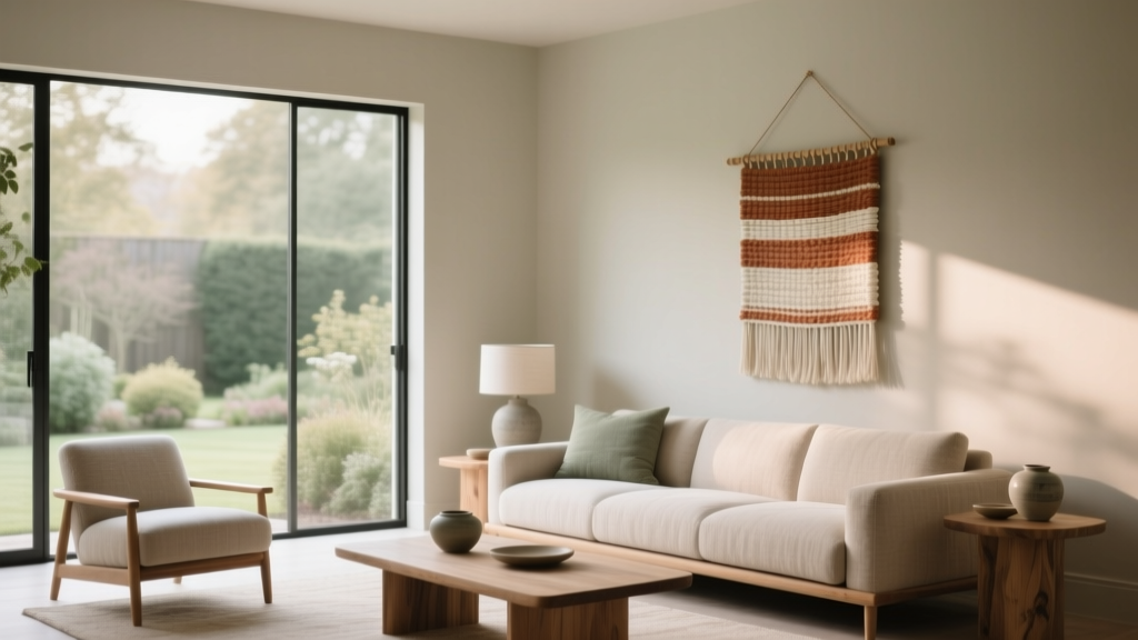 How to Use Muted Colors for Sophistication - The Decor Mag
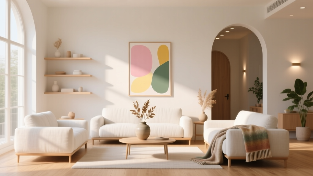 How to Create an Uplifting Color Palette - The Decor Mag
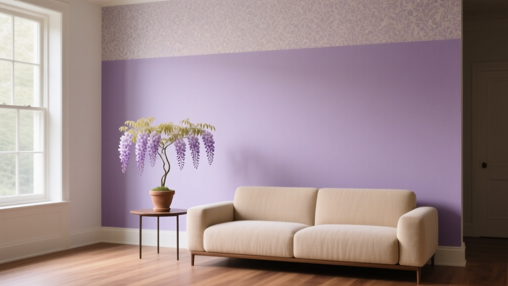 Best Wisteria Paint Colors - The Decor Mag
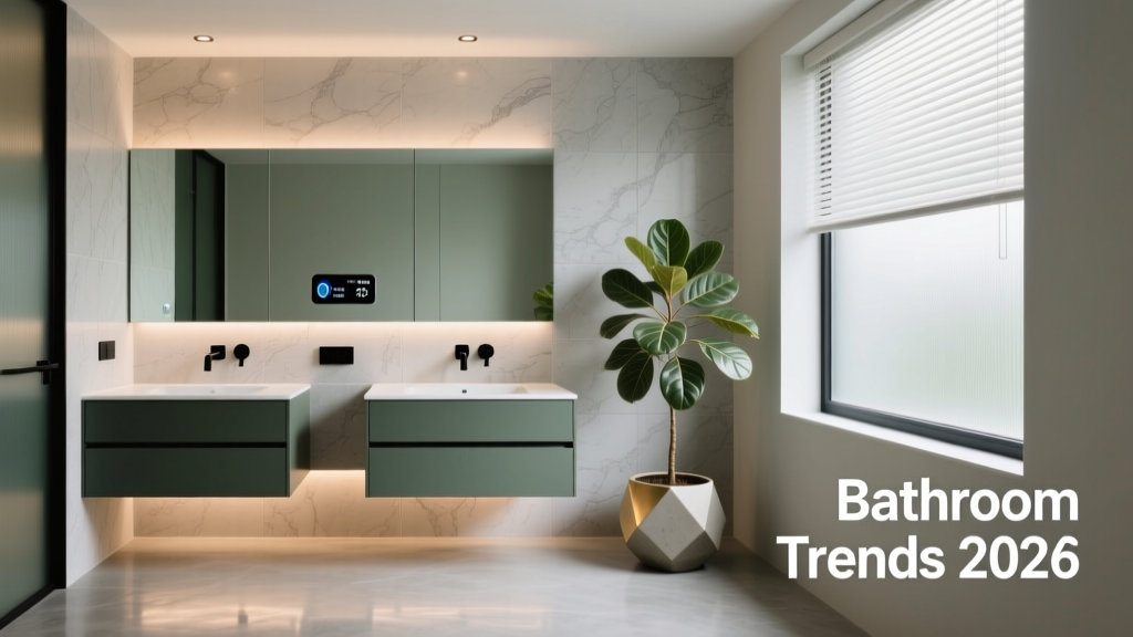 Bathroom Trends 2026: Wellness Integration, Material Innovation, and Smart Efficiency
 Best Lime Green Paint Colors - The Decor Mag
 Best Living Rooms for STEP: Design, Layout, and Accessibility Standards for Seniors and Mobility Support
 Best Mango Paint Colors - The Decor Mag