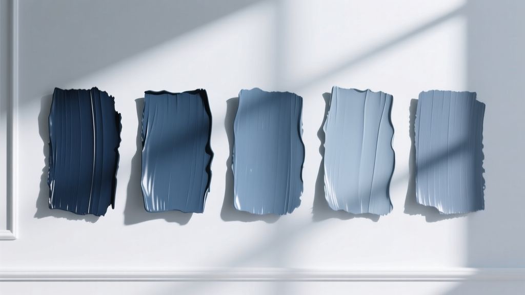
Best Slate Blue Paint Colors - The Decor Mag
Slate blue sits in that sweet spot between blue, gray, and a whisper of green—quietly colorful, effortlessly livable, and endlessly adaptable. If you love the idea of a blue room but worry about it feeling too bright, too beachy, or too “theme-y,” slate blue is a smart alternative. It reads as refined and grounded, like weathered stone or a hazy evening sky, which is why it works in everything from modern farmhouse to tailored traditional to contemporary minimalism.
This color topic matters because slate blue behaves differently depending on light, surrounding finishes, and even the direction your room faces. One slate blue can look serene and smoky in the morning, then turn noticeably cooler (or greener) by afternoon. Understanding those shifts helps you choose a slate blue paint color that supports your home’s architecture and your lifestyle—whether you’re after a calming bedroom, a dramatic dining room, or a fresh, designer-approved kitchen cabinet color.
Below, you’ll find standout slate blue paint colors across major brands, plus practical guidance on undertones, color schemes, and real-room application scenarios—so you can use slate blue with confidence.
What Is Slate Blue? Undertones, Mood, and Why It Works
Slate blue is typically a muted blue with gray (and sometimes green) undertones. Compared to navy, it’s softer; compared to a true gray-blue, it has more color presence. Slate blue tends to create a calm, steady atmosphere—great for lowering visual “noise” in busy homes while still feeling intentional and designed.
Color psychology: the feel of slate blue
- Calming and restorative: Blue is associated with tranquility; gray adds sophistication and quiet.
- Balanced and timeless: Muted hues feel less trend-dependent than vivid colors.
- Focused and grounded: Slate blue can make a room feel more composed—ideal for offices and reading nooks.
Slate blue vs. other popular blues
- Slate blue vs. navy: Navy is deeper and more formal; slate blue is airier and easier in daylight.
- Slate blue vs. powder blue: Powder blue is lighter and can skew playful; slate blue feels more grown-up.
- Slate blue vs. blue-gray: Blue-gray often reads more neutral; slate blue typically has a stronger blue identity.
How to Choose the Right Slate Blue Paint Color for Your Room
1) Read the light first (north, south, east, west)
- North-facing rooms: Cooler, flatter light can make slate blue feel more gray or slightly steely. Choose a slate blue with a softer, slightly warmer cast.
- South-facing rooms: Warm, bright light brings out the “blue” and can reveal green undertones. Many slate blues look their best here.
- East-facing rooms: Bright morning light, cooler afternoons. Test for how the color looks after 2 p.m.
- West-facing rooms: Warm afternoon/evening light can make slate blue feel cozier (sometimes a bit muddier). Pick a cleaner slate blue to avoid heaviness.
2) Decide: wall color, cabinet color, or accent color?
- Whole-room wall color: Choose a mid-tone slate blue with balanced undertones for long-term livability.
- Cabinets or built-ins: Slightly deeper slate blues look intentional and “custom.”
- Front door or accent wall: You can go darker and moodier without overpowering the home.
3) Coordinate with fixed finishes
Slate blue is especially sensitive to adjacent materials. Before committing, compare your sample to:
- Warm woods (oak, walnut, pine)
- Stone and tile (marble veining, travertine, terrazzo)
- Metal finishes (polished nickel, brass, matte black)
- Countertops (white quartz, gray quartzite, butcher block)
Best Slate Blue Paint Colors (Designer-Approved Picks)
These slate blue paint colors are popular for a reason: they have versatile undertones, consistent performance in real homes, and they pair beautifully with common trim whites and natural materials. Always sample first—slate blue can shift dramatically by lighting and surrounding colors.
Benjamin Moore Slate Blue Favorites
-
Benjamin Moore Boothbay Gray (HC-165)
A classic blue-gray that often reads like true slate blue in natural light. Works well in open-concept homes because it stays calm and refined.
Best for: living rooms, bedrooms, exterior siding, kitchen islands. -
Benjamin Moore Nimbus Gray (2131-50)
Airy and modern, with a soft gray base and a gentle blue cast. Great when you want slate blue vibes without going too saturated.
Best for: hallways, home offices, bathrooms, low-contrast color schemes. -
Benjamin Moore Philipsburg Blue (HC-159)
A richer blue-green that can read “slate” when paired with crisp whites and stone. It’s more colorful than a typical blue-gray, but still muted enough to feel sophisticated.
Best for: dining rooms, built-ins, statement powder rooms. -
Benjamin Moore Van Courtland Blue (HC-145)
An elegant, historic-leaning slate blue with a subtle green undertone. Especially beautiful with warm woods and antique brass.
Best for: traditional homes, libraries, kitchen cabinetry.
Sherwin-Williams Slate Blue Favorites
-
Sherwin-Williams Smoky Blue (SW 7604)
A true crowd-pleaser: moody, muted, and balanced. It creates a cocooning effect without reading too dark.
Best for: bedrooms, dens, accent walls, furniture pieces. -
Sherwin-Williams Misty (SW 6232)
A light blue-gray that can behave like a pale slate. Ideal if you want just a hint of blue in a neutral-forward palette.
Best for: nurseries, small bathrooms, ceilings, laundry rooms. -
Sherwin-Williams Slate Tile (SW 7624)
Deeper and more dramatic—excellent for cabinetry, built-ins, and exteriors. It can read charcoal-blue in dim light.
Best for: kitchen lowers, mudroom lockers, front doors. -
Sherwin-Williams Upward (SW 6239)
A fresher slate blue with a crisp, modern edge. When paired with bright white trim, it looks clean and contemporary.
Best for: home offices, guest rooms, modern living spaces.
Farrow & Ball Slate-Blue Alternatives
-
Farrow & Ball Blue Gray (No. 91)
Understated, misty, and architectural—reads like a refined slate in many homes. Pairs beautifully with limestone, linen, and natural oak.
Best for: kitchens, calm bedrooms, Scandinavian-inspired interiors. -
Farrow & Ball De Nimes (No. 299)
A denim-leaning blue that often lands in the slate family once it’s on the wall. Rich yet relaxed.
Best for: living rooms, studies, built-ins, exterior trim.
Real Room Examples: How to Use Slate Blue Like a Designer
Slate blue living room: cozy, not heavy
Scenario: You have a medium-light living room with warm wood floors and you want a calm, elevated backdrop.
- Paint idea: Benjamin Moore Boothbay Gray (HC-165) on walls
- Trim: a clean white like Benjamin Moore Chantilly Lace (OC-65) or Sherwin-Williams Pure White (SW 7005)
- Textiles: oatmeal linen curtains, warm ivory rug, camel leather or taupe upholstery
- Metals: antique brass or aged bronze for warmth
Why it works: Slate blue provides structure and calm; warm neutrals prevent it from feeling chilly.
Slate blue bedroom: restful and cocooning
Scenario: You want a sleep-friendly color that doesn’t feel overly dark.
- Paint idea: Sherwin-Williams Smoky Blue (SW 7604) on all walls
- Bedding: crisp white sheets, soft gray quilt, a muted clay or dusty rose accent pillow
- Nightstands: medium walnut or weathered oak
- Lighting: warm bulbs (2700K) to keep the color inviting at night
Why it works: The gray in slate blue reduces stimulation, while the blue promotes a serene, restorative mood.
Slate blue kitchen cabinets: timeless with personality
Scenario: You want cabinet color that won’t date quickly, and you already have white countertops.
- Paint idea: Benjamin Moore Van Courtland Blue (HC-145) or Sherwin-Williams Slate Tile (SW 7624) on lower cabinets
- Upper cabinets: warm white to keep the room bright
- Hardware: unlacquered brass, champagne bronze, or polished nickel
- Backsplash: handmade white subway tile, off-white zellige, or pale gray stone
Why it works: Slate blue reads custom and tailored. With warm metals and creamy whites, it feels classic rather than trendy.
Slate blue bathroom: spa-like and flattering
Scenario: You’re updating a bathroom with cool tile and want it to feel less stark.
- Paint idea: Benjamin Moore Nimbus Gray (2131-50) or Sherwin-Williams Misty (SW 6232)
- Vanity: white or light wood for brightness
- Accent: matte black mirror frame for contrast
- Soft goods: fluffy white towels, pale gray bath mat
Why it works: A lighter slate blue softens hard surfaces while still coordinating with cool grays and whites.
Slate blue exterior: curb appeal with depth
Scenario: You want a distinctive exterior that still feels traditional.
- Paint idea: Benjamin Moore Boothbay Gray (HC-165) for siding or Sherwin-Williams Slate Tile (SW 7624) for a front door
- Trim: warm white for a welcoming look
- Accents: natural stone, cedar, black shutters, or brass house numbers
Why it works: Slate blue holds up beautifully outdoors and looks especially good against greenery and natural stone.
Color Schemes That Pair Beautifully With Slate Blue
Go-to coordinating colors
- Whites: crisp whites for a clean look; creamy whites for a softer, traditional feel
- Warm neutrals: greige, taupe, camel, sand, oatmeal
- Earth tones: terracotta, clay, warm tan, olive
- Deep anchors: charcoal, soft black, espresso brown
- Fresh accents: sage green, dusty blush, muted mustard
Three reliable slate blue palettes (with application ideas)
-
Slate blue + warm white + natural oak
Use it: walls in slate blue, trim in warm white, oak furniture and woven textures for a modern organic look. -
Slate blue + brass + creamy stone
Use it: slate blue cabinets or built-ins, brass hardware, creamy quartz or marble-look surfaces for timeless elegance. -
Slate blue + charcoal + soft blush
Use it: slate blue bedroom walls, charcoal accents (frames/lighting), blush textiles for a layered, cozy feel.
Sheen and Application Tips for a Professional Finish
- Walls: Matte or eggshell reduces glare and keeps slate blue looking velvety and complex.
- Trim and doors: Satin or semi-gloss for durability and a crisp edge against slate blue.
- Cabinetry: Satin or a cabinet-specific enamel for cleanability and a smoother look.
- Sampling: Paint at least two large swatches (or use peel-and-stick samples) on different walls. Watch it in morning, midday, and evening light.
- Warm your bulbs: If your slate blue looks too icy at night, switch to 2700K lighting to bring back softness.
Common Slate Blue Paint Mistakes (and How to Avoid Them)
-
Ignoring undertones and ending up with “too green” or “too gray.”
Fix: Compare your sample directly to a true gray and a true blue. Undertones show up faster side-by-side. -
Pairing slate blue with the wrong white.
Fix: Crisp whites sharpen and modernize; creamy whites soften and traditionalize. Test your trim white next to the wall color. -
Using slate blue in a very dark room without contrast.
Fix: Add higher-contrast trim, lighter rugs, and reflective surfaces (mirrors, polished metals). -
Forgetting warm materials—then the room feels cold.
Fix: Balance slate blue with wood tones, warm metals, and creamy textiles. -
Choosing a color from a screen instead of sampling.
Fix: Always sample. Screens distort paint colors and hide undertone shifts.
FAQ: Slate Blue Paint Colors
Is slate blue warm or cool?
Slate blue is generally cool, but it can lean warmer depending on undertones (a touch of green or violet) and nearby finishes. Warm lighting and warm woods can make slate blue feel more inviting.
What trim color looks best with slate blue walls?
Most homes do well with a clean white trim (for a crisp, tailored look) or a softer warm white (for a more traditional, cozy feel). Sample your trim next to the slate blue—whites can look unexpectedly yellow or stark depending on the pairing.
Does slate blue make a room look smaller?
Mid-tone slate blues usually don’t shrink a room as much as very dark colors, especially with bright trim and good lighting. In small rooms, use lighter slate blues (like Sherwin-Williams Misty) and add reflective finishes to keep things open.
Can slate blue work with warm wood floors?
Yes—warm wood floors are one of slate blue’s best partners. The warm/cool balance makes the room feel layered and high-end. Slate blue often looks especially beautiful with oak, walnut, and medium-toned woods.
What accent colors go with slate blue?
Try terracotta, clay, olive, brass, creamy whites, and warm neutrals like taupe. For a fresher look, add soft sage or a muted mustard. For a more dramatic scheme, pair slate blue with charcoal or near-black.
Is slate blue a good cabinet color?
Slate blue is an excellent cabinet color because it’s distinctive without being loud. It reads timeless with white countertops, warm hardware, and natural textures. Deeper shades (like Sherwin-Williams Slate Tile) feel especially custom.
Next Steps: How to Test and Commit to the Right Slate Blue
To land on the best slate blue paint color for your home, narrow your options to 2–3 candidates, then:
- Sample them on multiple walls (or use large peel-and-stick samples).
- Check them next to your trim white, flooring, and countertops.
- Observe the color in daylight and under your evening lighting.
- Choose your sheen based on the surface (matte/eggshell for walls, satin for trim/cabinets).
Slate blue rewards thoughtful testing—it’s one of those paint colors that can look custom, calm, and elevated for years when you get the undertone and lighting right.
Want more help building a whole-home color scheme? Explore more paint color guides, color combinations, and interior color design tips on thedecormag.com.
More Articles
 How to Choose Colors Based on Room Lighting - The Decor Mag
 How to Choose Colors for a Wine Cellar - The Decor Mag
 Best White Paint Colors Compared - The Decor Mag
 How to Create a Transitional Color Palette - The Decor Mag
 How to Choose Colors for a Butler Pantry - The Decor Mag
 Best Green Paint Colors for Nature Lovers - The Decor Mag
 Small vs Step: Decoding the Critical Difference in Color Management for Print and Digital Workflows
 Best Lilac Paint Colors for Gentle Spaces - The Decor Mag
 Best Cobalt Blue Paint Colors - The Decor Mag
 How to Choose Colors for a Music Room - The Decor Mag