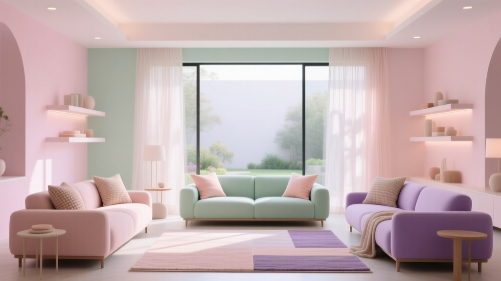
Pastel Color Palette Design Guide - The Decor Mag
Pastels have a reputation for being “soft” or “sweet,” but in real homes they behave more like quiet power tools: they shape mood, define light, and bring cohesion without shouting for attention. A well-built pastel color palette can make a small room feel airier, a dark hallway feel friendlier, and an open-plan space feel intentionally layered instead of visually noisy.
They also solve a common homeowner problem—wanting color without committing to something intense. Pastel paint colors sit in that sweet spot where you can express personality while keeping the space flexible for changing furniture, rugs, and art. The key is treating pastels like any other serious interior color scheme: pairing them with the right undertones, balancing them with neutrals, and controlling contrast with finishes and lighting.
This guide breaks down how to choose pastel paint colors, how to combine them, and how to apply them room by room using proven design principles, color psychology, and practical paint recommendations.
What Counts as a Pastel? (And Why Undertones Matter)
A pastel is essentially a hue “tinted” with white—think blush pink, mint, powder blue, lavender, and buttery yellow. They read lighter and gentler than saturated colors, but they still have undertones that can lean warm, cool, gray, or creamy. Undertones are what make a pastel feel modern and calm versus childish or “chalky.”
Pastel families and their typical undertones
- Blush/soft pink: can lean peachy (warm), rosy (neutral), or mauve (cool/gray).
- Powder blue: can lean icy (cool), periwinkle (blue-violet), or gray-blue (muted).
- Sage/mint: sage skews gray-green; mint skews blue-green and feels fresher.
- Lavender/lilac: can lean pink-violet (warm) or blue-violet (cool).
- Butter yellow: can feel sunny and warm, or creamy and subdued.
Design principle: Pastels amplify the undertone of the light in your home. North-facing rooms often make colors cooler; south-facing rooms tend to warm them up. Always test large swatches or peel-and-stick samples in morning and evening light.
Color Psychology: How Pastels Shape Mood
Pastel color palettes are popular in interior design for a reason—they tend to reduce visual stress. Because they’re lower in saturation, your eyes don’t “work” as hard, which creates a calm baseline. Then you can add contrast through textiles, wood tones, metal finishes, or a single deeper accent color.
- Soft blues: encourage ease and focus; great for bedrooms and offices.
- Sage and muted greens: restorative and balanced; perfect for living rooms, kitchens, and baths.
- Blush and warm pinks: cozy and flattering; ideal for bedrooms and powder rooms.
- Lavender: creative and soothing; works well in studios, nurseries, and reading spaces.
- Butter yellow: optimistic and welcoming; great for entryways and breakfast nooks.
Building a Pastel Color Scheme That Looks Grown-Up
The difference between a sophisticated pastel interior color design and a “kids’ room” vibe is structure. Use a clear palette, repeat undertones, and anchor the pastels with neutrals and natural materials.
Step 1: Choose your anchor neutral
A neutral acts like a volume knob for pastel paint colors. Pick one primary neutral for most fixed surfaces (trim, ceilings, major walls) and let pastels play supporting roles.
- Warm white: pairs beautifully with peachy blush, butter yellow, and creamy mint.
- Crisp white: makes cool pastels feel clean and modern (powder blue, lilac, icy mint).
- Greige: calms brighter pastels and adds sophistication.
- Soft gray: creates a contemporary, airy pastel palette—especially with blue and lavender.
Paint picks (widely available): Benjamin Moore White Dove (OC-17), Sherwin-Williams Alabaster (SW 7008), Benjamin Moore Classic Gray (OC-23), Farrow & Ball Ammonite (No. 274).
Step 2: Pick 1–2 main pastels, then add 1 accent
Most homes look best with a restrained pastel color palette:
- Main pastel (60%): your key mood color—often a wall color in one or two rooms.
- Secondary pastel (30%): used in an adjacent space, cabinetry, or textiles.
- Accent (10%): a deeper shade (navy, charcoal, terracotta) or a metallic (antique brass) to add definition.
Step 3: Control contrast with finish and texture
Pastels can look flat if everything has the same sheen and texture. Mix:
- Matte walls with eggshell trim for subtle separation.
- Natural wood (oak, ash, walnut) to ground the palette.
- Stone and ceramics (travertine, terrazzo, handmade tile) for depth.
- Black or oil-rubbed bronze hardware for crisp outlines.
Pastel Paint Color Recommendations (With Pairings)
These pastel paint colors are well-known, designer-friendly choices that work across many lighting conditions. Always sample first, but use these as strong starting points for pastel color schemes.
Blush / Soft Pink
- Benjamin Moore First Light (2102-70): airy blush with a modern feel. Pair with White Dove and light oak.
- Farrow & Ball Pink Ground (No. 202): warm, earthy pink. Pair with creamy whites and antique brass.
- Sherwin-Williams Intimate White (SW 6322): a gentle pink-beige that reads neutral in many rooms.
Best accents: warm greige, linen, terracotta, cognac leather, walnut.
Soft Blue / Powder Blue
- Benjamin Moore Palladian Blue (HC-144): a beloved blue-green that feels spa-like. Pair with crisp white trim and marble.
- Sherwin-Williams Sleepy Blue (SW 6225): calm, muted blue for bedrooms and offices.
- Farrow & Ball Borrowed Light (No. 235): light and reflective, great for low-light rooms.
Best accents: navy, soft gray, brushed nickel, white oak, sisal.
Sage / Mint Green
- Benjamin Moore Saybrook Sage (HC-114): classic sage with depth; beautiful on cabinetry.
- Sherwin-Williams Sea Salt (SW 6204): a soft green-blue that shifts with light; ideal for bathrooms and bedrooms.
- Farrow & Ball Mizzle (No. 266): a sophisticated gray-green that reads tailored and calm.
Best accents: creamy white, natural linen, aged brass, warm wood, matte black.
Lavender / Lilac
- Benjamin Moore Violet Mist (1437): quiet lavender with a gray base; feels grown-up.
- Sherwin-Williams Wallflower (SW 6281): a soft purple with warmth; lovely in guest rooms.
- Farrow & Ball Calluna (No. 270): muted heathered tone, great for statement alcoves.
Best accents: charcoal, soft white, pale oak, antique brass, deep plum (sparingly).
Butter Yellow
- Benjamin Moore Hawthorne Yellow (HC-4): warm, classic, and welcoming—great for kitchens and entryways.
- Sherwin-Williams Friendly Yellow (SW 6680): cheerful without being harsh when balanced with whites.
- Farrow & Ball Dorset Cream (No. 68): a rich creamy yellow that reads timeless.
Best accents: soft white, sage, warm gray, natural woven textures, unlacquered brass.
Real Room Scenarios: How to Use Pastel Color Palettes at Home
1) Living Room: Sage walls + warm white + layered neutrals
Look: calm, organic, and current—ideal for open-plan living.
- Walls: Farrow & Ball Mizzle (No. 266) or Benjamin Moore Saybrook Sage (HC-114) if you want more saturation.
- Trim/ceiling: Benjamin Moore White Dove (OC-17).
- Anchor pieces: oatmeal sofa, jute rug, light oak coffee table.
- Accent color: inky navy pillows or a black metal floor lamp for definition.
Application tip: If the room is connected to a warm kitchen, choose a sage with a slightly warm undertone so the transition feels seamless.
2) Bedroom: Powder blue + crisp white + soft contrast
Look: restful and airy, especially for smaller bedrooms.
- Walls: Sherwin-Williams Sleepy Blue (SW 6225) or Farrow & Ball Borrowed Light (No. 235).
- Trim: a clean white like Sherwin-Williams Pure White (SW 7005).
- Bedding: white duvet with pale gray or denim accents.
- Wood tones: ash, maple, or white oak to keep it light.
Application tip: Use a matte wall finish to reduce glare and keep the pastel feeling velvety at night.
3) Kitchen: Pastel cabinetry that still feels timeless
Look: fresh, welcoming, and less predictable than all-white.
- Cabinets: Benjamin Moore Saybrook Sage (HC-114) for a classic look, or Sherwin-Williams Sea Salt (SW 6204) for a lighter coastal feel.
- Walls: warm white (Alabaster SW 7008) or a pale greige.
- Counters: white quartz with soft veining, or warm butcher block for extra coziness.
- Hardware: antique brass to warm cool pastels; matte black to sharpen them.
Application tip: If you’re nervous, start with the island in a pastel and keep perimeter cabinets neutral.
4) Bathroom: Spa pastels with tile and metal finishes
Look: clean, calming, and flattering.
- Walls: Benjamin Moore Palladian Blue (HC-144) or Sherwin-Williams Sea Salt (SW 6204).
- Tile: white subway tile, handmade zellige, or pale gray porcelain.
- Metal: brushed nickel for a cool spa feel; brass for warmth.
- Textiles: white towels, waffle linen, natural wood bath stool.
Application tip: Bathrooms often have cooler light. If your pastel looks too icy, shift to a greener or slightly grayer version of the same hue.
5) Nursery or Playroom: Pastels without the “babyish” feel
Look: gentle, playful, and adaptable as your child grows.
- Walls: Benjamin Moore First Light (2102-70) or Benjamin Moore Violet Mist (1437).
- Trim: a warm white for softness.
- Accents: natural wood, woven storage, black picture frames to add structure.
Application tip: Consider a pastel ceiling with neutral walls for a subtle “color moment” that doesn’t dominate the room.
Pastel Color Combinations That Always Work
These pairings are dependable because they share compatible undertones and provide enough contrast to feel intentional.
- Sage + blush + warm white: calming and modern; great for bedrooms and living rooms.
- Powder blue + greige + crisp white: tailored and airy; great for offices and guest rooms.
- Lavender + soft gray + brass: sophisticated and creative; great for reading nooks and powder rooms.
- Butter yellow + sage + natural oak: sunny but grounded; perfect for kitchens and breakfast areas.
- Mint + pale peach + off-white: fresh and cheerful; great for laundry rooms or mudrooms.
Practical Application Tips for Pastel Paint Colors
Use these rules to avoid “too sweet” or “too washed out”
- Repeat the pastel at least 2–3 times (pillow, art, rug, vase). Repetition makes the color scheme feel designed.
- Add a grounding element (black, charcoal, navy, walnut) so the pastel reads elevated, not flimsy.
- Mind your trim color: warm trim softens; crisp trim sharpens. Match the trim temperature to your pastel undertone.
- Choose the right sheen: matte for walls, satin/eggshell for trim, and a durable cabinet enamel for kitchens.
- Sample larger than you think: pastels shift dramatically across shadows and corners.
Common Pastel Color Mistakes (and How to Fix Them)
- Mistake: Pairing pastels with stark, cool lighting.
Fix: Use warm LED bulbs (2700K–3000K) in living spaces to keep blush, butter yellow, and sage from feeling clinical. - Mistake: Mixing random undertones.
Fix: Keep a consistent undertone story—either mostly warm (creamy whites, peachy blush) or mostly cool (crisp whites, blue-based lavender). - Mistake: Using pastel everywhere with no contrast.
Fix: Introduce one strong anchor: a charcoal rug, black-framed art, deep navy pillows, or walnut furniture. - Mistake: Choosing a pastel that’s too bright for the room’s light.
Fix: In sunny rooms, select a slightly grayer (more muted) pastel so it doesn’t get blown out. - Mistake: Forgetting adjacent spaces.
Fix: Plan sightlines. If a pastel room opens into a warm neutral room, bridge them with a shared neutral (same trim color) or a repeat accent (brass, oak, or a textile color).
FAQ: Pastel Color Palettes in Interior Design
Are pastel paint colors still in style?
Yes—especially muted pastels with a gray or earthy base. Current interior color design favors softer, nature-inspired palettes that feel calm and livable, often paired with warm whites, natural wood, and aged metals.
How do I keep pastels from looking childish?
Use a tight palette (1–2 pastels), add a grounding color (charcoal, black, navy, walnut), and bring in texture—linen, wool, oak, stone, and ceramics. Pastels look more sophisticated when the materials feel substantial.
What neutral works best with pastels: warm white or cool white?
Match the neutral to the pastel undertone. Peachy blush, butter yellow, and many sages look best with warm whites like Sherwin-Williams Alabaster. Cooler pastels like lilac and powder blue often look cleaner with crisper whites like Sherwin-Williams Pure White.
Can I mix multiple pastels in one room?
You can, but keep them related. Choose pastels with similar undertones and vary their “weight” (one dominant pastel, one supporting pastel). Then anchor the room with a neutral and one darker accent.
What’s the best way to test pastel wall colors?
Test large samples on multiple walls and view them in daylight and lamplight. Pastels are sensitive to shadow; a color that looks perfect on a sunny wall can turn dull in a corner. Peel-and-stick samples can help, but painted samples often give the truest finish read.
Do pastels work in open-concept homes?
They do when you treat the whole space as one color scheme. Use a consistent trim color, repeat materials (wood tone, metal finish), and choose pastels that share undertones. Consider using one pastel as an accent zone (office nook, dining area) rather than on every wall.
Next Steps: Create Your Own Pastel Palette
Start with one room and build outward. Choose an anchor neutral, select one pastel that suits your home’s light, and decide where contrast will come from—hardware, wood tones, textiles, or a deeper accent paint. Then sample, live with it for a few days, and commit once the color feels consistent from morning to night.
- Pick your anchor neutral (trim + ceiling) and stick with it throughout the home.
- Select 1 main pastel paint color and 1 supporting pastel or texture color.
- Add 1 grounding accent (navy, charcoal, black, walnut) to sharpen the palette.
- Test samples in multiple lighting conditions before painting a full room.
For more paint color ideas, color scheme inspiration, and room-by-room guidance, explore the latest color guides on thedecormag.com.
More Articles
 Best Watermelon Red Paint Colors - The Decor Mag
 Tetradic Color Scheme Guide - The Decor Mag
 Best Tomato Red Paint Colors - The Decor Mag
 How to Create a Restraint Color Palette - The Decor Mag
 How to Choose Colors for a Scullery - The Decor Mag
 Best Navy Paint Colors for Every Style - The Decor Mag
 How to Create an Uplifting Color Palette - The Decor Mag
 Best Grapefruit Paint Colors - The Decor Mag
 How to Choose Colors for an Attic Room - The Decor Mag
 How to Use Color to Create Flow - The Decor Mag