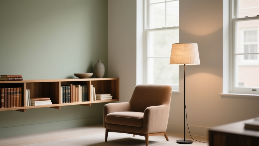
How to Choose Colors for a Reading Room - The Decor Mag
A great reading room is equal parts comfort and focus. The chair matters, the lighting matters, the acoustics matter—but color is the quiet designer working behind the scenes, shaping how calm, alert, cozy, or energized the space feels the moment you step in. The right paint colors and color scheme can make a small room feel like a private library, help a bright room feel less glaring, or turn an underused corner into your favorite daily ritual.
Reading is a sensory experience. You’re asking your eyes to concentrate, your mind to settle, and your body to stay comfortable for long stretches. Color psychology and design principles—like value (light vs. dark), undertone (warm vs. cool), and contrast—directly influence that experience. Choose wisely and your room supports attention and relaxation; choose poorly and it can feel restless, flat, or fatiguing.
This guide breaks down how to choose paint colors for a reading room using real-world scenarios, specific color recommendations (with trusted paint brands), and practical application tips you can use whether you’re painting one wall or designing an entire home library.
Start with the Feeling: What Kind of Reading Room Are You Creating?
Before you sample a single swatch, decide what you want the room to do for you. Color is easier when you’re designing toward a purpose.
Common reading room “moods” and their best color families
- Quiet and cocooning: deep greens, inky blues, moody charcoals, warm browns
- Bright and airy for daytime reading: soft off-whites, gentle greiges, pale blue-greens
- Warm and traditional “library” feel: tobacco tones, oxblood accents, olive greens, creamy trim
- Fresh and modern: crisp whites with a saturated accent (navy, forest, terracotta), clean contrast
- Creative and eclectic: layered jewel tones, color-blocking, unexpected accent colors (plum, saffron)
Color psychology supports these choices: blues and blue-greens tend to lower visual “noise” and feel steady; greens read as restorative; warm neutrals feel welcoming; very bright whites can feel energizing but may increase glare without the right lighting and finishes.
Assess Your Light First (It Changes Every Paint Color)
Lighting is the single biggest variable in interior color design. The same paint color can read creamy in one room and gray-green in another.
Use these lighting guidelines
- North-facing rooms: cooler, flatter light. Favor warmer paint colors (creamy whites, warm greiges, olive greens) to avoid a chilly feel.
- South-facing rooms: strong, warm light. You can handle deeper, cooler colors (navy, forest green) without the room feeling cold.
- East-facing rooms: bright in the morning, cooler later. Choose balanced neutrals or colors that stay pleasant as the day shifts.
- West-facing rooms: warm, intense late-day sun. Watch for paint colors turning overly yellow or orange; consider muted earth tones or grounded blues.
Tip: Test color samples the right way
- Paint a large sample (at least 12" x 12", ideally 24" x 24") on multiple walls.
- Check it in morning, afternoon, and evening light.
- View it next to your upholstery, rug, and bookcases—colors never live alone.
Choose a Color Scheme That Supports Focus
A reading room is a “low-distraction” space. That doesn’t mean it must be neutral; it means your color scheme should feel intentional and harmonious.
Three reliable color schemes for reading rooms
- Monochromatic: one hue in multiple values (light, medium, deep). Calming and cohesive—excellent for small rooms.
- Analogous: neighboring hues (blue + blue-green + green). Gentle flow with enough variation for interest.
- Complementary accents: a dominant calm color plus a small pop opposite it (navy + brass/mustard, green + blush, charcoal + terracotta). Keeps the room lively without feeling busy.
For focus, lean toward lower-contrast large surfaces and reserve high contrast for details: picture frames, a throw, a lampshade, or a single accent chair.
Best Paint Colors for Reading Rooms (With Brand Recommendations)
These paint colors are popular because they’re flexible, livable, and flattering in a wide range of homes. Always sample first—undertones vary by lighting and surrounding materials.
1) Deep greens for a classic library feel
Green is restorative and pairs beautifully with wood tones and leather. Deep greens also reduce glare, making them a favorite for dedicated reading rooms.
- Benjamin Moore Essex Green (HC-188): near-black green that feels tailored and timeless.
- Farrow & Ball Studio Green No. 93: rich and traditional; stunning in matte finishes.
- Sherwin-Williams Pewter Green (SW 6208): a softened green-gray that’s easier than true forest.
Pair with: creamy trim (Benjamin Moore White Dove OC-17), warm brass, walnut or oak shelves, and warm-white bulbs (2700K).
2) Moody blues that encourage calm focus
Blue supports concentration and brings a steady, quiet atmosphere—especially effective for evening reading.
- Benjamin Moore Hale Navy (HC-154): a dependable navy for built-ins or full rooms.
- Sherwin-Williams Naval (SW 6244): deep, saturated navy that reads modern and crisp.
- Farrow & Ball Hague Blue No. 30: a blue-green with dramatic depth; excellent for a statement room.
Pair with: soft whites, natural linen, cognac leather, and warm metals to keep blue from feeling too cool.
3) Warm neutrals for a cozy, welcoming reading nook
Warm neutrals are ideal when your reading space shares open-plan areas or you want a timeless backdrop for art and books.
- Benjamin Moore Edgecomb Gray (HC-173): a warm greige that reads soft and inviting.
- Sherwin-Williams Accessible Beige (SW 7036): approachable, warm, and versatile across many lighting conditions.
- Farrow & Ball Skimming Stone No. 241: a refined neutral with subtle warmth.
Pair with: layered textures—bouclé, wool, velvet—plus one deeper anchor color (charcoal, navy, or espresso) to prevent the room from feeling flat.
4) Soft off-whites when you want light without glare
Pure bright white can feel stark and can amplify glare on pages and screens. Off-whites give you the brightness without the bite.
- Benjamin Moore White Dove (OC-17): a balanced soft white for walls or trim.
- Sherwin-Williams Alabaster (SW 7008): warm and creamy; excellent for a serene reading room.
- Benjamin Moore Swiss Coffee (OC-45): richer and warmer—great in north-facing rooms.
Pair with: blackened bronze hardware, warm woods, and a colorful rug to add depth.
5) Earthy terracottas and clay tones for warmth and personality
Earth tones feel grounding and intimate—perfect for curling up with a novel. They also flatter warm wood and leather.
- Sherwin-Williams Cavern Clay (SW 7701): bold but livable—best as an accent or in a sunlit room.
- Farrow & Ball Red Earth No. 64: earthy and sophisticated, less “orange” than many terracottas.
- Benjamin Moore Terra Cotta Tile (2090-30): warm, saturated, and cozy for a feature wall.
Pair with: creamy whites, olive greens, and natural woven textures to keep the palette cohesive.
Real Room Examples: How These Color Choices Play Out
Scenario 1: A small spare room turned into a home library
Goal: Make it feel intentional and enveloping, not cramped.
- Walls + built-ins: Benjamin Moore Essex Green (HC-188) in an eggshell or matte finish
- Trim: Benjamin Moore White Dove (OC-17) in semi-gloss for crisp edges
- Accents: brass picture lights, a patterned rug with cream/green/rust
Why it works: Dark values blur corners (visually expanding the room) and reduce contrast glare. White trim creates structure without making the walls feel busy.
Scenario 2: A bright sunroom used for daytime reading
Goal: Keep it airy but comfortable on the eyes.
- Walls: Sherwin-Williams Alabaster (SW 7008)
- Accent (optional): Sherwin-Williams Pewter Green (SW 6208) on a single wall behind shelving
- Textiles: linen curtains, warm wood, a blue-green rug to cool the sunlight slightly
Why it works: A warm off-white softens intense daylight, while a muted green adds depth without competing with the view outside.
Scenario 3: An open-plan corner reading nook next to the living room
Goal: Define the nook without making it look like a separate paint project.
- Main wall color: Benjamin Moore Edgecomb Gray (HC-173)
- Nook definition: paint the bookcase back panel in Benjamin Moore Hale Navy (HC-154)
- Accessories: a cognac chair, cream throw, and a small art piece with navy + rust
Why it works: The room stays cohesive, while the navy adds a focal point and “visual hush” behind books.
Application Guidance: Finishes, Contrast, and Where to Put Color
Pick the right paint finish for a reading room
- Matte: cozy, low glare; great for walls (but choose a washable formula for durability).
- Eggshell: the most versatile reading-room finish—soft look with easier cleanup.
- Satin/Semi-gloss: best for trim, doors, and built-ins; adds subtle contrast and durability.
Where color works hardest
- Behind shelves: a deeper color adds depth and makes books/art pop.
- Ceiling: painting the ceiling a softer version of the wall color creates a cocoon effect, especially in moody palettes.
- Trim: warm white trim keeps the room bright; matching trim to walls feels modern and immersive.
Quick formula for a balanced reading room palette
- 60% dominant color: walls
- 30% supporting color: upholstery, rug, curtains
- 10% accent: art, pillows, decor (often the complementary “spark”)
Common Color Mistakes to Avoid
- Choosing a color only from a tiny swatch: undertones don’t show up until the color is on a large surface.
- Going too bright white in a high-sun room: it can create glare and feel clinical; try a warmer off-white.
- Ignoring undertones in fixed finishes: floors, wood tone, and stone can make a “neutral” look pink, green, or yellow.
- Too much high contrast: stark black/white patterns and sharp color breaks can feel visually restless for reading.
- Using cold light bulbs with moody paint: 4000K+ can turn cozy colors flat; aim for 2700K–3000K for most reading rooms.
- Forgetting the night-time test: reading often happens under lamps—always check colors under your actual evening lighting.
FAQ: Choosing Paint Colors and Color Schemes for a Reading Room
What are the best paint colors for a small reading room?
Deep, enveloping colors can work beautifully in small spaces because they minimize harsh contrast at corners. Try Benjamin Moore Essex Green (HC-188) or Sherwin-Williams Naval (SW 6244) for a cozy library feel, or use a warm light neutral like Sherwin-Williams Alabaster (SW 7008) if you want brighter walls.
Are dark colors bad for reading?
Not if your lighting is good. Dark walls can actually reduce glare and feel soothing. Use layered lighting: a dedicated reading lamp, ambient overhead light (dimmer if possible), and optional accent lighting for shelves.
What color temperature light bulbs work best with reading room paint colors?
For most reading rooms, 2700K–3000K creates a comfortable, warm atmosphere that flatters both warm neutrals and moody colors. Cooler bulbs can make cozy palettes feel stark and can shift undertones.
How do I choose a paint color that works with wood bookshelves?
Match the paint undertone to the wood’s temperature. Warm woods (oak, walnut, cherry) pair well with warm whites, warm greiges, olives, and deep greens. Cooler or painted woods pair nicely with blue-grays and navies. When in doubt, sample a muted green-gray like Sherwin-Williams Pewter Green (SW 6208)—it’s famously flexible.
Should a reading room be warm or cool?
Warm palettes feel cozy and inviting; cool palettes feel calm and focused. Many of the best reading rooms combine both—like a warm neutral wall with a cool navy accent—so the space stays comfortable without feeling sleepy.
What’s an easy, designer-approved color combination for a reading room?
Try a soft warm white + navy + cognac leather. For example: Benjamin Moore White Dove (OC-17) on walls, Benjamin Moore Hale Navy (HC-154) on built-ins, and warm brass accents. It’s timeless, high-impact, and works in traditional or modern homes.
Next Steps: A Simple Plan to Get Your Reading Room Color Right
- Decide the mood: cocooning (deep) or airy (light), classic or modern.
- Identify your light exposure: north/south/east/west and when you actually read.
- Pick 3 sample contenders: one safe neutral, one bolder choice, and one wildcard.
- Test large samples: in daylight and lamplight, next to your rug and upholstery.
- Finalize the scheme: dominant wall color, supporting textiles, and a small accent color for energy.
Your reading room doesn’t need to be large or formal to feel special—color is what gives it identity. When you choose paint colors with lighting, undertones, and comfort in mind, the room starts working for you: calmer evenings, better focus, and a space you’ll actually use.
Explore more color guides and paint color ideas on thedecormag.com to keep building a home that feels as good as it looks.
More Articles
 How to Create a Playful Color Palette - The Decor Mag
 How To Organize Island: A Practical, Space-Smart Guide for Kitchens of All Sizes
 How to Choose Colors for a Balcony - The Decor Mag
 Best Kitchen Design for Studio Apartments: Smart, Stylish & Space-Saving Solutions
 Best Pistachio Paint Colors - The Decor Mag
 Best Papaya Paint Colors - The Decor Mag
 Best Rust Red Paint Colors - The Decor Mag
 How to Choose Colors for an Entryway - The Decor Mag
 Best Berry Red Paint Colors - The Decor Mag
 How to Create a Minimalist Color Palette - The Decor Mag