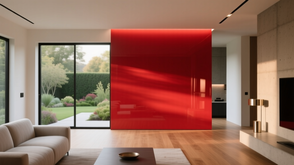
Best Candy Apple Red Paint Colors - The Decor Mag
Candy apple red is the color equivalent of a confident entrance: glossy, energized, and impossible to ignore. Used well, it brings warmth, drama, and a sense of celebration to a space—whether you’re painting a front door, upgrading kitchen cabinetry, or creating an accent wall that makes neutrals feel intentional rather than safe.
This shade family matters because red is one of the most psychologically powerful hues in interior color design. It can raise perceived warmth, increase energy, and add a “designed” feel faster than almost any other color. The trick is choosing the right candy apple red paint color (not too orange, not too burgundy, not too flat), then pairing it with the right undertones, finishes, and supporting palette so it reads sophisticated rather than loud.
Below, you’ll find standout candy apple red paint colors across major brands, plus room-by-room guidance, color schemes, and common mistakes that can sabotage the look.
What “Candy Apple Red” Means in Paint
Candy apple red isn’t a single formula—it’s a range. Most homeowners describe it as a clear, saturated red with a slightly cool or neutral base, reminiscent of lacquered apples, classic sports cars, and vintage diner stools. In paint terms, candy apple reds typically have:
- High chroma (rich saturation) with minimal gray
- Clean undertones that don’t swing too brown or too purple
- A “fresh” clarity that looks vibrant in daylight and bold at night
Because saturated reds are sensitive to light, the same paint color can feel bright and crisp in north-facing daylight and deeper, almost velvety, in warm evening light. Always sample on multiple walls before committing.
Color Psychology: Why Candy Apple Red Works
Red is associated with vitality, appetite, warmth, and confidence. Design-wise, it’s a powerful advancing color, meaning it visually comes forward. This makes it ideal for:
- Creating focal points (accent walls, built-ins, statement doors)
- Adding warmth to cool, gray-leaning interiors
- Energizing social rooms like dining rooms and kitchens
In bedrooms and quiet spaces, candy apple red is best used in smaller doses—think a painted vanity, an upholstered headboard, or a single wall—so the room still supports rest.
Best Candy Apple Red Paint Colors (By Brand)
These recommendations lean “candy apple” rather than brick, cranberry, or wine. Availability varies by region, so consider color matching if you’re loyal to one paint line.
Benjamin Moore Candy Apple Reds
- Benjamin Moore Raspberry Truffle (2080-10) – A bold, high-impact red that reads rich and saturated. Great when you want a luxe, lacquer-like presence on cabinetry or built-ins.
- Benjamin Moore Caliente (AF-290) – A popular designer red with a slightly warm edge. It can read “candy” in bright light and sophisticated in low light—excellent for dining rooms and statement doors.
- Benjamin Moore Heritage Red (HC-181) – Classic, slightly deeper and more traditional than a true candy apple, but still clean enough for a timeless red accent wall.
Sherwin-Williams Candy Apple Reds
- Sherwin-Williams Show Stopper (SW 7588) – True to the name: vivid and saturated. Ideal for a front door or a small powder room where you want drama.
- Sherwin-Williams Heartthrob (SW 6866) – A bright, clear red with a playful pop-art energy. Beautiful on furniture pieces, interior doors, or a modern accent niche.
- Sherwin-Williams Rave Red (SW 6608) – Slightly pinker and punchier; a great choice if you want “candy-coated” brightness rather than a deeper classic red.
Farrow & Ball: High-Style Reds
- Farrow & Ball Red Earth (No. 64) – Not a true candy apple, but a refined, earthy red that feels elevated and architectural. Use when you want warmth without the “stop sign” intensity.
- Farrow & Ball Preference Red (No. 297) – A deeper, more historic red that can still read glossy and candy-like in higher sheens, especially on millwork.
Behr Candy Apple Red Options
- Behr Red Pepper – A spicy, saturated red that can lean candy in bright spaces. Great for accent walls and decorative furniture.
- Behr Fire Cracker – A bright, lively red suited to playful interiors, kids’ spaces, or a bold front door.
Tip: For the most “candy apple” effect, choose a higher sheen on trim or a door (satin, semi-gloss, or gloss) and reserve flatter finishes for walls, where red can look heavier.
How to Choose the Right Candy Apple Red for Your Home
1) Match the Undertone to Your Fixed Finishes
Look at what you can’t easily change: flooring, countertops, tile, and upholstery. Reds can clash if their undertones fight those materials.
- With warm woods (oak, walnut): choose a red with a slightly warm or neutral base (e.g., BM Caliente).
- With cool marbles or stainless steel: a cleaner, slightly cooler red can look modern and crisp (e.g., SW Show Stopper).
- With beige/tan stone: avoid overly blue-based reds that can look harsh; try a grounded, classic red (e.g., BM Heritage Red).
2) Use LRV and Room Size as a Reality Check
Most candy apple reds are relatively dark in value even when they feel bright. In small rooms, a full red treatment can feel enveloping—sometimes gorgeous, sometimes claustrophobic.
- Small space: use red on one wall, cabinetry, or trim; balance with light neutrals.
- Large space: you can handle a full red dining room if you keep ceilings and trim lighter or choose a higher sheen strategically.
3) Test in the Lighting You Actually Live With
Red shifts dramatically between daylight and artificial light.
- Paint a large sample (at least 12" x 12", bigger is better).
- View it morning, afternoon, and at night.
- Check it next to white trim, black accents, and natural wood.
Real Room Examples: Where Candy Apple Red Shines
Front Door: Instant Curb Appeal
A candy apple red front door is classic and welcoming, and it pairs well with many exterior palettes. It’s also a smaller commitment with a big payoff.
- Best pairings: crisp white trim, charcoal siding, warm brick, black hardware
- Suggested colors: SW Show Stopper for bold modern homes; BM Caliente for a slightly warmer traditional look
- Finish tip: use semi-gloss for durability and that “lacquered” candy effect
Dining Room: Elevated and Appetite-Friendly
Red is famous for stimulating appetite and conversation—two things you want in a dining space. Keep it tailored with thoughtful contrast.
- Try this scheme: candy apple red walls + warm white trim + walnut table + brass lighting
- Suggested colors: BM Heritage Red for timeless depth; SW Heartthrob for a brighter contemporary vibe
- Proportion rule: if walls are red, keep the ceiling and trim lighter to prevent visual “compression”
Kitchen Cabinets or Island: A Designer Statement
Red cabinetry works best when the rest of the kitchen is calm. Think of red as the jewelry: stunning, but not head-to-toe.
- Best approach: paint only the island or lower cabinets in red, keep uppers warm white
- Countertop partners: white quartz, honed black stone, or light butcher block
- Suggested colors: BM Raspberry Truffle for richness; SW Rave Red for a playful, modern pop
Powder Room: Small Space, Big Personality
Powder rooms can handle saturated color because you don’t spend hours there. Candy apple red feels bold and intentional, especially with high-contrast fixtures.
- Pair with: black-framed mirror, polished nickel faucet, white pedestal sink
- Wall finish: consider eggshell for a soft glow (or satin if humidity is higher)
- Suggested colors: SW Show Stopper or BM Caliente
Accent Wall Behind a Sofa or Bed
For living rooms and bedrooms, a single candy apple red wall can bring energy without overwhelming the entire space.
- Keep balance: repeat the red in small accessories (art, a throw, a vase) so it feels integrated
- Suggested colors: SW Heartthrob for brighter punch; BM Heritage Red for a calmer, classic anchor
Color Schemes That Pair Beautifully With Candy Apple Red
These color combinations help candy apple red feel curated rather than chaotic. Use them for paint colors, textiles, and decor accents.
1) Red + Crisp White + Black (High Contrast Classic)
- Look: tailored, graphic, timeless
- Where it works: kitchens, mudrooms, modern farmhouses, doors and trim
- Design tip: add natural wood to soften the contrast
2) Red + Warm Neutrals + Brass (Cozy Sophistication)
- Look: inviting, layered, slightly vintage
- Where it works: dining rooms, libraries, entryways
- Try: creamy off-white walls, red built-ins, brass picture lights
3) Red + Deep Navy (Bold, Mature Contrast)
- Look: rich, classic, “heritage” but fresh
- Where it works: dining rooms, offices, exterior doors
- Pro tip: keep one of the two colors to accents if the room is small
4) Red + Blush + Natural Wood (Modern Playful)
- Look: contemporary, artful, upbeat
- Where it works: creative studios, eclectic living rooms, kids’ spaces
- Balance: use plenty of white space and clean lines
Application Guidance: Sheen, Placement, and Prep
- Sheen choices:
- Walls: matte or eggshell for a refined look
- Trim/doors/cabinets: satin or semi-gloss for durability and that candy-like glow
- Use a quality primer: saturated reds often need a tinted primer for even coverage and true color payoff.
- Plan for extra coats: reds are notorious for needing 2–4 coats depending on the base and prior wall color.
- Mind the edges: crisp cut lines matter more with red because contrast highlights imperfections.
Common Candy Apple Red Mistakes to Avoid
- Choosing the brightest red for every surface (walls, trim, ceiling). It flattens the design and can feel visually aggressive. Use red as a focal point and give it room to breathe.
- Ignoring undertones in nearby materials. A red that looks perfect on a swatch can clash with orange-toned floors or look too blue next to warm stone.
- Pairing with the wrong white. Stark blue-white trim can make some reds look slightly orange or garish. Try a warmer white if the red feels harsh.
- Using flat paint on high-touch surfaces. Doors and cabinets need washable finishes. Go satin or semi-gloss for performance and appearance.
- Underestimating lighting changes. Red can deepen at night; always review the sample under your evening bulbs.
FAQ: Candy Apple Red Paint Colors
What is the best candy apple red paint color for a front door?
Sherwin-Williams Show Stopper (SW 7588) is a strong contender for a true, vibrant statement. Benjamin Moore Caliente (AF-290) is slightly warmer and often feels more traditional. Use semi-gloss for durability and shine.
Will candy apple red make a room look smaller?
Yes, it can. Red is an advancing color, so it visually comes forward. In small rooms, consider a single accent wall, red cabinetry, or a painted door instead of four red walls.
What colors go best with candy apple red in a modern home?
For modern color schemes, pair candy apple red with crisp white, charcoal, matte black, and stainless steel. Deep navy also creates a refined, contemporary contrast.
Do I need a special primer under red paint?
Often, yes. Reds tend to need a tinted primer to prevent blotchiness and reduce the number of finish coats. Ask your paint store to tint the primer toward red or a compatible warm tone.
Is candy apple red too intense for a bedroom?
It depends on how you use it. A full candy apple red bedroom can feel stimulating. For better balance, use it on one wall, in textiles, or on furniture, and keep the rest of the palette soft (warm whites, light taupes, pale blush, or natural wood).
Next Steps: Make Candy Apple Red Feel Effortless
Start by choosing where you want the drama: a door, an island, a powder room, or a single accent wall. Then sample two to three reds (plus your trim white) and view them across a full day of lighting. Anchor the look with a simple supporting palette—white, black, warm wood, brass, or navy—and let the red be the star rather than the entire cast.
For more paint color ideas, color schemes, and interior color design guidance, explore the latest color guides on thedecormag.com.
More Articles
 12 Practical DIY Furniture Ideas You Can Build in a Weekend (With Exact Materials & Dimensions)
 Jewel Tone Color Scheme Ideas - The Decor Mag
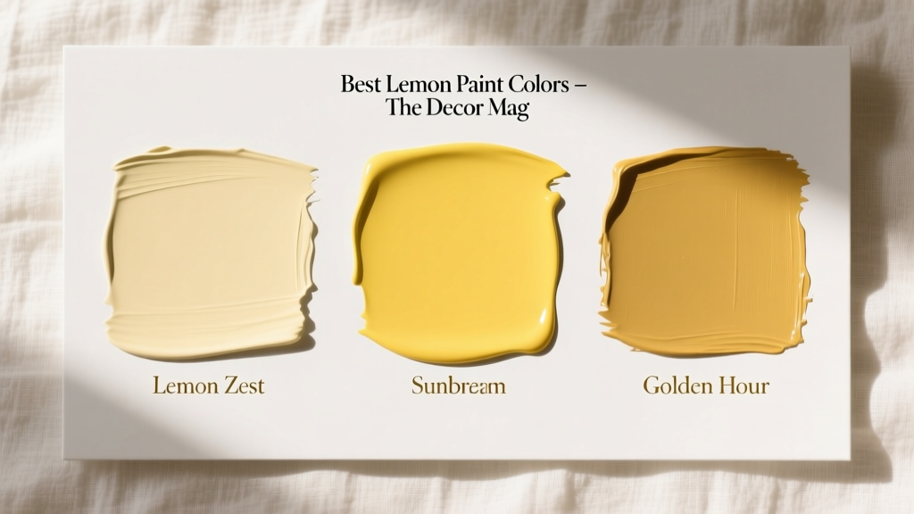 Best Lemon Paint Colors - The Decor Mag
 Best Apple Green Paint Colors - The Decor Mag
 How to Create a Transitional Color Palette - The Decor Mag
 Best Watermelon Red Paint Colors - The Decor Mag
 Best Jade Green Paint Colors - The Decor Mag
 Best Red Paint Colors for Drama and Warmth - The Decor Mag
 Cohesive Color Flow Between Rooms | The Decor Mag
 Best Berry Red Paint Colors - The Decor Mag