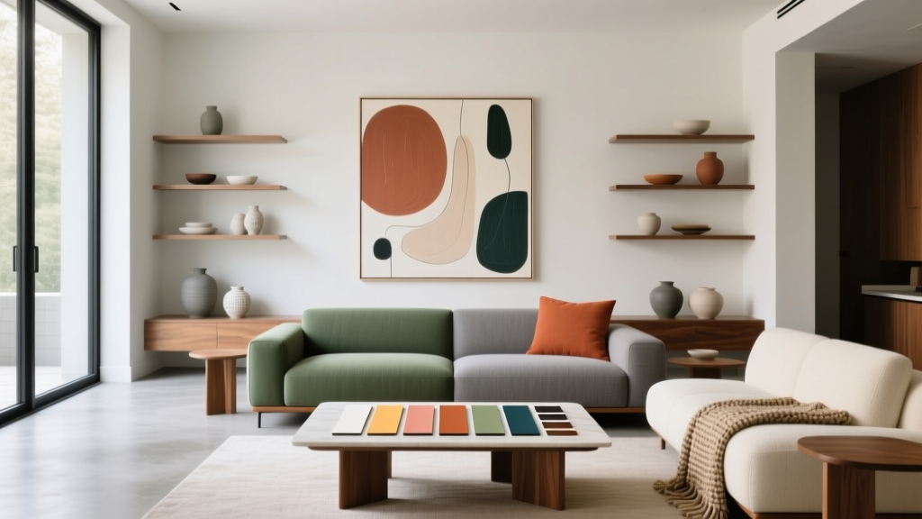
How to Create a Contemporary Color Palette - The Decor Mag
Contemporary interiors live and die by their color choices. The furniture may be sleek and the architecture may be clean-lined, but if the paint colors are flat, mismatched, or too “safe,” the whole space can feel generic. A contemporary color palette is less about chasing trends and more about building a purposeful mix of hues, values, and finishes that make a home feel current, calm, and confident.
Color affects how you experience your home every day. Warm neutrals can make an open-plan living room feel welcoming rather than cavernous, while cooler neutrals can sharpen modern details like black-framed windows or polished concrete floors. Contemporary color schemes also benefit from color psychology: the right undertones can reduce visual stress, improve focus in a home office, and make a bedroom feel more restorative.
This guide breaks down the design principles behind modern color palettes, offers specific paint color recommendations (with trusted brand references), and shows how to apply them in real rooms. You’ll leave with a clear framework for choosing paint colors, balancing neutrals with accents, and avoiding the mistakes that make “modern” read as cold or unfinished.
What Makes a Color Palette Feel Contemporary?
A contemporary palette typically has three signatures: refined neutrals, controlled contrast, and intentional accent color. It avoids overly saturated rainbow schemes, heavy matching, and the stark “white box” look unless the architecture supports it.
Key Contemporary Color Principles
- Undertone awareness: Modern rooms look polished when undertones align (warm with warm, cool with cool, or deliberately mixed with a plan).
- Value contrast: A balance of light and dark gives definition. Think soft off-white walls with deep charcoal cabinetry.
- Muted saturation: Contemporary accents often lean dusty, earthy, or smoky rather than neon-bright.
- Material harmony: Paint should coordinate with wood tone, metal finish, stone veining, and textile texture.
- Negative space: Breathing room matters. A modern color scheme uses restraint so shapes and light can shine.
Color Psychology, the Contemporary Way
- Warm whites and greiges support comfort and social connection—ideal for living rooms and kitchens.
- Blue-greens and soft blues tend to feel restorative and mentally “cooling”—great for bedrooms and bathrooms.
- Charcoal and black accents convey sophistication and structure—best as grounding notes (trim, doors, built-ins).
- Earthy greens and clays signal stability and calm—excellent for home offices, dens, and entryways.
Start With a Strong Foundation: Choosing Your Modern Neutral
Most contemporary color palettes begin with a neutral that sets the temperature of the home: warm, cool, or balanced. Your neutral does the heavy lifting across walls, ceilings, and sometimes cabinetry. Choose it first, then build accents around it.
Modern Warm Neutrals (Inviting, Not Yellow)
These work beautifully with white oak, brass, warm stone, and linen textures.
- Benjamin Moore White Dove (OC-17): A creamy, flexible off-white for walls and trim in contemporary spaces.
- Sherwin-Williams Alabaster (SW 7008): Soft and warm without reading beige; great for open-plan homes.
- Farrow & Ball School House White (No. 291): A muted, chalky neutral that reads modern in matte finishes.
Modern Cool Neutrals (Crisp, Architectural)
Ideal for homes with cool daylight, concrete, marble, chrome, or black metal.
- Benjamin Moore Chantilly Lace (OC-65): Clean and bright; best when you want sharp contrast with black accents.
- Sherwin-Williams Snowbound (SW 7004): A cool-leaning white that’s softer than a stark gallery white.
- Benjamin Moore Classic Gray (OC-23): A light, airy greige that can read warm or cool depending on lighting—excellent for continuity.
Balanced Greiges (The Contemporary Crowd-Pleaser)
Greige is popular in interior color design because it bridges warm and cool, making it easier to coordinate with changing decor.
- Sherwin-Williams Agreeable Gray (SW 7029): A versatile greige for living spaces that need softness with a modern edge.
- Benjamin Moore Edgecomb Gray (HC-173): Warm greige that pairs well with natural fibers and black accents.
- Farrow & Ball Ammonite (No. 274): A calm, contemporary neutral with a subtle modern undertone.
Build the Palette: A Simple Contemporary Formula
When homeowners struggle with color schemes, it’s often because they choose colors individually rather than as a system. Use a straightforward structure to keep the palette cohesive.
The 70/20/10 Approach (Updated for Modern Homes)
- 70% Base color: Walls (and often large rugs or sofas). Usually a white, off-white, or greige.
- 20% Supporting color: Casework, an accent wall, large drapery, or a secondary room color nearby in an open plan.
- 10% Accent color: Art, pillows, small furniture, a painted interior door, or a powder room statement.
Contemporary Contrast: Pick One “Anchor” Dark
A controlled dark color adds clarity and structure to a contemporary interior. Use it consistently so the home feels designed, not random.
- Benjamin Moore Kendall Charcoal (HC-166): A rich charcoal that looks modern on doors, built-ins, and kitchen islands.
- Sherwin-Williams Iron Ore (SW 7069): A soft black that’s popular for exteriors and interiors; dramatic without harshness.
- Farrow & Ball Railings (No. 31): A deep near-black with a blue undertone, elegant in matte.
Contemporary Color Combinations You Can Use Right Now
These modern color palettes pair well with today’s most common finishes—white oak, black metal, warm brass, and mixed stone.
Palette 1: Warm Minimalist (Soft, Modern, Livable)
- Base: Sherwin-Williams Alabaster (SW 7008)
- Supporting: Benjamin Moore Edgecomb Gray (HC-173)
- Anchor dark: Sherwin-Williams Iron Ore (SW 7069)
- Accent: Terracotta textiles, cognac leather, walnut wood
Best for: Open-plan living rooms, family-friendly spaces, modern farmhouse-meets-contemporary homes.
Palette 2: Cool Architectural (Clean Lines, High Contrast)
- Base: Benjamin Moore Chantilly Lace (OC-65)
- Supporting: Benjamin Moore Classic Gray (OC-23)
- Anchor dark: Benjamin Moore Kendall Charcoal (HC-166)
- Accent: Muted cobalt art, smoked glass, chrome details
Best for: Condos, modern builds, spaces with lots of natural light and black-framed windows.
Palette 3: Organic Contemporary (Earthy, Calm, Trend-Resistant)
- Base: Farrow & Ball Ammonite (No. 274)
- Supporting: Sherwin-Williams Evergreen Fog (SW 9130)
- Anchor dark: Farrow & Ball Railings (No. 31)
- Accent: Clay ceramics, olive textiles, natural jute
Best for: Bedrooms, home offices, serene living spaces that want color without loudness.
Palette 4: Moody Modern (Sophisticated, Cocooning)
- Base: Benjamin Moore White Dove (OC-17) for trim/ceiling, lighter walls
- Supporting: Benjamin Moore Revere Pewter (HC-172) as a mid-tone (test carefully for undertone)
- Anchor dark: Sherwin-Williams Urbane Bronze (SW 7048)
- Accent: Deep rust, warm metals, creamy boucle
Best for: Dining rooms, libraries, statement powder rooms, and rooms where you want a hotel-like feel.
Real Room Examples: How Contemporary Palettes Work in Practice
1) Contemporary Living Room: Calm Base + Graphic Contrast
Scenario: A bright living room with white oak floors and black window frames.
- Walls: Benjamin Moore Classic Gray (OC-23) in an eggshell finish
- Trim/Ceiling: Benjamin Moore Chantilly Lace (OC-65) in a satin (trim) and flat (ceiling)
- Fireplace or built-ins: Sherwin-Williams Iron Ore (SW 7069) in a satin
- Accents: Oatmeal sofa, black coffee table, olive and clay pillows, large-scale abstract art
Why it works: The light neutral keeps the room airy, while the dark anchor repeats the window frames for cohesion—classic contemporary color design.
2) Modern Kitchen: Two-Tone Cabinetry That Doesn’t Fight the Counters
Scenario: Quartz counters with subtle warm veining and brushed brass hardware.
- Upper cabinets: Sherwin-Williams Alabaster (SW 7008)
- Lower cabinets or island: Benjamin Moore Kendall Charcoal (HC-166)
- Walls: A soft greige like Sherwin-Williams Agreeable Gray (SW 7029) (test with your tile)
- Accent: Wood stools and warm textiles to keep it inviting
Why it works: The palette respects the counter’s undertone and uses contrast to define the kitchen without relying on trendy color.
3) Bedroom: Soft Color, Low Contrast, Better Rest
Scenario: A bedroom that needs to feel quiet but not bland.
- Walls: Sherwin-Williams Evergreen Fog (SW 9130) in matte
- Trim: Benjamin Moore White Dove (OC-17)
- Accent: Deep ink pillows, warm oak nightstands, layered whites in bedding
Why it works: A muted green supports calm (color psychology), while warm whites prevent the room from feeling cold.
4) Bathroom: Contemporary Spa With a Hint of Drama
Scenario: White tile, black fixtures, and a floating vanity.
- Walls: Farrow & Ball Ammonite (No. 274)
- Vanity: Farrow & Ball Railings (No. 31)
- Ceiling/trim: A clean white like Benjamin Moore Chantilly Lace (OC-65)
Why it works: The soft neutral keeps it spa-like; the deep vanity adds that contemporary punch without overwhelming the tile.
How to Test Paint Colors Like a Designer
- Test at least 3 candidates: One safe choice, one slightly warmer, one slightly cooler.
- Use large samples: Paint 12"x12" (or larger) on poster board and move it around the room.
- Check morning, afternoon, and night: Contemporary neutrals can swing dramatically under LEDs versus daylight.
- Match to fixed elements: Flooring, countertops, and large upholstery come first; paint adapts.
- Choose sheen intentionally: Matte for walls (modern, soft), satin for trim/doors (durable, crisp).
Common Color Mistakes to Avoid (That Make Homes Look Less Modern)
- Choosing white without considering undertones: A cool white next to warm tile can look dingy or slightly green.
- Overusing gray: A gray-on-gray scheme can feel flat. Add warmth via wood tones, textiles, or a muted accent color.
- Too many unrelated “accent” colors: Contemporary palettes rely on repetition. Pick one accent family (clay, olive, ink) and echo it 2–3 times.
- Ignoring transition spaces: Hallways and adjacent rooms should share a base neutral to avoid choppy color shifts.
- High contrast everywhere: Black-and-white in every room can feel harsh. Balance with mid-tones and warm textures.
- Forgetting finish coordination: Bright white paint next to creamy cabinets can make one look “wrong.” Keep whites consistent within sightlines.
FAQ: Contemporary Color Palettes
What are the best contemporary paint colors for an open floor plan?
Look for a flexible base neutral that carries well from room to room, such as Benjamin Moore Classic Gray (OC-23), Sherwin-Williams Alabaster (SW 7008), or Benjamin Moore White Dove (OC-17). Then use one anchor dark (like Sherwin-Williams Iron Ore, SW 7069) to create definition on doors, built-ins, or an island.
How do I choose between warm and cool neutrals?
Start with your fixed finishes. Warm woods, beige stone, and brass usually prefer warm whites/greiges. Cool gray tile, bright white quartz, and chrome often look sharper with cool whites. If you have mixed finishes, a balanced greige like Sherwin-Williams Agreeable Gray (SW 7029) can bridge the gap.
What accent colors look modern right now without feeling trendy?
Muted earth tones and softened nature hues tend to age well: clay/terracotta, olive/sage, smoky navy, and dusty blue. They add personality while still reading sophisticated and contemporary.
Should trim match wall color in a contemporary home?
Not always, but it can. Color-drenching (walls and trim in the same color) looks modern in offices, dining rooms, and bedrooms—especially with matte walls and satin trim. If you prefer contrast, keep trim a consistent white throughout the home for a clean, architectural look.
What’s the easiest way to make a neutral room feel more contemporary?
Add a single, repeated dark element (Iron Ore, Kendall Charcoal, or Railings) and introduce texture: linen drapery, boucle, natural wool, and warm wood. Contemporary style reads through contrast and material mix as much as paint color.
How many paint colors should I use in a whole house?
A cohesive contemporary scheme often uses 3–5 core paint colors: one main neutral, one secondary neutral, one anchor dark, and one or two accents (used selectively). This keeps the interior color design consistent and intentional.
Next Steps: Create Your Contemporary Palette With Confidence
Choose your base neutral first, then select one supporting mid-tone and one anchor dark to repeat throughout the home. From there, add a single accent color family—olive, clay, smoky blue—and echo it across textiles and decor for a modern, cohesive finish. Test paint samples in multiple lighting conditions, and let your fixed materials lead the decisions.
Explore more paint color guides, modern color schemes, and interior color design tips on thedecormag.com.
More Articles
 Best Palette Reading: Science, Standards, and Real-World Accuracy for Designers and Brand Managers
 Best Fire Engine Red Paint Colors - The Decor Mag
 How to Choose Colors for a Media Room - The Decor Mag
 How to Choose Colors for a Nursery - The Decor Mag
 Earth Tone Color Palette Inspiration - The Decor Mag
 Cheap vs Premium Reading: What the Data Says About Eye Strain, Comprehension, and Long-Term Value
 Best Blush Pink Paint Colors - The Decor Mag
 How To Match Aging With Space: Designing Environments That Support Lifelong Well-Being
 How to Use Color to Create Intimacy - The Decor Mag
 How to Choose Colors for an Attic Room - The Decor Mag