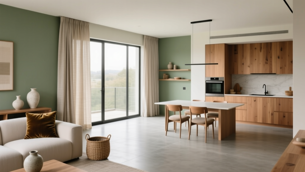
Cohesive Color Flow Between Rooms | The Decor Mag
A home feels calmer—and more intentional—when color moves through it with purpose. Cohesive color flow isn’t about painting every room the same shade; it’s about creating visual continuity so your eye can travel from space to space without abrupt stops. When the palette makes sense, rooms feel connected, and even small homes can feel larger and more refined.
Color flow also affects how you experience daily life. Warm, grounded hues can make shared spaces feel welcoming, while quieter tones help bedrooms and studies feel restorative. With a few smart interior color design principles—undertones, value (lightness/darkness), and repetition—you can build a paint color scheme that feels curated, not chaotic.
This guide breaks down practical strategies, specific paint color recommendations, and real application scenarios so you can confidently create a whole-home color scheme that works room by room.
What “Cohesive Color Flow” Really Means
Cohesive color flow is the relationship between rooms—how paint colors, trims, ceilings, and finishes interact from one threshold to the next. It’s less about matching and more about harmonizing.
The three pillars of cohesive color schemes
- Undertone alignment: Colors share compatible undertones (warm vs. cool, plus subtle leanings like green, violet, or pink).
- Value consistency: Rooms transition through similar light-to-dark levels, or shift intentionally in a predictable pattern.
- Repeat + vary: Repeat a few colors (or related shades) across rooms, while varying intensity and placement.
Color psychology: why flow changes how a home feels
- Warm neutrals (creams, greiges, soft terracottas) read inviting and social—ideal for living rooms and kitchens.
- Cool neutrals (soft grays, blue-grays) feel airy and quiet—great for bedrooms and baths.
- Green-based hues connect us to nature and often feel balanced—excellent “bridge” colors between warm and cool zones.
- Deep tones (navy, charcoal, forest green) add sophistication and can make transition spaces feel intentional rather than overlooked.
Start With a Whole-Home Color Map (Before Picking Paint)
A cohesive interior paint plan starts with a simple framework. Think of your home like a color story: you need a narrator (main neutral), supporting characters (secondary colors), and accents (punchy details).
Step-by-step: build a paint color scheme that flows
- Identify fixed elements: Flooring, countertops, cabinets, tile, large upholstery, and stone are your non-negotiables. Match paint undertones to these.
- Choose your main neutral: This becomes the backbone for halls, open concept areas, or most rooms.
- Select 2–3 supporting colors: Use them in adjacent rooms or as shifts in mood (calmer for bedrooms, warmer for gathering spaces).
- Pick 1–2 accent colors: Use in smaller doses (powder room, built-ins, doors, textiles).
- Decide on trim and ceiling approach: Consistent trim color unifies the home faster than any wall color choice.
Practical tip: use a “palette ratio”
- 70% main neutral (walls or large visual surfaces)
- 25% supporting colors (adjacent rooms, feature walls, cabinetry)
- 5% accents (pillows, art, lampshades, decorative paint moments)
Choose a Base Neutral That Can Travel
The most successful whole-home color schemes begin with a versatile neutral that behaves well in different lighting—morning, afternoon, and evening. Your goal is a neutral that doesn’t suddenly look pink, green, or purple as you move from room to room.
Reliable, widely used base neutrals (with paint brand references)
- Sherwin-Williams Alabaster (SW 7008): A warm white that feels soft, not stark. Strong choice for trim or walls in lower-light homes.
- Benjamin Moore White Dove (OC-17): A balanced white with gentle warmth—excellent for consistent trim across the home.
- Benjamin Moore Classic Gray (OC-23): A pale greige that works as an all-over wall color when you want subtle warmth.
- Sherwin-Williams Accessible Beige (SW 7036): A true greige that coordinates with many floors and stones; popular for open layouts.
- Farrow & Ball Skimming Stone (No. 241): A refined greige with depth; works beautifully in traditional and transitional homes.
How to pick the right neutral for your home’s light
- North-facing rooms: Light is cooler; choose warmer neutrals (Alabaster, White Dove, Accessible Beige) to avoid a cold cast.
- South-facing rooms: Light is warmer; you can handle cooler or balanced neutrals (Classic Gray) without feeling icy.
- East-facing rooms: Bright, warm mornings and cooler afternoons—avoid neutrals with tricky undertones; test large samples.
- West-facing rooms: Warm late-day light can intensify warmth—watch for neutrals that go too yellow.
Create Transitions With Undertones, Not Exact Matches
The secret to a seamless color transition is undertone continuity. If one room is a warm greige and the next is a cool blue-gray, the doorway can feel like a hard line. Use “bridge colors” that share DNA with both spaces.
Bridge color ideas that help rooms relate
- Green-gray neutrals: These can connect warm and cool palettes. Try Sherwin-Williams Sea Salt (SW 6204) (soft, spa-like) or Benjamin Moore Gray Owl (OC-52) (cool-leaning but versatile).
- Muddy blues: Blue with gray/green undertones feels sophisticated and flexible. Consider Benjamin Moore Smoke (2122-40) for a moody, calming shift.
- Stone-inspired greiges: Colors that echo natural materials make transitions feel architectural. Farrow & Ball Ammonite (No. 274) is a classic “connective” neutral.
Real Room Examples: Cohesive Color Flow Scenarios
Scenario 1: Open-concept living room + kitchen + hallway
Goal: Unified main space with enough variation to define functions.
- Main wall color: Sherwin-Williams Accessible Beige (SW 7036) in living/kitchen for continuity.
- Trim/ceiling: Benjamin Moore White Dove (OC-17) for crisp, warm-edged contrast.
- Kitchen island accent: Sherwin-Williams Naval (SW 6244) for grounded depth that still feels classic.
- Hallway (connecting zone): Keep Accessible Beige or go one step lighter (test SW Agreeable Gray, SW 7029) to brighten without changing undertone direction.
Why it works: Same undertone family throughout. The navy island adds a focal point without disrupting the flow.
Scenario 2: Warm main floor, calmer cool-toned bedrooms upstairs
Goal: Social warmth downstairs, restful coolness upstairs—without a jarring stair transition.
- Downstairs walls: Benjamin Moore Classic Gray (OC-23).
- Stairwell/landing bridge: Sherwin-Williams Sea Salt (SW 6204) or Benjamin Moore Healing Aloe (1562) for a gentle green-based transition.
- Primary bedroom: Benjamin Moore Pale Oak (OC-20) (a warm greige that reads serene) or a soft blue-gray like Benjamin Moore Boothbay Gray (HC-165) for more mood.
- Bath: Continue Sea Salt/Healing Aloe for a spa-like thread.
Why it works: The green-gray bridge color acts like a mediator between warm and cool zones, making the upstairs shift feel natural.
Scenario 3: Small home or apartment that needs to feel bigger
Goal: Expand visual space using value consistency and subtle shifts.
- Main neutral (most rooms): Sherwin-Williams Alabaster (SW 7008) or Benjamin Moore White Dove (OC-17).
- One deeper “anchor” room: A dining nook or office in Sherwin-Williams Iron Ore (SW 7069) or Benjamin Moore Hale Navy (HC-154).
- Ceiling strategy: Use a consistent flat white ceiling throughout to blur boundaries and keep sightlines clean.
Why it works: Light walls create continuity; one intentional deep room adds depth and sophistication without making the home feel chopped up.
Use Trim, Doors, and Ceilings as the Unifying Thread
If you change wall colors from room to room, consistent trim and interior doors can keep everything cohesive. This is especially helpful in older homes with many smaller rooms.
Recommendations for a cohesive trim plan
- Pick one trim white for most of the home: Benjamin Moore White Dove (OC-17) or Sherwin-Williams Alabaster (SW 7008) are dependable.
- Choose sheen intentionally: Satin or semi-gloss for trim; matte/eggshell for walls; flat for ceilings.
- Consider painting interior doors the trim color: This reduces visual “stops” at every doorway and supports color flow.
When to paint ceilings a color
- Use a tinted ceiling (one step lighter than the wall color) in rooms with low ceilings to reduce harsh contrast.
- Use a crisp white ceiling in open concept areas to keep the architecture feeling taller and brighter.
Repeat Colors Through Decor for Effortless Continuity
Paint is only one part of cohesive color design. Repeating the same hues in textiles, art, and finishes creates rhythm across rooms—even when wall colors change.
Easy repetition strategies (that don’t feel matchy)
- Echo one accent color: Example: navy appears as an island color, then shows up in a hallway runner and bedroom art.
- Repeat a metal finish: Keep brushed brass or matte black consistent in adjacent rooms.
- Carry wood tones: Similar oak/walnut undertones help rooms relate even with different wall colors.
- Use a consistent “white”: Matching trim and key textiles (curtains, bedding) builds a calm baseline.
Common Color Mistakes That Break Flow
- Ignoring undertones: Two “neutral” grays can clash if one is purple-based and the other is green-based.
- Too many unrelated bold colors: A red dining room, teal bathroom, and bright yellow kitchen can feel disconnected unless tied together with a strong neutral and repeated accents.
- Choosing paint from a tiny swatch: Always test large samples (poster board or peel-and-stick) and view them morning and night.
- Forgetting adjacent sightlines: Stand in doorways and look at both rooms at once; that’s where clashes reveal themselves.
- Overusing high-contrast transitions: Stark white trim + very dark walls in every room can feel choppy in a hallway-heavy home. Mix in mid-tones.
- Not accounting for existing finishes: Cool gray paint next to warm honey oak can look muddy or sour unless you bridge undertones thoughtfully.
Practical Application Tips for Choosing Paint Colors
- Test in context: Tape large samples on multiple walls, especially near doorways where color flow is most visible.
- Use the “three-view” check: Look at color from (1) the room, (2) the doorway, and (3) the next room looking back.
- Limit your paint library: For most homes, 1 main neutral + 2 supporting colors + 1 accent is enough for a cohesive color palette.
- Coordinate with flooring:
- Red/orange woods (cherry, some oak stains) pair well with warm whites and greiges.
- Gray-washed floors pair well with cooler whites and blue/green-grays.
- Use darker colors strategically: Put deeper hues in dining rooms, powder rooms, offices, or bedrooms where intimacy is a benefit.
FAQ: Cohesive Color Flow Between Rooms
Should every room in my house be the same color?
No. A cohesive whole-home color scheme is about harmony, not uniformity. Repeating undertones and keeping trim consistent usually delivers flow without making the home feel flat.
How many paint colors should I use in a typical home?
A practical guideline is 3–5 total: one main neutral, two supporting colors, one accent, plus a trim white. Large homes can handle more variation, but repetition is what keeps it cohesive.
What’s the easiest way to connect warm and cool rooms?
Use a bridge color with flexible undertones—often a green-gray like Sherwin-Williams Sea Salt (SW 6204) or a gentle greige like Farrow & Ball Ammonite (No. 274). Place it in hallways, landings, or transitional areas.
How do I prevent my hallway from feeling like a different “paint moment”?
Keep hallways in the main neutral or a lighter/darker shade of it. Then repeat the hallway color in small ways elsewhere (pillows, art mats, or a nearby room’s trim) so it feels intentional.
Do I need to match paint colors to my furniture?
You don’t need an exact match, but you do need coordination. Pull from your largest upholstered pieces and rugs: if they read warm, choose warm-leaning neutrals; if they read cool, avoid creamy yellows and warm beiges.
What’s the best trim color for a cohesive look?
Benjamin Moore White Dove (OC-17) is a widely loved option because it’s softly warm and plays well with many wall colors. Sherwin-Williams Alabaster (SW 7008) is another strong choice, especially in homes with warmer finishes.
Next Steps: Build Your Home’s Color Flow Plan
To create a cohesive color flow between rooms, start with a base neutral that suits your light and fixed finishes, then choose supporting colors with compatible undertones. Use transitional “bridge” shades in stairwells and hallways, and let consistent trim unify the entire paint color scheme. Finally, repeat a few accents through decor so the palette feels collected over time.
- Photograph your connected rooms and identify the main sightlines.
- Choose one trim white and commit to it.
- Select a main neutral, then test it in at least two rooms.
- Add 2–3 supporting colors and one accent, checking undertones at doorways.
- Repeat accent colors through textiles, art, and accessories for effortless continuity.
For more paint color ideas, color psychology guidance, and room-by-room color schemes, explore the latest color guides on thedecormag.com.
More Articles
 Best Key Lime Paint Colors - The Decor Mag
 Best Oxblood Paint Colors - The Decor Mag
 How to Use the 60-30-10 Color Rule - The Decor Mag
 Best Pear Green Paint Colors - The Decor Mag
 2026 Color of the Year: Predictions & Palettes
 Bathroom Trends 2026: Wellness Integration, Material Innovation, and Smart Efficiency
 How to Choose Colors for a Music Room - The Decor Mag
 How to Create a Dramatic Color Palette - The Decor Mag
 How to Choose Colors for a Conservatory - The Decor Mag
 Pastel Color Palette Design Guide - The Decor Mag