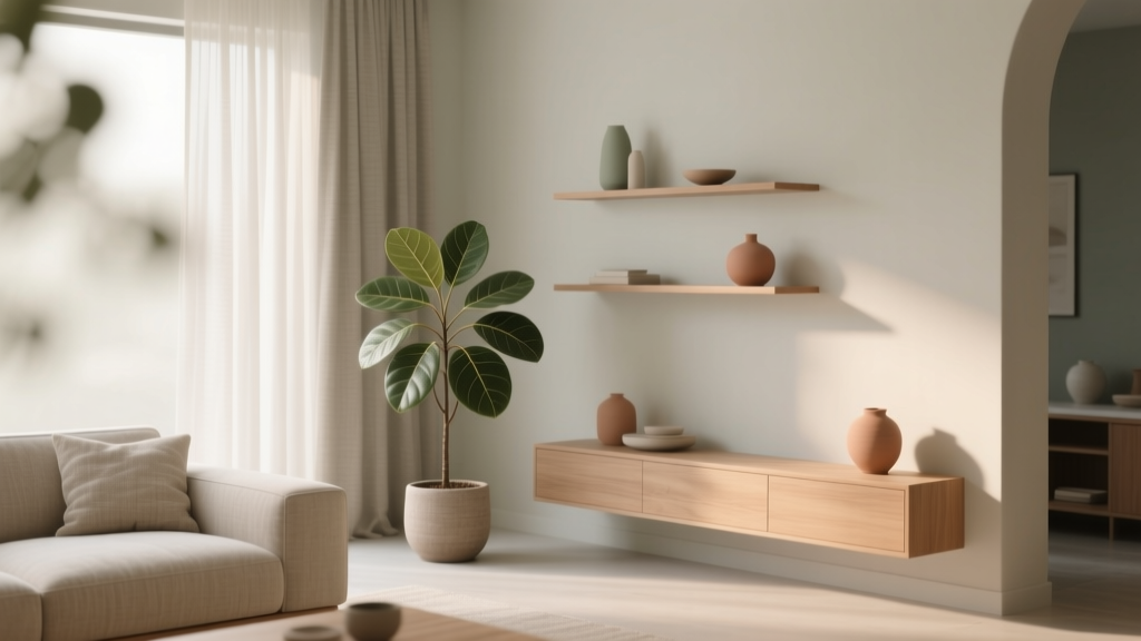
How to Create a Soothing Color Palette - The Decor Mag
A soothing color palette does more than “look nice.” It influences how your home feels the moment you walk in—calm or chaotic, restorative or overstimulating. Color psychology plays a quiet but powerful role in daily life: soft hues can lower perceived stress, while high-contrast or overly saturated schemes can keep the nervous system on alert.
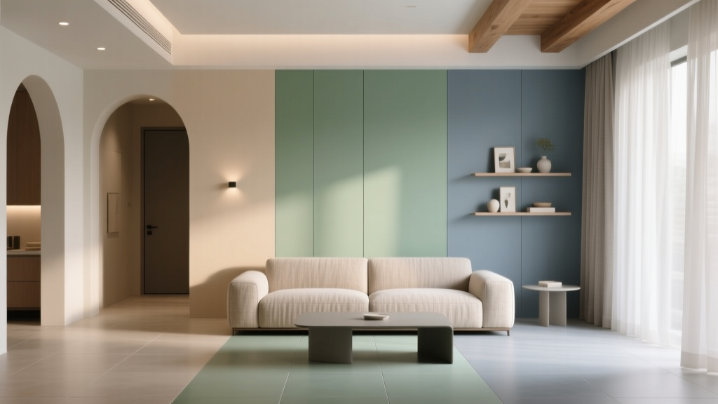
Homeowners often assume a relaxing space requires all-white walls or a sea of beige. The truth is more nuanced. The most soothing interior color design relies on balance—between warm and cool undertones, light and shadow, matte and reflective finishes, and the way your paint colors interact with natural light. When these elements align, even richer colors can feel serene.
This guide breaks down how to build calming color schemes room by room, with specific paint recommendations, real application scenarios, and the common mistakes that sabotage an otherwise peaceful design.
What Makes a Color Palette “Soothing”?
Color psychology: why calm colors work
Soothing palettes tend to share a few psychological cues:
- Lower saturation: Dusty, muted tones feel gentler than bright, high-chroma colors.
- Mid-to-light value: Lighter colors reflect more light and feel airy; mid-tones can feel grounded without being heavy.
- Undertone harmony: Colors that share compatible undertones (warm with warm, cool with cool, or intentionally balanced) read as cohesive rather than jittery.
- Nature references: Many calming palettes echo outdoor environments—fog, sand, sea glass, stone, greenery—signals our brains associate with safety and restoration.
Design principles that create visual rest
Relaxing interior color schemes often follow these principles:
- Low contrast transitions: Soft shifts between wall color, trim, and furnishings reduce visual noise.
- Repetition: Repeating 2–3 key tones across textiles, art, and paint ties the room together.
- Simple hierarchy: One main wall color, one supporting neutral, and one restrained accent prevents competing focal points.
Start Here: A Simple Method for Building a Calm Color Scheme
Step 1: Choose your “quiet neutral”
Your quiet neutral is the foundation—typically a wall color or dominant background. It should feel soft in multiple lights and flexible with finishes. Popular soothing neutrals include warm whites, gentle greiges, and misty taupes.
Paint color ideas (great calm foundations):
- Benjamin Moore White Dove (OC-17): A warm, creamy white that stays calm and classic.
- Sherwin-Williams Alabaster (SW 7008): Soft, welcoming white with a relaxed warmth.
- Farrow & Ball Skimming Stone (No. 241): A refined, understated greige that reads serene and tailored.
- Benjamin Moore Pale Oak (OC-20): A gentle greige that works beautifully in open plans.
Step 2: Add a soothing “color wash” (the mood maker)
This is where calm comes alive: a muted blue, a softened green, a dusty lavender, or a warm clay tint. Use it on walls, cabinetry, or a statement ceiling for an enveloping effect.
Soothing color wash paint options:
- Benjamin Moore Quiet Moments (1563): A spa-like blue-green that’s calm without feeling icy.
- Sherwin-Williams Sea Salt (SW 6204): A light green-gray that shifts with light—fresh, airy, and restful.
- Farrow & Ball Mizzle (No. 266): A soft gray-green with a misty, coastal feel.
- Sherwin-Williams Accessible Beige (SW 7036): A warm, grounding neutral that supports soft accent colors.
Step 3: Choose one anchor color (for depth and stability)
Soothing doesn’t mean flat. An anchor color adds depth—think charcoal, deep olive, navy, or warm espresso—used sparingly on built-ins, a powder room vanity, or a bedroom accent wall.
- Benjamin Moore Hale Navy (HC-154): Classic, calming navy that feels stable and timeless.
- Sherwin-Williams Evergreen Fog (SW 9130): Muted green-gray that reads modern and tranquil.
- Farrow & Ball Hague Blue (No. 30): Rich, moody blue-green that can still feel soothing with the right neutrals.
Step 4: Select a “soft highlight” instead of a bright pop
Many people reach for a high-energy accent (bright red, neon yellow), then wonder why the room feels tense. In relaxing color palettes, highlights are gentler: brushed brass, warm oak, creamy textiles, or a muted terracotta.
Easy soft highlights:
- Warm metal finishes: aged brass, champagne bronze
- Natural materials: white oak, linen, boucle, jute
- Warm accents: blush, clay, cinnamon, honey
How Light Changes Paint Colors (and How to Use It)
Natural light is the hidden “ingredient” in every paint color. A soothing palette depends on picking tones that behave well in your specific exposure.
Quick guide by room exposure
- North-facing rooms: Light is cooler and dimmer; choose warmer whites and warm greiges to prevent a chilly feel (try White Dove or Pale Oak).
- South-facing rooms: Bright, warm light supports cooler hues; blue-greens and soft grays stay balanced (try Quiet Moments or Mizzle).
- East-facing rooms: Warm morning light, cooler afternoons—choose colors that can flex (try Sea Salt or Accessible Beige).
- West-facing rooms: Strong golden afternoon light can intensify warm paint colors; consider muted cool tones to keep calm (soft blue-grays, sage greens).
Practical tip: sample like a pro
- Test at least two shades lighter and two darker than your first choice.
- Paint large swatches (or use peel-and-stick samples) on multiple walls.
- View in morning, midday, and evening lighting.
- Check the color next to fixed elements: flooring, countertops, tile, and upholstery.
Soothing Color Palette Recipes (Ready-to-Use Combinations)
These calming color schemes are designed for real homes—balanced undertones, gentle contrast, and flexibility across rooms.
Palette 1: Soft Coastal Calm (airy and restorative)
- Walls: Sherwin-Williams Sea Salt (SW 6204)
- Trim: Sherwin-Williams Alabaster (SW 7008)
- Anchor: Benjamin Moore Hale Navy (HC-154) on a built-in or interior doors
- Accents: bleached oak, linen, seagrass, brushed brass
Best for: living rooms, bathrooms, bedrooms, and open-concept spaces that need cohesion.
Palette 2: Warm Minimalist (calm without feeling cold)
- Walls: Benjamin Moore Pale Oak (OC-20)
- Trim: Benjamin Moore White Dove (OC-17)
- Anchor: Sherwin-Williams Evergreen Fog (SW 9130) for cabinetry or an accent wall
- Accents: warm tan leather, matte black details, textured wool rugs
Best for: modern homes, condos, and spaces with cooler daylight.
Palette 3: Quiet Earth (grounded and nurturing)
- Walls: Farrow & Ball Skimming Stone (No. 241)
- Trim: Farrow & Ball All White (No. 2005) or a similar crisp white
- Anchor: Farrow & Ball Hague Blue (No. 30) used sparingly
- Accents: terracotta, camel, walnut wood, soft ivory textiles
Best for: dining rooms, studies, and bedrooms where you want warmth and depth.
Real Room Examples: How to Apply Soothing Paint Colors
Bedroom: a sleep-friendly color scheme
Bedrooms benefit from low-contrast palettes and matte finishes that absorb light. A calming approach:
- Walls: Benjamin Moore Quiet Moments (1563) in eggshell
- Trim: Benjamin Moore White Dove (OC-17) in satin
- Textiles: layered whites, pale gray, and a muted blue throw
- Lighting: warm bulbs (2700K) to keep blues from turning icy
Scenario: If your bedroom gets intense morning sun, choose a slightly grayer blue-green so it doesn’t glow too brightly at sunrise.
Living room: calm, social, and cohesive
Living rooms need to feel relaxed but not sleepy. Use a quiet neutral and build softness through texture.
- Walls: Sherwin-Williams Accessible Beige (SW 7036)
- Trim: Sherwin-Williams Alabaster (SW 7008)
- Accent: a single deep tone (Hale Navy) on built-ins or a media wall
Scenario: For an open floor plan, keep the main wall color consistent and shift mood using textiles and artwork rather than changing paint colors every few steps.
Kitchen: soothing without looking dull
Kitchens can handle slightly more contrast due to hard surfaces and activity. A calming kitchen palette often pairs soft cabinets with warm whites and natural materials.
- Cabinets: Sherwin-Williams Evergreen Fog (SW 9130)
- Walls: Sherwin-Williams Alabaster (SW 7008)
- Hardware: aged brass or soft black
- Countertops: warm white quartz or honed stone for a gentle look
Scenario: If your backsplash has cool gray veining, consider a greener cabinet color to avoid a sterile, all-gray effect.
Bathroom: spa energy through color and finish
Bathrooms love misty hues and tonal layering. Choose a paint with a little gray to keep it sophisticated.
- Walls: Farrow & Ball Mizzle (No. 266)
- Trim/vanity: White Dove (OC-17) or a soft off-white
- Accents: eucalyptus green towels, pale stone tile, warm metal fixtures
Scenario: In a windowless bath, avoid overly cool blue-grays; they can look flat under artificial light. Opt for green-gray or warm greige instead.
Common Color Mistakes That Ruin a Soothing Palette
- Choosing paint colors without checking undertones: A warm beige next to a cool gray can look “off” even if both are beautiful alone.
- Overusing bright white: Stark whites can feel clinical, especially with cool LED lighting. Use softer whites like Alabaster or White Dove.
- Too much contrast: High-contrast trim, busy patterns, and multiple accent colors create visual tension.
- Ignoring sheen: High-gloss amplifies light and imperfections. For calm spaces, use matte/eggshell on walls, satin on trim, and reserve higher sheen for doors/cabinetry.
- Matching everything exactly: A soothing room needs gentle variation—layer tones in the same family (cream + oatmeal + warm gray) rather than one flat color everywhere.
- Forgetting the “fixed finishes”: Flooring, countertops, tile, and large upholstery pieces should guide your paint color choices, not fight them.
Practical Tips for Making Calm Color Schemes Work Everywhere
- Use the 60-30-10 guideline: 60% dominant color (walls), 30% secondary (upholstery/rugs), 10% accent (art, pillows, decor).
- Repeat your undertone: If you choose a green-gray wall, echo that with a muted green in textiles or art.
- Let texture do the talking: Calm rooms feel rich through linen, wool, wood grain, ceramic, and stone—less reliance on loud color.
- Consider color continuity: In hallways and open plans, using one primary wall color reduces visual breaks and creates flow.
- Balance warm and cool: Pair cool paint colors with warm materials (oak, brass) or warm paint colors with crisp whites and stone for clarity.
FAQ: Soothing Paint Colors and Calm Color Schemes
What are the best soothing paint colors for a whole house?
Look for quiet neutrals and soft, nature-based hues. Popular whole-home choices include Benjamin Moore Pale Oak, Benjamin Moore White Dove, and Sherwin-Williams Alabaster for a cohesive base, with accents like Sherwin-Williams Evergreen Fog or Benjamin Moore Hale Navy for depth.
Are cool colors always more calming than warm colors?
No. Cool blues and greens are often associated with calm, but warm neutrals (creamy whites, greiges, soft taupes) can feel equally soothing—especially in north-facing rooms or homes with cooler finishes.
How do I make a soothing palette if I love color?
Choose muted versions of your favorites and keep contrast low. For example, instead of a bright teal, use a softened blue-green like Quiet Moments. Add your bolder color in small doses (art, a vase, a single pillow) rather than on large wall areas.
What trim color works best with calming wall colors?
Soft whites tend to support soothing wall colors without harsh edges. Benjamin Moore White Dove and Sherwin-Williams Alabaster are reliable because they feel gentle and blend well with both warm and cool palettes.
How can I tell if a paint color will feel relaxing at night?
Test the color under your evening lighting. Use warm bulbs (2700K to 3000K) and avoid very cool LEDs, which can make blue-grays feel icy and make whites look stark. Sampling is the difference between “pretty” and “peaceful.”
What’s the easiest way to update a room to feel calmer without repainting?
Reduce contrast and add soft texture. Swap bright pillows for muted tones, add linen curtains, introduce a warm rug, and replace cool light bulbs with warmer ones. These shifts support a soothing color scheme even if the wall color stays the same.
Next Steps: Build Your Palette with Confidence
Start by selecting one quiet neutral and one soft color wash that suits your home’s light. Sample generously, compare against your fixed finishes, then add an anchor shade for depth. Keep contrast intentional, use texture to create richness, and let repetition tie your interior color design together.
For more paint color ideas, calming color combinations, and room-by-room guidance, explore our color guides on thedecormag.com.
More Articles
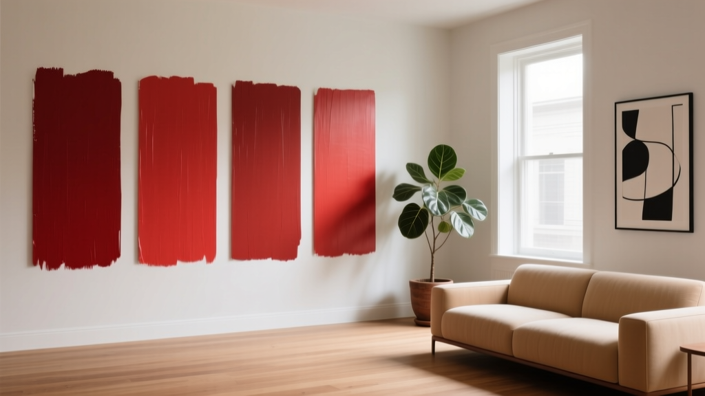 Best Cardinal Red Paint Colors - The Decor Mag
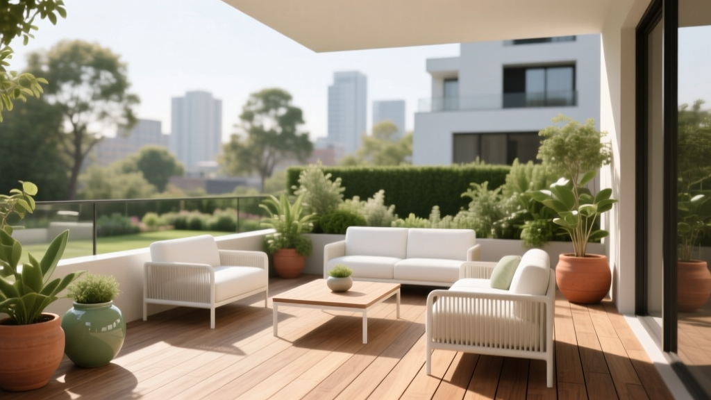 How to Choose Colors for a Terrace - The Decor Mag
 Best Palette Reading: Science, Standards, and Real-World Accuracy for Designers and Brand Managers
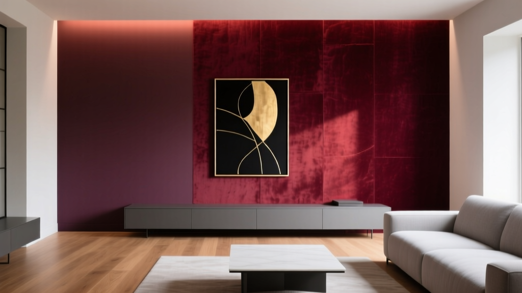 Best Wine Red Paint Colors - The Decor Mag
 Best Burgundy Paint Colors - The Decor Mag
 Best Pink Paint Colors That Aren't Juvenile - The Decor Mag
 Monochromatic Color Scheme Design Guide - The Decor Mag
 Friendly and Smart Compared: How Human-Centered Design and AI Intelligence Shape Modern Product Experiences
 Best Neutral Paint Colors for Every Room - The Decor Mag
 How to Create a Transitional Color Palette - The Decor Mag