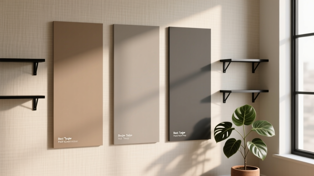
Best Taupe Paint Colors Compared - The Decor Mag
Taupe is one of those rare paint colors that can feel quietly luxurious, modern, and timeless all at once. It bridges the gap between warm beige and cool gray, giving you a neutral that adapts to changing light, shifting seasons, and evolving decor styles. If you’ve ever painted a room “greige” only to watch it turn pink at night or go muddy on cloudy days, you already know why choosing the right taupe paint color matters.
From a color-theory standpoint, taupe is compelling because it sits in a flexible middle zone: it can borrow warmth from brown or coolness from gray depending on its undertone. That adaptability is also what makes taupe tricky—undertones can flip dramatically under LEDs, north-facing daylight, or alongside certain floors and countertops.
This guide compares standout taupe paint colors across major brands, explains how to read undertones, and shows where each shade shines in real rooms—from living rooms and bedrooms to kitchens and exteriors—so you can build a cohesive interior color scheme with confidence.
What Makes a Color “Taupe” (and Why Undertone Is Everything)
Taupe generally describes a neutral in the beige-to-brown family that’s softened with gray. The result: a grounded, calming color that tends to feel more sophisticated than basic beige and warmer than many cool grays.
Taupe vs. Greige vs. Beige
- Taupe: Beige/brown base + gray influence; often reads earthy, cozy, and tailored.
- Greige: Gray base + beige warmth; often reads more modern and slightly cooler.
- Beige: Yellow/red base; can read sunny, traditional, sometimes “peachy” in warm light.
Common Taupe Undertones (and How They Behave)
- Pink/rose undertone: Soft and flattering; can turn mauve near cool whites or under warm bulbs.
- Green undertone: Earthy and natural; complements wood and stone; can look “drab” next to very cool grays.
- Violet undertone: Elegant and upscale; can feel cooler in north-facing light.
- Yellow undertone: Warm and inviting; can skew “tan” if your room has warm lighting and honey oak floors.
Quick Color Psychology: Why Taupe Works
Neutral doesn’t mean boring. Taupe’s psychology is about stability, comfort, and quiet confidence. It supports relaxation in bedrooms, creates a welcoming first impression in entryways, and offers a calm backdrop that lets art, textiles, and wood tones take center stage.
How to Choose the Best Taupe Paint Color for Your Space
1) Check Your Fixed Finishes First
Taupe is famously cooperative, but it still needs to harmonize with what won’t change easily:
- Flooring (red oak, white oak, tile with warm or cool grout)
- Countertops (marble veining can pull violet; granite can pull green)
- Cabinet color (bright white vs. creamy off-white)
- Metal finishes (brass warms; chrome cools)
2) Use LRV as a Practical Filter
LRV (Light Reflectance Value) helps you estimate how light or deep a taupe will feel.
- LRV 60+: Light taupes for brightening darker rooms and open plans.
- LRV 40–60: The most versatile range for living rooms, halls, and kitchens.
- LRV under 40: Deeper taupes for cozy dens, offices, dining rooms, and dramatic exteriors.
3) Test Correctly (This Prevents 90% of Taupe Regrets)
- Paint a large sample (at least 12x12 inches, ideally 24x24) on multiple walls.
- View it morning, afternoon, and night with your actual bulbs on.
- Hold your trim color next to it (bright whites can make taupe look darker and cooler).
- Compare it to one slightly warmer and one slightly cooler option to reveal undertones.
Best Taupe Paint Colors Compared (Top Picks by Brand)
Below are designer-favorite taupe paint colors that perform well in real homes. Use these as a curated starting point, then fine-tune based on your light, trim, and finishes.
Benjamin Moore: Classic, Nuanced Taupes
- Benjamin Moore Revere Pewter (HC-172)
A warm greige/taupe that’s a go-to neutral for open floor plans. It reads welcoming without going yellow.
Best for: Living rooms, hallways, whole-house color schemes.
Pairs well with: White Dove (trim), black accents, natural linen, medium oak. - Benjamin Moore Edgecomb Gray (HC-173)
A lighter, airy taupe-leaning greige that brightens spaces while keeping warmth.
Best for: North-facing rooms, kitchens with white cabinets, low-light spaces.
Pairs well with: Creamy whites, warm metals (brass), soft blue-grays. - Benjamin Moore Pashmina (AF-100)
A deeper taupe with a sophisticated, slightly smoky character. Great when you want depth without going full brown.
Best for: Dining rooms, offices, dramatic bedrooms, accent walls.
Pairs well with: Chantilly Lace (trim), camel leather, walnut, ivory textiles.
Sherwin-Williams: Versatile Taupes for Modern Homes
- Sherwin-Williams Accessible Beige (SW 7036)
A balanced warm neutral that often reads like a soft taupe in everyday lighting—very livable and consistent.
Best for: Whole-home neutrals, family rooms, transitional interiors.
Pairs well with: Pure White (trim), warm wood, muted sage accents. - Sherwin-Williams Agreeable Gray (SW 7029)
Not a true taupe, but a common “taupe alternative” when you want a neutral that leans slightly warmer than gray.
Best for: Open concept spaces, resale-friendly interiors.
Pairs well with: Soft black, crisp whites, greige upholstery. - Sherwin-Williams Anew Gray (SW 7030)
A richer greige with taupe warmth; more depth than Agreeable Gray, less brown than many tans.
Best for: Bedrooms, living rooms, connecting spaces where you want warmth.
Pairs well with: Cream trim, cognac leather, warm marble, dusty blues.
Farrow & Ball: Elevated Taupe for Character-Rich Spaces
- Farrow & Ball Elephant’s Breath (No. 229)
A cult-favorite taupe with a modern, slightly cool edge that can read stone-like and refined.
Best for: Contemporary living rooms, architectural spaces, boutique-feel bedrooms.
Pairs well with: Off-white trim, charcoal accents, pale oak, sculptural lighting. - Farrow & Ball Skimming Stone (No. 241)
A soft, light taupe that feels calm and natural—excellent for a serene, minimal palette.
Best for: Open plans, kitchens, hallways, calm bedrooms.
Pairs well with: Warm whites, woven textures, creamy stone, muted greens.
Behr: Approachable Taupes with Great Range
- Behr Wheat Bread (720C-3)
A warm taupe/tan that creates a cozy, traditional feel without going overly golden in many settings.
Best for: Living rooms, dens, rustic modern spaces.
Pairs well with: Cream trim, terracotta accents, dark woods. - Behr Silver Drop (790C-2)
A very light neutral that can read like a pale greige; helpful when you want taupe softness without depth.
Best for: Small rooms, ceilings, brightening open layouts.
Pairs well with: White cabinetry, cool stone, black fixtures.
Real Room Examples: Where Taupe Looks Its Best
Living Room: Warm, Flexible Backdrop for Layered Decor
Scenario: You have a mix of fabrics (linen, velvet), wood tones, and a patterned rug, and you want the walls to unify everything.
- Choose Benjamin Moore Revere Pewter or SW Accessible Beige for an easy, adaptable base.
- Layer tonal neutrals: ivory sofa, camel leather chair, black metal accents.
- Add dimension with a slightly deeper taupe on built-ins (try BM Pashmina for contrast).
Bedroom: Soft Taupe for a Calming, Flattering Retreat
Scenario: You want a restful bedroom that feels warm in the evening and gentle in morning light.
- Use BM Edgecomb Gray or F&B Skimming Stone for a light, serene envelope.
- Pair with warm whites in bedding to avoid a flat look.
- Accent colors that sing with taupe: dusty rose, muted navy, soft olive, antique brass.
Kitchen: Taupe Walls to Balance White Cabinets and Busy Stone
Scenario: White cabinets feel stark, and your countertop has warm veining or speckling.
- Try SW Anew Gray or BM Revere Pewter for a warm, modern neutral.
- If your stone pulls cool (gray veining), consider F&B Elephant’s Breath for a tailored, stone-like harmony.
- Keep trim and ceiling a clean, not-too-creamy white for clarity.
Bathroom: Spa-Like Taupe That Doesn’t Turn Pink
Scenario: Lots of cool tile and chrome fixtures make warm colors unpredictable.
- Look for taupes with a steadier, less rosy read, such as SW Accessible Beige or F&B Elephant’s Breath.
- Use high-quality lighting (3000K is a flattering middle ground) to reduce undertone surprises.
- Pair with creamy towels, natural wood, and stone accessories for a spa color scheme.
Exterior: Taupe for Timeless Curb Appeal
Scenario: You want a classic exterior paint color that works with stone, brick, or darker roofing.
- Deeper taupes like BM Pashmina often read sophisticated outdoors.
- Coordinate with trim in a warm white and consider a near-black front door for definition.
- Test in full sun and shade; exterior light can wash taupe out or amplify undertones.
Winning Taupe Color Combinations (Designer-Approved Pairings)
Use taupe as the anchor, then build a palette with contrast and temperature balance.
- Taupe + Crisp White + Soft Black: Clean, modern, high contrast (great for open plan homes).
- Taupe + Sage Green + Warm Wood: Earthy and calming (perfect for kitchens and living rooms).
- Taupe + Navy + Brass: Classic and upscale (ideal for offices, dining rooms).
- Taupe + Terracotta + Cream: Warm, Mediterranean-leaning comfort (works beautifully with textured textiles).
- Taupe + Dusty Rose + Walnut: Soft, sophisticated, flattering for bedrooms.
Common Taupe Paint Color Mistakes to Avoid
- Skipping undertone comparisons
Taupe rarely reveals its true personality in isolation. Always compare at least two neighbors: one warmer, one cooler. - Choosing taupe without checking your trim white
Bright, blue-white trim can make taupe look dingy; creamy trim can make some taupes look more pink or tan. - Using the wrong bulb temperature
Very warm bulbs (2700K) can push taupe toward yellow or pink; very cool bulbs (4000K+) can make it feel gray and flat. - Ignoring room orientation
North-facing rooms cool colors down; south-facing rooms warm them up. A taupe that’s perfect in one room can shift in another. - Not accounting for surrounding materials
Taupe reflects what’s around it—green from trees outside, red from rugs, yellow from oak floors.
FAQ: Taupe Paint Colors
Is taupe warm or cool?
Taupe can be warm, cool, or balanced depending on undertone. Warm taupes lean more brown/tan; cool taupes lean more gray or violet. Testing in your lighting is the surest way to tell.
What’s the best taupe paint color for an open floor plan?
Benjamin Moore Revere Pewter and Sherwin-Williams Accessible Beige are popular because they stay relatively stable from room to room and coordinate well with many floors and finishes.
Why does my taupe look pink or purple?
This usually comes from undertones being amplified by your light source or nearby finishes. Warm bulbs, sunset light, and certain white trims can pull out rosy/violet notes. Compare with a greener taupe to see the shift clearly.
What trim color goes best with taupe walls?
Soft, versatile whites tend to work best. Options like Benjamin Moore White Dove or Sherwin-Williams Pure White often pair nicely, creating a clean edge without making taupe look muddy or overly cool.
Can taupe work with gray floors?
Yes—choose a taupe that has a slightly cooler or more balanced undertone so it doesn’t fight the floor. Many homeowners have success with SW Agreeable Gray (greige-leaning) or cooler taupe options like F&B Elephant’s Breath, then warm up the room with wood furniture and textiles.
What sheen should I use for taupe paint?
For most walls, eggshell is a durable, forgiving choice. Use matte for low-traffic rooms where you want a soft, velvety look. Save semi-gloss for trim and doors to create crisp contrast.
Next Steps: Find Your Taupe and Make It Feel Intentional
Start by narrowing your shortlist to three taupe paint colors—one light, one mid-tone, and one deeper option—then test large swatches on multiple walls. Match your taupe to the undertones in your fixed finishes, and build a simple supporting palette: a dependable trim white, one darker accent (charcoal or black), and one muted color (sage, navy, terracotta, or dusty rose) to add personality.
If you’re ready to keep refining your interior color design, explore more paint color comparisons, whole-house color schemes, and room-by-room guides on thedecormag.com.
More Articles
 Best Key Lime Paint Colors - The Decor Mag
 How to Use Color to Create Unity - The Decor Mag
 Best Beige Paint Colors That Aren't Boring - The Decor Mag
 Best Aqua Paint Colors - The Decor Mag
 Best Tomato Red Paint Colors - The Decor Mag
 The Ultimate Reading Guide: Science-Backed Strategies for Faster Comprehension, Retention, and Lifelong Engagement
 How to Choose Colors for West-Facing Rooms - The Decor Mag
 How to Use Color to Create Intimacy - The Decor Mag
 Best White Paint Colors Compared - The Decor Mag
 Best Orange Paint Colors for Energy & Warmth (2026)