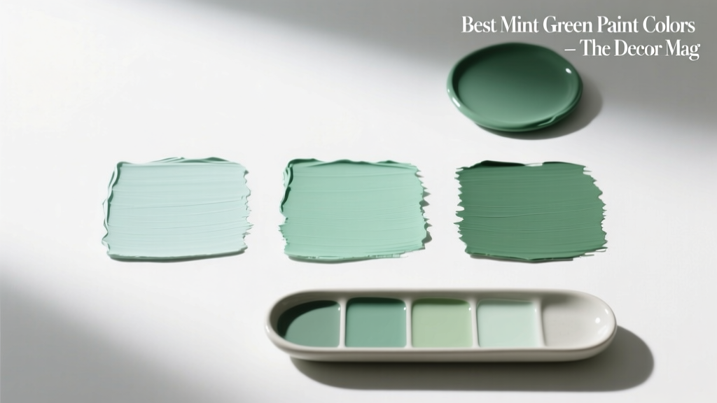
Best Mint Green Paint Colors - The Decor Mag
Mint green is one of those rare paint colors that can feel nostalgic and fresh at the same time. It nods to vintage tile and retro appliances, yet it also reads clean, modern, and calming when paired with today’s lighter woods, warm whites, and brushed metals. For homeowners looking to introduce color without committing to something loud, mint is a sweet spot: noticeably green, softly tinted, and surprisingly versatile across rooms.
Color psychology plays a big role in mint’s popularity. Greens are associated with balance, restoration, and ease—qualities many people want more of at home. Mint specifically adds a “breath of air” effect because it sits closer to white on the value scale and often carries a cool, watery undertone. The result is a paint color that can brighten dim spaces, soften hard finishes like stone or stainless steel, and create a relaxed backdrop for everyday living.
This guide breaks down the best mint green paint colors (with brand references), how to choose the right undertone, and how to use mint in real rooms—from kitchens and bathrooms to bedrooms and exteriors—so your color scheme feels intentional, not accidental.
What Makes a Paint Color “Mint Green”?
Mint green isn’t a single shade; it’s a family of pale greens that typically include:
- High lightness (value): Mint is usually a light paint color, closer to off-white than mid-tone green.
- A cool lean: Many mint paint colors have blue, aqua, or gray undertones.
- Low-to-moderate saturation: The best mints feel soft rather than neon.
The key design principle: undertone control. In different lighting, the same mint can read greener, bluer, grayer, or even slightly yellow. Knowing what’s in your mint helps you build a cohesive interior color design.
Mint Green Undertones: Blue Mint vs. Yellow Mint
- Blue-leaning mints feel crisp, spa-like, and coastal. Great with marble, chrome, and cool whites.
- Yellow-leaning mints feel sunnier and more “garden fresh.” Great with warm whites, brass, and natural oak.
- Gray-leaning mints feel sophisticated and modern. Great in open-concept homes where you want calm continuity.
How to Choose the Best Mint Green for Your Home
Before you commit to a gallon, evaluate the surfaces and light you already have. Mint green is sensitive to its surroundings—beautiful when it harmonizes, awkward when it clashes.
Use These 5 Checks Before Picking a Mint
- Check your fixed finishes: Countertops, tile, flooring, and stone dictate the best undertone. Warm beige travertine usually wants a warmer mint; cool marble often loves a blue mint.
- Assess natural light direction: North-facing rooms can make mint look grayer/cooler; south-facing rooms can make mint look brighter and more green.
- Choose a white trim partner: Crisp whites (e.g., Chantilly Lace) sharpen mint; warm whites (e.g., White Dove) soften it.
- Decide your mood: For energizing kitchens, pick a cleaner mint. For bedrooms, a gray-mint often reads more restful.
- Sample correctly: Paint 2’x2’ swatches on multiple walls or use peel-and-stick samples. View morning, midday, and evening.
Best Mint Green Paint Colors (Designer-Favorite Picks)
Below are standout mint green paint colors across major brands, chosen for their livability and flexibility in real homes. Always sample first—batch variations and lighting can shift the look.
Benjamin Moore Mint Green Paint Colors
-
Benjamin Moore Hollingsworth Green (HC-141)
A refined, historic-feeling green that can read like a deeper mint in bright light. Works well for dining rooms, built-ins, or a statement kitchen island. -
Benjamin Moore Spring Mint (2040-70)
A light, cheerful mint with a clean personality. Great for laundry rooms, kids’ bathrooms, and spaces that need brightness. -
Benjamin Moore Soft Fern (2144-40)
More muted and nature-inspired than candy-mint. Ideal if you want mint’s calm without looking pastel. -
Benjamin Moore Pale Smoke (1584)
Not a true mint on paper, but a beloved gray-green with airy blue undertones that reads “minty” in many rooms. Excellent for bedrooms and open-concept living areas.
Sherwin-Williams Mint Green Paint Colors
-
Sherwin-Williams Mint Condition (SW 6743)
A clear, playful mint that brings personality to cabinetry, doors, and accent walls. Pair with warm whites to keep it inviting. -
Sherwin-Williams Sea Salt (SW 6204)
A famous soft green-blue that often reads as a muted mint in bathrooms and bedrooms. Spa-like, flexible, and easy to coordinate. -
Sherwin-Williams Rainwashed (SW 6211)
A watery green-blue that leans coastal. Beautiful in sunrooms, primary bathrooms, and airy kitchens. -
Sherwin-Williams Quietude (SW 6212)
Slightly deeper and grayer than Rainwashed, with a tranquil feel. Great when you want mint energy but more sophistication.
Farrow & Ball and Designer-Style Mints
-
Farrow & Ball Cabbage White (No. 269)
A delicate, understated green that reads fresh and classic. Lovely for bedrooms, hallways, and cottage-style kitchens. -
Farrow & Ball Cooking Apple Green (No. 32)
Brighter and more spirited—excellent for a pantry, mudroom cabinetry, or a joyful breakfast nook.
Behr Mint Green Paint Colors
-
Behr Breezeway (MQ3-21)
An airy sea-glass green that plays well with coastal, modern, and casual interiors. Strong candidate for bathrooms and guest rooms. -
Behr Soft Mint (varies by collection)
Behr offers multiple “Soft Mint” options across lines; look for one that feels slightly grayed for a more elevated finish. Always compare chips side by side in your lighting.
Real Room Examples: Where Mint Green Looks Best
Mint Green Kitchens: Cabinets, Islands, and Walls
Mint green kitchens can swing retro or modern depending on your pairings. For a contemporary look, keep mint slightly muted and balance it with warm neutrals and natural textures.
Try these application scenarios:
- Cabinets: Sherwin-Williams Mint Condition on lower cabinets + warm white uppers (e.g., SW Alabaster) for a fresh two-tone kitchen.
- Kitchen island: Benjamin Moore Hollingsworth Green on the island + white perimeter cabinets + oak stools for a tailored focal point.
- Walls: Benjamin Moore Spring Mint on walls with white trim and a simple backsplash for a bright, clean feel.
Hardware and finish pairings:
- Brushed brass for warmth and a slightly vintage edge
- Polished nickel or chrome for crisp, classic contrast
- Matte black for a modern graphic note (best with grayer mints)
Mint Green Bathrooms: A Spa Palette That Won’t Feel Cold
Bathrooms are a natural home for mint green paint colors because the hue echoes water and cleanliness. The trick is preventing mint from going icy.
- Pair Sherwin-Williams Sea Salt with warm white tile, creamy towels, and natural oak to keep it inviting.
- Use Rainwashed with marble-look porcelain and chrome fixtures for a bright, coastal spa vibe.
- Choose a semi-gloss or satin finish for better moisture resistance and easier cleaning.
Mint Green Bedrooms: Soft, Restorative, and Light-Reflective
For bedrooms, mint works best when it’s slightly muted—enough color to soothe, not enough to energize. Gray-mints shine here because they support rest and layer beautifully with textiles.
- Benjamin Moore Pale Smoke on walls + crisp white bedding + linen drapes for an airy, hotel-like calm.
- Sherwin-Williams Quietude + warm wood nightstands + ivory rug to keep the palette grounded.
Bedroom palette idea (balanced and modern):
- Walls: Pale Smoke
- Trim: Benjamin Moore White Dove
- Accents: camel leather, antique brass, soft black frames
- Textiles: oatmeal linen, cream boucle, subtle sage pattern
Living Rooms and Open-Concept Spaces: Mint as a Neutral
In open layouts, mint can act like a colored neutral if you choose a softened shade with gray undertones. It bridges blues, greens, and warm woods smoothly.
- Use Sea Salt or Pale Smoke throughout main spaces for continuity.
- Layer in warm accents (oak, tan, terracotta) to prevent the space from feeling sterile.
- Repeat mint in small doses—pillows, art, pottery—to make the color scheme feel intentional.
Exteriors and Front Doors: Mint with Curb Appeal
Mint is charming outside when you treat it like a highlight, not the whole story. A mint front door can brighten neutral siding and create an inviting first impression.
- Front door: A clearer mint (like SW Mint Condition) with white trim and black lighting feels crisp and classic.
- Porch ceiling: A pale blue-mint can feel breezy and traditional, especially with white beadboard.
Mint Green Color Schemes That Work Every Time
Mint’s best partners follow a simple design principle: balance coolness with warmth and add contrast for definition.
Go-To Mint Green Pairings
- Mint + warm white: soft, timeless, and bright (ideal for kitchens and trim-heavy rooms)
- Mint + natural oak: organic warmth that keeps mint from feeling icy
- Mint + brass: elevated and slightly vintage (great for bathrooms and lighting)
- Mint + navy: crisp contrast with a tailored look (perfect for bedrooms and offices)
- Mint + terracotta or clay: modern, earthy tension (excellent for boho and Mediterranean-inspired spaces)
- Mint + soft gray: calming and contemporary (great in open-concept homes)
Three Ready-Made Mint Palettes (Copy-and-Paste Friendly)
- Spa Clean: Sea Salt + crisp white + light gray stone + chrome
- Modern Organic: Pale Smoke + White Dove + oak + linen + matte black accents
- Retro Fresh: Mint Condition + warm white + checkerboard floor accents + brass hardware
Common Mint Green Paint Mistakes (and How to Avoid Them)
- Choosing mint without checking undertones: Mint can flip blue or yellow depending on your flooring and counters. Sample next to your fixed finishes.
- Pairing cool mint with a cool white trim in a low-light room: This can feel clinical. In dim spaces, use a warmer white trim or add warm wood and brass.
- Overusing mint in one space: Mint works best with breathing room. If you’re painting cabinets mint, keep walls and backsplash quieter.
- Ignoring sheen: Flat can scuff in busy areas; high gloss can exaggerate wall imperfections. For most rooms, eggshell on walls and satin on trim is a safe starting point.
- Forgetting contrast: Mint needs a grounding element—charcoal, navy, warm wood, or black—so the room doesn’t feel washed out.
FAQ: Mint Green Paint Colors
What is the most popular mint green paint color?
Sherwin-Williams Sea Salt (SW 6204) is one of the most popular soft green paint colors that often reads minty, especially in bathrooms and bedrooms. It’s widely used because it’s muted, flexible, and easy to coordinate.
Does mint green work with warm wood floors?
Yes—mint green and warm wood are a strong match. Choose a mint with a touch of gray or warmth (rather than an icy blue mint) and pair it with a warm white trim to keep the palette cohesive.
What trim color looks best with mint green walls?
For most homes, a soft warm white trim (like Benjamin Moore White Dove) makes mint feel inviting. If you want a sharper, modern look, a crisp white can work—just watch for a chilly effect in low light.
Is mint green a good whole-house paint color?
Brighter mints can feel themed across an entire home, but muted gray-mints (such as Benjamin Moore Pale Smoke or Sherwin-Williams Quietude) can work beautifully in open-concept layouts when paired with consistent trim and flooring.
How do I keep mint green from looking like a nursery color?
Avoid overly sweet, high-chroma mint and add grown-up anchors: warm woods, substantial rugs, black or bronze accents, and layered neutrals (ivory, taupe, stone). Also consider using mint on cabinetry or a single accent wall rather than every surface.
What colors complement mint green the most?
Mint pairs especially well with warm whites, natural oak, brass, navy, soft grays, and earthy tones like terracotta. The best combination depends on whether your mint leans blue (go warmer with accents) or yellow (you can handle more crisp neutrals).
Next Steps: Bring Mint Green Home with Confidence
Start by picking two or three mint green paint colors from different undertone families—one blue-leaning, one gray-muted, one slightly warmer—then sample them next to your flooring and in your room’s natural light. Build your color scheme around a trim white you already love, and add contrast through hardware, textiles, or a darker companion color like navy or charcoal.
For more paint color ideas, coordinating color schemes, and room-by-room interior color design guidance, explore the latest color guides on thedecormag.com.
More Articles
 Friendly and Smart Compared: How Human-Centered Design and AI Intelligence Shape Modern Product Experiences
 Best Candy Apple Red Paint Colors - The Decor Mag
 How to Use Color to Define Spaces - The Decor Mag
 Best Moss Green Paint Colors - The Decor Mag
 How to Choose Accent Wall Colors - The Decor Mag
 How to Create a Timeless Color Palette - The Decor Mag
 How to Choose Colors for West-Facing Rooms - The Decor Mag
 Best Blush Pink Paint Colors - The Decor Mag
 Best Indigo Paint Colors - The Decor Mag
 Best Hydrangea Blue Paint Colors - The Decor Mag