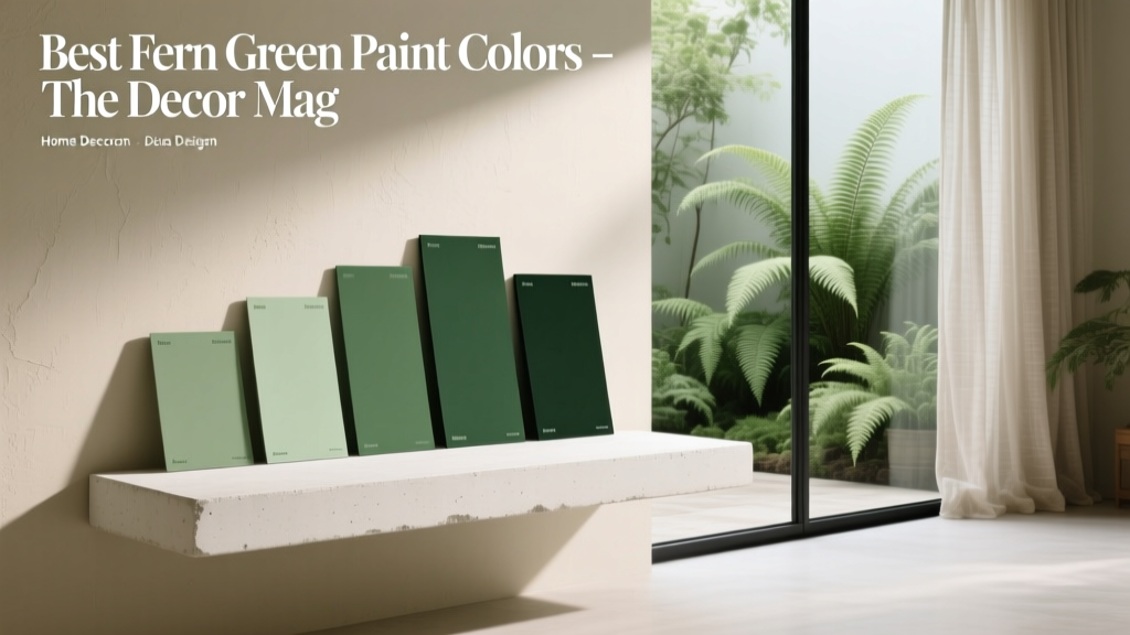
Best Fern Green Paint Colors - The Decor Mag
Fern green has a rare superpower in interior design: it reads as both grounded and fresh. It has the calm, restorative feel we associate with nature, but it also carries enough depth to anchor a room like a classic neutral. If you’ve been craving color without committing to something loud, fern green paint colors deliver that “alive” feeling while staying timeless.
This topic matters because green is one of the easiest hues to live with long-term—especially the muted, leafy greens that mimic real botanicals. From cozy living rooms to spa-like bathrooms, fern green supports the way we want our homes to feel right now: soothing, layered, and connected to the outdoors. With the right undertone and finish, it can look tailored in a modern space or softly traditional in an older home.
Below you’ll find the best fern green paint colors, how to choose the right one for your lighting, and the color schemes that make fern green look intentional (not “I picked a random green chip at the store”).
What “Fern Green” Means in Paint (and Why Undertones Matter)
Fern green sits in the middle of the green family—typically muted, slightly earthy, and less blue than many sage greens. It often has soft gray, olive, or yellow undertones, which is why it can shift dramatically from room to room.
Fern green vs. sage vs. olive
- Fern green: mid-toned, botanical, natural-looking; often balanced between warm and cool.
- Sage green: lighter and dustier (more gray); usually reads calmer and airier.
- Olive green: warmer and more yellow/brown; feels earthier and more rustic.
Color psychology: why fern green feels so livable
Green is strongly tied to balance, restoration, and comfort. In color psychology terms, greens can reduce visual stress because our eyes process them easily. Fern green in particular evokes growth and stability—ideal for spaces where you want to exhale (bedrooms, living rooms, reading nooks) or focus without intensity (offices, libraries).
How to Choose the Right Fern Green for Your Home
Before picking a paint color name, start with the two variables that change green the most: light and fixed finishes.
1) Check your lighting temperature
- North-facing rooms: cooler, flatter light can make fern green look more gray or slightly dull. Consider a warmer fern green with olive undertones.
- South-facing rooms: warm, abundant light can make greens glow. Choose a slightly grayer fern green if you want a calmer look.
- East-facing rooms: bright morning light + cooler afternoons. Balanced fern greens work best.
- West-facing rooms: warm afternoon/evening light can push greens toward yellow. Avoid overly warm olives unless you want that effect.
2) Compare against your hard finishes
Hold samples next to what you can’t easily change:
- Warm woods (oak, walnut), cool woods (ash), or red-toned woods (cherry)
- Countertops (marble, quartz, granite) and backsplash tile
- Flooring (warm LVP, cool gray tile, natural stone)
- Metal finishes (brass, black, chrome, nickel)
3) Choose the right sheen for fern green
- Matte/flat: best for walls where you want a velvety, heritage look; hides imperfections.
- Eggshell: the safest all-around option for living spaces; subtle washability.
- Satin: great for kitchens, baths, trim when you want durability; can highlight wall texture.
- High-gloss: dramatic on cabinets or furniture; can skew color slightly deeper and richer.
Best Fern Green Paint Colors (Designer-Approved Picks)
These paint colors sit in the fern green neighborhood—leafy, natural, and versatile. Always test with peel-and-stick samples or painted boards, because green is famously reactive to surrounding colors.
Benjamin Moore Fern Green 2145-12
If you want a true “fern” statement, this is a classic. It’s medium-deep with a botanical richness that reads sophisticated rather than trendy.
- Best for: dining rooms, libraries, built-ins, accent walls
- Looks great with: warm white trim, brass lighting, medium-toned woods
Sherwin-Williams Ripe Olive (SW 6209)
On the deeper, earthier end of fern green, Ripe Olive gives you a moody green that still feels natural. It leans olive but can read “fern-like” in balanced daylight.
- Best for: exterior doors, powder rooms, kitchen islands, cozy bedrooms
- Pair with: creamy whites, tan leather, black accents
Farrow & Ball Green Smoke (No. 47)
A soft, atmospheric green with gray-blue complexity. If your style is vintage, English-inspired, or calm contemporary, Green Smoke delivers depth without heaviness.
- Best for: bedrooms, sitting rooms, cabinetry
- Pair with: off-white linens, antique brass, warm oak
Benjamin Moore Gloucester Sage (HC-100)
While technically more sage-leaning, it lands beautifully in the fern green palette when you want something lighter and more forgiving. It reads leafy and quiet on walls.
- Best for: open-plan spaces, hallways, nurseries, bathrooms
- Pair with: white subway tile, pale stone, light wood
Sherwin-Williams Evergreen Fog (SW 9130)
A modern green-gray that can feel fern-like in rooms with natural textures. It’s a go-to if you want a contemporary, calming green that won’t dominate.
- Best for: living rooms, home offices, whole-home color schemes
- Pair with: greige upholstery, clay accents, matte black fixtures
Behr Jojoba (MQ2-13)
Jojoba is an approachable, earthy green that plays well with beige, tan, and warm whites. It’s ideal if your home already has warm tones you don’t want to fight.
- Best for: family rooms, kitchens with wood cabinetry, entryways
- Pair with: natural fibers, aged brass, creamy trim
Farrow & Ball Calke Green (No. 34)
A heritage-style green that nods to traditional paint colors found in historic homes. It can read deep fern in lower light and fresh botanical in bright rooms.
- Best for: studies, dining rooms, exterior shutters, mudrooms
- Pair with: crisp whites, terracotta, dark-stained wood
Real Room Ideas: Where Fern Green Paint Looks Best
Living room: a grounded backdrop for layered neutrals
Fern green walls make a living room feel settled and inviting, especially with texture-forward styling.
- Try: Sherwin-Williams Evergreen Fog on walls in eggshell
- Style with: oatmeal linen sofa, walnut coffee table, cream boucle chair
- Accent colors: cognac leather, soft black, warm brass
Bedroom: calm, cocooning, and sleep-friendly
Because fern green supports relaxation, it’s ideal for bedrooms—especially when paired with warm whites and natural textiles.
- Try: Farrow & Ball Green Smoke for a misty, enveloping look
- Best combo: ivory bedding + natural oak nightstands + muted artwork
Kitchen: cabinets or island for a tailored, organic pop
Fern green cabinetry reads custom and timeless. It also hides everyday wear better than white.
- Try: Benjamin Moore Fern Green 2145-12 on lower cabinets (satin)
- Pair with: warm white uppers, creamy quartz, handmade zellige tile
- Hardware: aged brass for warmth, matte black for contrast
Bathroom: spa energy with the right white
Fern green works beautifully with tile and stone. The key is choosing a white that complements the undertone.
- Try: Benjamin Moore Gloucester Sage for an airy spa feel
- Tile pairings: white marble-look porcelain, warm white ceramic, soft gray stone
Entryway or mudroom: practical and welcoming
These high-traffic spaces benefit from colors that feel intentional and hide scuffs.
- Try: Behr Jojoba on walls or lockers (satin for durability)
- Add: woven baskets, wood hooks, a jute runner
Fern Green Color Schemes That Always Work
Fern green becomes “designer” when it’s part of a clear color scheme. Use these combinations to build a cohesive interior color design.
1) Fern green + warm white + natural wood
- Vibe: organic modern, Scandinavian warmth
- Paint pairing idea: fern green walls + creamy trim + oak floors
2) Fern green + taupe/greige + black accents
- Vibe: modern, tailored, slightly graphic
- Where it shines: living rooms, offices, kitchens
3) Fern green + terracotta + brass
- Vibe: earthy, Mediterranean, warm and collected
- Best for: dining rooms, kitchens, sunrooms
4) Fern green + blush + cream
- Vibe: soft, romantic, vintage-inspired
- Best for: bedrooms, nurseries, dressing rooms
5) Fern green + navy + crisp white
- Vibe: classic, coastal-prep, polished
- Best for: offices, guest rooms, built-ins
Common Fern Green Paint Mistakes (and How to Avoid Them)
-
Skipping undertone testing.
Green can flip from soothing to swampy depending on nearby finishes. Paint large sample boards and move them around the room throughout the day. -
Choosing a fern green that’s too saturated for the space.
In small, low-light rooms, a very deep green can feel heavy. Consider a softened fern green (green-gray) or use the deeper shade as an accent. -
Pairing fern green with the wrong white.
A stark, blue-white can make warm greens look muddy. Match warm greens with creamy whites; cooler fern greens can handle cleaner whites. -
Forgetting about sheen and texture.
Satin on imperfect walls can highlight flaws, especially with deeper greens. Use matte/eggshell on walls and reserve satin for trim or cabinetry. -
Not balancing the room with contrast.
Fern green loves structure—add contrast via light trim, dark hardware, or warm wood to keep it from feeling flat.
Practical Tips for Sampling and Painting Fern Green
- Sample at least 2–3 greens in the same value range (one warmer, one cooler, one “middle”).
- View next to your sofa/rug/cabinets—greens are influenced by surrounding colors more than most hues.
- Use large samples (poster-board size) and test in corners and near windows.
- Plan your transitions in open floor plans: fern green pairs beautifully with warm whites, soft greiges, and light taupes in adjacent rooms.
- Consider a monochrome moment: paint walls and trim in the same fern green, changing only sheen (matte walls, satin trim) for a modern, enveloping look.
FAQ: Fern Green Paint Colors
Is fern green a good whole-house paint color?
It can be, especially in a softened green-gray version (like Sherwin-Williams Evergreen Fog or Benjamin Moore Gloucester Sage). For a whole-home approach, use fern green in main spaces and transition to warm whites or greiges in connecting rooms to keep the flow light.
What trim color looks best with fern green walls?
Most fern greens look best with warm whites or soft off-whites. If your fern green leans cool/gray, a cleaner white can work. Test your trim white next to the wall color in the room’s actual lighting.
Does fern green work with oak cabinets or oak floors?
Yes—fern green is excellent with oak. Choose a fern green with enough warmth (slight olive/earth undertone) so it harmonizes with oak’s golden tones rather than clashing.
What are the best accent colors for fern green?
Reliable accents include:
- Warm neutrals: cream, beige, camel
- Earth tones: terracotta, clay, tobacco leather
- Deep contrasts: charcoal, soft black, navy
- Metals: aged brass, antique gold, matte black
Can fern green make a room look darker?
Darker fern greens can reduce perceived brightness, especially in north-facing rooms. If you want the fern look without the heaviness, pick a lighter fern-leaning green or use fern green on one focal wall, cabinetry, or built-ins.
What finish should I use for fern green kitchen cabinets?
Satin is the most common choice for cabinets because it’s durable and easy to clean while still looking refined. For a more contemporary look, some homeowners choose a semi-gloss, but it will reflect more light and highlight surface imperfections.
Next Steps: Make Fern Green Feel Effortless
Start by identifying your room’s light (north/south/east/west), then choose two or three fern green paint colors with different undertones. Test large samples beside your floors, countertops, and key textiles. Once you’ve landed on the right green, build a simple color scheme—warm white + wood + one strong contrast (black, navy, or brass) is an easy formula that looks designer every time.
For more paint color ideas, undertone guides, and room-by-room color schemes, explore the latest color guides on thedecormag.com.
More Articles
 Best Purple Paint Colors for Sophistication - The Decor Mag
 How to Choose Colors for a Library - The Decor Mag
 How to Test Paint Colors Before Committing - The Decor Mag
 Best Terracotta Paint Colors for Warmth - The Decor Mag
 Best Burnt Orange Paint Colors - The Decor Mag
 Best Aqua Paint Colors - The Decor Mag
 Best Dusty Rose Paint Colors - The Decor Mag
 How to Choose Colors for a Garage Conversion - The Decor Mag
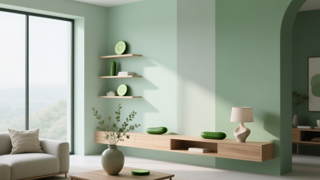 Best Cucumber Paint Colors - The Decor Mag
 Placement Safety Tips: Preventing Falls, Injuries, and Equipment Failure in Industrial and Residential Settings