Earth Tone Color Palette Inspiration - The Decor Mag
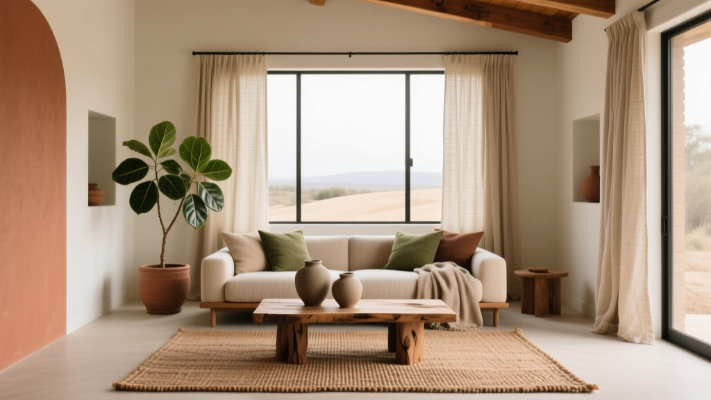
Earth tone color palettes have a rare talent in interior design: they feel timeless without feeling bland, and they read “designed” without feeling overly styled. Drawn from nature—clay, sand, stone, bark, moss, and sunbaked terracotta—these hues create rooms that feel grounded, welcoming, and quietly elevated. If you’re searching for paint colors that age well, photograph beautifully, and work across changing trends, earth tones are a smart foundation.
Earthy color schemes also solve a common homeowner challenge: making a space feel cohesive. Because these hues sit in the middle of the color spectrum (often softened with gray, brown, or black), they blend more easily across open-concept layouts, varied wood tones, and mixed materials. With the right balance of warm and cool undertones, an earth tone palette can brighten a dark room, calm a busy one, or add richness to a blank builder-grade space.
From a color psychology standpoint, earth tones are associated with stability, comfort, and restoration. Think of how you feel in a forest or on a desert hike—regulated, present, and at ease. Translating that feeling into an interior is less about choosing “brown paint” and more about selecting a thoughtful range of naturals: creamy whites, warm beiges, clay pinks, olive greens, and muted charcoals.
What Counts as an Earth Tone Palette?
Earth tones are typically low- to medium-saturation colors inspired by natural materials. They can skew warm (terracotta, camel, ochre) or cool (sage, slate, mushroom), but they share one trait: they feel grounded rather than sugary or neon.
Core Earth Tone Families
- Warm neutrals: cream, ivory, beige, camel, taupe
- Clay and mineral reds: terracotta, rust, brick, dusty rose
- Sunbaked yellows: ochre, mustard, honeyed tan
- Greens from foliage: sage, olive, moss, eucalyptus
- Deep anchors: charcoal, espresso, warm black, deep umber
- Earthy blues (sparingly): denim, slate, stormy blue-gray
Undertones: The Make-or-Break Detail
Two “beiges” can behave completely differently depending on undertone. Earth tones often carry subtle notes of pink, yellow, green, or gray. Use undertones to create harmony:
- Pink-leaning neutrals pair beautifully with terracotta, warm wood, and brass.
- Green-leaning neutrals feel organic with olive, stone, and black accents.
- Gray-leaning “mushrooms” calm busy spaces and balance warm flooring.
Earth Tone Color Schemes That Work in Real Homes
A successful interior color design plan usually includes a light base, a mid-tone body color, and one or two deeper accents. Use the ideas below as starting points, then adjust based on your lighting and fixed finishes.
1) Warm Modern Desert: Cream + Clay + Olive
This is the go-to palette for a relaxed, contemporary look—especially with linen, travertine, and natural oak.
- Base: Benjamin Moore White Dove (OC-17) or Sherwin-Williams Alabaster (SW 7008)
- Clay accent: Farrow & Ball Red Earth (No. 64) or Benjamin Moore Terra Cotta Tile (CC-432)
- Green counterpoint: Sherwin-Williams Evergreen Fog (SW 9130) or Benjamin Moore Saybrook Sage (HC-114)
- Depth: Sherwin-Williams Urbane Bronze (SW 7048) for doors or built-ins
Where it shines: open-concept living/dining spaces, homes with warm wood floors, Southwestern or California casual interiors.
2) Soft Stone & Sand: Greige + Mushroom + Charcoal
If you want earth tones without obvious “color,” lean into mineral neutrals. This scheme reads elevated and architectural.
- Base: Benjamin Moore Classic Gray (OC-23) or Sherwin-Williams Greek Villa (SW 7551)
- Main wall color: Benjamin Moore Edgecomb Gray (HC-173)
- Deeper neutral: Farrow & Ball Elephant’s Breath (No. 229)
- Anchor: Benjamin Moore Wrought Iron (2124-10) (a softer, earthy near-black)
Where it shines: north-facing rooms, modern farmhouse interiors, homes with cooler stone or tile.
3) Rustic Warmth: Camel + Rust + Espresso
This palette is cozy and nostalgic, perfect for traditional details, vintage rugs, and darker woods.
- Base neutral: Sherwin-Williams Natural Linen (SW 9109)
- Rust accent: Benjamin Moore Audubon Russet (HC-51) (try in an entry or dining room)
- Wood-friendly deep: Sherwin-Williams Darkroom (SW 7083) or Benjamin Moore Espresso (AF-180)
Where it shines: libraries, dining rooms, dens, and homes with traditional millwork.
4) Earthy Coastal: Warm White + Driftwood + Sage
Coastal doesn’t have to mean icy blue. This approach stays sun-washed, calm, and natural.
- Base: Benjamin Moore Simply White (OC-117)
- Driftwood neutral: Sherwin-Williams Accessible Beige (SW 7036)
- Sage green: Benjamin Moore October Mist (1495) or Sherwin-Williams Clary Sage (SW 6178)
- Optional contrast: Farrow & Ball Off-Black (No. 57) on window sashes
Where it shines: bedrooms, sunrooms, kitchens with rattan or light oak, homes near water that want a natural mood.
How to Apply Earth Tones Room by Room
Living Room: Create a Layered Neutral Base
Earth tones excel in living rooms because they support texture—bouclé, wool, wood grain, woven shades—without competing.
- Walls: Choose a soft neutral like White Dove or Edgecomb Gray for flexibility.
- Accent wall or built-ins: Try Evergreen Fog or Urbane Bronze for depth.
- Textile strategy: Mix 3–4 earthy materials (linen + leather + jute + wool) rather than adding more colors.
Real room scenario: A long, open living room with a greige sofa can feel flat. Paint built-ins in Urbane Bronze, add a clay-toned rug, and bring in olive pillows. You’ll get contrast, warmth, and a more intentional focal point.
Kitchen: Keep It Clean, Then Add Earthy Contrast
For kitchens, earth tone color schemes work best when the base stays crisp and the warmth comes through cabinetry, islands, or accents.
- Cabinet-friendly whites: Sherwin-Williams Alabaster or Benjamin Moore Simply White
- Island colors: Sherwin-Williams Evergreen Fog (soft and modern) or Benjamin Moore Wrought Iron (dramatic but not harsh)
- Backsplash pairing: Creamy zellige, limestone-look tile, or warm veined quartz complement earth tones best.
Real room scenario: White perimeter cabinets + an Evergreen Fog island + unlacquered brass hardware + warm white walls creates a kitchen that feels current but not trendy.
Bedroom: Use Earth Tones for Restorative Color Psychology
Bedrooms benefit from colors that lower visual stimulation. Muted greens and clay neutrals support calm and comfort.
- Soothing wall colors: Benjamin Moore October Mist or Saybrook Sage
- Warm envelope option: Farrow & Ball Red Earth as an all-over color for a cocoon effect
- Trim: Keep trim in a creamy white (avoid stark bright white if the walls are warm).
Real room scenario: In a bedroom with medium oak furniture, a sage wall color prevents the room from feeling too “orange.” Add camel bedding and a rust throw to bring in warmth without overwhelming the space.
Bathroom: Go Earthy, Not Muddy
Bathrooms can handle deeper earth tones because the hard surfaces bounce light—just be mindful of undertones around tile.
- Best choices: mushroom greiges, warm whites, olive accents
- Paint ideas: Benjamin Moore Edgecomb Gray (walls) + Wrought Iron (vanity)
- Materials: Pair with travertine-look porcelain, warm metal finishes, and off-white grout.
Earth Tone Color Palette Tips Designers Rely On
- Pick a hero undertone and repeat it. If your main neutral leans pink-beige, echo that warmth in art, textiles, and wood tones.
- Use contrast levels, not just different colors. A palette feels richer when it includes light, mid, and deep values (for example: Alabaster + Accessible Beige + Urbane Bronze).
- Balance warm and cool for a natural look. Too warm reads orange; too cool reads gray. A touch of olive or charcoal often corrects the balance.
- Sample paint the right way. Paint a large swatch (at least 12x12) on multiple walls and view it morning, afternoon, and evening.
- Let fixed finishes lead. Flooring, stone, and countertops are your “non-negotiables.” Pull undertones from them to choose paint colors that harmonize.
Common Earth Tone Color Mistakes (and How to Avoid Them)
- Mistake: Choosing a beige that turns yellow or pink at night.
Fix: Check the bulb temperature. Warm LEDs (2700K) intensify warmth; consider 3000K for a balanced glow, and sample paint under your actual lighting. - Mistake: Using only mid-tone browns.
Fix: Add a light (creamy white) and a deep (charcoal/bronze) to create a complete interior color design scheme. - Mistake: Ignoring adjacent room color flow.
Fix: In open layouts, repeat one neutral across spaces, then change accents (terracotta in living room, olive in kitchen) to keep cohesion. - Mistake: Pairing warm earth tones with stark cool white trim.
Fix: Choose a softer white with warmth—White Dove or Alabaster—so transitions feel natural. - Mistake: Over-saturating with terracotta everywhere.
Fix: Use clay and rust as accents: a powder room, a niche, a front door, or textiles. Let neutrals do the heavy lifting.
FAQ: Earth Tone Paint Colors and Color Schemes
What are the best earth tone paint colors for a whole house?
Start with a versatile warm white or soft greige for main areas, then layer accents room by room. Popular whole-home options include Benjamin Moore White Dove, Sherwin-Williams Alabaster, and Benjamin Moore Edgecomb Gray. Add depth with a consistent dark accent like Benjamin Moore Wrought Iron or Sherwin-Williams Urbane Bronze.
Do earth tones work in small rooms?
Yes—earth tones can actually make small rooms feel more intentional and cozy. Use lighter values (creamy whites and sand tones) if you want openness, or go deeper (olive, bronze) for a jewel-box effect with strong lighting and reflective finishes.
How do I keep an earth tone palette from looking dull?
Increase contrast and texture. Pair a soft wall color with crisp trim, add black or bronze accents, and introduce tactile materials (linen, wool, leather, ceramics). Artwork with a bit of blue-gray or off-black can also sharpen the palette without breaking the earthy mood.
What colors go best with terracotta walls?
Terracotta pairs well with creamy whites, warm taupes, olive greens, and soft charcoals. Try: terracotta + White Dove trim + olive textiles + aged brass. Avoid icy grays, which can make terracotta look overly orange.
Which earth tone paint colors look best with oak floors?
For honey oak, choose neutrals with gentle warmth or balanced greige undertones: Sherwin-Williams Accessible Beige, Benjamin Moore Edgecomb Gray, or Benjamin Moore Classic Gray. For red oak, consider green-leaning neutrals and sages like October Mist to visually calm pink undertones.
Are earth tones still in style?
Earth tones are less of a trend and more of a classic category—similar to navy or black. What changes is the styling: today’s look favors softer clays, muted olives, and warm whites paired with natural stone, artisanal tile, and mixed metals.
Next Steps: Build Your Earth Tone Palette with Confidence
If you want a home that feels cohesive, calming, and elevated, start with one anchor neutral and one earthy accent. Use this simple plan:
- Choose a base: warm white or soft greige (sample 2–3 options).
- Select one defining color: olive, terracotta, or mushroom for personality.
- Add a deep: charcoal or bronze for contrast (doors, built-ins, or a vanity).
- Repeat finishes: stick to 1–2 wood tones and 1–2 metal finishes for a cleaner look.
Earth tones reward patience: sample generously, observe undertones in your lighting, and let your home’s materials guide the final choices. For more paint color recommendations, color scheme ideas, and room-by-room interior color design guidance, explore the color guides on thedecormag.com.
More Articles
 Best Melon Paint Colors - The Decor Mag
 Best Pine Green Paint Colors - The Decor Mag
 Split Complementary Color Palette Ideas - The Decor Mag
 Fluted vs Headboard: Understanding the Structural, Aesthetic, and Functional Differences
 Best Watermelon Red Paint Colors - The Decor Mag
 Best Living Rooms for STEP: Design, Layout, and Accessibility Standards for Seniors and Mobility Support
 Best Scarlet Paint Colors - The Decor Mag
 Jewel Tone Color Scheme Ideas - The Decor Mag
 Best Azure Blue Paint Colors - The Decor Mag
 Best Steel Blue Paint Colors - The Decor Mag