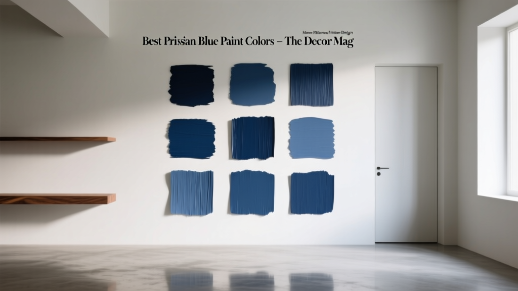
Best Prussian Blue Paint Colors - The Decor Mag
Prussian blue is one of the most compelling hues in interior color design: deep, cool, and quietly dramatic without veering into harsh navy or saturated cobalt. It’s the color of tailored wool coats, vintage ink, and old-world European doors—refined, moody, and incredibly livable when chosen well. For homeowners who want a rich statement color that still reads classic, Prussian blue paint is a smart and versatile choice.
What makes this topic matter is that “Prussian blue” isn’t one single paint color on a fan deck. The name describes a family of blue tones that typically sit between blue and blue-green, with a dark value and a slightly muted character. Depending on undertone and lighting, Prussian blue can lean more inky, more teal, or more slate. Selecting the right version—and pairing it with the right trim, metals, and adjacent colors—can turn a room from heavy to handsome, or from flat to layered and luminous.
This guide breaks down the best Prussian blue paint colors, how to use them room by room, and how to avoid the most common mistakes. Expect practical tips, real application scenarios, and color scheme ideas you can take straight to your next paint sample run.
What Is Prussian Blue, Exactly?
Prussian blue originated as a pigment with historic depth and a slightly green-leaning blue character. In interiors, Prussian blue paint colors typically share these traits:
- Deep value: Dark enough to feel grounding and architectural.
- Cool-to-neutral undertone: Often reads cooler than true navy; some versions tilt teal.
- Muted saturation: Less “electric” than cobalt, more complex than primary blue.
- Elegant contrast range: Pairs beautifully with crisp whites, warm woods, brass, and stone.
If you’re searching for “Prussian blue wall paint” online, you’ll see it used interchangeably with inky navy, blue-black, and deep teal. The best matches generally live in that in-between space: a sophisticated blue with subtle green or gray that keeps it from looking flat.
Color Psychology: Why Prussian Blue Works So Well at Home
Blue is strongly linked to calm, trust, and clarity—reasons it shows up in bedrooms, offices, and spa-like bathrooms. Prussian blue adds an extra layer: depth and stability. Because it’s darker and more complex than airy sky blues, it can make spaces feel:
- More grounded (great for open-plan areas that need definition)
- More intimate (ideal for dining rooms, libraries, and dens)
- More curated (adds an “intentional” designer finish, especially with high-contrast trim)
Design principle to keep in mind: darker colors visually “pull in” walls, which can feel cozy and enveloping—especially when balanced with reflective elements and lighter adjacent finishes.
Best Prussian Blue Paint Colors (Designer-Approved Picks)
These recommendations hit the Prussian blue sweet spot: deep, classic, and flexible across a range of interiors. Always sample first; undertones shift dramatically from room to room.
1) Farrow & Ball “Inchyra Blue” (No. 289)
A cult favorite for a reason. Inchyra Blue reads like a stormy Prussian blue-green—an inky teal-leaning shade that looks historic and modern at once.
- Best for: Built-ins, kitchen cabinetry, libraries, dining rooms
- Undertone: Blue-green with a smoky cast
- Pairs well with: Warm white trim, aged brass, walnut, natural linen
2) Farrow & Ball “Railings” (No. 31)
Railings sits between navy and blue-black. While slightly more neutral than a classic green-leaning Prussian, it delivers that same inky sophistication and looks stunning in lower-light rooms.
- Best for: Accent walls, interior doors, powder rooms, trim for a modern edge
- Undertone: Deep blue with a charcoal influence
- Pairs well with: Crisp whites, marble, polished nickel, cool grays
3) Benjamin Moore “Hale Navy” (HC-154)
A design staple that can read close to Prussian blue in many homes—especially when it picks up cooler daylight or when paired with clean whites. It’s slightly more traditional navy than classic Prussian, but it performs reliably and looks rich rather than flat.
- Best for: Exteriors, kitchen islands, statement cabinets, offices
- Undertone: Strong blue with a balanced depth
- Pairs well with: White oak, warm brass, creamy whites, tan leather
4) Benjamin Moore “Blue Note” (2129-30)
Blue Note is an excellent choice for homeowners who want a moody Prussian effect with a hint of slate. It can read like a deep denim or blue-black depending on lighting.
- Best for: Bedrooms, media rooms, statement walls, built-ins
- Undertone: Blue with a soft gray influence
- Pairs well with: Soft whites, oatmeal textiles, brushed brass, dark woods
5) Sherwin-Williams “In the Navy” (SW 9178)
Deep, confident, and crisp. While it leans more navy than green-tinged Prussian, it’s a practical pick for modern color schemes where you want “ink blue” without teal.
- Best for: Exterior siding, front doors, offices, cabinetry
- Undertone: Clean deep blue
- Pairs well with: Bright white trim, black accents, light stone, concrete
6) Sherwin-Williams “Naval” (SW 6244)
Naval is rich and classic with a slightly softer feel than some ultra-dark blues. If you love the idea of Prussian blue walls but want an approachable, widely used option, Naval is a strong contender.
- Best for: Dining rooms, bedrooms, built-in shelving, exteriors
- Undertone: Deep blue with a subtly muted quality
- Pairs well with: Warm whites, caramel leather, rattan, antique brass
7) Behr “Dark Navy” (S530-7) or “Starless Night” (M520-7)
Behr’s deeper blues can read beautifully Prussian in the right context—especially when you style them with warm woods and creamy whites. “Starless Night” leans very inky; “Dark Navy” is a touch clearer.
- Best for: Budget-friendly transformations, accent walls, doors
- Undertone: Dark blue; varies by pick
- Pairs well with: White trim, light oak, warm metals, woven textures
How to Choose the Right Prussian Blue for Your Lighting
Lighting is the difference between “luxurious ink” and “why does this look black?” Use these guidelines to narrow your shortlist:
North-Facing Rooms (Cool, gray daylight)
- Choose a Prussian blue with a slightly clearer blue base (to avoid looking too gray).
- Consider: Hale Navy, In the Navy, Naval
South-Facing Rooms (Warm, strong sunlight)
- You can handle moodier, smokier versions without them looking dull.
- Consider: Inchyra Blue, Blue Note, Railings
Low-Light Rooms (Small windows, shaded exposure)
- Avoid overly blackened blues unless you want a cocoon effect.
- Use higher-sheen accents (satin on trim, glossy hardware, mirrors) to bounce light.
Real Room Examples: Where Prussian Blue Shines
1) Prussian Blue Living Room Walls
A Prussian blue living room can feel tailored and welcoming—especially when you layer warm textures. Try Prussian blue on all four walls for a library feel, or use it on a single focal wall behind the sofa.
Try this scheme:
- Walls: Benjamin Moore Blue Note
- Trim: warm white (creamy, not icy)
- Furniture: camel leather or oatmeal upholstery
- Accents: brass, walnut, soft black frames
2) Prussian Blue Kitchen Cabinets or Island
Prussian blue kitchen cabinetry reads elevated and timeless, especially with stone counters and warm metals. If you’re nervous, start with the island only and keep perimeter cabinets light.
Try this scheme:
- Island: Farrow & Ball Inchyra Blue
- Perimeter cabinets: warm white
- Countertops: white quartz with soft veining or honed marble look
- Hardware: aged brass or unlacquered brass
3) Dining Room Drama (Without Feeling Heavy)
Prussian blue is a natural fit for dining rooms: it enhances candlelight, makes artwork pop, and feels intimate. Add reflective elements—mirrors, metallics, glass—to keep the room energized.
- Walls: Sherwin-Williams Naval
- Ceiling: keep it a soft white to lift the space
- Lighting: warm bulbs (2700K) for flattering ambience
4) Bedroom Cocoon: Calm, Dark, and Restful
For a bedroom, a Prussian blue with a touch of gray can feel serene rather than stimulating. Pair it with soft textiles and warm wood tones to prevent a chilly mood.
- Walls: Benjamin Moore Blue Note or Farrow & Ball Railings
- Bedding: white, flax, or warm gray
- Nightstands: oak or walnut
5) Front Door or Exterior Accent
Prussian blue on a front door reads classic and confident—especially with white trim and traditional details. On exteriors, deeper blues also hide dirt better than lighter hues while still looking crisp.
- Door: Benjamin Moore Hale Navy or Sherwin-Williams In the Navy
- Hardware: polished brass for tradition, matte black for modern
Winning Color Combinations with Prussian Blue
Prussian blue is a power player in color schemes because it balances beautifully with both warm and cool partners. Use these combinations as a starting point:
Classic Contrast (Timeless and Clean)
- Prussian blue + warm white trim + black accents
- Best for: modern traditional, coastal classic, transitional homes
Warm and Luxurious (Designer Layering)
- Prussian blue + camel leather + walnut + aged brass
- Add: creamy rugs, boucle, linen, or jute
Nature-Inspired (Sophisticated, Slightly Earthy)
- Prussian blue + olive green + clay/terracotta + natural oak
- Best for: craftsman homes, organic modern interiors
Fresh and Airy (For Smaller Spaces)
- Prussian blue + pale greige + crisp white + light stone
- Use: higher LRV neutrals nearby to keep brightness
Application Tips: Finish, Placement, and Paint Testing
- Pick the right sheen:
- Walls: matte/flat for a velvety, upscale look
- Trim/doors: satin or semi-gloss for durability and contrast
- Cabinetry: satin or enamel finish designed for cabinets
- Test with large samples: Paint a 2’x2’ (or larger) swatch on multiple walls. Dark blues change dramatically from morning to night.
- Plan your contrast: Deep Prussian blues look best when they have something lighter or warmer to play against—trim, ceiling, textiles, or art.
- Mind the bulbs: Warm bulbs (2700K–3000K) soften Prussian blue; cool bulbs can make it look icier and more severe.
Common Prussian Blue Paint Mistakes to Avoid
- Choosing a blue that’s too black for the room’s light. If the room is dim, you may lose the blue and end up with near-black walls. Balance with lighter ceilings, brighter trim, and reflective decor.
- Pairing it with a stark, icy white. Many Prussian blues look best next to warm whites rather than ultra-bright “blue whites,” which can make the space feel cold.
- Ignoring undertones in fixed finishes. Check your countertop, tile, flooring, and upholstery. If you have warm wood floors, a slightly green-leaning Prussian can look especially rich; with cool gray floors, choose a more neutral inky blue.
- Skipping a cohesive whole-home color flow. Prussian blue is bold. Make sure adjacent spaces have a supporting neutral palette so the blue feels intentional rather than random.
- Using too many competing “statement” colors. Let Prussian blue be the anchor. Keep other saturated hues limited to art and accents.
FAQ: Prussian Blue Paint Colors
Is Prussian blue the same as navy?
Not exactly. Navy is typically a cleaner, more straightforward dark blue. Prussian blue often carries a subtle green or gray undertone that makes it feel inkier and more complex.
What trim color looks best with Prussian blue walls?
Warm whites are the most forgiving and elevated choice (think creamy, soft whites rather than icy bright white). For a modern look, Prussian blue also works with charcoal or even matching blue trim in a satin finish.
Does Prussian blue make a room look smaller?
Darker colors can visually bring walls in, which may feel cozier. If you want the richness without heaviness, use lighter ceilings, ample lighting, and reflective surfaces like mirrors, glass, and metallic accents.
Is Prussian blue a good choice for kitchen cabinets?
Yes—Prussian blue cabinetry is timeless and pairs well with brass, marble-look counters, and both warm and cool neutrals. Consider using it on an island first if you’re unsure.
What colors go well with Prussian blue in a color scheme?
Top pairings include warm white, greige, camel, walnut, brass, olive green, terracotta, and soft blush. The best combination depends on whether you want classic contrast, warm luxury, or nature-inspired harmony.
How do I keep Prussian blue from looking too cold?
Add warmth through wood tones, creamy textiles, warm metal finishes (brass), and warm lighting (2700K–3000K). Avoid pairing it exclusively with cool grays and icy whites.
Next Steps: Bring Prussian Blue Home with Confidence
Start by identifying where you want depth: an accent wall, cabinetry, a front door, or an entire room. Choose two or three Prussian blue paint colors to sample, view them through the day, and build a supporting palette around warm whites, natural woods, and a few well-chosen metals. With the right undertone and contrast, Prussian blue delivers that rare mix of drama and longevity—bold today, classic for years.
For more paint color ideas, color schemes, and room-by-room guidance, explore our latest color guides on thedecormag.com.
More Articles
 Best Aqua Paint Colors - The Decor Mag
 How to Test Paint Colors Before Committing - The Decor Mag
 How to Create an Uplifting Color Palette - The Decor Mag
 Best Indigo Paint Colors - The Decor Mag
 Earth Tone Color Palette Inspiration - The Decor Mag
 Cheap vs Premium Placement: What $0.12 CPM Really Costs Your Brand
 Best Sky Blue Paint Colors - The Decor Mag
 Best Mustard Yellow Paint Colors - The Decor Mag
 Trends vs Island: How Color Forecasting and Brand Identity Diverge in Commercial Design
 Minimalist Color Palettes That Actually Feel Warm