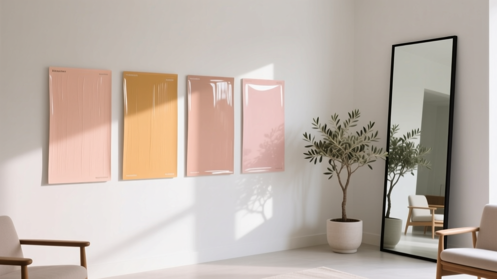
Best Melon Paint Colors - The Decor Mag
Melon paint colors live in that sweet spot between cheerful and sophisticated—warm without being heavy, playful without feeling juvenile. When used well, melon shades bring a soft glow that flatters skin tones, makes rooms feel welcoming, and adds a “designed” layer even to simple spaces. They’re especially appealing to homeowners who want color but aren’t ready for bold reds or loud oranges.
What makes this topic matter right now is how many homes are shifting away from stark whites and cool grays. Melon hues—think cantaloupe, honeydew-leaning peach, or sun-warmed coral—pair beautifully with natural wood, creamy trim, warm metals, and today’s popular textured materials like limewash, plaster finishes, and woven textiles. With the right undertone and lighting, melon can read calm and airy, or vibrant and energizing.
Below, you’ll find the best melon paint colors, how to choose the right one for your light, and real room scenarios that show exactly where melon shines. You’ll also get color schemes, trim advice, and the most common mistakes that make melon feel “off.”
What Counts as a “Melon” Paint Color?
“Melon” isn’t one single color—it’s a family. In interior color design, melon sits between peach and soft orange, sometimes drifting toward coral (pink undertone) or apricot (yellow undertone). The best melon paint colors typically share these characteristics:
- Warmth: A golden or rosy undertone that creates a sunny effect.
- Medium-to-light value: Often brighter than terracotta, softer than true orange.
- Approachable saturation: Enough color to feel intentional, not so much that it overwhelms.
From a color psychology perspective, melon tones are associated with friendliness, optimism, and comfort. They can boost energy in social spaces (kitchens, dining rooms) and create a flattering, gentle warmth in personal spaces (bedrooms, bathrooms).
How to Choose the Right Melon for Your Home
1) Read the Undertone: Peach vs. Apricot vs. Coral
- Peach-leaning melon: Softer, more neutral, great for open-concept spaces.
- Apricot-leaning melon: More golden/yellow, especially sunny in north-facing rooms.
- Coral-leaning melon: More pink/red, lively and modern; can feel bold on all four walls.
2) Consider Natural Light (The Make-or-Break Factor)
- North-facing rooms: Light is cooler—choose a melon with a bit more golden warmth to prevent a dull or gray cast.
- South-facing rooms: Plenty of warm light—choose a slightly softer, less saturated melon to avoid “neon” intensity at midday.
- East-facing rooms: Bright mornings, softer afternoons—melon looks fresh early and calmer later.
- West-facing rooms: Warm, intense late light—test swatches at 4–7 pm so the color doesn’t turn too fiery.
3) Match Melon with Fixed Finishes
Before committing, compare your melon sample to what isn’t changing:
- Flooring (red oak, white oak, tile, carpet)
- Countertops (marble, quartz with warm veining, speckled granite)
- Cabinetry (warm white, cream, greige, natural wood)
- Upholstery and rugs (especially if they carry pinks, rust, or gold)
Best Melon Paint Colors (Designer-Approved Picks)
These recommendations cover a range—subtle peachy melons, brighter cantaloupes, and modern coral-melons. Always test in your home: undertones shift with lighting and adjacent colors.
Soft, Versatile Melon Paint Colors (Great for Whole Rooms)
-
Benjamin Moore Gentle Peach (2168-70)
A delicate peach-melon that reads airy and clean. Ideal for bedrooms, nurseries, and sunrooms where you want warmth without loud color. -
Benjamin Moore Apricot Blush (2174-40)
A balanced apricot with a classic melon feel—warm, friendly, and surprisingly flexible with both creams and light grays. -
Sherwin-Williams Intimate White (SW 6322)
A blush-leaning off-white that can feel “melon-adjacent” in warm light. Perfect when you want a hint of peach without committing to full color. -
Farrow & Ball Pink Ground (No. 202)
A refined rosy-peach that pairs beautifully with warm whites and natural linen textures. Reads “grown-up” and quietly luminous.
True Melon/Cantaloupe Shades (Warm, Sunny, Statement-Friendly)
-
Benjamin Moore Gobi Desert (2110-50)
A warm, sun-baked melon with earthy depth. Works well in living rooms and hallways where you want enveloping warmth that still feels light. -
Sherwin-Williams Persimmon (SW 6339)
A bold, ripe melon-orange. Best as an accent wall, front door, or powder room color—high impact and energetic. -
Behr Papaya Whip (M190-1)
A soft cantaloupe cream that suits kitchens and family spaces. Works nicely with white cabinetry and warm metallics. -
Dunn-Edwards Apricot Glow (DE 5765)
A radiant apricot-melon that feels sunny but not harsh. Great for breakfast nooks and creative studios.
Modern Coral-Melon Options (Fresh, Stylish, and Flattering)
-
Benjamin Moore Coral Gables (2010-40)
A lively coral with melon warmth—vibrant without turning fluorescent. Excellent for a confident dining room or a playful entry. -
Sherwin-Williams Coral Reef (SW 6606)
A punchy coral-melon that reads modern and upbeat. Use in small rooms or as a color-pop on cabinetry or built-ins. -
Farrow & Ball Setting Plaster (No. 231)
A cult-favorite warm blush with a sophisticated plaster-like effect. In many homes it reads as a muted melon-pink—ideal for living rooms and bedrooms with layered neutrals.
Real Room Examples: Where Melon Paint Looks Best
1) Kitchen: Melon as a Warmth Boost
If your kitchen feels cold—think gray tile, stainless steel, or stark white counters—melon can bring the “fresh fruit” warmth that makes the space feel alive.
Try this scenario:
- Walls: Behr Papaya Whip (M190-1)
- Cabinets: Warm white (creamy, not icy)
- Hardware: Brushed brass or champagne bronze
- Accents: Natural wood cutting boards, terracotta pottery, creamy linen roman shades
Design principle at work: Warm analogous harmony (peach–apricot–gold) creates cohesion and comfort.
2) Living Room: A Subtle Melon That Plays Well with Neutrals
In a living room, melon reads most sophisticated when it’s softened—more peach or apricot than pure orange—and paired with calm neutrals.
Try this scenario:
- Walls: Benjamin Moore Apricot Blush (2174-40)
- Trim: Soft white (not bright optic white)
- Sofa: Oatmeal or warm greige upholstery
- Rug: Vintage-inspired with muted terracotta and cream
- Metals: A mix of black + warm brass for contrast
Pro tip: Add one “cooling” element (slate blue pillow, smoky glass, or a charcoal accent) to keep the room from feeling overly sweet.
3) Bedroom: Flattering, Calm, and Cozy
Melon is surprisingly soothing when it’s low-to-medium saturation. It casts a soft, flattering glow—especially at night under warm bulbs.
Try this scenario:
- Walls: Farrow & Ball Pink Ground (No. 202) or Benjamin Moore Gentle Peach (2168-70)
- Bedding: Cream, sand, and clay tones
- Wood tones: Walnut or white oak
- Accent color: Sage green or muted olive (gorgeous complementary balance)
4) Bathroom or Powder Room: High Impact in a Small Space
Small rooms can handle more saturation because you’re not staring at four large walls all day. This is where brighter melon and coral-melon colors shine.
Try this scenario:
- Walls: Sherwin-Williams Coral Reef (SW 6606)
- Vanity: White or warm wood
- Tile: White zellige-style tile, warm marble, or terrazzo with peach flecks
- Mirror + lighting: Brass or bronze for warmth; avoid cool chrome if the room already runs cool
5) Front Door or Accent Piece: Melon as a Color Pop
If you’re color-curious, melon is a friendly entry point. A melon-painted door or built-in adds personality without locking you into an all-over wall color.
- Front door: Sherwin-Williams Persimmon (SW 6339) for bold energy
- Built-ins: Benjamin Moore Coral Gables (2010-40) for a modern twist
Winning Color Schemes with Melon
Melon is easiest to style when you use proven color relationships—complementary contrast, analogous warmth, or grounded neutrals.
Melon + Neutrals (Timeless and Resale-Friendly)
- Melon + creamy white + warm greige
- Melon + sand + natural wood
- Melon + soft black accents (lighting, frames) for definition
Melon + Green (A Designer Favorite)
- Melon + sage + warm white (calm and organic)
- Melon + olive + brass (moody, elevated)
- Melon + deep forest green (dramatic complementary contrast)
Melon + Blue (Fresh, Balanced Contrast)
- Melon + dusty blue + cream (soft, coastal-adjacent)
- Melon + navy + bright white (crisp, classic contrast)
Melon + Terracotta (Layered Warmth)
- Melon + terracotta + camel leather (rich, desert-modern)
- Add a grounding neutral like putty, mushroom, or warm stone to prevent overload
Practical Application Tips (So Melon Looks Intentional)
- Choose the right sheen:
- Walls: Matte/eggshell for most living spaces
- Kitchens/baths: Satin for wipeability
- Trim: Semi-gloss or satin for crisp contrast
- Test big: Paint a 2' x 2' sample (or use peel-and-stick samples) on multiple walls. Watch it morning, midday, and evening.
- Use warm bulbs: Melon can look flat under cool LEDs. Aim for 2700K–3000K for a warm, flattering glow.
- Balance with texture: Add woven shades, nubby rugs, linen drapery, and wood tones so the color feels layered, not sugary.
- Repeat the color quietly: Echo melon in one or two small places (artwork, a vase, a pillow) to make the wall color feel integrated.
Common Melon Color Mistakes to Avoid
- Pairing melon with icy white trim: Bright, cool whites can make melon look harsher. Choose a warm white or creamy off-white instead.
- Ignoring undertones in stone and tile: Pink-leaning melon can clash with very yellow beige tile; golden-apricot melon can fight with cool gray marble. Compare samples directly to your finishes.
- Overloading warm colors: Melon + red + orange + yellow in one room can feel chaotic. Add a grounding neutral or a cooling accent (sage, dusty blue, charcoal).
- Choosing too much saturation for a large, open space: Bold melon can dominate an open-concept plan. Use a softer melon on walls and save the brighter version for accents.
- Testing only under store lighting: Melon shifts dramatically at home. Always test in your actual room lighting and next to your furnishings.
FAQ: Best Melon Paint Colors
Is melon a good paint color for resale?
Yes—when you choose a softer, peach-leaning melon and pair it with warm whites and natural materials. For maximum resale appeal, use melon in bedrooms, powder rooms, or as an accent rather than throughout an entire open floor plan.
What trim color works best with melon walls?
Warm whites and creamy off-whites are the most foolproof. If you like contrast, a soft black or deep bronze accent (doors, hardware, frames) can sharpen the look without cooling the room too much.
Does melon work with gray flooring?
It can, but undertones matter. With cool gray floors, choose a melon that’s slightly muted (less orange, more peach) and warm up the space with wood furniture, warm metals, and creamy textiles.
Can I use melon in a north-facing room?
Absolutely. North light can make colors feel cooler, so select a melon with more golden-apricot warmth to keep the room from looking flat or dusty.
What’s the best way to use melon if I’m afraid of too much color?
Start small: a melon front door, a painted vanity, or an accent wall. You can also pick a melon-tinted off-white (like a blushy warm neutral) to get the effect with less saturation.
Which colors pair best with melon for a cohesive scheme?
Warm whites, sand/tan neutrals, sage and olive greens, dusty blues, and touches of charcoal or black for definition are consistently successful pairings.
Next Steps: Make Melon Work Beautifully in Your Home
Pick three melon candidates—one soft peach, one true cantaloupe, and one coral-leaning option—then test them on multiple walls. Observe them across the day, compare against your flooring and countertops, and decide whether your room needs a gentle glow (soft melon) or a confident statement (brighter melon/coral). Build your color scheme with warm whites, natural textures, and one grounding accent for balance.
For more paint color ideas, undertone guidance, and room-by-room palettes, explore our color guides on thedecormag.com.
More Articles
 How to Choose Colors for a Deck - The Decor Mag
 Best Wine Red Paint Colors - The Decor Mag
 How to Create a Traditional Color Palette - The Decor Mag
 How to Choose Colors for a Rental Property - The Decor Mag
 How to Use the 60-30-10 Color Rule - The Decor Mag
 Best Red Paint Colors for Drama and Warmth - The Decor Mag
 Best Honeydew Paint Colors - The Decor Mag
 How to Choose Colors for a Scullery - The Decor Mag
 How to Choose Colors for a Wine Cellar - The Decor Mag
 Best Cherry Red Paint Colors - The Decor Mag