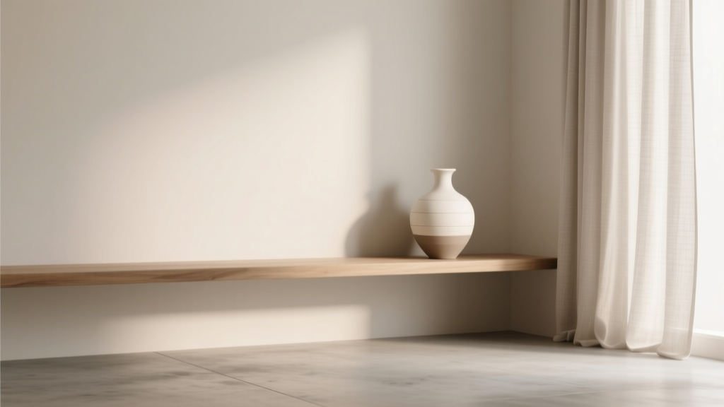
Monochromatic Color Scheme Design Guide - The Decor Mag
A monochromatic color scheme is one of the most powerful tools in interior color design because it does something many homeowners want: it makes a room feel cohesive, calm, and intentionally styled—without relying on a complicated palette. When done well, monochromatic spaces read as elevated and designer-led, even if you’re working with simple materials or a modest budget.
This approach matters because most “why doesn’t my room look pulled together?” problems come down to color fragmentation: too many unrelated undertones, competing accent colors, or random whites that don’t agree with each other. A monochromatic color scheme solves that by anchoring the room to one hue family, then building depth through tint (adding white), tone (adding gray), and shade (adding black).
If you love serene bedrooms, gallery-like living rooms, modern kitchens, or spa bathrooms, monochromatic paint colors and finishes can be your shortcut. The key is knowing how to vary value, texture, and sheen so the room feels layered—not flat.
What Is a Monochromatic Color Scheme (and Why It Works)?
A monochromatic color scheme uses one core hue and expands it through lighter and darker variations. That can mean:
- One color family across the room: walls, trim, ceiling, and furnishings all live in the same hue range.
- Multiple values: pale, mid-tone, and deep versions of the same hue to create contrast.
- Neutral support: metals, wood tones, and small doses of black/white to sharpen edges.
From a design-principles standpoint, monochromatic schemes succeed because they strengthen:
- Harmony: fewer competing undertones means a calmer visual field.
- Rhythm: repeated color cues guide the eye smoothly around the room.
- Emphasis: texture, form, and lighting become the “star,” making interiors feel curated.
Color Psychology: The Mood Benefits of Monochromatic Rooms
Monochromatic color design can shape how a room feels:
- Blues: restful, focused, cooling—ideal for bedrooms and offices.
- Greens: balanced, restorative, nature-connected—great for living rooms and kitchens.
- Warm neutrals (beige, taupe): grounding, welcoming—perfect for open-plan spaces.
- Soft grays: quiet sophistication—best when warmed with wood and textiles.
- Terracotta and clay: cozy, energizing—excellent for dining rooms and entryways.
How to Build a Monochromatic Color Palette (Step-by-Step)
1) Choose Your Anchor Hue and Identify Its Undertone
The most common reason monochromatic paint schemes fail is undertone mismatch. Before selecting paint colors, decide if your hue leans:
- Warm: yellow, red, or brown undertones (often flattering with brass and warmer woods).
- Cool: blue, green, or violet undertones (often crisp with chrome, marble, and cooler woods).
- Neutral-leaning: balanced undertones (easier to pair across finishes and textiles).
Practical tip: Compare paint swatches against a sheet of true white paper in your room’s lighting. Undertones become obvious next to a clean reference.
2) Select Three Values: Light, Mid, and Deep
A reliable monochromatic color scheme formula:
- Light value: ceiling, trim, or large textiles (keeps the room airy).
- Mid value: main wall color (the “body” of the room).
- Deep value: built-ins, an accent wall, cabinetry, or upholstery (adds structure and depth).
If you want a seamless, modern look, keep values closer together. If you want drama, increase the gap between light and deep.
3) Add Dimension with Texture and Sheen (Not More Colors)
In monochromatic interiors, texture does the heavy lifting. Mix:
- Matte or flat paint on walls for a velvety, forgiving finish.
- Eggshell/satin on trim or cabinetry for subtle contrast.
- Textiles: bouclé, linen, velvet, wool, chunky knits.
- Hard materials: honed stone, oak, rattan, plaster, ceramic.
Designer move: Keep the color consistent but shift sheen. A satin-painted bookcase in the same hue as matte walls reads rich and architectural.
Monochromatic Paint Color Recommendations (With Brand References)
These monochromatic color combinations are built for real homes and common lighting conditions. Always sample first; paint colors shift dramatically from morning to evening.
Serene Blue Monochrome
- Light: Benjamin Moore Ice Mist (a pale, airy blue that softens bright light)
- Mid: Benjamin Moore Boothbay Gray (blue-green depth without feeling icy)
- Deep: Farrow & Ball Hague Blue (inky sophistication for built-ins or a moody dining room)
Best for: bedrooms, offices, guest rooms. Pair with white oak, brushed nickel, and crisp white bedding for a modern coastal feel.
Restorative Green Monochrome
- Light: Sherwin-Williams Sea Salt (soft green-gray that reads spa-like)
- Mid: Benjamin Moore Saybrook Sage (classic sage warmth for living spaces)
- Deep: Sherwin-Williams Evergreen Fog or Benjamin Moore Essex Green (for cabinetry, libraries, or accent walls)
Best for: kitchens, living rooms, mudrooms. Add warm brass hardware and creamy off-whites to avoid a chilly look.
Warm Neutral (Beige/Taupe) Monochrome
- Light: Sherwin-Williams Alabaster (soft, creamy white for trim and ceilings)
- Mid: Benjamin Moore Edgecomb Gray (greige that bridges warm and neutral décor)
- Deep: Benjamin Moore Revere Pewter or Sherwin-Williams Accessible Beige (great on built-ins, vanities, or a cozy reading nook)
Best for: open-concept homes, hallways, family rooms. Layer with natural linen, leather, and warm wood tones for depth.
Modern Gray Monochrome (Done Right)
- Light: Benjamin Moore Classic Gray (a warm-leaning, barely-there gray)
- Mid: Sherwin-Williams Repose Gray (balanced, versatile mid-tone)
- Deep: Benjamin Moore Chelsea Gray (strong, grounded charcoal for contrast)
Best for: contemporary living rooms and condos. Prevent flatness with high-contrast textures: black metal, chunky rugs, and layered lighting.
Earthy Terracotta/Clay Monochrome
- Light: Benjamin Moore Swiss Coffee (creamy backdrop that complements warm clay)
- Mid: Sherwin-Williams Cavern Clay (iconic terracotta that feels sunbaked and inviting)
- Deep: Farrow & Ball Red Earth or Sherwin-Williams Rookwood Terra Cotta (great for dining rooms and statement alcoves)
Best for: dining rooms, entryways, and Mediterranean-inspired spaces. Balance with off-white trim and aged brass.
Real Room Examples and Application Scenarios
1) Monochromatic Living Room: Layered Neutrals That Don’t Feel Boring
Scenario: You want a calm living room that still feels styled.
- Walls: Benjamin Moore Edgecomb Gray (mid value)
- Trim/Ceiling: Sherwin-Williams Alabaster (light value)
- Sofa: oatmeal linen
- Rug: tonal ivory/greige pattern (low contrast)
- Accent depth: taupe velvet chair, warm wood coffee table
Why it works: The room stays in one warm-neutral family; depth comes from fabric texture and wood grain, not extra colors.
2) Monochromatic Bedroom: Blue-on-Blue for Better Rest
Scenario: You want a bedroom that feels like a retreat.
- Walls: Benjamin Moore Boothbay Gray
- Ceiling: 50% lighter mix of the wall color (ask the paint store for a half-strength formula)
- Bedding: crisp white with layered blue throws (light to mid)
- Drapery: textured navy or denim linen (deep value)
Pro tip: Use matte paint on the walls and a slightly higher sheen on trim to keep edges clean without introducing a new color.
3) Monochromatic Kitchen: Green Cabinetry That Feels Timeless
Scenario: You want a colored kitchen but fear it will date quickly.
- Cabinets: Sherwin-Williams Evergreen Fog (satin)
- Walls: a lighter green-gray like Sherwin-Williams Sea Salt (eggshell)
- Backsplash: off-white tile with warm grout
- Hardware: brushed brass or aged bronze
- Countertops: warm white quartz or honed stone
Why it works: A single hue family keeps the kitchen cohesive while finishes (metal, stone, tile) create visual variety.
4) Monochromatic Bathroom: Spa Style with Soft Contrast
Scenario: You want a bathroom that feels clean, soothing, and elevated.
- Walls: Benjamin Moore Classic Gray
- Vanity: Benjamin Moore Chelsea Gray (deep, grounding)
- Tile: tonal white/gray with a matte finish
- Textiles: plush towels in the same gray family
Lighting tip: Choose 2700K–3000K bulbs for flattering warmth; overly cool bulbs can make gray schemes feel sterile.
Monochromatic Design Rules Designers Rely On
- Use the 60-30-10 approach—monochrome edition: 60% mid value (walls), 30% light value (trim, large textiles), 10% deep value (anchors like cabinets or accents).
- Repeat the deepest value at least 2–3 times: one deep accent can look accidental; repeating it creates intention (e.g., a navy chair, a framed print, and a lamp base).
- Let one material be the “pattern”: veined stone, wood grain, or a tonal rug adds movement without introducing new colors.
- Respect undertones across the whole room: warm paint + cool white tile can clash; cool paint + creamy trim can look muddy.
Common Monochromatic Color Mistakes to Avoid
- Choosing colors with mismatched undertones: A green-gray wall next to a pink-beige rug can look “off” even if both seem neutral.
- Not enough value contrast: If everything is the same mid-tone, the room can feel flat. Add a deep anchor (charcoal, forest, navy) or lighten the ceiling/trim.
- Ignoring sheen: Using the same finish everywhere can dull architectural details. Use flatter walls and slightly higher sheen on trim/cabinetry.
- Overcorrecting with too many “accent” colors: One or two supporting neutrals (black, warm white, natural wood) is usually enough.
- Forgetting lighting temperature: Paint color is inseparable from light. North-facing rooms often need warmer versions of your chosen hue.
FAQ: Monochromatic Color Schemes
Is a monochromatic color scheme the same as using all one color?
Not exactly. True monochromatic interior design uses variations of one hue—lighter and darker values—plus texture and sheen shifts. A room painted one flat color with no variation often feels unfinished.
What’s the easiest monochromatic scheme for beginners?
Warm neutrals are the most forgiving. Try Sherwin-Williams Alabaster on trim/ceiling, Benjamin Moore Edgecomb Gray on walls, and a deeper greige like Sherwin-Williams Accessible Beige on one built-in or vanity.
Can I use black or white in a monochromatic room?
Yes. Black, white, and natural wood are common “supporting actors” that sharpen a monochromatic palette. The room still reads monochrome as long as the dominant color family stays consistent.
How do I choose trim color in a monochromatic design?
Two reliable options:
- Tinted trim: Use the same paint color as the walls but 50% lighter for soft continuity.
- Coordinated white: Use a white with the same undertone (e.g., creamy whites with warm greiges; crisp whites with cool blues).
Do monochromatic rooms make spaces feel smaller?
Often the opposite. Because there are fewer visual breaks, the eye moves smoothly, which can make a room feel larger. Using a lighter ceiling and thoughtful lighting helps maintain openness.
How can I test monochromatic paint colors without repainting?
Buy sample pots and paint large boards (at least 12x12 inches). Move them around the room—near windows, in corners, and under lamps—then view them morning and night.
Your Next Steps: Make a Monochromatic Scheme Work in Your Home
To apply a monochromatic color scheme with confidence, follow this short plan:
- Pick one hue family that fits the room’s purpose (restful blues, grounding greiges, restorative greens).
- Choose three values—light, mid, deep—keeping undertones consistent.
- Assign each value a job: walls (mid), trim/ceiling (light), anchors (deep).
- Layer texture and sheen to create contrast without adding new colors.
- Sample in your lighting and adjust warmth/coolness before committing.
A well-built monochromatic palette is more than a “safe choice”—it’s a design strategy that elevates everything from architecture to artwork. For more paint color ideas, room-by-room palettes, and interior color design guidance, explore additional color guides on thedecormag.com.
More Articles
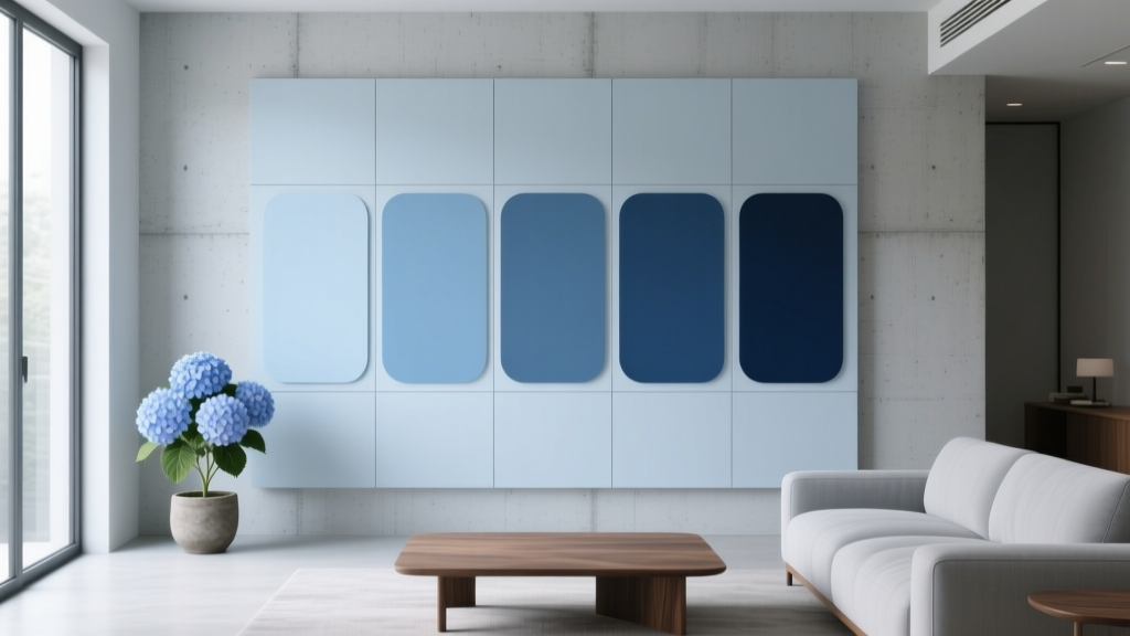 Best Hydrangea Blue Paint Colors - The Decor Mag
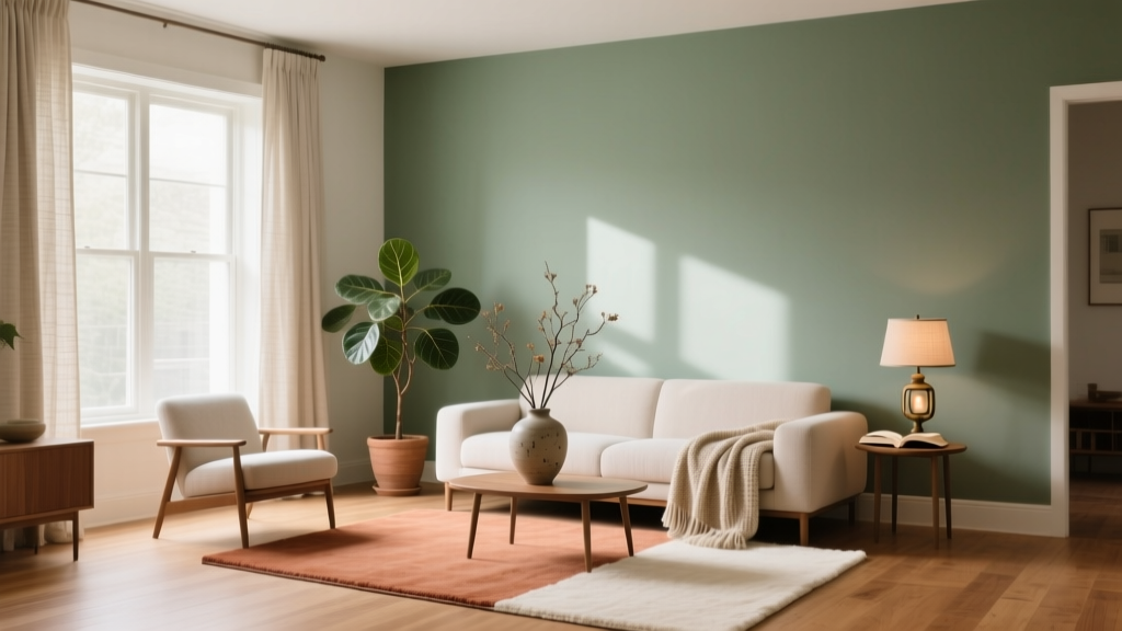 Color Psychology in Home Design Guide - The Decor Mag
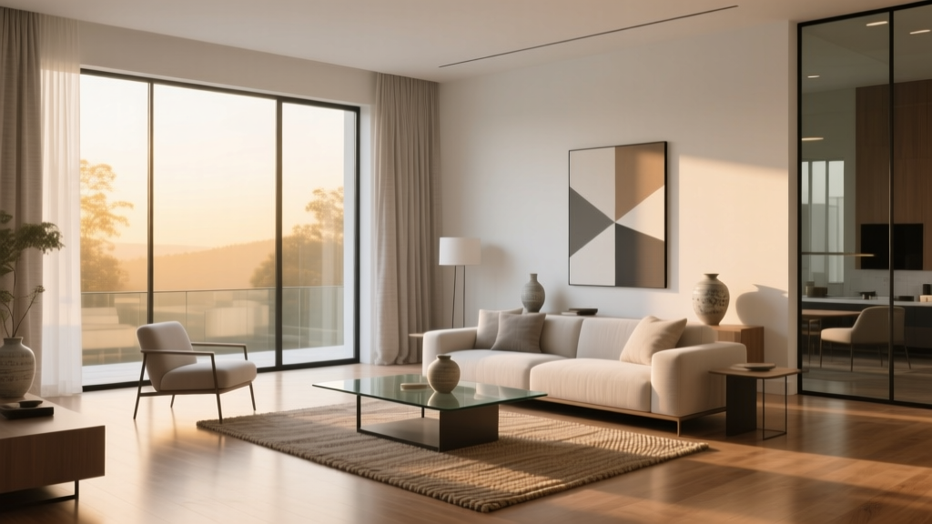 Minimalist Color Palettes That Actually Feel Warm
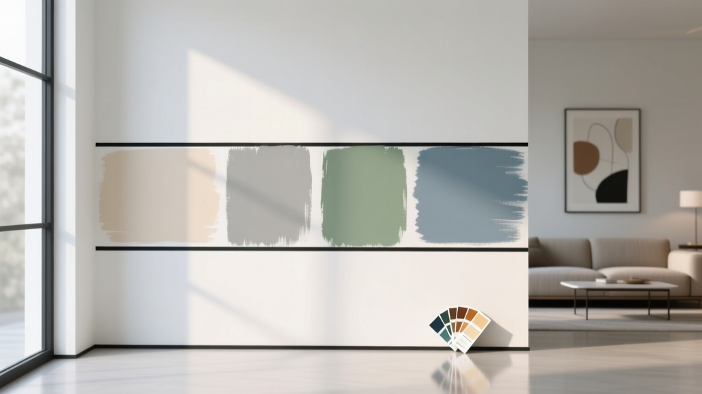 How to Test Paint Colors Before Committing - The Decor Mag
 How to Match Colors to Furniture and Fabrics - The Decor Mag
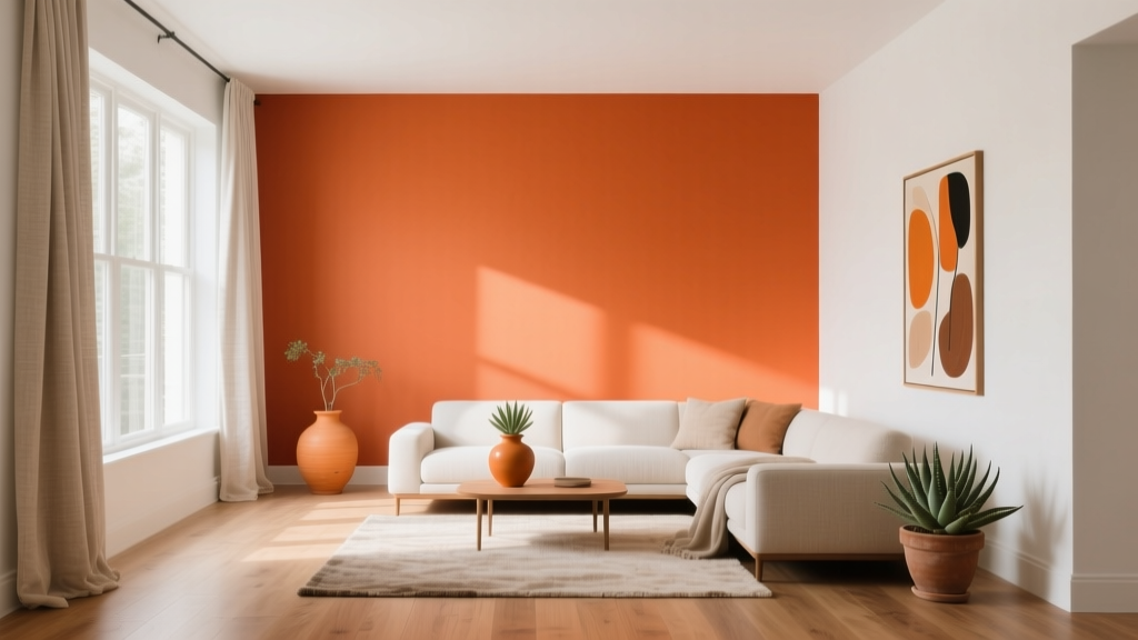 Best Orange Paint Colors for Energy & Warmth (2026)
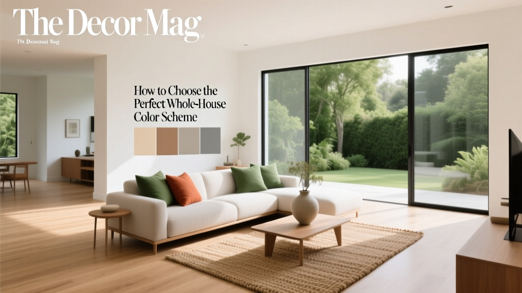 Whole-House Color Scheme: How to Choose (2026)
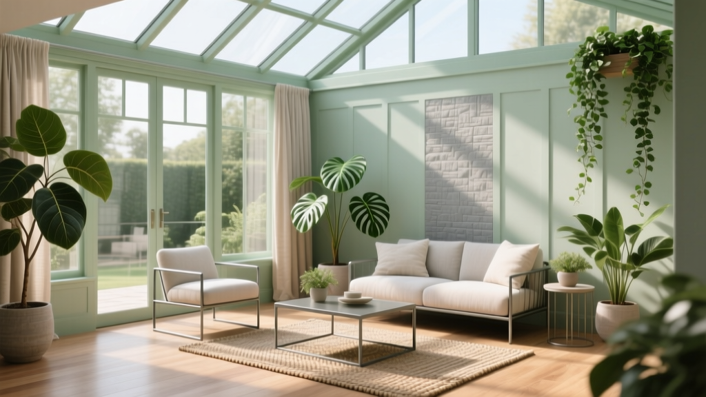 How to Choose Colors for a Conservatory - The Decor Mag
 How to Choose Accent Wall Colors - The Decor Mag
 Best Rose Red Paint Colors - The Decor Mag