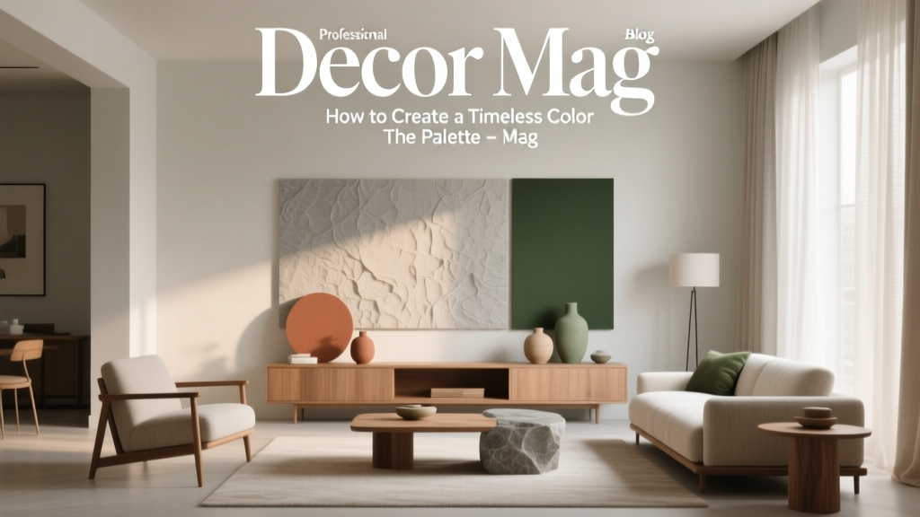
How to Create a Timeless Color Palette - The Decor Mag
Color is one of the fastest ways to make a home feel intentional. It can calm a busy mind, make a room feel brighter without changing a single light fixture, and create the kind of flow that makes a house feel “designed” rather than decorated in pieces. The challenge is that color trends move quickly—today’s must-have green or beige can feel dated when the next wave hits.
A timeless color palette isn’t about playing it safe or living in a sea of white. It’s about choosing interior paint colors and supporting hues that age gracefully, flatter your home’s architecture, and still allow you to evolve your style through textiles, art, and accessories. The best timeless palettes are built on design principles (balance, contrast, and cohesion) and color psychology (how hues influence mood and perception).
This guide breaks down how to build a classic, flexible color scheme—from foundational neutrals to accent colors—plus specific paint color recommendations, real-room scenarios, and the common mistakes that quietly derail an otherwise beautiful plan.
What “Timeless” Really Means in Interior Color Design
Timeless color palettes share a few traits: they’re balanced, adaptable, and grounded in undertones that work in many lighting conditions. They aren’t necessarily “neutral-only”; rather, they rely on hues with longevity—colors that have been used for decades because they work.
Characteristics of a timeless color scheme
- Undertone clarity: Warm or cool undertones are consistent, so rooms feel connected.
- Value range: A mix of light, mid, and dark tones creates depth (and avoids the flat, one-note look).
- Natural inspiration: Colors drawn from stone, clay, wood, linen, and foliage tend to feel enduring.
- Flexible accents: Accent colors can shift with seasons and trends without repainting the whole home.
- Compatibility with materials: Works with flooring, countertops, tile, and existing furniture—especially the expensive, harder-to-change elements.
Start with Your Home’s “Fixed Elements” (The Palette You Already Have)
Before choosing paint colors, inventory what isn’t changing. Timeless design starts with harmony between paint and permanent finishes.
Key fixed elements to match
- Flooring (oak, walnut, LVP, tile, carpet)
- Countertops and backsplash (marble, quartz, granite, zellige)
- Cabinetry color and wood tone
- Large upholstered furniture
- Trim color and window frames
- Natural light direction (north vs. south-facing)
Practical tip: Pull the most dominant undertone from your fixed elements and let it guide your neutral base. For example, a countertop with warm beige veining will usually look best with a warm white or greige, not a crisp blue-white.
Choose a Neutral Foundation That Won’t Date
Neutrals are the backbone of most timeless color palettes. The key is selecting a neutral that complements your lighting and finishes, then using it consistently as a through-line across the home.
Timeless whites (not too stark, not too creamy)
- Benjamin Moore White Dove (OC-17): Soft, classic warm white; excellent for walls and trim when you want gentle contrast.
- Sherwin-Williams Alabaster (SW 7008): Warm, approachable white that suits traditional and modern interiors.
- Farrow & Ball Wimborne White (No. 239): A refined off-white that feels historic and fresh.
Timeless greiges and light neutrals (the “easy living” base)
- Benjamin Moore Edgecomb Gray (HC-173): A beloved greige that reads warm and airy.
- Sherwin-Williams Accessible Beige (SW 7036): Neutral with broad appeal; plays well with warm woods.
- Benjamin Moore Pale Oak (OC-20): Soft, elegant, and versatile; ideal for open floor plans.
Timeless mid-tones (for depth without heaviness)
- Benjamin Moore Revere Pewter (HC-172): A classic that bridges warm and cool elements (test carefully in your lighting).
- Sherwin-Williams Agreeable Gray (SW 7029): Popular for a reason—balanced, calm, and adaptable.
- Farrow & Ball Skimming Stone (No. 241): A sophisticated neutral with a softly aged look.
Color psychology note: Warm whites and greiges tend to feel inviting and restorative, which is why they perform so well in living rooms, bedrooms, and open-plan spaces where comfort matters most.
Build a Timeless Palette Using the 60-30-10 Rule
One of the most practical design principles for interior color schemes is the 60-30-10 rule. It creates balance by dividing your palette into dominant, secondary, and accent colors.
- 60% Dominant: Walls and large visual fields (your main neutral).
- 30% Secondary: Upholstery, rugs, curtains, cabinetry, or a secondary wall color.
- 10% Accent: Art, pillows, lampshades, a painted piece of furniture, or a powder room moment.
Timeless palette formulas that work
- Warm white + camel + black: Clean, tailored, and enduring.
- Greige + soft navy + brass: Classic with a polished edge.
- Ivory + sage + walnut: Calm and nature-forward, great for modern organic interiors.
- Stone gray + crisp white + terracotta: Grounded and welcoming, especially in homes with lots of natural light.
Pick Accent Colors with Longevity (Not Just Trend Power)
The most timeless accent colors are rooted in historical interiors and nature. Think deep blues, muted greens, warm clays, and inky charcoals. These shades can feel current without relying on a short-lived trend.
Classic accent color recommendations
- Navy / Deep Blue: Benjamin Moore Hale Navy (HC-154), Sherwin-Williams Naval (SW 6244)
- Soft Green / Sage: Benjamin Moore Saybrook Sage (HC-114), Sherwin-Williams Evergreen Fog (SW 9130)
- Charcoal / Soft Black: Benjamin Moore Wrought Iron (2124-10), Sherwin-Williams Iron Ore (SW 7069)
- Warm Terracotta / Clay: Farrow & Ball Red Earth (No. 64), Sherwin-Williams Cavern Clay (SW 7701)
Color psychology note: Blue supports focus and steadiness (ideal for offices and bedrooms). Green is associated with balance and restoration (excellent for living rooms, kitchens, and baths). Charcoal adds security and definition, giving a palette structure.
Real Room Examples: Timeless Color Palettes in Action
1) Open-concept living room + kitchen: cohesive, calm, and adaptable
Scenario: You want flow from kitchen to living space without everything matching exactly.
- Main wall color (60%): Benjamin Moore White Dove (OC-17) in eggshell
- Cabinet color (30%): Sherwin-Williams Accessible Beige (SW 7036) or a warm wood tone
- Accent (10%): Benjamin Moore Wrought Iron (2124-10) on hardware, lighting, and a built-in or island
Application guidance: Keep ceilings a clean white (often the same as trim) to visually lift the space. Add contrast with matte black or aged brass to make the palette feel intentional rather than “all neutral.”
2) Bedroom retreat: soft, timeless, and flattering in low light
Scenario: Your bedroom is north-facing and feels cool.
- Main wall color: Benjamin Moore Pale Oak (OC-20)
- Trim: Sherwin-Williams Alabaster (SW 7008) in satin
- Accent color: Sherwin-Williams Evergreen Fog (SW 9130) in bedding, a bench, or an upholstered headboard
Application guidance: Use warm metals (brass, antique gold) and creamy textiles to counteract cool daylight. Avoid icy grays that can turn steely in north light.
3) Dining room: timeless drama without feeling trendy
Scenario: You want a rich, memorable space that still feels classic.
- Walls: Benjamin Moore Hale Navy (HC-154) in matte or eggshell
- Trim and ceiling: Benjamin Moore White Dove (OC-17) in satin
- Accent: Warm wood dining table + linen drapery + brass chandelier
Application guidance: Dark walls look most timeless when paired with crisp, traditional trim lines and warm texture. Add art with off-white mats to keep contrast sharp and elegant.
4) Bathroom: spa-like, classic, and clean
Scenario: You want a bathroom color scheme that won’t feel dated next to tile.
- Walls: Sherwin-Williams Agreeable Gray (SW 7029) or a warm white like Alabaster (SW 7008)
- Vanity: Benjamin Moore Wrought Iron (2124-10) for a grounded, timeless base
- Accent: Soft green towels + natural wood accessories
Application guidance: If your tile is cool (blue-gray marble), lean into cool-leaning neutrals; if your tile is warm (travertine, cream porcelain), keep walls and trim warm.
How to Test Paint Colors Like a Designer
Even “perfect” paint colors can fail if undertones clash or lighting changes the read. Testing is what turns good taste into reliable results.
- Sample in multiple spots: Paint at least two walls (especially one in shadow) with large swatches.
- Check at three times of day: Morning, midday, and evening under lamps.
- Compare to true white: Hold a sheet of white paper up to spot undertones (pink, green, yellow, or blue).
- Match to your textiles: Bring in your rug, sofa fabric, and wood samples while evaluating.
- Use peel-and-stick samples: Great for clean testing; just remember sheen and texture can still differ from full paint.
Common Color Mistakes That Make a Home Feel Dated
- Ignoring undertones: A “neutral” can look pink, green, or purple next to the wrong flooring.
- Choosing paint before hard finishes: Paint is easier to change than tile and countertops—build around the permanent items.
- Overusing one color everywhere: A timeless palette still needs contrast; vary values (light to dark) to create dimension.
- Following trends without adapting to your light: A viral gray or beige may fall flat in your exposure.
- Forgetting sheen: High-gloss on walls highlights flaws; too-flat trim can look dull. (Many designers like eggshell walls, satin trim.)
- Skipping color continuity: When each room has unrelated undertones, the house feels choppy—even if each room is pretty on its own.
Create Whole-Home Flow: A Simple Step-by-Step Plan
- Pick one main neutral for the majority of walls (especially hallways and open areas).
- Select 1–2 supporting neutrals (one lighter, one deeper) for flexibility in bedrooms, offices, or adjacent rooms.
- Choose 2 accent colors (a “calm” accent like sage or dusty blue, plus a “bold” accent like navy or charcoal).
- Repeat finishes (hardware metal, trim white, wood tone) to visually connect spaces.
- Use color zoning rather than random variety: keep public areas cohesive; allow private rooms to shift slightly.
FAQ: Timeless Paint Colors and Color Schemes
What are the best timeless neutral paint colors?
Designer favorites include Benjamin Moore White Dove (OC-17), Sherwin-Williams Alabaster (SW 7008), Benjamin Moore Pale Oak (OC-20), and Sherwin-Williams Accessible Beige (SW 7036). The “best” choice depends on your flooring undertone and natural light.
How do I choose between warm vs. cool neutrals?
Match your dominant fixed elements. Warm woods, beige stone, and creamy tile usually prefer warm whites/greiges. Cool gray tile, bright white quartz, and chrome finishes often work better with cooler whites and soft grays. When in doubt, choose a balanced greige and test it next to your finishes.
What’s a timeless accent color that won’t feel trendy?
Navy and charcoal are two of the most enduring choices. Try Benjamin Moore Hale Navy (HC-154) or Sherwin-Williams Naval (SW 6244) for navy, and Benjamin Moore Wrought Iron (2124-10) or Sherwin-Williams Iron Ore (SW 7069) for charcoal.
How many colors should a whole-house palette include?
A strong whole-home color scheme can be built with 5–7 total colors: one primary neutral, one trim color (often the same as the primary in a different sheen), 1–2 supporting neutrals, and 2 accent colors. This keeps your interior color design cohesive without feeling repetitive.
Should trim match walls for a timeless look?
Matching can be timeless in modern homes, especially with soft whites or greiges. For a more classic feel, use a slightly brighter or cleaner trim color in satin to frame the architecture (for example, White Dove trim with Pale Oak walls).
How do I keep a timeless palette from feeling boring?
Layer texture and contrast: natural wood, woven materials, stone, linen, and a few dark anchors (charcoal, black, or navy). Timeless rooms rely on depth—mixing matte and sheen, light and dark, smooth and tactile surfaces.
Next Steps: Build Your Palette and Make It Yours
Choose a neutral foundation that suits your light and fixed finishes, then add supporting shades and accents using the 60-30-10 rule. Test paint samples in multiple spots, commit to a clear undertone direction, and use contrast—at least one deeper color—to give your home structure and sophistication.
If you’re ready to refine your choices room by room, explore more paint color ideas, color scheme guides, and interior color design inspiration at thedecormag.com.
More Articles
 How to Choose Colors for a Mudroom - The Decor Mag
 Best Sapphire Blue Paint Colors - The Decor Mag
 How to Create a Soothing Color Palette - The Decor Mag
 How to Choose Colors for a Courtyard - The Decor Mag
 Best Brown Paint Colors for Cozy Rooms - The Decor Mag
 Best Celery Paint Colors - The Decor Mag
 Best Apricot Paint Colors - The Decor Mag
 Color Wheel Basics for Home Decorating - The Decor Mag
 Best Lapis Blue Paint Colors - The Decor Mag
 Friendly and Smart Compared: How Human-Centered Design and AI Intelligence Shape Modern Product Experiences