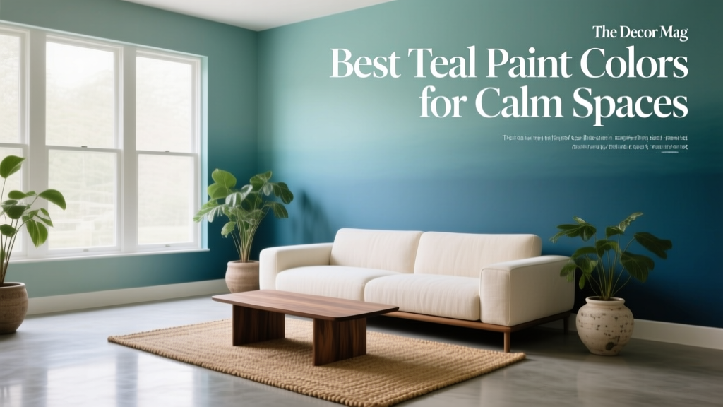
Best Teal Paint Colors for Calm Spaces - The Decor Mag
Teal has a rare talent in interior color design: it can feel grounded like blue, renewing like green, and quietly sophisticated like a muted jewel tone. When homeowners want a calm space that doesn’t read cold, teal paint colors often land in the sweet spot—serene, lived-in, and layered enough to keep a room from feeling flat.
This topic matters because “calm” isn’t a one-size-fits-all mood. A teal that feels spa-like in a bright bathroom can look moody in a north-facing bedroom. The best results come from understanding undertones, light exposure, and how teal interacts with surrounding finishes. With the right teal wall color (or cabinet color, or accent color), you can create a restful palette that still feels intentional and stylish.
Below you’ll find designer-trusted teal paint color recommendations, room-by-room application scenarios, calming color schemes to pair with teal, and the most common mistakes that make teal feel chaotic instead of comforting.
Why Teal Works for Calm Interiors (Color Psychology + Design Principles)
From a color psychology standpoint, teal borrows the steadiness of blue and the restorative, nature-linked associations of green. That combination supports a sense of balance—one reason teal shows up in spa environments, wellness branding, and tranquil bedrooms.
What “calm teal” looks like in practice
- More gray, less neon: Calm teals tend to be muted or softened with gray, which reduces visual intensity.
- Mid-tone to deep tones: Very pale teals can read icy; very saturated teals can feel energetic. Middle values and softened darks are typically more relaxing.
- Undertone awareness: Teal can lean greener (fresh, coastal, botanical) or bluer (quiet, classic, water-inspired). The undertone will steer the mood.
Design principle: contrast controls the vibe
A calm room isn’t always low-contrast, but the contrast needs to be deliberate. Teal walls paired with high-contrast black-and-white patterns can feel graphic. Teal paired with creamy whites, pale woods, and warm metals reads softer and more restorative.
How to Choose the Right Teal Paint Color for Your Light
Teal is extremely responsive to lighting conditions, which is why testing is non-negotiable. Before you commit, decide what kind of calm you want: airy and coastal, deep and cocooning, or balanced and classic.
Use this quick guide to match teal to your space
- North-facing rooms (cool light): Choose teals with a touch more green or warmth to avoid a steely, chilly cast.
- South-facing rooms (warm light): You can handle deeper, bluer teals without the room feeling too cold.
- East-facing rooms (warm morning, cooler afternoon): Mid-tone teals hold up best across shifting daylight.
- West-facing rooms (dramatic warm afternoon): Bluer teals can prevent the room from turning overly yellow or muddy later in the day.
Sampling tips that prevent expensive regrets
- Test at least two teals: One that leans blue, one that leans green—then compare.
- Paint a large sample: A 2' x 2' patch (or a peel-and-stick sample) tells the truth better than a tiny swatch.
- Check at 3 times of day: Morning, afternoon, evening. Teal can shift dramatically under lamplight.
- Compare against your fixed finishes: Tile, countertops, flooring, upholstery—these set the undertone rules.
Best Teal Paint Colors for Calm Spaces (Designer-Approved Picks)
These teal paint colors are widely used because they’re versatile, sophisticated, and less likely to feel loud. Availability can vary by region, but most can be color-matched across brands.
1) Benjamin Moore Aegean Teal (2136-40)
A modern classic: a soft, muted teal with a gentle gray cast. It reads calm and grounded rather than beachy-bright.
- Best for: Bedrooms, living rooms, home offices, dining rooms
- Undertone: Blue-green with noticeable gray
- Pairs well with: Warm white trim (e.g., Benjamin Moore White Dove OC-17), light oak, aged brass
2) Sherwin-Williams Riverway (SW 6222)
A deeper teal-leaning blue that creates a quiet, enveloping mood—great when you want calm with a hint of drama.
- Best for: Accent walls, libraries, powder rooms, moody bedrooms
- Undertone: Blue-forward teal
- Pairs well with: Soft greige, creamy whites, walnut, black accents in small doses
3) Sherwin-Williams Rainwashed (SW 6211)
A light, airy blue-green that feels like a breath of fresh air. While not a deep teal, it’s a reliable option for calm spaces where you want a brighter, spa-like look.
- Best for: Bathrooms, nurseries, serene kitchens, laundry rooms
- Undertone: Blue-green with a soft, misty quality
- Pairs well with: White subway tile, pale quartz, brushed nickel, light rattan
4) Farrow & Ball Green Blue (No. 84)
Farrow & Ball’s take is complex and quietly historic—teal that shifts with light and feels layered rather than flat.
- Best for: Traditional homes, reading rooms, entryways, built-ins
- Undertone: Balanced blue-green with depth
- Pairs well with: Off-white trim, antique brass, warm stone, linen textiles
5) Farrow & Ball Dix Blue (No. 82)
A calmer, more blue-leaning teal that reads refined and timeless—excellent for creating a cozy, quiet room without going too dark.
- Best for: Bedrooms, studies, hallways
- Undertone: Blue with a softened teal influence
- Pairs well with: Soft white, tan leather, warm woods
6) Behr Blueprint (S470-5)
A balanced teal that feels approachable and modern. This is a great pick if you want a clear teal statement that still reads calm in most lighting.
- Best for: Accent walls, guest rooms, mudrooms, cabinetry
- Undertone: True teal with moderate saturation
- Pairs well with: White trim, matte black hardware, natural fiber rugs
7) Benjamin Moore Wythe Blue (HC-143)
Often described as a soft blue-green, Wythe Blue sits near teal territory and performs beautifully in calm, collected spaces—especially those with warm light and classic trim details.
- Best for: Sunrooms, kitchens, bedrooms, open-plan living areas
- Undertone: Gentle green with a blue wash
- Pairs well with: Creamy whites, pale gray stone, warm oak
Real Room Examples: How to Use Teal for a Calm Look
Bedroom: Cocooning teal walls with soft contrast
For a restful bedroom, choose a muted mid-tone teal like Benjamin Moore Aegean Teal or a deeper shade like Sherwin-Williams Riverway on all four walls for a wrapped, quiet feeling.
- Trim: Warm white (avoid stark, icy whites)
- Bedding: Layer linen in ivory, oatmeal, or pale gray
- Accents: Aged brass reading lamps, warm wood nightstands
Bathroom: Spa-like teal with clean materials
In a bathroom, lighter teals such as Sherwin-Williams Rainwashed create a crisp, calming backdrop—especially with white tile and minimal clutter. If you love a boutique-hotel vibe, try a deeper teal on the vanity and keep walls light.
- Wall color: Rainwashed for airy calm
- Vanity: A deeper teal like Riverway for contrast
- Finishes: Brushed nickel for cool clarity or unlacquered brass for warmth
Living room: Teal as a “quiet statement”
Teal works beautifully in living rooms because it holds its own next to wood tones, artwork, and textiles. A shade like Farrow & Ball Green Blue reads elevated and layered, especially in homes with traditional millwork.
- Walls: Green Blue for depth
- Upholstery: Cream boucle, oatmeal linen, or camel leather
- Rug: Soft pattern with warm neutrals to keep the mood relaxed
Kitchen & cabinetry: Teal as a grounding anchor
Teal kitchen cabinets can feel both fresh and timeless when you pick a teal with gray built in. Consider Benjamin Moore Aegean Teal or Behr Blueprint on lower cabinets or an island, paired with light countertops.
- Cabinets: Teal on lowers, warm white on uppers
- Countertops: White quartz, pale marble look, or light butcher block
- Hardware: Aged brass for warmth; matte black for crisp modern contrast
Home office: Focus-friendly teal for visual calm
Teal can reduce the starkness of a typical white office without distracting you. Try a mid-tone teal behind the desk (or on built-ins) to create a restful focal plane that still feels energized enough for productivity.
- Best picks: Aegean Teal, Green Blue, Riverway (if you want moody)
- Style tip: Keep shelves curated and repeat warm neutrals to avoid visual clutter
Calming Color Schemes That Pair Beautifully with Teal
Teal plays nicely with both warm and cool palettes. The key is choosing supporting colors that keep the overall color scheme soothing, not busy.
Go-to teal color combinations
- Teal + warm white + natural wood: The easiest calm formula; works in nearly any room.
- Teal + greige + brass: Sophisticated and grown-up; ideal for living rooms and bedrooms.
- Teal + blush or muted terracotta: Adds gentle warmth and softness; great for textiles and art.
- Teal + navy: Layered and tranquil when both are muted; keep patterns minimal.
- Teal + sage green: Nature-forward and calming; use one as the main and the other as an accent.
Material pairings that make teal feel calmer
- Warm metals: Aged brass, antique bronze
- Soft textures: Linen, wool, boucle, cotton matelassé
- Organic elements: Oak, walnut, rattan, jute
- Stone: Warm white marble, travertine, creamy limestone look
Application Guidance: Where Teal Looks Best (and How Much to Use)
Teal can be a wall color, an accent color, or a cabinetry finish. The calmest results usually come from choosing one “hero” teal and repeating it subtly around the room.
3 calm ways to use teal paint
- All-over walls: Best for muted mid-tones and deeper teals in bedrooms and dens. Use warm white trim to soften edges.
- Single accent wall: Works in open floor plans or smaller rooms. Choose an accent wall that supports the room’s function (behind the bed, behind the sofa, behind the desk).
- Cabinets or built-ins: Teal on cabinetry feels custom and calm, especially with simple hardware and clean counters.
Finish recommendations for a serene look
- Walls: Matte or eggshell to reduce glare and visual noise
- Trim: Satin for wipeability and gentle contrast
- Cabinetry: Satin or semi-gloss (depending on brand recommendations and durability needs)
Common Teal Paint Mistakes (and How to Avoid Them)
- Choosing teal from a screen: Teal shifts heavily with light. Always sample in the room.
- Ignoring undertones in fixed finishes: Teal next to a very warm beige tile can turn muddy; next to icy gray can look harsh. Match undertones on purpose.
- Pairing teal with stark, cool whites: Bright, blue-white trim can make teal feel colder. Try warmer whites for calm.
- Overloading the room with competing blues/greens: Too many similar saturated colors can feel chaotic. Choose teal as the main, then keep supporting colors quieter.
- Forgetting about evening lighting: Warm bulbs can make some teals look greener; cool bulbs can make them look sharper. Aim for consistent bulb temperature across the space (many calm homes prefer soft warm-white lighting).
FAQ: Teal Paint Colors for Calm, Beautiful Rooms
Is teal a good color for a relaxing bedroom?
Yes—muted teal paint colors are especially effective for bedrooms because they feel soothing without being sterile. Look for teals softened with gray (such as Benjamin Moore Aegean Teal) for the most calming effect.
What undertone should I choose: blue-leaning teal or green-leaning teal?
Blue-leaning teals tend to feel quieter and more classic; green-leaning teals often feel fresher and more botanical. Use your room’s light and surrounding finishes to decide: cool rooms often benefit from slightly greener teals, while sunny rooms can handle bluer teals.
What trim color looks best with teal walls?
Warm whites are the most foolproof choice for calm interiors. A creamy white trim softens teal and keeps the room feeling welcoming, especially under warm lighting.
Can teal work in a small room without feeling dark?
Yes. Choose a lighter, misty teal (like Sherwin-Williams Rainwashed) or use teal on one wall, cabinetry, or built-ins. Also keep ceilings and trim lighter to maintain brightness.
What colors pair best with teal for a calm color scheme?
For a relaxing palette, pair teal with warm white, greige, sand, soft blush, muted terracotta, or natural wood tones. Keep patterns subtle and repeat warm neutrals to maintain visual quiet.
Should I use teal in an open floor plan?
You can, but continuity matters. Use teal in a defined zone (a dining area or built-ins) and connect it to the rest of the home by repeating the color in textiles, artwork, or accessories. This creates flow without overwhelming the space.
Next Steps: How to Commit to the Right Teal with Confidence
Start by narrowing your goal—airy spa calm or cozy cocoon calm—then choose two teal paint colors to sample (one bluer, one greener). Test them on multiple walls, view them day and night, and confirm the undertone works with your flooring, tile, and countertops. Once you’ve picked your teal, build a calming color scheme around warm whites, natural woods, and soft textures so the room feels restful from every angle.
For more paint color guides, color scheme ideas, and interior color design tips, explore our latest color articles on thedecormag.com.
More Articles
 How to Use Color to Define Spaces - The Decor Mag
 Best Indigo Paint Colors - The Decor Mag
 How to Use Color to Create Intimacy - The Decor Mag
 Best Cream Paint Colors for Warm Neutrals - The Decor Mag
 Open Floor Plan Color Transitions (2026)
 Best Sky Blue Paint Colors - The Decor Mag
 Best Key Lime Paint Colors - The Decor Mag
 How to Use Color to Create Depth - The Decor Mag
 2026 Color Trends: Earth Tones Making a Comeback
 How to Use Color to Create Coolness - The Decor Mag