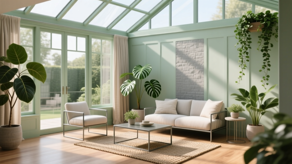
How to Choose Colors for a Conservatory - The Decor Mag
A conservatory is one of the most color-sensitive spaces in a home. It’s wrapped in glass, flooded with shifting daylight, and visually tethered to the garden—meaning your paint colors will look different hour to hour, season to season. A hue that feels calm at 9 a.m. can turn chilly by late afternoon; a “soft neutral” can suddenly read yellow, pink, or gray depending on the foliage outside.
That’s why choosing a conservatory color scheme isn’t just about picking a favorite paint chip. It’s about understanding light, reflection, undertones, and how color psychology shapes the way the room feels. Get it right, and a conservatory becomes a restorative retreat, a luminous dining room, or a lively indoor-outdoor entertaining zone. Get it wrong, and it can feel glaring, washed out, or oddly disconnected from the rest of your interior design.
This guide walks you through practical, designer-approved steps, with specific paint color recommendations, real application scenarios, and common mistakes to avoid—so you can choose conservatory paint colors with confidence.
Start with the Conservatory’s Light: The Make-or-Break Factor
1) Identify your conservatory orientation
Natural light behaves differently based on direction, and that changes how wall paint colors read:
- North-facing: Cooler, flatter light. Warm neutrals and creamy whites help prevent a gray, underlit feel.
- South-facing: Bright, warm, consistent light. You can handle deeper colors, cooler tones, and crisp whites without the room feeling gloomy.
- East-facing: Warm morning light, cooler afternoons. Balanced neutrals and soft greens/blue-grays work beautifully.
- West-facing: Cooler mornings, intense golden afternoon sun. Watch for paint colors that go overly warm (beige can turn orange).
2) Understand “glassbox effect” and reflections
In a conservatory, color comes from everywhere: greenery, terracotta pots, paving, sky, even neighboring buildings. These reflections can tint your interior paint colors. A pale gray might pick up green from the garden; a white might look blue in winter or creamy in summer.
3) Test paint the right way (this matters more here than any other room)
- Paint large samples (at least 24" x 24") on multiple walls.
- Check them in the morning, mid-day, golden hour, and at night with lights on.
- Evaluate next to flooring, upholstery, and the view outside.
Choose Your Mood: Color Psychology for Conservatories
A conservatory can be many things: a sunny breakfast room, a plant-filled reading nook, or a formal sitting area. Let the room’s primary use guide your color scheme.
- For calm and retreat: soft greens, muted blue-grays, warm whites. These hues echo nature and reduce visual noise.
- For energy and sociability: warm neutrals, sun-baked terracottas, honeyed creams, and optimistic yellows—used thoughtfully to avoid glare.
- For elegance: tailored neutrals (greige, stone, putty), deep accent colors (ink, forest, charcoal), and crisp trim.
Color psychology tip: saturated warm colors (like strong yellow) can feel amplified under strong daylight—great in small doses, less forgiving on every wall.
Build a Conservatory Color Scheme in 3 Layers
Layer 1: Background walls and ceiling
In many conservatories, the “walls” are limited—often a dwarf wall, plaster sections, or a ceiling detail. That makes your main wall color even more noticeable. Choose a background color that supports light rather than fighting it.
Layer 2: Trim, frames, and architectural details
Window frames, skirting, beams, and interior doors become key design elements. Crisp white trim can look sharp, but in a bright conservatory it can also feel stark. A softer off-white can be more forgiving.
Layer 3: Anchors (flooring, rugs, furniture, and textiles)
Because glass creates visual openness, your furniture and textiles do the heavy lifting for warmth and contrast. A well-chosen rug, Roman blinds, or upholstered dining chairs can “ground” a pale paint color scheme.
Best Paint Colors for Conservatories (With Brand References)
Warm whites and soft neutrals (timeless and light-friendly)
These shades keep a conservatory airy without turning clinical. They also work with most garden views and interior color palettes.
- Benjamin Moore White Dove (OC-17): a soft, warm white that stays calm in changing light; ideal for trim or walls.
- Sherwin-Williams Alabaster (SW 7008): creamy without being yellow; excellent for north-facing conservatories.
- Farrow & Ball Pointing (No. 2003): a warm off-white with a gentle red undertone; beautiful with terracotta floors and rattan.
- Farrow & Ball Skimming Stone (No. 241): a relaxed greige that adds softness and pairs well with greenery.
Application scenario: A bright south-facing conservatory used as a dining room can feel balanced with White Dove on walls and a slightly crisper white on trim, plus a natural jute rug and oak table to add warmth.
Nature-inspired greens (the most flattering link to the garden)
Green is a natural fit for conservatories because it harmonizes with outdoor foliage. Muted, gray-green shades feel sophisticated and won’t overwhelm in full daylight.
- Farrow & Ball Mizzle (No. 266): a soft gray-green that reads serene; works especially well in east-facing light.
- Farrow & Ball Pigeon (No. 25): blue-green with depth; elegant for built-ins or a dwarf wall.
- Benjamin Moore Saybrook Sage (HC-114): warm, classic sage; ideal if your conservatory feels cool.
- Sherwin-Williams Sea Salt (SW 6204): a light green-blue that stays airy; lovely for a relaxed sitting space.
Color combination: Pair a muted green wall (Mizzle or Saybrook Sage) with:
- Trim in Alabaster or White Dove
- Accents in warm brass, natural linen, and honey-toned wood
- Textiles with a touch of clay or rust for contrast
Soft blues and blue-grays (fresh, elegant, and light-reflective)
Blue can feel crisp and restorative, but it’s sensitive to cold light. In north-facing conservatories, choose blue-grays with a touch of warmth.
- Benjamin Moore Palladian Blue (HC-144): a classic spa-like blue-green; works beautifully with white trim and wicker.
- Sherwin-Williams Misty (SW 6232): a gentle blue-gray; a safe choice when you want calm without strong color.
- Farrow & Ball Light Blue (No. 22): softly traditional; charming for a breakfast conservatory with patterned cushions.
Real room example: A conservatory reading nook with pale blue-gray walls (Misty), a white ceiling, and layered textiles (linen drapes, wool rug, boucle chair) feels cool in summer and cozy in winter when paired with warm lamps.
Sunny creams and gentle yellows (for a cheerful conservatory—without glare)
Yellow is uplifting, but full sun can turn it intense. Aim for creamy, muted versions rather than high-chroma lemon shades.
- Benjamin Moore Hawthorne Yellow (HC-4): a historic, grounded yellow that pairs well with dark woods and botanical prints.
- Farrow & Ball Hay (No. 37): a soft straw tone that feels natural with stone floors.
Where it works best: North- and east-facing conservatories, especially if the space is used for breakfast or morning coffee. Use yellow on a dwarf wall or a single plaster wall if you’re wary of it taking over.
Deep accents (to stop the room from feeling “floaty”)
Many conservatories feel visually unanchored because they’re so light. A deep accent color adds structure and designer-level contrast.
- Farrow & Ball Hague Blue (No. 30): dramatic blue-green; stunning on cabinetry, an interior door, or a feature wall.
- Benjamin Moore Hale Navy (HC-154): a reliable navy that holds its depth in strong sunlight.
- Sherwin-Williams Iron Ore (SW 7069): a soft charcoal that looks modern on frames or trim.
Application scenario: Paint the dwarf wall in Hague Blue, keep upper walls in Pointing, add a striped rug, and finish with matte black lantern pendants. The result feels tailored and intentional, not overly “sunroom casual.”
Match the Conservatory to the Rest of the House
A conservatory often connects to a kitchen, dining room, or living space—so color continuity matters. You don’t need an exact match, but you do want a shared undertone.
- If your interior palette leans warm (oak, cream, terracotta), choose warm whites, sages, and creamy neutrals.
- If your home is cool and modern (gray stone, chrome, black), lean into crisp off-whites, blue-grays, and deep charcoals.
- If you love heritage style, try historic colors: muted ochres, smoky greens, and chalky off-whites.
Quick test: Hold your conservatory paint sample next to the adjacent room’s wall color and trim color. If they fight, adjust undertone (more warm or more cool) before committing.
Conservatory Color Schemes: 5 Ready-to-Use Palettes
1) Soft Botanical (calm and garden-linked)
- Walls: Farrow & Ball Mizzle
- Trim: Benjamin Moore White Dove
- Accents: warm brass, linen, natural oak
2) Classic Airy Neutral (bright, timeless)
- Walls: Sherwin-Williams Alabaster
- Trim: Sherwin-Williams Pure White (SW 7005)
- Accents: black metal, jute, greenery
3) Coastal Quiet (fresh without feeling themed)
- Walls: Benjamin Moore Palladian Blue
- Trim: Benjamin Moore Simply White (OC-117)
- Accents: pale wood, woven textures, white pottery
4) Conservatory with Drama (high contrast, designer feel)
- Dwarf wall/cabinetry: Benjamin Moore Hale Navy
- Upper walls: Farrow & Ball Pointing
- Accents: cognac leather, patterned rug, warm lighting
5) Sun-Warmed Heritage (welcoming and traditional)
- Walls: Farrow & Ball Hay
- Trim: Sherwin-Williams Alabaster
- Accents: terracotta, floral prints, dark wood
Where to Use Color in a Conservatory (Beyond the Walls)
If your conservatory has more glass than wall space, focus on “color surfaces” that still influence the room.
- Dwarf walls: perfect for deeper colors (navy, forest green) that hide scuffs and add weight.
- Ceilings: a soft tinted white can reduce glare. Try a whisper of color rather than full saturation.
- Window frames and trim: consider off-white instead of bright white for a softer look.
- Furniture as color: an olive sofa, rust velvet chairs, or a navy banquette can define the palette even with neutral walls.
- Rugs and blinds: essential for balancing brightness; they bring pattern, warmth, and acoustical comfort.
Common Conservatory Color Mistakes to Avoid
- Choosing paint at night and committing: conservatories are daytime rooms; always test in daylight across multiple hours.
- Using stark, cool white everywhere: it can feel glaring and bluish against glass. Opt for a warmer white like White Dove or Alabaster.
- Ignoring undertones: a “neutral” beige can skew peach, pink, or yellow in bright sun—especially with warm flooring.
- Overdoing bright yellow: high-chroma yellows can feel intense and reflective. Choose muted, creamy yellows or limit them to accents.
- No contrast at all: an all-pale palette can read washed out. Add anchoring elements: a deeper dwarf wall, darker furniture, or a patterned rug.
- Forgetting nighttime lighting: warm bulbs (2700K) usually flatter conservatory paint colors better than cool LEDs.
FAQ: Choosing Paint Colors for a Conservatory
What is the best color for a conservatory to feel bigger?
Light, warm neutrals and soft whites expand the sense of space without feeling cold. Try Sherwin-Williams Alabaster or Benjamin Moore White Dove, then add contrast through textiles and furniture.
Should a conservatory be painted the same color as the adjoining room?
Not necessarily, but it should share an undertone. If the next room is a warm greige, choose a warm white or sage rather than a cool blue-gray that will clash at the transition.
Do darker colors work in conservatories?
Yes—especially on dwarf walls, cabinetry, or as accents. Deep shades like Benjamin Moore Hale Navy or Farrow & Ball Hague Blue look rich in daylight and help ground a glass-heavy space.
How do I stop my conservatory from feeling too bright or glaring?
Use warmer wall colors, soften trim whites, and add light-absorbing elements: rugs, upholstered seating, Roman blinds, and matte finishes. A slightly warmer neutral often reduces that “glare bounce” effect.
What paint finish is best for conservatory walls and trim?
For walls, eggshell or matte (if durable) helps diffuse light and hides imperfections. For trim, choose satin or semi-gloss for wipeability, especially near plants and condensation-prone areas.
How can I choose colors that work with my garden view?
Pick a palette that harmonizes with dominant outdoor colors. If you have lots of evergreen shrubs, muted greens and warm whites look cohesive. If your view is stone and gravel, consider greiges and blue-grays for a refined, tonal scheme.
Next Steps: A Simple Plan to Choose Your Conservatory Colors
- Decide how the room should feel (calm, bright, cozy, formal).
- Assess orientation and reflections (north/south/east/west plus garden influence).
- Select a base neutral (warm white, greige, soft sage) that supports daylight.
- Add contrast intentionally with a deep dwarf wall, darker furniture, or layered textiles.
- Sample generously and view across the full day before painting the whole room.
If you’d like more help refining undertones, choosing coordinated trim whites, or building whole-home color schemes, explore more color guides on thedecormag.com.
More Articles
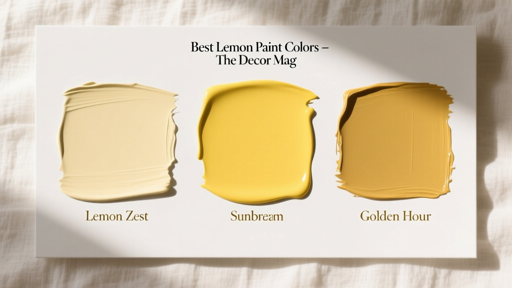 Best Lemon Paint Colors - The Decor Mag
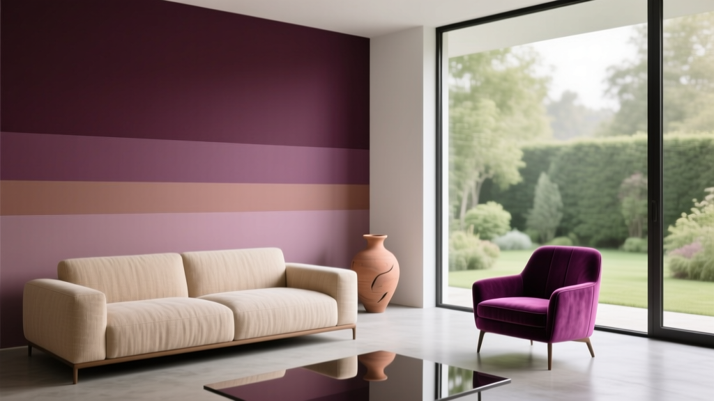 Best Plum Paint Colors for Drama - The Decor Mag
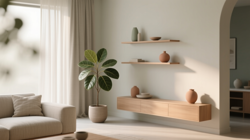 How to Create a Soothing Color Palette - The Decor Mag
 Best Midnight Blue Paint Colors - The Decor Mag
 Reading for Options: How Visual Literacy Drives Strategic Decision-Making in Design and Branding
 How to Choose Colors for a Music Room - The Decor Mag
 Best Chartreuse Paint Colors - The Decor Mag
 Best Eucalyptus Paint Colors - The Decor Mag
 How to Use Color to Create Grandeur - The Decor Mag
 Best Rust Red Paint Colors - The Decor Mag