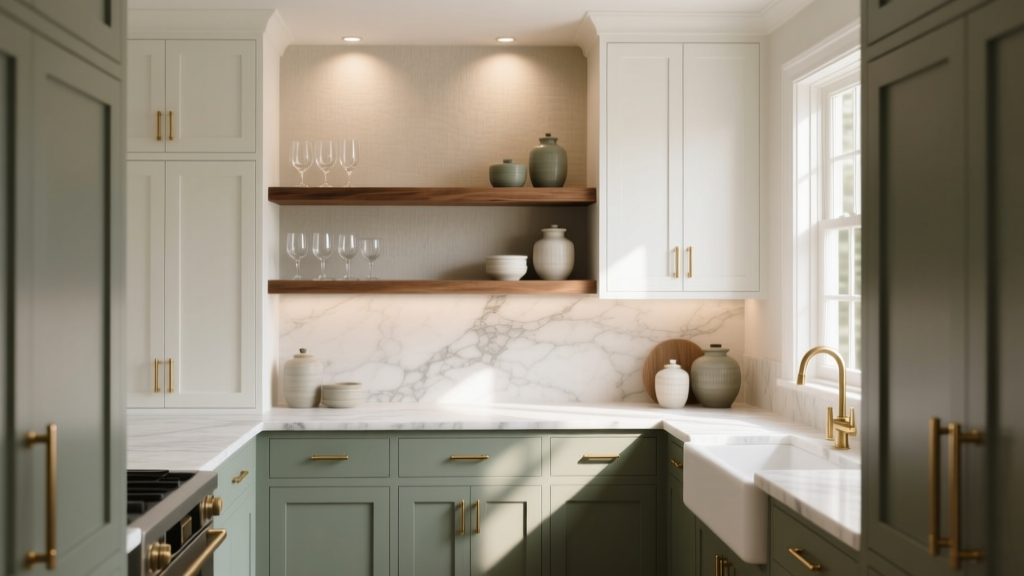
How to Choose Colors for a Butler Pantry - The Decor Mag
A butler pantry is one of the most satisfying spaces to design because it sits between utility and luxury. It’s where coffee gets brewed before the house wakes up, where serving platters wait for guests, where the “messy middle” of entertaining can disappear behind a door. Color choices here matter more than many homeowners expect—because this is a small room that works hard, often with limited natural light and a lot of reflective surfaces.
The right paint colors can make a butler pantry feel brighter, cleaner, and more intentional, while also connecting it seamlessly to the kitchen and adjacent dining areas. The wrong palette can make it look muddy, cramped, or disconnected, especially when you add under-cabinet lighting, countertops, and open shelving. Choosing a thoughtful color scheme is the difference between “extra storage” and a true design moment.
This guide breaks down color psychology, design principles, and practical application tips so you can confidently choose paint colors for a butler pantry—whether you’re building one from scratch or refreshing an existing space.
Start With the Butler Pantry’s Job (Function Drives Color)
Before selecting a paint fan deck favorite, identify how you’ll actually use the space. Color design works best when it supports function.
Common butler pantry types and what color should do
- Serving + staging pantry: needs flattering light for food and table settings; colors should feel inviting and “dressed up.”
- Appliance garage pantry: often packed with coffee machines, mixers, and toasters; colors should minimize visual clutter and feel calm.
- Wet bar / beverage pantry: can handle bolder, moodier paint colors; contrast looks intentional and elevated.
- Overflow storage pantry: priority is brightness and clarity so you can find items; lighter paint colors and high-LRV finishes help.
Color psychology shortcut: Light neutrals and warm whites support cleanliness and ease. Muted greens and blues read calm and organized. Deep navy, charcoal, and wine tones bring drama and sophistication—best when lighting is excellent.
Evaluate Light First: Natural Light, Bulbs, and Undercabinet LEDs
Butler pantries are frequently interior rooms with little or no natural light. That makes lighting temperature and paint undertones non-negotiable.
What to check before you paint
- Natural light direction (if any): north light cools colors; south light warms them; east/west shifts throughout the day.
- Bulb temperature: 2700K is warm and cozy; 3000K is balanced; 3500K+ can feel clinical in small pantries.
- LED strip color: cheap under-cabinet LEDs can cast green or blue, warping your paint color and making whites look gray.
- Reflective surfaces: glossy backsplash tile, quartz, and glass can bounce color around—great for brightness, risky for strong hues.
Pro tip: Paint large swatches (at least 12"x12") on multiple walls and observe them under (1) overhead lighting, (2) under-cabinet lighting, and (3) daylight from nearby rooms. A butler pantry paint color that looks perfect at noon can look dingy at night.
Choose a Color Scheme That Connects to the Kitchen
A butler pantry usually sits next to the kitchen, so the most successful color schemes feel related—even when the pantry has its own personality. Think of the pantry as a “supporting actor” that can be a touch richer, darker, or more playful than the kitchen without fighting it.
3 reliable ways to coordinate color
- Monochromatic: same hue family as the kitchen, one to two shades deeper (great for seamless flow).
- Analogous: neighboring hues (blue-green next to green; warm white next to beige) for harmony.
- Complementary accent: subtle opposites (navy with warm brass; green with blush) for controlled contrast.
Design principle: Keep at least one element consistent between kitchen and pantry—cabinet color, countertop tone, metal finish, or wall paint family—to avoid a patchwork look.
Best Paint Color Directions for a Butler Pantry (With Specific Recommendations)
These palettes work particularly well in small, hardworking spaces. Use them as starting points, then adjust for lighting and finishes.
1) Warm whites and creamy neutrals (bright, timeless, clean)
Warm whites are ideal for pantries used for storage and daily routines. They make the space feel larger and help packaging and dishware look crisp.
- Benjamin Moore White Dove (OC-17): creamy, soft, extremely versatile for walls or cabinetry.
- Sherwin-Williams Alabaster (SW 7008): warm and welcoming; pairs beautifully with brass hardware.
- Farrow & Ball Wimborne White (No. 239): refined, gently warm; great for traditional homes.
Great pairings:
- White walls + light oak shelves + polished nickel for an airy, classic pantry.
- Creamy white cabinets + soft gray-veined quartz + handmade white zellige backsplash for a high-end look.
2) Soft greige and warm taupe (grounded, hides scuffs, pairs with stone)
Greige is a workhorse in a high-traffic pantry because it’s forgiving. It also complements many countertop materials and warm wood tones.
- Benjamin Moore Edgecomb Gray (HC-173): warm greige that stays elegant in low light.
- Sherwin-Williams Accessible Beige (SW 7036): balanced, dependable, great with warm whites.
- Farrow & Ball Skimming Stone (No. 241): understated, sophisticated taupe.
Where this shines: an appliance-heavy pantry with lower cabinets. Greige keeps the room from feeling stark while maintaining a “clean and organized” mood.
3) Muted greens (fresh, organized, nature-inspired)
Green is strongly associated with balance and restoration—perfect for a room that supports routines. Muted, gray-green tones feel calm rather than loud.
- Benjamin Moore Saybrook Sage (HC-114): classic sage, warm and homey.
- Sherwin-Williams Clary Sage (SW 6178): earthy and muted; pairs beautifully with cream and brass.
- Benjamin Moore October Mist (1495): soft, modern green with gentle depth.
Great pairings:
- Sage cabinets + white quartz + aged brass pulls + clear glass sconces for a pantry that feels curated.
- Green walls + white shelves + black metal brackets for a modern farmhouse vibe.
4) Dusty blues and blue-grays (calm, elegant, tailored)
Blue supports a sense of order and calm, which is useful in a space that can easily become visually busy. Dusty, gray-leaning blues are especially flattering under warm lighting.
- Benjamin Moore Boothbay Gray (HC-165): a classic blue-gray that reads sophisticated.
- Sherwin-Williams Misty (SW 6232): soft and airy; great for walls when cabinets are white.
- Sherwin-Williams Smoky Blue (SW 7604): deeper, moody, and refined for cabinetry.
Ideal scenario: A serving pantry between kitchen and dining room—blue adds a slightly formal, “dressed” feel without being dark.
5) Deep, dramatic hues (jewel-box pantries that feel custom)
If your pantry has strong lighting (recessed + under-cabinet), deep colors can turn it into a destination. Dark paint colors also make open shelving and glassware pop.
- Benjamin Moore Hale Navy (HC-154): iconic navy; bold but not harsh.
- Sherwin-Williams Iron Ore (SW 7069): soft charcoal-black; stunning with brass and warm wood.
- Farrow & Ball Railings (No. 31): deep blue-black with richness and depth.
Pro tip: In a dark butler pantry color scheme, use a lighter countertop and reflective backsplash to prevent the space from feeling heavy.
Real Room Examples and Application Scenarios
Scenario A: Bright storage pantry with white cabinets
Goal: Make a narrow pantry feel larger and easier to use.
- Walls: Sherwin-Williams Alabaster (SW 7008)
- Cabinets: matching Alabaster in a satin finish
- Backsplash: glossy white subway tile (reflects light)
- Hardware: polished nickel for a clean, classic look
Why it works: A warm white color scheme keeps shadows soft, reduces contrast on tight walls, and makes the pantry feel fresh every day.
Scenario B: Entertaining pantry with glass-front uppers
Goal: Create a transition space that feels special next to the dining room.
- Cabinets: Benjamin Moore Boothbay Gray (HC-165)
- Walls/Ceiling: Benjamin Moore White Dove (OC-17)
- Countertop: light quartz with subtle movement
- Accent: small-scale geometric tile with gray-blue tones
Why it works: Blue-gray reads tailored and elegant, and the lighter envelope keeps the space bright while letting cabinetry anchor the design.
Scenario C: Moody wet bar pantry with brass accents
Goal: A jewel-box moment for evening entertaining.
- Walls + cabinets: Benjamin Moore Hale Navy (HC-154)
- Backsplash: mirrored tile or glossy deep green tile for depth
- Hardware/faucet: aged brass
- Lighting: 3000K bulbs + warm LED strips to prevent a cold cast
Why it works: Dark hues feel intentional in a bar zone, and brass adds warmth that keeps navy from feeling stern.
Where to Use Color: Walls, Cabinets, Ceiling, and Trim
In a butler pantry, color placement matters as much as the color itself. Small rooms can look choppy if every surface changes.
Smart placement strategies
- Color on cabinets, neutral walls: Great for a high-end look; keeps the room from feeling boxed in.
- Color on walls, neutral cabinets: Works when cabinetry is already installed and you want a refresh.
- Color-drenching (walls + trim + cabinets): Best for moody pantries; visually smooths the space and feels custom.
- Ceiling paint: Use the same white as trim to lift the room, or match wall color in a jewel-box pantry.
Finish guidance:
- Walls: eggshell or satin for wipeability
- Cabinets/trim: satin or semi-gloss for durability
- If you have heavy use: look for washable, scrubbable interior paint lines (each major brand offers one)
Easy Color Combinations That Rarely Fail
Use these tried-and-true color schemes as a blueprint for butler pantry paint colors.
- White Dove walls + Hale Navy base cabinets + brass hardware (classic contrast)
- Alabaster cabinets + Clary Sage walls + light oak shelving (warm, organic, relaxed)
- Accessible Beige walls + matte black pulls + creamy backsplash (modern neutral)
- Boothbay Gray cabinets + marble-look quartz + polished nickel (tailored and timeless)
- Iron Ore lower cabinets + warm white uppers + wood countertop (grounded, high style)
Common Color Mistakes to Avoid in a Butler Pantry
- Choosing paint before countertops and backsplash: Stone and tile have undertones that can make “perfect” paint look off.
- Ignoring undertones in low light: Some grays go purple; some beiges go pink; some whites go green under LEDs.
- Too many competing whites: Mixing a cool white cabinet with a warm white wall can look accidental. Use one dominant white, then coordinate.
- Overusing high-gloss on every surface: Shine highlights wall imperfections and can feel harsh in a tight room. Keep sheen balanced.
- Going dark without a lighting plan: Dark cabinetry and walls need layered lighting, or the pantry will feel flat and cramped.
- Forgetting continuity with adjacent rooms: A pantry that clashes with the kitchen looks like an afterthought, even if it’s beautifully painted.
FAQ: Choosing Paint Colors for a Butler Pantry
What are the best paint colors for a small butler pantry?
Warm whites and light greiges are the most reliable for small spaces. Try Benjamin Moore White Dove (OC-17) or Sherwin-Williams Alabaster (SW 7008) for brightness, or Benjamin Moore Edgecomb Gray (HC-173) for a soft, forgiving neutral.
Should a butler pantry match the kitchen?
It should coordinate, not necessarily match. Keeping one or two shared elements—like a related wall color family, matching hardware finish, or the same white on trim—creates flow without making the pantry feel identical.
Can you use dark paint colors in a butler pantry?
Yes, especially for a wet bar or entertaining pantry. Dark colors like Benjamin Moore Hale Navy (HC-154) or Sherwin-Williams Iron Ore (SW 7069) look dramatic and custom when paired with strong lighting and lighter reflective surfaces.
What paint finish is best for a butler pantry?
Use eggshell or satin on walls for cleanability, and satin or semi-gloss on cabinets and trim for durability. Pantries get fingerprints and scuffs, so washable paint formulas are worth it.
How do I avoid paint looking weird under under-cabinet lights?
Test paint samples under your actual LED strips and overhead lights. Aim for quality LEDs around 2700K–3000K with good color rendering. Avoid very cool lighting, which can make warm neutrals look dull and make some whites look gray-green.
Next Steps: A Simple Plan to Pick Your Butler Pantry Color
- List what the pantry does (coffee station, storage, serving, bar) and pick a mood: bright, calm, or dramatic.
- Confirm lighting (bulb temperature and LED color) before finalizing paint.
- Choose your anchor finish (countertop or backsplash) and match paint undertones to it.
- Select a color scheme that connects to the kitchen: monochromatic, analogous, or controlled contrast.
- Test samples on multiple walls and view them morning, afternoon, and night.
A well-chosen butler pantry color scheme makes daily routines smoother and entertaining more enjoyable—while adding a layer of personality to the spaces that support your home’s heart.
Looking for more paint color ideas and interior color design guidance? Explore our color guides and curated palettes on thedecormag.com.
More Articles
 How to Use Desaturated Colors for Elegance - The Decor Mag
 Best Oxblood Paint Colors - The Decor Mag
 Best Lilac Paint Colors for Gentle Spaces - The Decor Mag
 How to Choose Bathroom Paint Colors - The Decor Mag
 Pastel Color Palette Design Guide - The Decor Mag
 Best Sapphire Blue Paint Colors - The Decor Mag
 Best Wisteria Paint Colors - The Decor Mag
 2026 Color Trends: Earth Tones Making a Comeback
 How to Use Color to Create Contrast - The Decor Mag
 How to Choose Colors Based on Room Lighting - The Decor Mag