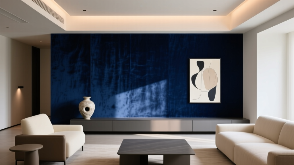
Best Midnight Blue Paint Colors - The Decor Mag
Midnight blue has a rare talent in interior design: it feels timeless and dramatic without becoming trend-fatigued. It can read as modern and moody in a city loft, traditional and tailored in a colonial, or cozy and enveloping in a small bedroom—depending on the undertone, lighting, and what you pair it with. For homeowners who want color with depth (but not the starkness of black), midnight blue paint colors are a confident step toward a more intentional home.
Beyond aesthetics, midnight blue taps into color psychology in a way few hues do. Deep blues are associated with calm, stability, and focus—qualities that make them especially effective in bedrooms, studies, dining rooms, and media spaces. Used well, midnight blue creates a “night-sky” backdrop that makes art, metals, and wood tones look richer, while still feeling livable day to day.
This guide breaks down what midnight blue really means, how to choose the best shade for your room, and the most designer-trusted midnight blue paint colors across popular brands. You’ll also get real room scenarios, color schemes, and practical painting tips—plus common mistakes to avoid.
What Counts as “Midnight Blue” in Interior Paint?
Midnight blue sits in the deep end of the blue family—darker than navy in many cases, often with a subtle cast of black, violet, or green. In paint terms, it typically has a low Light Reflectance Value (LRV), meaning it absorbs more light than it reflects. That’s why it can feel so atmospheric.
Midnight Blue vs. Navy vs. Blue-Black
- Midnight blue: Deep, saturated blue with noticeable complexity (often violet or charcoal undertones). Feels velvety and dimensional.
- Navy: Cleaner, more “uniform” deep blue that often reads classic and preppy.
- Blue-black: So dark it can appear nearly black except in bright light; best for high-drama moments and strong contrast.
Why Undertones Make or Break Midnight Blue
Undertones decide whether a midnight blue feels crisp, cozy, or slightly murky. Watch for:
- Violet-leaning midnight blues (luxurious, romantic, great with brass)
- Green-leaning midnight blues (earthy, sophisticated, excellent with walnut and olive)
- Charcoal/ink undertones (modern, architectural, striking with white trim)
How to Choose the Best Midnight Blue Paint Color for Your Room
1) Start With Lighting (Natural + Artificial)
Lighting changes deep paint more dramatically than light neutrals. Use these rules of thumb:
- North-facing rooms: Cooler light can make midnight blue feel icier or flatter. Consider a slightly warmer, violet-leaning blue.
- South-facing rooms: Strong warm light makes midnight blue look richer and more saturated. Most midnight blues work well here.
- East-facing rooms: Bright mornings, shadowy afternoons—choose a balanced shade that won’t go dull later in the day.
- West-facing rooms: Warm late-day light can bring out purple or gray undertones; test before committing.
2) Decide Your “Depth Goal”: Cozy Cocoon or Tailored Contrast?
- Cocoon effect: Paint walls (and optionally ceiling) in the same midnight blue; use softer, low-sheen finishes.
- Tailored contrast: Pair midnight blue walls with crisp white trim and ceiling; keep furnishings lighter for balance.
3) Match to Fixed Elements
Midnight blue should harmonize with what you’re not changing:
- Warm woods (oak, walnut) often love green-leaning or inky blues.
- Cool marbles and chrome prefer cleaner, charcoal-leaning midnight blues.
- Brass and gold shine against violet-leaning midnight blues.
Best Midnight Blue Paint Colors (Designer Favorites)
Below are standout midnight blue paint colors that repeatedly perform well in real homes. Always sample first—deep blues can shift with light and sheen.
Benjamin Moore
- Benjamin Moore Hale Navy (HC-154)
A benchmark deep blue that can read navy-to-midnight depending on the room. Excellent for cabinetry, built-ins, and exteriors. Pair with white trim for a classic color scheme. - Benjamin Moore Newburyport Blue (HC-155)
Rich and historic-feeling with a slightly coastal sophistication. Works beautifully in dining rooms and libraries with warm wood and aged brass. - Benjamin Moore Gentleman’s Gray (2062-20)
A moody, green-leaning blue that feels deep and complex. Stunning in bedrooms and studies; looks high-end with creamy whites and walnut. - Benjamin Moore Blue Note (2129-30)
A softer “inky” midnight that still reads dark but less stark. Great for walls when you want drama without the heaviness of near-black.
Sherwin-Williams
- Sherwin-Williams Naval (SW 6244)
A deep, confident blue that’s popular for accent walls, kitchen islands, and exterior shutters. Pairs well with warm whites and brushed brass. - Sherwin-Williams Inkwell (SW 6992)
Blue-black drama. Perfect for doors, statement ceilings, powder rooms, and modern millwork. Use when you want midnight that borders on black. - Sherwin-Williams Indigo Batik (SW 7602)
A patterned-textile kind of blue with a slightly softened, livable feel. Excellent for bedrooms and family rooms that need depth without looking severe. - Sherwin-Williams Salty Dog (SW 9177)
A saturated, jewel-toned deep blue. Beautiful in dining rooms and offices with warm wood and crisp trim.
Farrow & Ball
- Farrow & Ball Hague Blue (No. 30)
A cult-favorite deep blue with green undertones that feels historic and modern at once. Gorgeous in libraries, kitchens, and paneled rooms. - Farrow & Ball Railings (No. 31)
A blue-black that looks sophisticated and architectural. Use on trim, cabinetry, or for an all-over modern cocoon effect. - Farrow & Ball Stiffkey Blue (No. 281)
True inky depth with a classic maritime vibe. Works well with bright whites, linen textures, and antiques.
Behr
- Behr Night Club (S550-7)
A bold, saturated midnight blue for statement walls, media rooms, and dramatic bedrooms. Pair with warm metals and creamy whites. - Behr Blueprint (S470-5)
Not as dark as the deepest midnight shades, but a strong “inky blueprint” blue that layers easily with neutrals and natural textures.
Where Midnight Blue Looks Best: Real Room Scenarios
Living Room: A Sophisticated Backdrop for Art and Texture
Midnight blue living rooms feel grounded and gallery-like. The key is balancing depth with light and texture.
- Best paint picks: Benjamin Moore Blue Note, Sherwin-Williams Indigo Batik
- Try this color scheme: midnight blue walls + warm white trim + camel leather + oak + ivory rug
- Styling tip: Add at least three tactile materials (linen, boucle, leather, wool) so the room doesn’t feel flat.
Bedroom: Calm, Cocooning, and Restorative
Deep blue supports rest—especially when you soften contrast and choose warm, dimmable lighting.
- Best paint picks: Benjamin Moore Gentleman’s Gray, Farrow & Ball Hague Blue
- Try this color scheme: midnight blue + muted sage + warm white bedding + aged brass lamps
- Finish tip: Use matte or eggshell to keep the look velvety and reduce glare.
Dining Room: Elevated Drama That Feels Intentional
Midnight blue dining rooms glow at night and look refined during the day—especially with layered lighting.
- Best paint picks: Sherwin-Williams Salty Dog, Benjamin Moore Newburyport Blue
- Try this color scheme: midnight blue + crisp white ceiling + walnut table + brass chandelier
- Pro move: Add a large mirror or artwork with warm tones to keep the room inviting.
Home Office: Focus and Visual Quiet
Blue is associated with concentration and clarity, making midnight blue a smart choice for work zones.
- Best paint picks: Sherwin-Williams Naval, Farrow & Ball Railings
- Try this color scheme: midnight blue + soft greige + black accents + natural wood
- Application idea: Paint built-in shelves midnight blue and keep surrounding walls lighter for contrast.
Kitchen and Built-Ins: Midnight Blue That Feels Custom
Midnight blue cabinetry reads high-end and hides wear better than bright whites.
- Best paint picks: Benjamin Moore Hale Navy, Sherwin-Williams Inkwell
- Try this color scheme: midnight blue lowers + warm white uppers + unlacquered brass hardware + white quartz
- Finish tip: Cabinets often look best in satin or semi-gloss for durability and wipeability.
Powder Room: Small Space, Big Impact
A tiny room is the perfect place to go bold. Midnight blue makes white fixtures pop and feels boutique-hotel polished.
- Best paint picks: Sherwin-Williams Inkwell, Farrow & Ball Stiffkey Blue
- Try this color scheme: midnight blue + marble + brass + high-contrast black accents
- Ceiling idea: Paint the ceiling the same color for a seamless, immersive look.
Winning Color Combinations With Midnight Blue
Midnight blue is flexible, but it shines brightest with thoughtful contrast and temperature balance.
Classic and Crisp
- Midnight blue + bright white trim + black accents
- Best for: modern, coastal, transitional interiors
Warm and Luxurious
- Midnight blue + brass + camel + cream
- Best for: traditional, art deco, eclectic homes
Earthy and Collected
- Midnight blue + olive + walnut + linen
- Best for: organic modern, vintage-inspired spaces
Moody Monochrome
- Midnight blue + charcoal + smoky gray + subtle texture shifts
- Best for: minimalist, contemporary, loft-style interiors
Application Guidance: Get a Rich, Even Midnight Blue Finish
- Sample large and in multiple spots: Use peel-and-stick samples or paint poster boards. Check morning, afternoon, and evening.
- Prime strategically: Deep colors often need a tinted primer for even coverage and truer color.
- Choose sheen intentionally:
- Matte: best for low-traffic walls and a luxe look
- Eggshell: great all-around for living spaces
- Satin/Semi-gloss: ideal for trim, doors, cabinets, and durability
- Expect two coats (often three): Midnight pigments can be less forgiving—especially over light or patchy walls.
- Upgrade your lighting: Deep paint loves warm, layered light. Aim for 2700K–3000K bulbs and add dimmers when possible.
Common Midnight Blue Mistakes (and How to Avoid Them)
- Skipping undertone testing
Fix: Compare your chosen blue against a true navy and a blue-black sample. Undertones become obvious side by side. - Using cool white lighting
Fix: Replace 4000K+ bulbs with warmer temperatures; midnight blue looks more inviting under warm light. - Choosing a high-gloss wall finish
Fix: Keep walls matte/eggshell unless you specifically want a lacquered, reflective effect (and have flawless walls). - Not enough contrast
Fix: Add a counterweight—white trim, light upholstery, or a pale rug—to keep the room from feeling heavy. - Forgetting about the ceiling
Fix: Decide early: bright ceiling for airy contrast, or color-drenched ceiling for a cozy, immersive mood.
FAQ: Midnight Blue Paint Colors
Is midnight blue too dark for small rooms?
Not necessarily. Midnight blue can make small rooms feel intentional and cozy rather than cramped, especially with good lighting and a lighter floor/rug. Powder rooms, offices, and bedrooms are some of the best small-space candidates.
What trim color works best with midnight blue walls?
Crisp whites create classic contrast, while softer warm whites feel more relaxed. If you want a moodier look, try a deep charcoal trim or color-drench the trim in the same midnight blue for a modern finish.
Does midnight blue work with gray floors?
Yes, but choose the right undertone. If your floors are cool gray, look for a midnight blue with charcoal or neutral undertones (rather than very green). Test samples directly against the flooring.
What are the best accent colors with midnight blue?
Top pairings include warm brass/gold, crisp white, camel leather, walnut, olive green, blush, and terracotta. For a clean modern scheme, use black and white accents with midnight blue as the anchor.
Should I paint a midnight blue accent wall or the whole room?
An accent wall works when you want a focal point without changing the room’s overall light level. Painting the whole room (and even the ceiling) creates a richer, more designer-forward atmosphere—especially in bedrooms, dining rooms, and media rooms.
What’s the best midnight blue for cabinets?
Look for deep, stable colors that hold up in different lighting. Popular choices include Benjamin Moore Hale Navy and Sherwin-Williams Naval for a classic look, or Sherwin-Williams Inkwell for a near-black statement.
Next Steps: Make Midnight Blue Feel Effortless in Your Home
Choose two to three midnight blue paint colors that fit your room’s lighting and fixed finishes, then sample them at full scale. Decide whether your goal is crisp contrast (white trim, lighter furnishings) or a cocooning, color-drenched mood (matched walls and trim). Finish by dialing in the supporting palette—warm metals, natural textures, and layered lighting are the fastest way to make midnight blue look intentional and expensive.
For more paint color ideas, undertone guides, and room-by-room color schemes, explore the latest color guides on thedecormag.com.
More Articles
 Best Bathroom Floor Solutions: Performance, Safety, and Style Compared
 How to Create a Playful Color Palette - The Decor Mag
 Best Pine Green Paint Colors - The Decor Mag
 Best Lime Green Paint Colors - The Decor Mag
 Best Dusty Rose Paint Colors - The Decor Mag
 Best Jade Green Paint Colors - The Decor Mag
 How to Choose Colors for a Music Room - The Decor Mag
 How to Choose Bathroom Paint Colors - The Decor Mag
 Best Cream Paint Colors for Warm Neutrals - The Decor Mag
 Best Fern Green Paint Colors - The Decor Mag