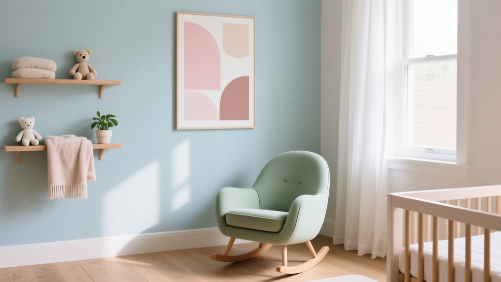
How to Choose Colors for a Nursery - The Decor Mag
Nursery color is one of the earliest design choices you’ll make for your child—and it quietly shapes how the room feels day to day. Color influences mood, energy, and perceived comfort, which matters in a space that needs to do a lot: soothe a newborn at 2 a.m., support naps, make nighttime feeding feel calm, and eventually become a playful, inspiring room for a growing child.
Beyond emotion, nursery paint colors also have practical power. The right palette can make a small room feel airy, warm up a north-facing space, balance strong daylight, and create a cohesive look with furniture and textiles you’ll add over time. Thoughtful color planning now can save you from repainting in six months—and can make the nursery feel “finished” even if you’re still collecting decor pieces.
This guide breaks down how to choose nursery colors using color psychology, lighting and undertones, and timeless design principles. You’ll find specific paint color recommendations, real-room application scenarios, and common mistakes to avoid, so you can build a nursery color scheme that feels both beautiful and livable.
Start With the Feeling: Color Psychology for Nurseries
Before picking a paint chip, decide how you want the nursery to feel. Babies respond to contrast and light; adults respond to mood and visual “quiet.” Great nursery color design finds the middle ground: gentle enough for rest, interesting enough to grow with your child.
What common nursery colors communicate
- Soft greens: Balanced, restorative, nature-linked. Great for easing visual stress.
- Powdery blues: Calm and cooling. Can feel crisp in bright light and chilly in darker rooms.
- Warm whites and creams: Safe, timeless, and flexible. Excellent backdrops for changing decor.
- Blush, dusty rose, muted terracotta: Comforting warmth and gentle energy.
- Lavender and lilac: Quiet, dreamy, slightly whimsical—best when muted, not saturated.
- Warm grays and greiges: Modern, grounding neutrals that make colorful accents pop.
- Yellows: Cheerful and sunny, but can feel intense if too bright or too saturated.
A smart rule of thumb
For most nurseries, aim for a palette that’s 60% calm base, 30% supportive secondary color, and 10% accent (art, pillows, books, toys). This structure keeps the room from feeling busy and gives you flexibility as tastes change.
Read the Room: Light, Orientation, and Undertones
Choosing paint colors for a nursery is less about the “best” shade and more about how that shade behaves in your room. Natural light, exposure, and existing finishes can shift a paint color dramatically.
How lighting affects nursery paint colors
- North-facing rooms: Cooler, grayer light. Favor warm whites, warm greiges, or muted warm colors to avoid a dreary look.
- South-facing rooms: Bright, warm light. You can use cooler hues (soft blue-green, pale gray) without them feeling icy.
- East-facing rooms: Bright mornings, softer afternoons. A balanced neutral or gentle green works well across the day.
- West-facing rooms: Warm late-day light that can amplify reds/yellows. Choose softer, dustier tones for control.
Undertones: why “white” isn’t just white
Undertone is the subtle color bias within a paint. In nursery color schemes, undertones are what make a “neutral” feel creamy, pinkish, greenish, or gray. Compare paint samples next to your crib wood tone and flooring:
- Pair warm woods (oak, maple): warm whites, soft greens, warm greiges.
- Pair cool woods/painted furniture (white, gray, black): balanced whites, gentle blue-grays, muted mauves.
Sample like a designer
- Buy peel-and-stick samples or sample pots of 3–5 colors.
- Paint at least a 12x12 inch swatch on two walls (one brightest, one darkest).
- Check the color morning, afternoon, and night with lamps on.
- View it next to the textiles you’ll actually use (curtains, rug, bedding).
Choose a Nursery Color Scheme That Grows With Your Child
The most successful nursery color palettes feel age-flexible. Trend-forward choices can still be timeless when they’re muted, balanced, and used in the right proportions.
Three reliable color scheme frameworks
- Monochromatic: One hue in multiple values (light to dark). Example: pale sage walls, deeper olive accents, warm white trim.
- Analogous: Neighboring hues on the color wheel for a soft blend. Example: blue + blue-green + green.
- Complementary (softened): Opposites on the color wheel, but muted so they don’t fight. Example: dusty blue + warm terracotta accents.
A practical palette checklist
- One main wall color (calm, mid-to-light value)
- A trim/ceiling white that matches undertones
- A textile “bridge” (rug or curtains) that includes both hues
- One accent color you can swap easily (art, throw, bins)
Specific Nursery Paint Color Recommendations (Designer-Approved)
These paint colors are popular because they’re versatile, soft, and easy to coordinate with common nursery furniture finishes. Always sample first—your lighting and surrounding colors matter.
Warm whites and creams (timeless, cozy)
- Benjamin Moore White Dove (OC-17): A balanced warm white that works with both warm and cool accents.
- Sherwin-Williams Alabaster (SW 7008): Soft, creamy, and welcoming—excellent in north-facing nurseries.
- Farrow & Ball Pointing (No. 2003): A gentle off-white with warmth that feels classic and calm.
Best pairings: natural oak crib, linen curtains, woven textures, pastel art, muted greens.
Soft greens (restorative, nature-inspired)
- Benjamin Moore Saybrook Sage (HC-114): A warm sage with depth—beautiful for an accent wall or full room in bright light.
- Benjamin Moore Healing Aloe (1562): A pale blue-green that feels airy and clean.
- Sherwin-Williams Sea Salt (SW 6204): Light, spa-like, and flexible; reads more green or blue depending on light.
Best pairings: white trim, warm wood, brass hardware, botanical prints, creamy textiles.
Powdery blues and blue-grays (serene, classic)
- Benjamin Moore Palladian Blue (HC-144): A soft blue-green that feels fresh and light.
- Sherwin-Williams Sleepy Blue (SW 6225): A gentle blue that stays soft rather than sugary.
- Farrow & Ball Borrowed Light (No. 235): Pale, airy blue—great in rooms with strong daylight.
Best pairings: crisp white ceiling, light rugs, gray-blue textiles, warm wood to prevent coolness.
Blush, dusty rose, and muted terracotta (warm, comforting)
- Benjamin Moore First Light (2102-70): A whisper-soft blush that acts like a neutral.
- Sherwin-Williams Redend Point (SW 9081): A muted clay/rose that feels modern and soothing.
- Farrow & Ball Setting Plaster (No. 231): Warm and understated; pairs beautifully with creams and natural textures.
Best pairings: warm white trim, rattan, vintage brass, soft olive accents, natural linen.
Greige and gentle taupe (modern, grounding)
- Benjamin Moore Edgecomb Gray (HC-173): A warm greige that reads soft and calm—excellent for a gender-neutral nursery color scheme.
- Sherwin-Williams Agreeable Gray (SW 7029): Popular for a reason: adaptable and easy to style with color.
- Benjamin Moore Classic Gray (OC-23): A light, barely-there greige that keeps small nurseries bright.
Best pairings: black-and-white art, muted pastels, deep green accents, warm woods.
Real Room Examples: Nursery Color Schemes in Action
Scenario 1: Small nursery with limited daylight
Goal: brighter, cozier room without feeling stark.
- Walls: Sherwin-Williams Alabaster (SW 7008)
- Trim/Ceiling: same color in a different sheen for seamless softness
- Accents: warm sage textiles (Benjamin Moore Saybrook Sage-inspired), honey wood crib, woven basket storage
Application tip: Add one larger, higher-contrast element (a medium-toned rug or mural-style art) so the room doesn’t look washed out.
Scenario 2: Bright, south-facing nursery that feels too intense
Goal: calm the light and reduce glare.
- Walls: Benjamin Moore Healing Aloe (1562) or Sherwin-Williams Sea Salt (SW 6204)
- Trim: Benjamin Moore White Dove (OC-17)
- Accents: oatmeal curtains, pale wood, soft black details (frames, hardware)
Application tip: Choose a matte or eggshell finish for walls to soften the brightness (and reduce sheen-related glare).
Scenario 3: Gender-neutral nursery with a modern look
Goal: timeless base with playful accents that can evolve.
- Walls: Benjamin Moore Edgecomb Gray (HC-173)
- Accent color: muted terracotta (Sherwin-Williams Redend Point, SW 9081) in art and textiles
- Second accent: dusty blue (pillows, mobile) for balance
Application tip: Keep the biggest items neutral (walls, rug, dresser) and swap accents seasonally as your child grows.
Scenario 4: Classic “storybook” nursery without feeling themed
Goal: gentle charm that still feels design-forward.
- Walls: Farrow & Ball Borrowed Light (No. 235)
- Trim: warm white (White Dove or Alabaster)
- Accents: gingham or ticking stripe, warm brass sconce, vintage animal prints, creamy boucle chair
Application tip: Use pattern at varying scales (tiny stripe + medium gingham + large art) to keep it layered but calm.
Where to Use Color: Walls, Ceiling, Trim, and Accents
Your nursery color scheme doesn’t have to live only on four walls. Strategic placement can elevate the room while keeping it restful.
Smart ways to apply nursery paint colors
- All-over wall color: best for soothing palettes (warm whites, light sage, pale greige).
- Single accent wall: works well behind the crib for visual focus. Choose a slightly deeper version of your wall color to keep it cohesive.
- Two-tone (half wall / wainscot): a practical choice for durability and visual structure—especially once toddler years arrive.
- Painted ceiling: excellent for adding softness. A “tinted white” (a lighter version of the wall color) feels cozy without closing in the room.
- Trim strategy: for a calm look, use a trim color close to the wall color (low contrast). For a crisp, tailored look, use a cleaner white with matching undertones.
Finish and durability guidance
- Walls: matte or eggshell for a soft look; choose a washable formula if possible.
- Trim/doors: satin or semi-gloss for easier cleaning.
- Safety: look for low-VOC or zero-VOC paints; allow proper curing and ventilation before the nursery is in full use.
Common Nursery Color Mistakes (and How to Fix Them)
- Choosing a color without testing in your lighting: Fix by sampling on multiple walls and viewing across the day.
- Going too saturated on large surfaces: Bright colors can overstimulate and feel smaller. Fix by using saturated hues as accents instead of wall colors.
- Ignoring undertones: The “wrong” white can look pink, green, or dingy. Fix by matching undertones to floors and major furniture.
- Too many competing patterns and colors: Fix with a tighter palette (2–3 main colors) and repeat each color at least twice in the room.
- High contrast everywhere: Black-and-white can be graphic and fun, but too much can feel harsh. Fix by adding warm neutrals, wood, and soft textures to buffer contrast.
- Designing for baby only: Newborn needs are short-lived; toddler and child years are longer. Fix by choosing a timeless base and swapping decor over time.
FAQ: Choosing Nursery Colors
What are the best calming paint colors for a nursery?
Soft greens, blue-greens, and warm off-whites tend to feel most calming. Popular choices include Benjamin Moore Healing Aloe (1562), Sherwin-Williams Sea Salt (SW 6204), and Benjamin Moore White Dove (OC-17).
Should a nursery be painted white or color?
Either can work. White nurseries feel airy and flexible, especially with layered textiles and art. A soft color (sage, pale blue, blush, greige) can add warmth and personality without overwhelming the space.
How do I choose a nursery color scheme that’s gender-neutral?
Start with a versatile base—greige, warm white, soft sage, or muted clay—then add accents in multiple hues. Benjamin Moore Edgecomb Gray (HC-173) or Sherwin-Williams Alabaster (SW 7008) are reliable foundations for gender-neutral nursery design.
What paint finish is best for nursery walls?
Matte or eggshell is typically best for walls because it looks soft and hides imperfections. If you expect frequent cleaning, choose a washable matte/eggshell line from your preferred brand.
Is it okay to paint an accent wall behind the crib?
Yes. It’s a great way to anchor the room and highlight the crib area. Keep the accent color within the same family as the rest of the palette (deeper sage, dusty blue, warm clay) so the nursery still feels restful.
How many colors should I use in a nursery?
For a cohesive look, aim for 2–3 main colors plus one small accent. A simple structure—neutral base + gentle color + accent—creates a calm room that still feels designed.
Next Steps: Build Your Nursery Palette With Confidence
Choose a mood first, evaluate your natural light, then test 3–5 paint colors with an eye on undertones. Once you land on a wall color, lock in trim, then repeat your main hues through a rug, curtains, and art for an intentional nursery color scheme that feels calm, layered, and ready to grow.
If you’re deciding between a few options, start with a warm white or soft greige as your foundation—then bring in color through accessories you can change as your child’s style evolves.
For more paint color ideas, color scheme guides, and interior color design tips, explore the nursery and whole-home color resources on thedecormag.com.
More Articles
 Best Palette Reading: Science, Standards, and Real-World Accuracy for Designers and Brand Managers
 How to Choose Colors Based on Room Lighting - The Decor Mag
 Best Cherry Red Paint Colors - The Decor Mag
 How to Create a Grounded Color Palette - The Decor Mag
 How to Choose Colors for Small Spaces - The Decor Mag
 How to Create a Traditional Color Palette - The Decor Mag
 How to Choose Colors for a Veranda - The Decor Mag
 Best Emerald Green Paint Colors - The Decor Mag
 How to Choose Colors for a Home Office - The Decor Mag
 Best Burgundy Paint Colors - The Decor Mag