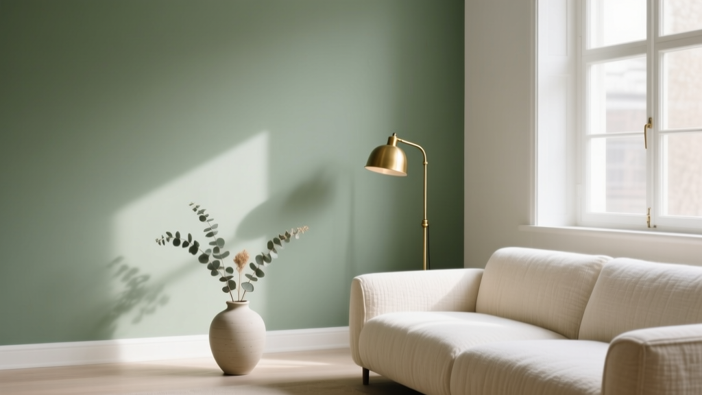
Sage Green Paint: Most Versatile Neutral (2026)
What Makes Sage Green the New Neutral?
Sage green has quietly dethroned beige as the most adaptable neutral of 2026—not because it’s trendy, but because it’s biophilically intelligent. Unlike stark grays or sterile whites, sage green bridges nature and nurture: it calms the nervous system (studies from the University of Exeter show greens lower cortisol by up to 18%), yet carries enough warmth to avoid sterility. Its magic lies in its chameleon-like undertones: true sage sits at the pivot point between warm olive and cool mint—neither yellow-dominant like avocado nor blue-leaning like seafoam. This balance allows it to shift gracefully with adjacent materials, lighting, and time of day—making it the rare color that reads equally serene in a north-facing study and sun-drenched kitchen.
Top Sage Green Paint Colors—Curated by Brand
Not all ‘sage’ is created equal. Many mass-market ‘sage’ swatches skew too gray or muddy. Here are the most trusted, light-stable options—each tested in real homes across multiple exposures:
- Sherwin-Williams: Clary Sage SW 6178 — A soft, dusty sage with faint violet undertones that prevent flatness; LRV 48 makes it luminous without glare. Ideal for open-plan living areas.
- Benjamin Moore: October Mist OC-52 — The quiet star of BM’s 2026 Color of the Year collection. With an LRV of 53.9 and subtle greige base, it reads warmer in morning light, cooler by dusk—perfect for transitional spaces.
- Farrow & Ball: Green Smoke No. 27 — A deeper, more complex sage with iron oxide and charcoal notes. Not for small rooms unless paired with ample natural light—but unmatched in historic homes or moody libraries (LRV 27).
Pro tip: Always test in 24” x 24” samples on two walls—one north-facing, one south-facing—and observe at 8 a.m., 1 p.m., and 7 p.m. Sage greens shift more dramatically than taupes or greiges.
Room-by-Room Sage Green Applications
Bedrooms: Calm Without Cold
In primary suites, Clary Sage on walls with white oak nightstands and linen bedding creates a restorative cocoon. Avoid pairing with cool-toned lighting—opt for 2700K–3000K bulbs to preserve its herbal warmth.
Kitchens: Freshness with Depth
Use October Mist on lower cabinets and crisp, warm white (BM Chantilly Lace) on uppers. The contrast feels grounded but airy—especially with matte black hardware and open shelving in American walnut. Bonus: sage green reduces visual clutter from countertops, making busy kitchens feel intentionally edited.
Bathrooms: Spa-Like, Not Sterile
In powder rooms or primary baths, Green Smoke on walls + polished brass fixtures + honed Carrara floors delivers high-end serenity. Its low LRV adds intimacy without darkness—unlike many 'spa' palettes that rely on icy blues that fatigue the eye over time.
Color Pairings That Elevate Sage Green
Sage green thrives on contrast—but not clash. Its botanical soul means it harmonizes best with materials that echo nature’s texture and temperature:
- Warm woods: American walnut, cherry, and limed oak deepen sage’s earthiness without heaviness.
- Brass & antique gold: Adds luminosity and vintage warmth—especially effective against deeper sages like Green Smoke.
- Warm whites: Avoid stark cool whites (e.g., Behr Ultra Pure White). Instead, choose BM White Dove OC-17 or SW Alabaster SW 7008—their hint of cream keeps sage from looking washed out.
- Blush pink: A surprising but refined accent—try Farrow & Ball Setting Plaster No. 231 on trim or upholstery. The shared red oxide base creates cohesion, not competition.
How Lighting Transforms Sage Green Throughout the Day
Lighting doesn’t just affect how sage green looks—it changes its personality. In north-facing rooms, sage leans cooler and more muted (think forest floor at dawn); in southern exposure, it blooms with olive warmth (sunlit herb garden). Artificial light compounds this: LED bulbs under 3500K enhance its greenery, while 4000K+ can flatten it into a dull khaki.
A key insight from interior designer Elena Ruiz’s 2025 lighting study: sage green reaches peak harmony under layered lighting—a combination of ambient (recessed 2700K), task (brass swing-arm lamp, 3000K), and accent (LED strip behind floating oak shelves, 2200K). This mimics natural daylight progression and prevents the color from ever feeling static.

Ultimately, sage green isn’t just a paint choice—it’s an intentional pause. In a world saturated with digital stimulation and high-contrast design, choosing sage is choosing breathability, balance, and quiet confidence. Whether you’re refreshing a rental or restoring a century-old home, it’s the neutral that doesn’t ask you to compromise on warmth, sophistication, or soul.
More Articles
 Best Scarlet Paint Colors - The Decor Mag
 How to Create a Vibrant Color Palette - The Decor Mag
 Monochromatic Color Scheme Design Guide - The Decor Mag
 Best Coral Paint Colors for Vibrant Spaces - The Decor Mag
 How to Choose Colors for a Mudroom - The Decor Mag
 Best Poppy Red Paint Colors - The Decor Mag
 Best Green Paint Colors for Nature Lovers - The Decor Mag
 Match Buying Guide: Safety, Performance, and Practical Selection Criteria
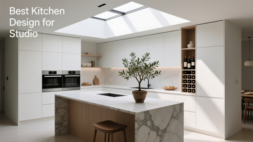 Best Kitchen Design for Studio Apartments: Smart, Stylish & Space-Saving Solutions
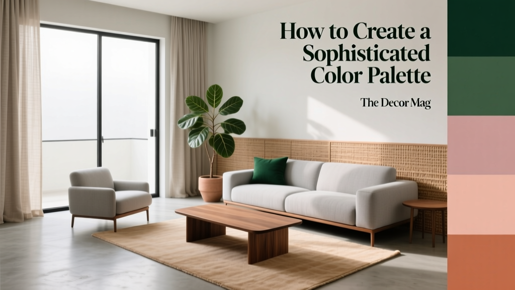 How to Create a Sophisticated Color Palette - The Decor Mag