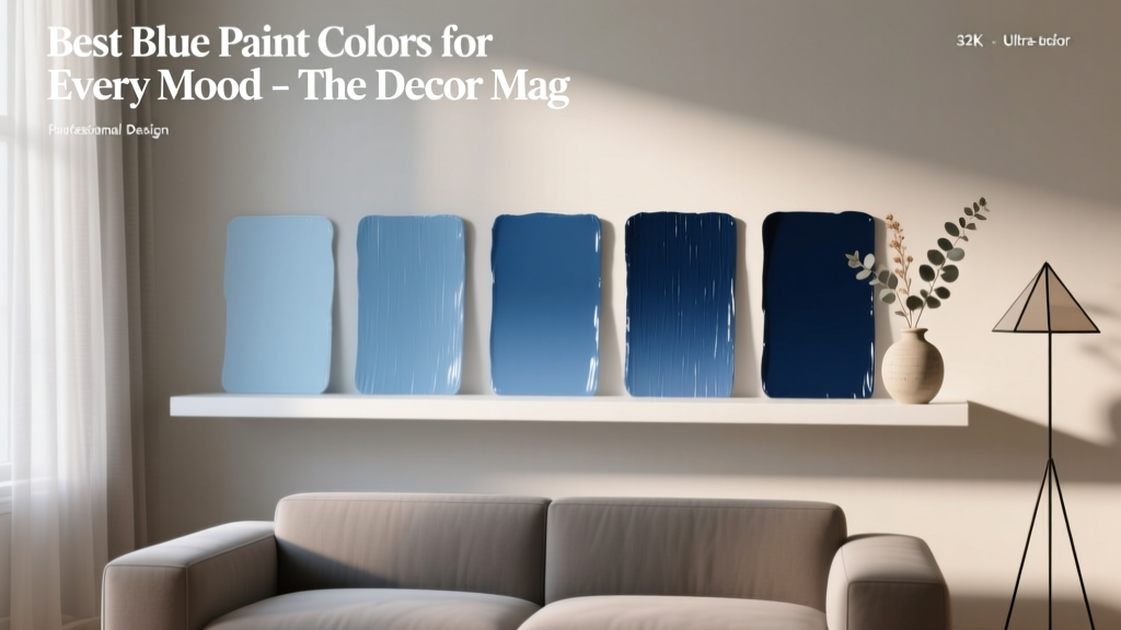
Best Blue Paint Colors for Every Mood - The Decor Mag
Blue is one of the most requested paint colors in interior design—and for good reason. It’s versatile enough to read crisp and modern, soft and calming, or rich and dramatic depending on its undertone, depth, and surrounding finishes. The right blue can lower visual “noise” in a busy home, make a small room feel more expansive, and set a tone that supports how you want to live in a space.
What makes blue especially powerful is its range of emotional cues. Pale airy blues often feel restorative, moody navies can feel grounding and secure, and bright mid-tone blues add energy without the intensity of saturated reds or oranges. If you’ve ever tried a blue that looked perfect online but turned icy, gloomy, or “baby-ish” on your wall, you already know: selecting blue paint colors is as much about light, undertones, and context as it is about preference.
This guide breaks down the best blue paint colors for different moods—plus practical tips, room-by-room examples, and common mistakes to avoid—so you can build a color scheme that looks intentional in real homes, not just in swatches.
How Blue Paint Creates Mood: Color Psychology Meets Real-World Design
Color psychology tells us blue is associated with calm, trust, clarity, and stability. In interior color design, those associations show up as:
- Lower visual temperature: Blue tends to feel cooler, which can soothe overstimulating spaces.
- Expanded space perception: Lighter blues can push walls back visually, helping rooms feel more open.
- Grounding effect at deeper values: Navy and inky blues add depth and a sense of “enclosure,” which can be cozy and secure.
- Shifting personality by undertone: A blue with gray can feel tailored; blue with green can feel coastal; blue with violet can feel romantic or luxe.
The most reliable way to pick the best blue paint color is to decide the mood first, then match the undertone and depth to your room’s lighting and finishes.
Before You Choose: 4 Factors That Change a Blue Paint Color
- Natural light direction
- North-facing: cool, flatter light can make blues look grayer or icier.
- South-facing: warm, bright light can make blues look more vibrant and slightly greener.
- East-facing: bright morning light, softer later—blues may shift noticeably through the day.
- West-facing: warm afternoon light can deepen blues and emphasize green undertones.
- Undertones
- Gray-blue: refined, modern, calm.
- Green-blue: fresh, coastal, spa-like.
- Violet-blue: moody, romantic, sophisticated.
- Sheen
- Matte/Flat: soft, forgiving, great for moody blues.
- Eggshell/Satin: balanced, wipeable, ideal for most walls.
- Semigloss: best for trim/doors; can make blues look more saturated.
- Adjacent materials
- Warm woods make many blues feel richer and cozier.
- Cool marble, chrome, and bright white can push blues toward crisp and icy.
- Beige/tan textiles can soften even strong blues.
Best Blue Paint Colors by Mood (with Room Ideas)
1) Calm & Restorative: Soft Blue-Greens and Hazy Light Blues
For bedrooms, bathrooms, and reading nooks, choose a blue that feels airy rather than stark. Blue-greens and soft gray-blues are reliable for creating a restful mood without looking juvenile.
- Benjamin Moore Palladian Blue (HC-144): a classic spa-like blue-green that reads clean and soft in natural light.
- Sherwin-Williams Sea Salt (SW 6204): a subtle blue-green/gray that adapts beautifully to a wide range of finishes.
- Farrow & Ball Borrowed Light (No. 235): a delicate, optimistic light blue that feels gentle rather than icy.
Real room scenario: A primary bathroom with white subway tile and brushed nickel fixtures can feel cold if the wall color is too blue. Pair Sea Salt on walls with warm elements—like a light oak vanity or brass accents—to keep the mood serene, not clinical.
Best pairings (color combinations):
- Warm white trim: Benjamin Moore White Dove (OC-17)
- Soft sandy neutrals: Sherwin-Williams Accessible Beige (SW 7036)
- Natural textures: rattan, linen, light oak
2) Fresh & Clean: Crisp Sky Blues for an Uplifting Boost
When you want a room to feel bright and “reset,” look for a clear blue that leans slightly cool but not gray. These blues work well in kitchens, laundry rooms, and sunlit home offices.
- Benjamin Moore Woodlawn Blue (HC-147): a breezy, cheerful blue that stays light and friendly.
- Sherwin-Williams Sky High (SW 6504): a clearer blue with a lively, optimistic feel.
- Behr Adirondack Blue (N480-5): a saturated sky blue that energizes without feeling neon.
Real room scenario: In a kitchen with white cabinets and a marble-look quartz countertop, use Woodlawn Blue on the walls to bring in color without competing with veining. Keep hardware in polished nickel for a clean look, or add warmth with honey-toned wood stools.
Application tips:
- Use satin or eggshell for wipeable walls in kitchens and mudrooms.
- Balance clear blues with grounding neutrals (greige floors, wood accents) to avoid a “playroom” vibe.
3) Cozy & Grounding: Mid-Tone Denim Blues
Denim and dusty medium blues feel familiar, approachable, and comfortable. They’re ideal for family rooms, guest bedrooms, and hallways where you want color that’s easy to live with.
- Benjamin Moore Van Deusen Blue (HC-156): a designer favorite—deep denim with a timeless, tailored mood.
- Sherwin-Williams Smoky Blue (SW 7604): a muted blue-gray that feels cozy and sophisticated.
- Farrow & Ball De Nimes (No. 299): a classic denim blue that pairs beautifully with both warm and cool palettes.
Real room scenario: Paint a living room Van Deusen Blue in eggshell, then layer in creamy upholstery, warm oak furniture, and a patterned rug that includes hints of rust, ivory, and blue. The room will read inviting rather than heavy.
Best pairings (color schemes):
- Warm whites and creams: BM Swiss Coffee (OC-45)
- Earth accents: terracotta, camel leather, walnut
- Metals: aged brass for warmth, matte black for contrast
4) Dramatic & Luxurious: Deep Navy and Inky Blues
Dark blue paint colors create instant atmosphere. They’re excellent for dining rooms, libraries, powder rooms, and bedrooms where you want a cocooning, elevated feel. Dark blues also make artwork and brass lighting look especially striking.
- Benjamin Moore Hale Navy (HC-154): rich, classic navy that holds its color in many lighting conditions.
- Sherwin-Williams Naval (SW 6244): a deep navy with a modern edge, great for cabinetry or walls.
- Farrow & Ball Hague Blue (No. 30): a dramatic blue-green that feels historic and bold.
Real room scenario: A small powder room is the perfect place to go bold. Use Hague Blue on walls in matte, add a vintage-inspired mirror, and choose warm lighting (2700K). The result feels intentional and boutique-like, not dark and gloomy.
Pro move: For maximum drama, paint trim and doors the same color as the walls (a “color-drench” approach) in satin or semigloss while keeping walls matte/eggshell.
5) Creative & Energetic: Punchy Teals and Blue-Forward Aquas
When you want a space to spark ideas—think studios, playrooms, creative offices, or breakfast nooks—choose a blue with more chroma (saturation). Teals and aquas can feel joyful and artistic without overwhelming a room when balanced well.
- Benjamin Moore Caribbean Teal (2123-20): vibrant, statement-making teal for accent walls or furniture.
- Sherwin-Williams Blue Peacock (SW 0064): bold teal with depth; great for a dramatic focal point.
- Behr Japanese Blueberry (PPU12-16): a playful blue-teal that reads modern and spirited.
Real room scenario: In a home office, paint the built-in bookcase Blue Peacock in satin, keep walls a warm white, and incorporate natural wood. The contrast feels crisp and motivating without making the room visually chaotic.
Best pairings:
- Warm whites: SW Alabaster (SW 7008)
- Coral or terracotta accents for complementary energy
- Natural fibers to keep the palette grounded
6) Soft & Romantic: Blue with a Whisper of Lavender or Gray
If you love blue but want something more nuanced than coastal or classic, consider blue-violets and smoky periwinkles. These bring a gentle romantic mood that still feels grown-up.
- Benjamin Moore Violet Blue (1372): a muted blue with a subtle violet undertone.
- Sherwin-Williams Let it Rain (SW 9152): a sophisticated blue-gray that can feel misty and modern.
- Farrow & Ball Cornflower (No. 93): a charming, slightly vintage blue that feels soft and decorative.
Real room scenario: In a guest bedroom, use Let it Rain with creamy bedding and warm wood nightstands. Add a touch of brushed brass in lamps or picture frames to keep the palette from skewing too cool.
Where Blue Works Best: Room-by-Room Application Ideas
- Bedrooms: Choose soft blue-greens (Palladian Blue) or smoky blue-grays (Smoky Blue) for a calming effect.
- Living rooms: Denim blues (De Nimes) balance comfort and style; pair with warm neutrals and textured fabrics.
- Kitchens: Consider navy cabinets (Naval) with warm hardware; use lighter blues on walls for an airy feel.
- Bathrooms: Spa blues (Sea Salt) work beautifully with white tile; add warmth through wood and brass.
- Dining rooms: Go moody (Hale Navy) for an intimate, dramatic backdrop to art and candlelight.
- Front doors & exteriors: Deep navy is timeless; test undertones against stone, brick, and roof color first.
Blue Paint Color Mistakes (and How to Avoid Them)
- Skipping undertone checks: A blue that looks “true” can swing green or purple next to your flooring or countertops. Compare your sample to fixed materials in the room.
- Testing only a tiny swatch: Paint a large sample (at least 2' x 2') or use a sample board you can move around. Blue shifts dramatically in corners and at night.
- Choosing a blue that’s too cool for the lighting: In north-facing rooms, many blues turn steely. Consider a slightly warmer blue (with green or violet) or use warmer bulbs (2700K–3000K).
- Overusing bright white trim: Stark whites can make some blues feel icy. Softer whites like White Dove or Alabaster often look more natural.
- Ignoring sheen: A dark blue in high sheen can look plasticky and highlight wall flaws. Keep walls matte/eggshell; reserve semigloss for trim and doors.
- Forgetting flow between rooms: If blue appears in multiple spaces, repeat a consistent trim color and carry one connecting neutral (like warm white or greige) to keep your color scheme cohesive.
Practical Tips for Choosing the Best Blue Paint Color
- Start with the mood: calm, crisp, cozy, dramatic, creative, or romantic—then narrow by undertone.
- Sample in multiple lights: morning, afternoon, and nighttime with lamps on.
- Anchor the palette: choose one of these support strategies:
- Blue + warm white + wood (timeless, easy)
- Blue + greige + black accents (modern, tailored)
- Blue + cream + brass (warm, elevated)
- Blue + sand + sea-glass greens (coastal, soft)
- Use blue strategically: If you’re nervous, start with a vanity, built-ins, a front door, or a powder room before committing to an open-concept main space.
FAQ: Blue Paint Colors, Undertones, and Color Schemes
What’s the best blue paint color for a bedroom?
Look for soft, muted blues or blue-greens that lower visual energy. Popular choices include Benjamin Moore Palladian Blue and Sherwin-Williams Sea Salt. Pair with warm white trim and layered textiles for a relaxing bedroom color scheme.
Why does my blue paint look gray (or dull) on the wall?
Many “designer blues” are intentionally grayed down. Low natural light—especially in north-facing rooms—can also mute color. Try a clearer blue (like Benjamin Moore Woodlawn Blue) or warm up the room with 2700K–3000K bulbs, warmer trim white, and wood tones.
What blue paint colors work best with warm wood floors?
Denim and navy tones are especially flattering with oak, walnut, and cherry. Consider Benjamin Moore Van Deusen Blue, Farrow & Ball De Nimes, or Benjamin Moore Hale Navy. Add cream textiles and brass accents to keep the room balanced.
Can I use dark blue paint in a small room?
Yes—dark blue can make a small room feel intentional and cozy rather than cramped. Use warmer lighting, limit high-contrast white trim, and consider color-drenching with one deep tone like Sherwin-Williams Naval or Farrow & Ball Hague Blue.
What trim color looks best with blue walls?
Soft warm whites are the most forgiving with blue paint colors. Try Benjamin Moore White Dove or Sherwin-Williams Alabaster. Crisp bright whites can work too, but they often make cool blues feel icier.
How do I build a cohesive color scheme around blue?
Choose one blue as your “hero,” then select:
- One consistent white (trim and ceilings)
- One neutral (greige, beige, or soft gray) for nearby rooms
- One accent family (brass/black metal, warm woods, terracotta, or sea-glass greens)
Next Steps: Make Blue Work in Your Home
Pick two or three blues from the mood that fits your space, then test large samples in your actual lighting next to your fixed finishes (flooring, countertops, tile, and upholstery). Once you’ve chosen your blue, lock in a supportive trim white and a simple accent plan—wood tone, metal finish, and one textile pattern—to make the color feel integrated instead of isolated.
For more paint color guides, undertone breakdowns, and room-by-room color scheme ideas, explore the color library at thedecormag.com.
More Articles
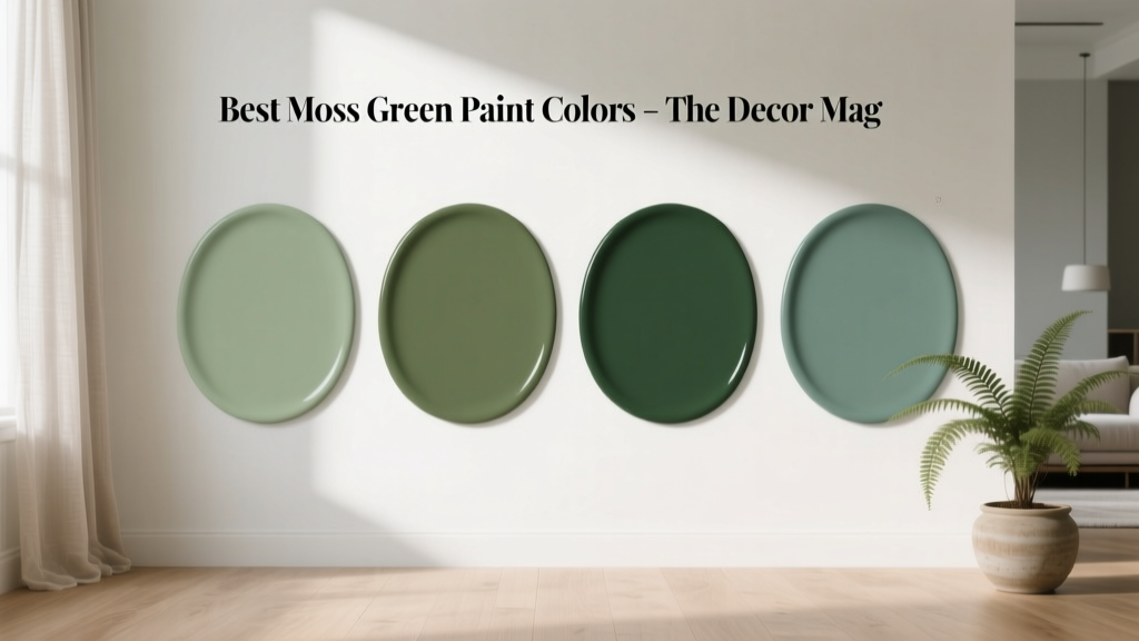 Best Moss Green Paint Colors - The Decor Mag
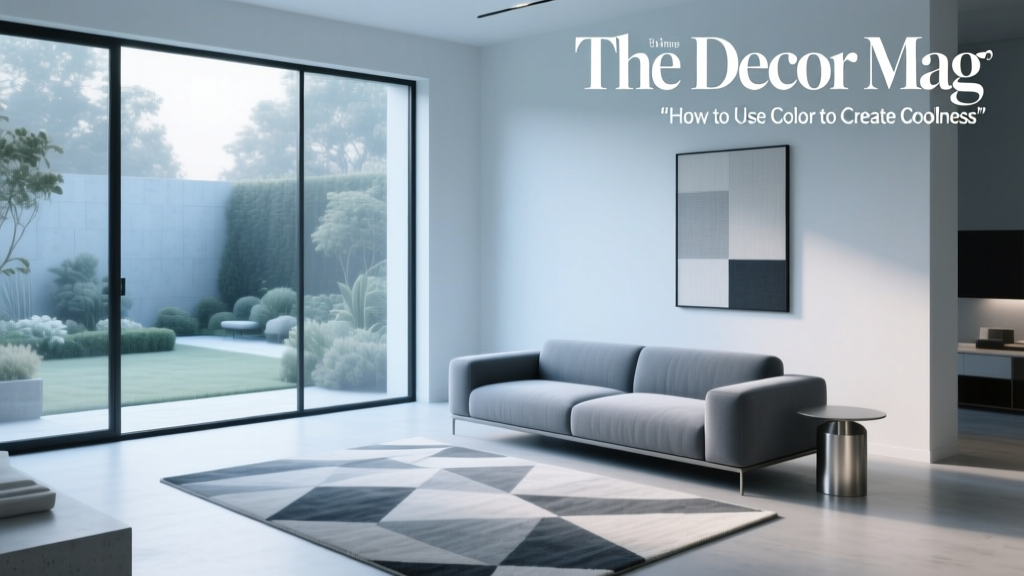 How to Use Color to Create Coolness - The Decor Mag
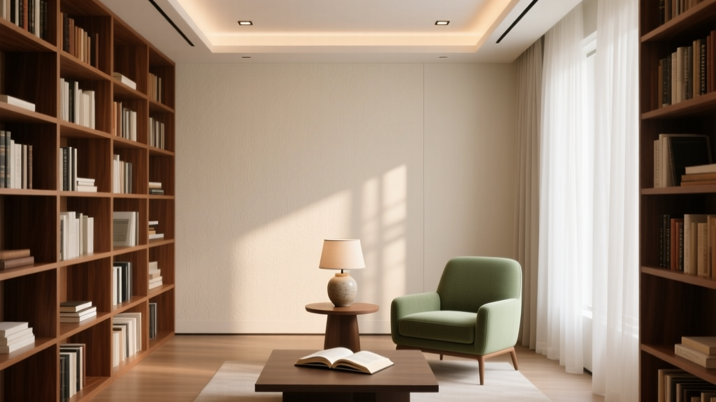 How to Choose Colors for a Library - The Decor Mag
 Best Honey Paint Colors - The Decor Mag
 Best Plum Paint Colors for Drama - The Decor Mag
 The Ultimate Reading Guide: Science-Backed Strategies for Faster Comprehension, Retention, and Lifelong Engagement
 Tetradic Color Scheme Guide - The Decor Mag
 Living Room Colors for Entertaining (2026)
 Best Bathroom Floor Solutions: Performance, Safety, and Style Compared
 Color Psychology in Living Rooms: Mood & Function (2026)