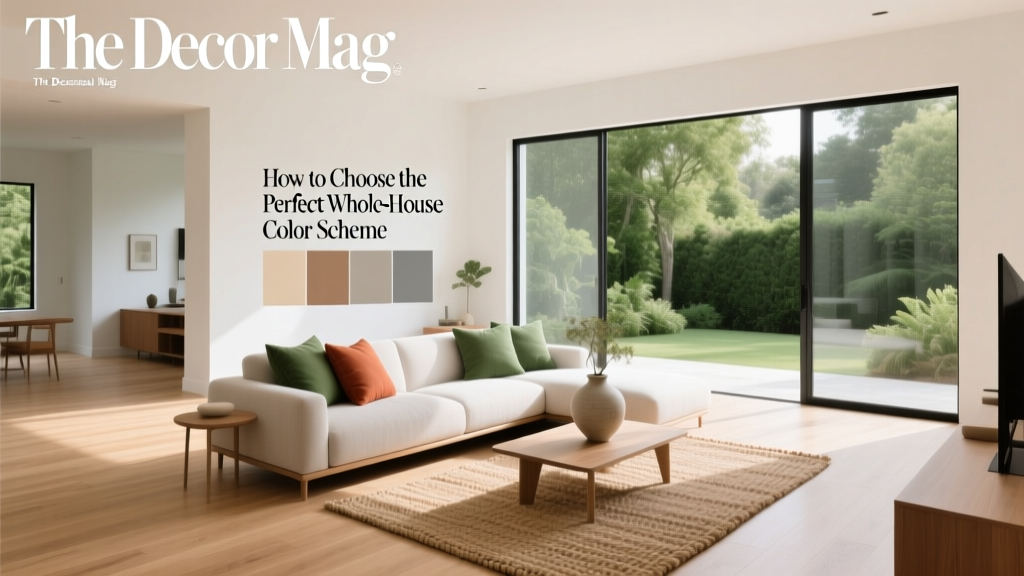
Whole-House Color Scheme: How to Choose (2026)
A whole-house color scheme does more than make your rooms look “coordinated.” It shapes how your home feels from the moment you step inside—calm or energetic, airy or grounded, modern or classic. The right palette creates a visual rhythm as you move from space to space, making even a mix of old and new furnishings feel intentional.
Color also affects daily life in subtle ways. Warm hues can encourage sociability in gathering spaces, cooler tones can support focus and rest, and balanced neutrals can give your mind a break in a busy household. When you plan paint colors as a system rather than room-by-room impulses, you get a home that flows, photographs beautifully, and adapts to changing décor over time.
This guide breaks down interior color design into a clear, repeatable process—complete with paint color recommendations, room-by-room scenarios, and the most common mistakes that derail otherwise great ideas.
What “Whole-House Color Scheme” Really Means
A whole-house color scheme is a curated set of paint colors (and undertones) that repeat throughout your home in a deliberate way. You’re not painting every room the same shade. You’re building a palette with:
- 1–2 core neutrals (for most walls and/or trim)
- 1–3 supporting colors (soft color shifts between rooms)
- 1–2 accent colors (bolder moments: powder rooms, doors, built-ins)
- A consistent trim strategy (same white or same depth across the home)
Design principle: repetition creates unity; contrast creates interest. A successful whole-home paint palette balances both.
Step 1: Read Your Home’s Fixed Elements and Light
Start with what won’t change
Your best color scheme will harmonize with “fixed finishes,” including:
- Flooring (red oak, walnut, gray LVP, terracotta tile)
- Stone and tile (cool marble vs warm travertine)
- Cabinetry and countertops
- Large upholstered pieces you plan to keep
Practical tip: Make a quick “finish board” by photographing floors, counters, and key furniture in daylight. Undertones show up more clearly in photos.
Evaluate natural light direction (and what it does to paint)
- North-facing rooms: cooler, flatter light; warm neutrals prevent a chilly cast.
- South-facing rooms: bright, warm light; many colors look richer and more saturated.
- East-facing rooms: crisp morning light, softer afternoon; colors can shift noticeably.
- West-facing rooms: warm late-day glow; be careful with already-warm paint colors.
Color psychology note: Cooler palettes tend to feel serene and spacious; warmer palettes feel welcoming and cozy. Light direction helps you decide where each effect will feel best.
Step 2: Choose a Neutral “Anchor” (Your Home’s Backbone Color)
If you want effortless flow, select one neutral that can live in multiple rooms—hallways, open-concept areas, and adjacent spaces. The goal isn’t “safe.” The goal is compatible: a neutral with an undertone that agrees with your floors and stone.
Popular whole-house neutral families (with paint recommendations)
Warm whites (creamy, inviting, great with warm woods)
- Benjamin Moore White Dove (OC-17): a classic soft white with gentle warmth, excellent on walls or trim.
- Sherwin-Williams Alabaster (SW 7008): warm, approachable, ideal for an airy but not stark feel.
- Farrow & Ball Wimborne White (No. 239): clean with a traditional softness; lovely in older homes.
Balanced greige (works with many finishes, modern-traditional sweet spot)
- Sherwin-Williams Accessible Beige (SW 7036): flexible greige that plays well with both warm and cool elements.
- Benjamin Moore Edgecomb Gray (HC-173): warm greige that feels light and calm, great for open plans.
- Benjamin Moore Balboa Mist (OC-27): pale greige with a refined look; watch in very cool light.
Soft, modern gray (best when floors/stone lean cool)
- Benjamin Moore Classic Gray (OC-23): barely-there gray-beige, reads clean and spacious.
- Sherwin-Williams Repose Gray (SW 7015): a designer staple; can read warm or cool depending on light.
Application guidance: If you’re unsure between two neutrals, choose the one that looks best next to your largest fixed element (often flooring). Your walls should support the room; the floor shouldn’t fight the walls.
Step 3: Decide on a Trim and Ceiling Strategy (This Is Where “Polished” Happens)
Consistency with trim is one of the fastest ways to make a whole-house color scheme look intentional. Pick a trim color and use it throughout the home—baseboards, casings, doors, and ideally ceilings (or a coordinated ceiling white).
Reliable trim whites (designer favorites)
- Benjamin Moore Chantilly Lace (OC-65): crisp, modern white; best with cooler palettes.
- Benjamin Moore Simply White (OC-117): bright with a touch of warmth; friendly in most homes.
- Sherwin-Williams Pure White (SW 7005): a balanced white that doesn’t go too icy or too creamy.
Sheen tips for a cohesive interior color design
- Walls: eggshell (most rooms) or matte (for a softer, high-end look)
- Trim/doors: satin or semi-gloss for durability and subtle contrast
- Ceilings: flat to reduce glare (especially in rooms with lots of natural light)
Pro move: Use the same trim color, but adjust sheen—this creates definition without introducing a new color that might clash across rooms.
Step 4: Build Your Palette Using a Simple Formula
Designers often rely on a ratio that keeps color schemes from feeling chaotic. Try this whole-house guideline:
- 70% core neutral(s) (main walls, hallways, open areas)
- 20% supporting colors (bedrooms, offices, secondary spaces)
- 10% accent colors (powder room, built-ins, interior doors, statement ceilings)
Then add a unifying “thread”—a repeated undertone (warm, cool, earthy, or muted) and a repeated depth level (light, medium, or dark) so rooms relate even when colors change.
Whole-House Color Scheme Ideas (With Real Room Scenarios)
Palette A: Warm, timeless, and welcoming (great for traditional and transitional homes)
- Main neutral: Benjamin Moore White Dove (OC-17)
- Supporting neutral: Sherwin-Williams Accessible Beige (SW 7036)
- Soft color: Benjamin Moore Saybrook Sage (HC-114)
- Accent: Farrow & Ball Hague Blue (No. 30) or Sherwin-Williams Naval (SW 6244)
- Trim: Benjamin Moore Simply White (OC-117)
How it looks in a home:
- Open-concept living/dining: White Dove walls keep things bright; add texture via rugs and linen drapery.
- Kitchen: Accessible Beige on walls pairs beautifully with warm wood floors and brass; keep cabinets white or light greige.
- Primary bedroom: Saybrook Sage creates a restorative vibe (color psychology: green supports calm and balance).
- Powder room: Hague Blue for drama—high impact, low commitment.
Palette B: Airy and modern (perfect for lots of natural light and clean-lined interiors)
- Main neutral: Benjamin Moore Classic Gray (OC-23)
- Supporting color: Sherwin-Williams Sea Salt (SW 6204)
- Warm counterbalance: Sherwin-Williams Shoji White (SW 7042)
- Accent: Benjamin Moore Kendall Charcoal (HC-166)
- Trim: Sherwin-Williams Pure White (SW 7005)
How it looks in a home:
- Hallways and main areas: Classic Gray reads open and refined without feeling cold.
- Bathrooms: Sea Salt brings spa energy and flatters white tile.
- Guest room or office: Shoji White adds subtle warmth (helpful if the room faces north).
- Built-ins or interior doors: Kendall Charcoal adds architectural weight and looks sharp with stainless steel and black hardware.
Palette C: Earthy and grounded (ideal for homes with warm floors, stone, or Mediterranean touches)
- Main neutral: Sherwin-Williams Alabaster (SW 7008)
- Supporting neutral: Benjamin Moore Edgecomb Gray (HC-173)
- Clay accent: Farrow & Ball Setting Plaster (No. 231)
- Deep accent: Sherwin-Williams Iron Ore (SW 7069)
- Trim: Alabaster (same color as walls) in a higher sheen for a soft, modern look
How it looks in a home:
- Living room: Alabaster keeps the room sunlit and relaxed; layer in natural fibers and warm metals.
- Dining room: Setting Plaster adds flattering warmth for evening gatherings (color psychology: pink-clay tones feel nurturing and convivial).
- Mudroom/laundry: Iron Ore on cabinetry or a feature wall hides scuffs and adds sophistication.
Step 5: Create Flow Room-to-Room (Without Making Everything Match)
“Flow” comes from controlled transitions. Use these strategies to connect paint colors across adjacent spaces:
- Repeat one color at least twice. Example: the same soft green in a bedroom and a hallway runner pattern.
- Keep undertones consistent. If your main neutral is warm, your supporting colors should be muted and warm-leaning, not icy.
- Shift depth, not temperature. Move from light to medium to dark within the same undertone family.
- Use doors as “buffers.” If two colors are close but not perfect neighbors, separate them with a doorway painted in your consistent trim color.
Open floor plan tip: In a great room that includes kitchen, dining, and living, use one wall color across the entire space. Bring variety through textiles, art, and accent paint on an island or built-ins.
Testing Paint Colors the Designer Way
Even the best paint color recommendations can fail if you skip testing. Paint is highly reflective and will pick up colors from floors, rugs, and even landscaping outside.
- Test large samples. Paint 2' x 2' swatches or use large peel-and-stick samples.
- Test on multiple walls. At minimum, one bright wall and one shadow wall.
- Observe for 24 hours. Morning, afternoon, evening, lamps on and off.
- Check next to trim and flooring. Undertone conflicts show up at the edges.
Quick hack: If a color looks great at noon but awful at night, your light bulbs may be the issue. Warm LEDs (2700K–3000K) usually flatter warm neutrals; 3000K–3500K can suit balanced greiges and modern palettes.
Common Whole-House Color Mistakes to Avoid
- Picking paint colors in isolation. A swatch that’s pretty alone can clash next to stone, cabinetry, or flooring.
- Mixing mismatched undertones. Cool gray walls with warm beige tile often look “off,” even if both are neutral.
- Using too many unrelated colors. If every room has a different bold hue, your home can feel fragmented and visually tiring.
- Ignoring sheen and finish. The same color in different sheens can read like two different colors—use this intentionally, not accidentally.
- Going too bright too fast. Highly saturated walls can feel overwhelming in large areas; use bold color as an accent or in smaller rooms first.
- Forgetting the transition spaces. Hallways, stairwells, and foyers are the glue. Treat them as part of the palette, not leftovers.
FAQ: Whole-House Paint Colors and Color Schemes
How many paint colors should a whole-house color scheme include?
Most homes feel cohesive with 5–9 total paints: 1–2 wall neutrals, 1 trim color, 2–4 supporting room colors, and 1–2 accents for punch (doors, built-ins, powder room).
Should every room be a different color?
No. Repeating the same neutral in connecting spaces creates flow. Use different colors where you want a shift in mood—bedrooms, offices, or a dining room—while keeping undertones consistent.
What are the safest whole-house neutral paint colors?
Designer-friendly choices include Benjamin Moore White Dove, Sherwin-Williams Alabaster, Sherwin-Williams Accessible Beige, and Benjamin Moore Edgecomb Gray. “Safest” depends on your fixed finishes and light, so test before committing.
How do I choose between warm white and cool white walls?
Look at your flooring and stone. Warm woods, cream tile, and brass usually prefer warm whites (White Dove, Alabaster). Cool marble, gray tile, and chrome often look sharper with cleaner whites (Chantilly Lace, Pure White). Light direction matters too—north-facing rooms typically benefit from warmth.
What’s the best way to add color without repainting everything later?
Use color strategically in smaller, high-impact places: a powder room, laundry room, interior doors, a kitchen island, or built-in cabinetry. Keep main areas neutral so your palette can evolve with décor.
Can I use different trim colors in different rooms?
You can, but it’s harder to make a home feel cohesive. A single trim color throughout is the simplest route to a polished whole-house color scheme. If you want variation, change sheen or use an accent color on interior doors rather than changing all trim.
Your Next Steps: Build a Palette You’ll Love Living With
Start by identifying your fixed finishes and the light direction in your most-used rooms. Choose one anchor neutral, commit to a consistent trim color, then add two or three supporting shades that share undertones. Test your finalists on multiple walls, in daylight and lamplight, and map your choices on a simple floor plan before you buy gallons.
For more paint color recommendations, undertone guides, and room-specific color scheme ideas, explore our latest color articles at thedecormag.com.
More Articles
 How to Choose Colors for a Breakfast Nook - The Decor Mag
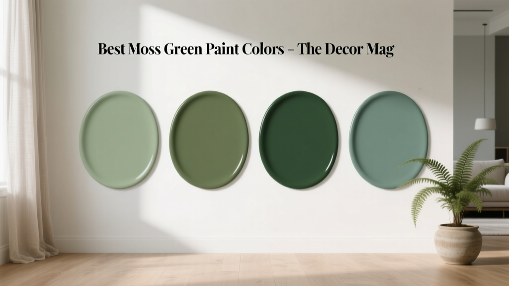 Best Moss Green Paint Colors - The Decor Mag
 Best Midnight Blue Paint Colors - The Decor Mag
 Best Living Rooms for STEP: Design, Layout, and Accessibility Standards for Seniors and Mobility Support
 Best Steel Blue Paint Colors - The Decor Mag
 Best Watermelon Red Paint Colors - The Decor Mag
 Reading FAQ Answered: Evidence-Based Answers to 27 Common Questions About Vision, Eye Health, and Reading Performance
 How to Create a Modern Color Palette - The Decor Mag
 How to Create an Energizing Color Palette - The Decor Mag
 Best Sky Blue Paint Colors - The Decor Mag