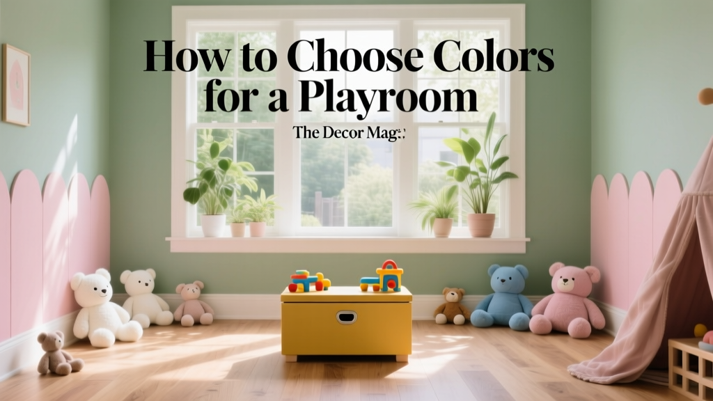
How to Choose Colors for a Playroom - The Decor Mag
A playroom is one of the few spaces in a home where joy can lead the design brief. It’s where art projects sprawl, imaginations run loud, and little personalities evolve quickly. Color does more than decorate that story—it shapes it. The right paint colors can make a room feel energizing without being chaotic, calming without being dull, and flexible enough to grow with your child.
Because playrooms often do double duty (homework zone, craft studio, reading nook, sleepover hub), color choices matter for function as much as fun. A thoughtful interior color design approach helps you manage visual clutter, support focus, and create “zones” without building walls.
Below, you’ll find practical color psychology, proven color schemes, specific paint color recommendations, and real-world application scenarios so you can choose playroom colors that look great, wear well, and feel right for your family.
Start With How the Playroom Will Be Used
Before choosing paint swatches, clarify how the room needs to perform. This will guide your color scheme and sheen choices far more effectively than chasing trends.
Ask yourself these questions
- Who uses the room? Toddlers, school-age kids, teens, adults supervising?
- What happens here most? Active play, LEGO builds, reading, crafts, gaming, homework?
- How messy will it get? Markers, finger paint, scuffs from ride-on toys?
- Is it shared with another function? Guest room, office, storage, laundry pass-through?
- How long do you want the colors to last? A few years vs. a decade-long “grow with them” plan.
Match color energy to activity zones
- High-energy zone (gross motor play): warmer or brighter accents work well.
- Focus zone (homework, puzzles): softer mid-tones reduce glare and distraction.
- Calm zone (reading nook): cooler greens/blues or warm neutrals help regulate.
Use Color Psychology Without Overdoing It
Color psychology isn’t about assigning one emotion to one hue—it’s about how saturation, value (lightness/darkness), and contrast influence mood. In a playroom, the goal is typically “stimulating but not frantic.”
General color effects that work well in playrooms
- Blues: can feel calming and spacious; great for reading corners and “reset” areas.
- Greens: balanced and restorative; often the easiest color family to live with long-term.
- Yellows: optimistic and sunny, but can feel sharp if too bright or used everywhere.
- Reds and hot pinks: high energy; best as accents or in small doses.
- Purples: playful and creative; softer lavenders are more soothing than saturated violets.
- Neutrals: give the eyes a place to rest and make toys/books look intentional rather than cluttered.
In practice, most successful playroom color schemes rely on a neutral or gentle base plus controlled bursts of color through one wall, built-ins, furniture, rugs, or art.
Evaluate Light First: The Key to Choosing Paint Colors
Lighting changes everything. The same paint color can look crisp in a bright south-facing room and muddy in a low-light basement playroom. When choosing playroom paint colors, start by assessing:
- Natural light direction: North light is cooler; south is warmer; east is morning-bright; west can be golden and intense.
- Room size and ceiling height: darker colors can cozy a big room, but may shrink a small one.
- Artificial lighting: warm LEDs can yellow whites; cool LEDs can make colors look icy.
Practical sampling tips
- Test large swatches (12x12 minimum) on multiple walls.
- Look at samples morning, afternoon, and evening.
- Hold the color next to flooring, storage furniture, and the largest rug.
- Remember: a color on four walls always reads stronger than on a chip.
Choose a Color Scheme That Can Handle Visual Clutter
Playrooms come with built-in color: toys, books, bins, art supplies. A smart interior color design strategy is to choose paint colors that “edit” the room visually.
Three reliable playroom color scheme formulas
1) Neutral base + one signature accent
Best for: shared spaces, long-term flexibility, toy-heavy rooms.
- Base ideas: Benjamin Moore White Dove (OC-17), Sherwin-Williams Alabaster (SW 7008)
- Accent wall ideas: Sherwin-Williams Sea Salt (SW 6204), Benjamin Moore Wythe Blue (HC-143)
2) Soft color-on-color (two to three related hues)
Best for: calm, design-forward playrooms, Montessori-inspired spaces.
- Example palette: muted green + warm white + clay accent
- Paint ideas: Farrow & Ball Green Smoke (No. 47), Benjamin Moore Classic Gray (OC-23), Sherwin-Williams Cavern Clay (SW 7701) as a small punch
3) High-contrast graphics (but controlled)
Best for: modern homes, older kids, creative families who want impact.
- Example palette: crisp white + black + one bright color
- Paint ideas: Benjamin Moore Chantilly Lace (OC-65), Sherwin-Williams Tricorn Black (SW 6258), Benjamin Moore Caliente (AF-290) for a confident accent
Specific Color Recommendations (By Playroom “Mood”)
Use these paint color combinations as starting points. Adjust saturation based on your room’s light and the amount of colorful toys you’ll store on display.
Calm & Cozy Playroom (great for mixed ages)
- Walls: Sherwin-Williams Sea Salt (SW 6204) or Benjamin Moore Palladian Blue (HC-144)
- Trim/Ceiling: Sherwin-Williams Alabaster (SW 7008)
- Accent (pillows/bins/door): soft navy like Benjamin Moore Hale Navy (HC-154)
Why it works: blue-green hues reduce visual noise and support a relaxed, “stay awhile” feeling.
Bright & Cheerful (without overwhelming the room)
- Walls: Benjamin Moore Simply White (OC-117) or White Dove (OC-17)
- Accent wall or built-ins: Sherwin-Williams Naples Yellow (SW 9021) or a softer golden tone like Honey Blush (SW 6661) used sparingly
- Secondary accent: a clean teal like Sherwin-Williams Poolhouse (SW 7603) in small areas
Why it works: keeping the main field light allows bright colors to feel intentional rather than chaotic.
Creative Studio Vibe (art-friendly and modern)
- Walls: Benjamin Moore Classic Gray (OC-23) or Sherwin-Williams Agreeable Gray (SW 7029)
- Accent: Sherwin-Williams Cavern Clay (SW 7701) or Benjamin Moore Terra Cotta Tile (2090-30)
- Trim: Benjamin Moore Chantilly Lace (OC-65)
Why it works: warm neutrals hide scuffs and let children’s art become the focal point.
Grow-With-Them Palette (kid-friendly now, teen-friendly later)
- Walls: Benjamin Moore Edgecomb Gray (HC-173)
- Accent: Benjamin Moore Saybrook Sage (HC-114) or Sherwin-Williams Pewter Green (SW 6208)
- Optional deep anchor: Sherwin-Williams Iron Ore (SW 7069) on a door or storage unit
Why it works: grounded greens and warm greiges feel sophisticated while still playful with the right textiles.
Real Room Examples & Application Scenarios
Scenario 1: Small playroom with too many toys
Goal: reduce visual clutter.
- Paint walls a soft neutral: Sherwin-Williams Alabaster (SW 7008).
- Add a single colored element: built-in shelves in Benjamin Moore Wythe Blue (HC-143).
- Choose matching bins (2–3 bin colors max) to create order.
Result: the room reads calmer, and the toys feel curated rather than chaotic.
Scenario 2: Basement playroom with low natural light
Goal: brighten without turning the space stark.
- Use a warm white on walls: Benjamin Moore White Dove (OC-17).
- Add “sun” with accents: a golden ochre rug, or a painted nook in Sherwin-Williams Naples Yellow (SW 9021).
- Consider satin or eggshell for better bounce and cleanability.
Result: the room feels welcoming, not cave-like, and still hides everyday wear.
Scenario 3: Shared playroom + homework corner
Goal: distinct zones using paint colors.
- Main walls: Benjamin Moore Classic Gray (OC-23).
- Homework corner: a calming green like Sherwin-Williams Pewter Green (SW 6208) on the desk wall.
- Play zone: keep it flexible with colorful accessories rather than more paint colors.
Result: the homework area feels intentional and focused without building partitions.
Where to Put Color: Walls, Ceiling, Trim, and Accents
Best places to use bold color
- Accent wall behind shelving (to frame toys and books like a display)
- Inside built-ins (high impact, low overwhelm)
- Doors (a fun surprise color that’s easy to repaint later)
- Lower half of the wall (wainscot effect): hides scuffs and anchors the room
Ceiling color: the underrated playroom move
A soft tinted ceiling can add whimsy without making the room feel smaller. Try a barely-there sky tone (a lightened version of your wall color) or a gentle blue like a very pale take on Benjamin Moore Palladian Blue (HC-144).
Paint finish guidance for durability
- Walls: eggshell or satin for wipeability
- Trim/doors: semi-gloss for durability
- Ceiling: flat or matte to minimize glare
Common Color Mistakes to Avoid
- Using multiple bright colors on large surfaces. It competes with toys and can feel overstimulating.
- Choosing a color without testing it in the room. Lighting can shift a “happy” color into neon or dullness.
- Ignoring undertones. A gray with a purple undertone can clash with warm wood floors; a cool white can look icy next to beige carpet.
- Over-committing to trendy hues. A trendy saturated color can feel dated quickly; use trends in accents if you love them.
- Making everything white. All-white playrooms can highlight mess and feel stark—add warmth through greige, light wood, or a soft color wash.
- Forgetting about visual rest. Kids thrive with stimulation, but they also benefit from calmer fields of color.
Actionable Next Steps for Choosing Your Playroom Colors
- Pick your base: choose a warm white or gentle neutral that complements floors and large furniture.
- Select one “story color”: a green, blue, or clay tone that sets the mood.
- Decide where color lives: one accent wall, built-ins, door, or two-tone lower wall.
- Limit the palette: aim for 3–5 colors total (including white/neutral), especially in toy-heavy rooms.
- Sample and observe: test swatches on multiple walls for 48 hours.
- Plan the textiles: choose a rug or curtain pattern that ties your paint colors together.
FAQ: Choosing Paint Colors for a Playroom
What are the best paint colors for a small playroom?
Light, warm neutrals and soft mid-tones tend to work best. Try Sherwin-Williams Alabaster (SW 7008) or Benjamin Moore White Dove (OC-17) on walls, then add a single accent like Benjamin Moore Wythe Blue (HC-143) on shelving or one wall.
Are bright colors bad for a playroom?
Not at all—bright colors are fantastic in controlled doses. Use them as accents (inside bookcases, on a door, or in a mural shape) rather than on every wall. This keeps the room playful without tipping into overstimulation.
How many colors should a playroom have?
A reliable rule is 3–5 total colors, including your white/neutral. This includes paint plus major textiles (rug, curtains) and helps the room feel cohesive even when toys are out.
What paint finish is best for playroom walls?
Eggshell or satin are the go-to finishes for playrooms because they’re easier to wipe clean than matte/flat. For trim and doors, semi-gloss holds up well to fingerprints and scuffs.
How do I choose colors that will grow with my child?
Start with a timeless base (greige, warm white, soft green) and let personality come through in accessories. Colors like Benjamin Moore Edgecomb Gray (HC-173) paired with Sherwin-Williams Pewter Green (SW 6208) can feel kid-friendly now and still look right for older kids later.
What if my child wants a very bold color?
Give them a “yes” in a defined area: paint the inside of a closet, a playhouse nook, the back panel of shelves, or a geometric section of wall. That approach honors their preference while preserving a balanced color scheme for the whole room.
Conclusion
Choosing colors for a playroom is really about designing a space that supports play, learning, and calm—sometimes all in the same afternoon. A thoughtful color scheme, guided by light, function, and a little color psychology, creates a room that feels lively without losing its balance.
If you’re ready to move forward, pick a flexible base paint color, commit to one signature accent, and test samples in your real lighting. For more paint color ideas, color schemes, and interior color design guidance, explore our latest color guides on thedecormag.com.
More Articles
 Best Kiwi Green Paint Colors - The Decor Mag
 How to Choose Colors for South-Facing Rooms - The Decor Mag
 Reading FAQ Answered: Evidence-Based Answers to 27 Common Questions About Vision, Eye Health, and Reading Performance
 Best Apricot Paint Colors - The Decor Mag
 How to Choose Colors Based on Room Lighting - The Decor Mag
 How to Create a Harmonious Color Palette - The Decor Mag
 Studio Color Palettes That Expand Small Rooms
 Best Melon Paint Colors - The Decor Mag
 How to Use Color to Change Room Perception - The Decor Mag
 Best Sky Blue Paint Colors - The Decor Mag