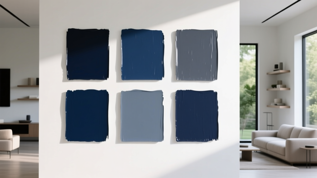
Best Navy Paint Colors for Every Style - The Decor Mag
Navy is one of those rare paint colors that can feel classic and fresh at the same time. It reads as grounded and tailored, yet it has enough depth to look sophisticated in modern homes. Whether you want a bold dining room, a calm bedroom, or a crisp exterior, navy paint offers a high-impact way to add character without relying on trendy, short-lived hues.
From a color psychology standpoint, navy tends to signal stability, confidence, and calm—qualities that make rooms feel more intentional and “designed.” It also performs beautifully as a near-neutral: it can function like black or charcoal in a color scheme, but with a softer, more livable presence. The key is choosing the right navy paint color (undertones matter) and pairing it with the right finishes, lighting, and supporting colors.
This guide walks through standout navy paint colors for every interior style, where they work best, what to pair them with, and the most common navy color mistakes that can derail an otherwise great plan.
Why Navy Works: Color Theory, Undertones, and Light
Navy’s undertones: the secret to a “perfect” match
Navy isn’t just “dark blue.” It can lean:
- Green-leaning (inky, moody, slightly earthy)
- Violet-leaning (richer, more dramatic, sometimes jewel-like)
- Gray-leaning (muted, modern, and more neutral)
- True blue (crisp, classic, and nautical)
Undertone decides whether your navy reads serene or stormy, preppy or industrial, traditional or contemporary.
Lighting changes everything (especially with dark paint colors)
Navy paint can shift significantly depending on:
- Natural light direction: North-facing rooms often make navy look cooler and deeper; south-facing rooms bring out warmth and richness.
- Artificial lighting: Warm LEDs can soften navy and reveal green undertones; cool LEDs can sharpen it and emphasize blue/violet.
- Sheen level: Matte absorbs light (moodier), while satin/eggshell reflects light (more polished, sometimes brighter).
Design principle: navy as an anchor color
In interior color design, navy often acts as an anchor—a stabilizing deep tone that makes lighter colors look cleaner and more luminous. It’s a reliable way to add contrast, define architectural features, and create a focal point without the visual harshness of black.
Best Navy Paint Colors (with Brand References) by Style
1) Classic & Traditional: Timeless, tailored navy
If you love wainscoting, crown molding, warm woods, and heritage-inspired interiors, choose navies with a slightly softened, dignified feel.
- Benjamin Moore Hale Navy (HC-154) — A go-to “true” navy. Rich and balanced, great for built-ins, dining rooms, and exteriors.
- Sherwin-Williams Naval (SW 6244) — Deep and confident with a clean finish; reads elegant in traditional and transitional spaces.
- Farrow & Ball Hague Blue (No. 30) — A deep blue with green undertones; refined and historic-feeling, stunning in libraries and studies.
Real room scenario: A traditional dining room with white trim and navy walls feels formal without being fussy. Pair Hale Navy on the walls with warm brass sconces, a walnut table, and creamy linen drapes. Keep the ceiling a crisp white to preserve height and brightness.
Best pairings for traditional navy:
- Warm whites (ivory, cream)
- Brass and antique gold finishes
- Wood tones: walnut, mahogany, medium oak
- Accents: camel leather, burgundy, forest green
2) Modern & Minimal: Sleek navy with a gray edge
Modern spaces often look best with navies that feel slightly muted or inky—less nautical, more architectural.
- Benjamin Moore Gentleman’s Gray (2062-20) — A very deep blue that can read near-black; dramatic and modern on accent walls or cabinetry.
- Sherwin-Williams Inkwell (SW 6992) — A bold blue-black that’s striking in contemporary rooms with clean lines.
- Farrow & Ball Railings (No. 31) — A soft black with blue undertones; sophisticated for doors, trim, and modern cabinetry.
Real room scenario: In an open-concept living space, paint a single fireplace wall in Inkwell and keep surrounding walls warm white. Add black-framed art, a low-profile sofa, and a pale oak coffee table. The navy acts as a clean focal plane without clutter.
Modern color schemes that work:
- Navy + warm white + black accents
- Navy + greige + light oak
- Navy + taupe + brushed nickel
3) Coastal & Nautical: Crisp, clean, and airy navy
Coastal style needs navy that reads straightforward, fresh, and classic—especially paired with bright whites and sandy neutrals.
- Benjamin Moore Hale Navy (HC-154) — A coastal classic when paired with bright white trim.
- Sherwin-Williams Salty Dog (SW 9177) — Bold and saturated, great for doors, accents, or a powder room with wallpaper.
- Behr Starless Night (MQ5-05) — Deep and approachable; works well in family-friendly interiors.
Real room scenario: A coastal mudroom with beadboard painted Salty Dog looks polished and practical. Add white hooks, woven baskets, and a striped runner. Choose a satin finish for easier cleaning in high-traffic areas.
Coastal-friendly combos:
- Navy + bright white + natural jute
- Navy + soft sand + driftwood tones
- Navy + pale blue + brushed brass
4) Farmhouse & Rustic: Navy that feels warm and grounded
Farmhouse and rustic interiors often have warm woods, creamy whites, and aged metals. Choose navies that don’t feel too sharp—slightly softened or green-leaning options are often the sweet spot.
- Farrow & Ball Hague Blue (No. 30) — Green-leaning depth pairs beautifully with reclaimed wood and vintage rugs.
- Sherwin-Williams Naval (SW 6244) — Strong enough for cabinetry and islands, especially with warm countertops.
- Benjamin Moore Newburyport Blue (HC-155) — A rich blue with classic appeal; charming on kitchen islands and built-ins.
Real room scenario: A farmhouse kitchen with a navy island painted Newburyport Blue looks custom and grounded. Pair with off-white perimeter cabinets, a butcher-block accent, and aged bronze hardware for a lived-in warmth.
Rustic-friendly pairings:
- Creamy whites instead of stark bright whites
- Weathered woods and warm oak
- Oil-rubbed bronze or aged brass
- Textiles: ticking stripe, wool, vintage-inspired patterns
5) Glam & Art Deco: Jewel-like navy with high contrast
For glamorous spaces, look for navy that feels saturated and luxe. This is where velvet, lacquer, brass, and marble shine.
- Benjamin Moore Blue Note (2129-30) — A deep, elegant navy that feels plush and moody.
- Sherwin-Williams Anchors Aweigh (SW 9179) — A rich navy that pairs well with gold and statement lighting.
- Farrow & Ball Stiffkey Blue (No. 281) — Intensely pigmented and dramatic; ideal for a jewel-box powder room.
Real room scenario: Paint a powder room in Stiffkey Blue with a high-gloss or modern eggshell finish. Add a marble vanity top, a vintage-inspired mirror, and brass fixtures. The high contrast makes the room feel intentional and high-end.
Glam color pairings:
- Navy + brass + crisp white
- Navy + emerald + black accents
- Navy + blush + champagne metals
Where Navy Paint Looks Best: Room-by-Room Guidance
Living rooms
- Use navy on a feature wall behind a sofa or fireplace for depth.
- Balance with lighter textiles: ivory curtains, pale rugs, and light wood.
- Best picks: Hale Navy, Naval, Railings.
Bedrooms
- Navy supports restful sleep when paired with warm whites and soft textures.
- Try navy on the headboard wall or all four walls for a cocoon effect.
- Best picks: Blue Note, Hague Blue, Naval.
Kitchens and cabinetry
- Navy cabinets feel custom; choose durable finishes and wipeable sheens.
- Pair with: white quartz, warm butcher block, or light granite with movement.
- Best picks: Newburyport Blue, Hale Navy, Inkwell (for a blue-black look).
Bathrooms and powder rooms
- Navy is ideal for “jewel-box” powder rooms and spa-like bathrooms.
- Use reflective surfaces (mirrors, polished tile) to keep it from feeling heavy.
- Best picks: Stiffkey Blue, Anchors Aweigh, Salty Dog.
Exteriors and front doors
- Navy exteriors read classic and upscale, especially with white trim.
- For doors, go a touch bolder—high contrast boosts curb appeal.
- Best picks: Hale Navy, Naval, Salty Dog.
How to Build a Navy Color Scheme (That Looks Designed)
Use the 60-30-10 rule
A reliable interior color design approach:
- 60% dominant light neutral (walls or large surfaces)
- 30% secondary color (navy on cabinetry, built-ins, a feature wall, or upholstered pieces)
- 10% accent color (brass, terracotta, emerald, artwork, pillows)
Navy-friendly paint colors and materials to pair
- Whites: warm white, soft white, crisp white (choose based on lighting)
- Neutrals: greige, taupe, warm gray, camel
- Complementary accents: rust/terracotta, copper, mustard, coral
- Nature-inspired pairings: sage green, olive, warm wood
- Metals: brass (warm), polished nickel (clean), black (graphic)
Common Navy Paint Mistakes (and How to Avoid Them)
- Choosing navy without testing undertones: Paint large swatches on multiple walls and check them morning, afternoon, and night.
- Using a bright white that feels icy: If the room is north-facing, consider a warmer white for trim and ceiling to prevent a cold, flat look.
- Ignoring sheen: Matte can look velvety on walls, but on trim/cabinetry a satin or semi-gloss often wears better and looks sharper.
- Not balancing dark paint colors: Bring in light rugs, pale upholstery, and reflective finishes so navy feels intentional—not heavy.
- Forgetting about adjacent rooms: Navy works best when the surrounding spaces have a related undertone (warm with warm, cool with cool) to avoid awkward transitions.
FAQ: Navy Paint Colors, Finishes, and Design Tips
What is the most popular navy paint color?
Benjamin Moore Hale Navy is one of the most widely used navy paint colors because it’s balanced, versatile, and reads “true navy” in many homes. Sherwin-Williams Naval is another top favorite for walls and cabinetry.
Will navy walls make my room look smaller?
Navy can make a room feel more intimate, but not necessarily smaller. Use lighter flooring or rugs, keep the ceiling bright, and add layered lighting (ambient + task + accent). Dark paint colors often look best when the room has contrast and a few reflective surfaces.
What trim color looks best with navy?
Most homeowners prefer a crisp white or soft warm white trim with navy. If you want a moodier look, consider a lower-contrast approach—soft white walls with navy trim or even navy-on-navy with a sheen shift (matte walls, satin trim).
Is navy a warm or cool color?
Navy is typically cool, but undertones can make it feel warmer or cooler. A green-leaning navy can feel earthier and warmer; a violet-leaning navy can feel cooler and more dramatic. Always test in your lighting.
What colors go well with navy in a whole-house color palette?
Navy pairs well with warm whites, greige, light oak, and accents like terracotta, mustard, and brass. For a calmer palette, pair navy with soft sage, dusty blue, and creamy neutrals.
Should I use navy in a matte or satin finish?
For walls, matte or eggshell typically looks the most refined and forgiving. For cabinetry, doors, and trim, satin or semi-gloss is more durable and easier to clean. In powder rooms, a higher sheen can look especially dramatic.
Next Steps: Choose, Test, and Commit with Confidence
Start by deciding what role navy will play in your space: a grounding wall color, a statement cabinet finish, or an accent on doors and built-ins. Then narrow your options to two or three navy paint colors, test them in large swatches, and evaluate them in your room’s natural and artificial light. Finally, build a supporting color scheme with the right white, a warm neutral, and a few accents that match your style.
For more paint color advice, color scheme ideas, and room-by-room guides, explore our latest color articles on thedecormag.com.
More Articles
 Best Denim Blue Paint Colors - The Decor Mag
 Best Charcoal Paint Colors for Modern Spaces - The Decor Mag
 How to Use Desaturated Colors for Elegance - The Decor Mag
 Best Crimson Paint Colors - The Decor Mag
 How to Choose Colors for Kitchen Cabinets - The Decor Mag
 How to Create a Moody Color Palette - The Decor Mag
 Best Gray Paint Colors for 2026 - The Decor Mag
 Best Seaweed Green Paint Colors - The Decor Mag
 Best Pink Paint Colors That Aren't Juvenile - The Decor Mag
 Best Mustard Yellow Paint Colors - The Decor Mag