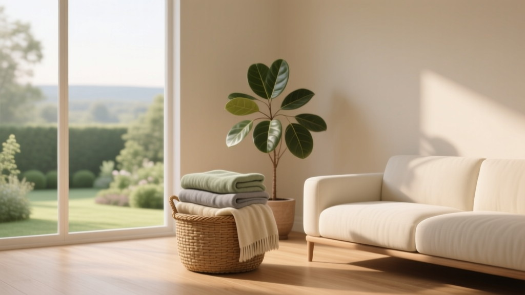
How to Use Color to Create Calm - The Decor Mag
Color is one of the fastest ways to change how a home feels. Before furniture is moved or renovations begin, paint colors and soft furnishings quietly set the emotional “volume” of a room—either amplifying stress or lowering it. When life is busy, many homeowners crave spaces that feel restorative: bedrooms that help you exhale, living rooms that feel grounded, and kitchens that don’t overwhelm.
Calm doesn’t mean bland. The most soothing interiors are rarely all-white or colorless; they’re thoughtfully layered with gentle hues, balanced contrast, and lighting-aware choices. Understanding a few basics of color psychology, undertones, and saturation helps you build color schemes that feel peaceful in real life—morning and night, sunny and cloudy, tidy and lived-in.
This guide breaks down how to use interior color design to create calm, with specific paint color recommendations (including brand names), room-by-room scenarios, and the most common mistakes that turn “serene” into “flat” or “cold.”
What “Calm” Looks Like in Color Psychology
Color psychology isn’t about rigid rules; it’s about patterns in how people tend to respond to color. In interiors, calm is most often associated with hues that feel stable, soft, and nature-adjacent. Think sky, sand, stone, fog, and leaves after rain.
Three traits calm colors tend to share
- Lower saturation: Muted, dusty, or grayed tones read quieter than bright, pure hues.
- Balanced undertones: Colors that don’t swing too pink, too yellow, too icy, or too neon feel easier on the eye.
- Comfortable contrast: Calm rooms still need contrast, just not harsh contrast. Soft whites, gentle charcoals, and warm woods keep things grounded.
The nervous system and “visual noise”
Many overstimulating rooms share a common feature: too many competing colors and high-contrast edges. Calm color schemes reduce “visual noise” by repeating a limited palette and choosing finishes that soften light (eggshell, matte, washed textiles).
Foundations: Undertone, Light, and Finish
Before choosing paint colors, evaluate three factors that often make or break a calming palette.
1) Identify the room’s light temperature
- North-facing rooms: Cooler, grayer light; warm-leaning neutrals and greiges often feel more inviting.
- South-facing rooms: Warm, bright light; cooler greens and blue-grays stay balanced and don’t turn yellow.
- East-facing rooms: Crisp morning light, softer later; colors can shift dramatically throughout the day.
- West-facing rooms: Warm afternoon glow; be cautious with warm whites and beiges that can look too golden at sunset.
2) Understand undertones (the hidden color bias)
A “neutral” paint color often has a whisper of green, pink, violet, or yellow. In calm interiors, undertone harmony matters more than the color family itself. A green-gray with a blue undertone will feel serene next to marble and stainless, while a beige with a pink undertone may clash and feel restless.
3) Choose a calming finish
- Walls: Matte or eggshell to soften glare and reduce harsh reflections.
- Trim: Satin or semi-gloss for cleanability and gentle contrast.
- Ceilings: Flat/matte; consider a “soft ceiling” tint instead of stark white for a cocoon effect.
Calm Color Families (and Exactly What to Try)
These are reliable starting points for calm paint colors and interior color schemes. Always sample first—calm is as much about how a color behaves in your specific light as the color itself.
Soft whites that feel quiet, not sterile
Soft whites create calm when they’re warm enough to feel welcoming and complex enough to avoid looking like primer.
- Benjamin Moore White Dove (OC-17): A creamy, balanced white; excellent for whole-home calm or trim in layered neutral schemes.
- Sherwin-Williams Alabaster (SW 7008): Warm, gentle, and forgiving in mixed lighting; ideal for bedrooms and living rooms.
- Farrow & Ball Wimborne White (No. 239): A soft, traditional white with subtle warmth; works beautifully with natural materials.
Calm pairing idea: Soft white walls + warm oak + linen textiles + brushed brass accents for warmth without busyness.
Greige and warm neutrals for grounded serenity
Greige (a blend of gray and beige) is a staple in calming interior color design because it reads stable and quietly warm.
- Benjamin Moore Edgecomb Gray (HC-173): A classic greige that adapts to many homes; soothing in open-plan spaces.
- Sherwin-Williams Agreeable Gray (SW 7029): A versatile warm neutral; can feel calm with layered textures and creamy whites.
- Farrow & Ball Skimming Stone (No. 241): Soft, stone-like warmth; elegant in bedrooms and hallways.
Calm pairing idea: Greige walls + crisp off-white trim + blackened metal hardware + woven natural fiber rugs.
Blue-grays and gentle blues for a slower pace
Blues often lower the perceived “temperature” of a space, which many people interpret as calm. The key is avoiding overly icy or overly saturated blues unless balanced with warmth.
- Benjamin Moore Smoke (2122-40): A soft blue-gray-green chameleon; spa-like in bathrooms and serene in bedrooms.
- Sherwin-Williams Sea Salt (SW 6204): A light green-blue that reads airy and clean; excellent for coastal calm.
- Benjamin Moore Boothbay Gray (HC-165): A deeper, classic blue-gray; calming as an accent wall or in a den.
Calm pairing idea: Blue-gray walls + warm white trim + walnut furniture + creamy textiles to avoid a chilly feel.
Muted greens for nature-based calm
Green is strongly associated with restoration because it echoes landscapes and plants. Muted greens—sage, olive, and gray-greens—are especially calming.
- Benjamin Moore Saybrook Sage (HC-114): A time-tested sage; cozy, stable, and welcoming.
- Sherwin-Williams Evergreen Fog (SW 9130): A modern gray-green; calm without being too “country.”
- Farrow & Ball Mizzle (No. 266): A gentle, misty green-gray that shifts beautifully with daylight.
Calm pairing idea: Sage walls + creamy white ceiling + aged brass + pale woods + handmade ceramics.
Dusty blush and warm clay for quiet comfort
Warm pinks, blush tones, and clay neutrals can be deeply calming when they’re muted and grounded—think sunrise rather than bubblegum.
- Farrow & Ball Setting Plaster (No. 231): A soft plaster pink; calming in bedrooms and reading nooks.
- Benjamin Moore White Sand (OC-10): Warm, sandy neutral with subtle peachy comfort.
- Sherwin-Williams Redend Point (SW 9081): A modern clay-leaning neutral; excellent for cozy living rooms.
Calm pairing idea: Dusty blush walls + warm white trim + natural linen + terracotta accents in small doses.
Room-by-Room: Real Application Scenarios
Bedroom: create a “lowered heartbeat” palette
Bedrooms benefit from color schemes that reduce contrast and feel enveloping. Consider taking paint beyond the walls for a cocoon effect.
- Scenario A: Spa calm
Walls: Benjamin Moore Smoke (2122-40)
Trim/Ceiling: Benjamin Moore White Dove (OC-17)
Textiles: white linen, pale gray blanket, light wood nightstands - Scenario B: Warm, grounded calm
Walls: Sherwin-Williams Alabaster (SW 7008)
Accent (headboard wall or ceiling): Sherwin-Williams Evergreen Fog (SW 9130)
Metals: aged brass or warm bronze
Tip: If you’re sensitive to coolness at night, lean toward warm whites and sage greens rather than icy blue-grays.
Living room: calm that still feels social
Living rooms need calm without feeling sleepy. A smart approach is using a quiet neutral on most surfaces, then adding one slightly deeper anchoring color.
- Base: Benjamin Moore Edgecomb Gray (HC-173) on walls.
- Anchor: Add depth with a muted blue-gray (Benjamin Moore Boothbay Gray HC-165) on built-ins or a fireplace wall.
- Unify: Repeat the anchor color in small textiles (a pillow stripe, artwork matting) to reduce visual clutter.
Tip: Calm rooms often use fewer patterns—but richer textures: bouclé, nubby linen, wool, cane, and warm woods.
Kitchen: calm without looking dull
Kitchens can feel hectic because of hard surfaces and high contrast (white cabinets, dark counters, shiny appliances). Calm comes from softening transitions.
- Cabinet color idea: Sherwin-Williams Evergreen Fog (SW 9130) for lowers, with warm white uppers (SW Alabaster).
- Wall color idea: Benjamin Moore White Dove (OC-17) to keep things light but not stark.
- Backsplash: Warm white tile with a soft, handmade edge; avoid busy, high-contrast patterns if you want tranquility.
Tip: If your countertops are cool (gray marble, concrete), choose a wall white that won’t turn yellow—White Dove is a reliable bridge.
Bathroom: create a restorative, water-inspired scheme
Bathrooms are ideal for gentle blue-green paint colors, especially in matte finishes that feel less “glossy showroom.”
- Walls: Sherwin-Williams Sea Salt (SW 6204)
- Trim: Sherwin-Williams Alabaster (SW 7008)
- Extras: White towels, pale oak accessories, soft black hardware for subtle contrast
Tip: If a bathroom has no natural light, avoid very cool blue-grays; choose a green-gray or warm neutral to prevent a clinical feel.
Home office: calm focus, not sleepy
For focus, choose calm colors with a touch of depth. Too pale can feel washed out; too dark can feel heavy. Aim for mid-tones and low sheen.
- Walls: Farrow & Ball Mizzle (No. 266) for a gentle green-gray
- Trim: A soft white like Benjamin Moore White Dove (OC-17)
- Accent: Add a deep charcoal in decor (frames, desk lamp) to sharpen attention without adding bright color
Calm Color Combinations That Rarely Fail
These palettes are designed to work as whole-room color schemes. Use them as a starting template, then adjust for your finishes and light.
- Soft White + Sage + Warm Wood
Example: SW Alabaster + SW Evergreen Fog + white oak - Greige + Cream + Charcoal
Example: BM Edgecomb Gray + BM White Dove + soft charcoal textiles - Blue-Gray + Warm White + Brass
Example: BM Smoke + SW Alabaster + aged brass accents - Stone + Clay + Linen
Example: F&B Skimming Stone + SW Redend Point accents + natural linen drapes
Practical Tips for Choosing Calm Paint Colors
- Sample larger than you think. Use peel-and-stick samples or paint poster boards at least 12x12 inches. Move them around the room.
- Check color at 3 times: morning, midday, and evening with lamps on. Calm colors can turn unexpectedly icy or yellow after dark.
- Match to fixed finishes. Start with what you can’t change easily: flooring, countertops, tile, large upholstery pieces.
- Limit your palette. For a calm home, aim for:
- 1 main wall color
- 1 trim/ceiling white
- 1–2 supporting tones repeated throughout
- Use color repetition as a calming tool. Echo the wall color in an artwork detail, pillow piping, or a throw to make the room feel intentional.
Common Color Mistakes That Disrupt Calm
- Choosing paint by name instead of undertone. “Warm gray” can still pull purple or green. Always test next to your floors and fabrics.
- Going too bright, too fast. High-chroma colors read energetic. If you love color, choose a muted version or use it in accents.
- Using stark white everywhere. Bright, blue-white walls can feel harsh and increase contrast. Swap to a softer white like BM White Dove or SW Alabaster.
- Ignoring nighttime lighting. Warm bulbs can make neutrals look yellow; cool LEDs can make rooms feel sterile. Aim for consistent bulbs (2700K–3000K is a cozy range for most homes).
- Too many unrelated colors in one sightline. Open-plan spaces feel calmer when adjacent rooms share undertones (for example, all warm-leaning or all cool-leaning).
FAQ: Using Color to Create Calm
What are the best calming paint colors for a whole home?
Look for soft whites and greiges with balanced undertones. Popular whole-home choices include Benjamin Moore White Dove (OC-17), Sherwin-Williams Alabaster (SW 7008), and Benjamin Moore Edgecomb Gray (HC-173). These work well for connected spaces and flexible decor.
Are blue paint colors always calming?
Not always. Soft, muted blues and blue-grays tend to feel calming, but very bright blues can feel stimulating, and very icy blues can feel cold. Balance blue with warm woods, creamy whites, and warm metals for a more restful effect.
How do I choose a calming color for a dark room?
In low natural light, avoid overly cool or very gray-heavy colors that can look gloomy. Try warmer whites (SW Alabaster) or gentle green-grays (SW Evergreen Fog). Use matte finishes and add layered lighting to keep the room soft.
What’s the easiest calm color scheme for beginners?
A warm white + one muted nature tone is the simplest formula. For example: SW Alabaster on walls with SW Evergreen Fog on an accent (built-ins, a vanity, or a single wall), then repeat that green in a few accessories.
How can I make a neutral room feel calm instead of boring?
Add texture and quiet contrast. Layer linen curtains, a wool rug, matte ceramics, and warm wood. Use a slightly deeper tone (charcoal, smoky blue-gray) in small doses to give the eye a resting place without adding “noise.”
Should trim be the same white as the walls for a calm look?
It can be. Color-drenching (walls and trim in the same color) is very calming because it reduces contrast lines. If you prefer contrast, keep it soft—use a warm white trim against a muted wall color rather than a stark, bright white.
Next Steps: Build Your Calm Color Plan
Start with one room where calm matters most—often the bedroom or living room—then choose a paint color that suits the room’s light and fixed finishes. Sample it, view it through the day, and build a simple palette around it: a soft white, one supporting tone, and a grounded neutral for contrast. Calm comes from repetition, undertone harmony, and texture as much as from the color itself.
For more paint color ideas, color schemes, and interior color design guidance, explore the latest color guides on thedecormag.com.
More Articles
 Best Cantaloupe Paint Colors - The Decor Mag
 Best Poppy Red Paint Colors - The Decor Mag
 How to Choose Colors for a Deck - The Decor Mag
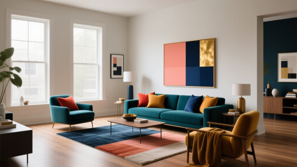 Complementary Color Pairing Ideas - The Decor Mag
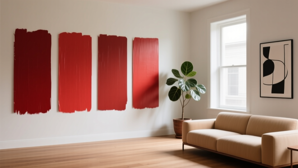 Best Cardinal Red Paint Colors - The Decor Mag
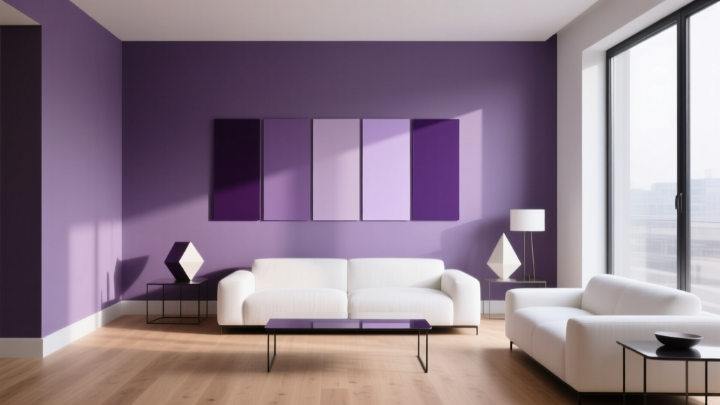 Best Purple Paint Colors for Sophistication - The Decor Mag
 How to Choose Colors for a Playroom - The Decor Mag
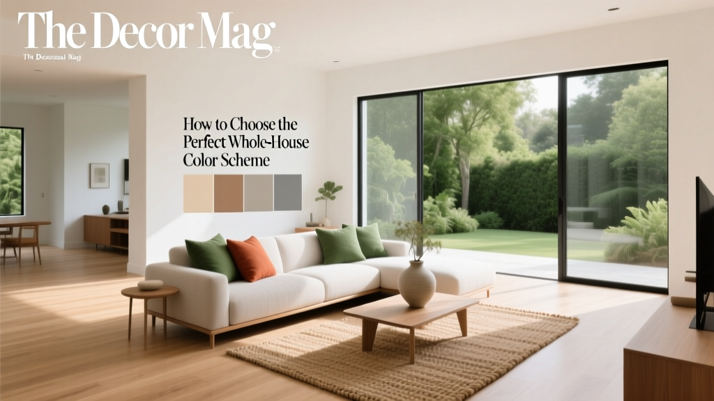 Whole-House Color Scheme: How to Choose (2026)
 Best Wisteria Paint Colors - The Decor Mag
 Best Burnt Orange Paint Colors - The Decor Mag