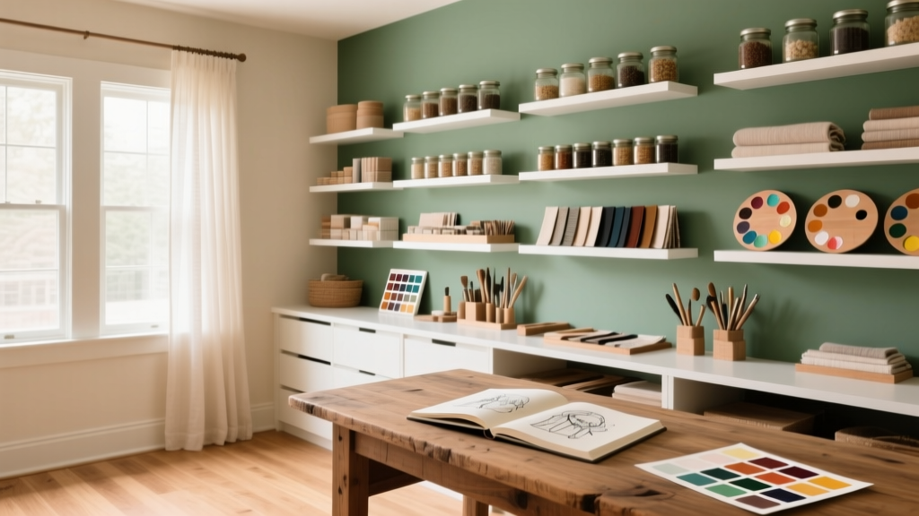
How to Choose Colors for a Craft Room - The Decor Mag
A craft room is equal parts studio, storage zone, and sanctuary. It needs to spark ideas, support long stretches of focus, and make it easy to see true color—whether you’re quilting, painting, scrapbooking, sewing, or building miniatures. The paint colors and color schemes you choose aren’t just “decor.” They shape your energy, influence how accurately you perceive materials, and can even determine how organized the room feels.
Unlike a living room where mood is the main goal, a craft room has a performance requirement: it must work under different types of light, accommodate visual clutter (supplies), and provide contrast so your projects stand out. Choosing the right interior paint colors helps you balance calm and creativity, reduce eye fatigue, and create an inspiring backdrop that won’t compete with your work.
This guide breaks down the best craft room color ideas using color psychology, design principles, and practical application scenarios—plus paint color recommendations from brands homeowners can actually buy.
Start With How You Use the Room (Function Before Palette)
Before looking at paint swatches, clarify what the space needs to do most days. The “right” craft room paint color depends on your crafts, your workflow, and the level of visual stimulation you enjoy.
Ask yourself these questions
- What crafts happen here most? Sewing/quilting needs accurate color and strong task lighting; painting benefits from neutral walls; kids’ crafts can handle bolder color.
- Do you create with lots of color already? If your materials are bright (fabric walls, yarn, paper), calmer wall colors prevent visual overload.
- Is the room used for focus or play? Focus favors soft neutrals, blue-greens, and muted tones; playful crafting can support brighter accents.
- How much storage is visible? Open shelving packed with supplies reads as “color,” so your wall color may need to act as a buffer.
- Do you photograph your work here? Neutral backdrops help colors read true and simplify editing.
Use Color Psychology to Support Creativity and Focus
Color psychology isn’t about strict rules—it’s about choosing a palette that supports the way you want to feel while working.
Best color families for craft rooms
- Soft greens and blue-greens: Restful, steady, and excellent for reducing eye fatigue. Great for detail work (sewing, beading, drawing).
- Warm whites and light greiges: Clean and flexible. They let your supplies and projects take center stage, and they reflect light well.
- Muted blues: Support calm concentration. A good choice for a craft room that doubles as a home office.
- Sunny yellows (soft, not neon): Uplifting and optimistic. Best as an accent or on cabinetry, especially in darker rooms.
- Terracotta and clay tones: Grounding, cozy, and modern—beautiful for fiber arts and pottery-inspired studios.
When to avoid overly saturated color
Highly saturated walls can skew how you see your materials (especially in painting or fabric matching) and can feel “loud” when the room is already supply-heavy. If you love bold color, keep it strategic: one accent wall, a door, lower cabinetry, or a pinboard zone.
Evaluate Light First: North, South, East, West
Lighting is the make-or-break factor for paint colors. The same shade can look crisp and airy in one craft room and dull in another. Consider both natural light direction and bulb temperature.
How light direction affects craft room paint colors
- North-facing rooms: Cooler, sometimes gray light. Choose warmer whites and warm-leaning neutrals to prevent a chilly feel. Try Benjamin Moore White Dove (OC-17) or Sherwin-Williams Alabaster (SW 7008).
- South-facing rooms: Bright, warm light. Many colors work here; cooler tones can look especially balanced. Try Benjamin Moore Pale Smoke (1584) or Sherwin-Williams Sea Salt (SW 6204).
- East-facing rooms: Bright in the morning, cooler later. Soft neutrals and gentle greens handle the shift well. Try Farrow & Ball Skimming Stone or Benjamin Moore Classic Gray (OC-23).
- West-facing rooms: Warm, golden afternoon light. Avoid overly warm paint if you don’t want it to feel yellow at sunset. Try a balanced greige like Sherwin-Williams Agreeable Gray (SW 7029) or a muted blue-green like Benjamin Moore Healing Aloe (1562).
Bulb tip for accurate color
For color-true crafting, use high-CRI LED bulbs (90+ CRI) in a neutral range (around 3500K–4000K). This keeps paint colors and materials from looking too warm or too icy.
Choose a Color Scheme That Can Handle “Creative Clutter”
Craft rooms tend to include a lot of small items: spools, paper packs, paint tubes, labels, bins, and tools. A smart color scheme helps the room feel intentional even when projects are mid-stream.
Three reliable craft room color scheme approaches
1) Neutral shell + colorful supplies (most forgiving)
- Walls: Warm white or light greige
- Trim: Crisp white for clean edges
- Storage: Mostly white with a few natural wood pieces
- Accent color: 1–2 tones repeated in bins, pegboards, chair upholstery
Paint ideas: Benjamin Moore Simply White (OC-117) for walls and Chantilly Lace (OC-65) for trim; or Sherwin-Williams Alabaster (SW 7008) walls with Pure White (SW 7005) trim.
2) Tone-on-tone calm (excellent for focus)
- Walls: Soft green, blue-green, or misty blue
- Trim and cabinetry: Same color, 1–2 shades lighter/darker
- Accents: Natural textures (oak, rattan, linen) and black hardware
Paint ideas: Sherwin-Williams Sea Salt (SW 6204) walls with Benjamin Moore White Dove (OC-17) trim; or Benjamin Moore Healing Aloe (1562) with white shelving for a spa-like studio vibe.
3) Energized accent wall + neutral balance (best for motivation)
- Main walls: Neutral
- One accent zone: Color behind a desk, cutting table, or pegboard
- Repeat the accent color: Twice elsewhere (stool, bins, art) to feel cohesive
Paint ideas for accents: Sherwin-Williams Naval (SW 6244) for a bold navy; Benjamin Moore Hale Navy (HC-154); or a lively coral like Benjamin Moore Soft Salmon (2174-60) in small doses.
Specific Paint Color Recommendations (Walls, Trim, Cabinets)
These are craft room-friendly paint colors that perform well under typical home lighting and pair easily with storage systems.
Best wall colors for craft rooms
- Warm white: Sherwin-Williams Alabaster (SW 7008) — soft, welcoming, reduces glare.
- Crisp neutral white: Benjamin Moore White Dove (OC-17) — balanced, great with wood and colorful supplies.
- Light greige: Sherwin-Williams Agreeable Gray (SW 7029) — flexible backdrop that hides scuffs better than white.
- Very light gray (color-true projects): Benjamin Moore Classic Gray (OC-23) — subtle warmth, photography-friendly.
- Soft blue-green: Sherwin-Williams Sea Salt (SW 6204) — calm, fresh, easy to live with.
- Muted sage: Benjamin Moore Saybrook Sage (HC-114) — cozy, traditional-meets-modern, great with brass or black hardware.
Trim and ceiling colors
- Clean trim white: Sherwin-Williams Pure White (SW 7005) — reads crisp without looking stark.
- Brightest trim/ceiling: Benjamin Moore Chantilly Lace (OC-65) — sharp, gallery-like clarity.
Cabinet and built-in storage colors
- Classic navy storage: Benjamin Moore Hale Navy (HC-154) — hides wear, adds depth.
- Moody green: Sherwin-Williams Pewter Green (SW 6208) — sophisticated, calming.
- Soft gray cabinets: Benjamin Moore Stonington Gray (HC-170) — clean, modern, low-fuss.
Real Room Examples and Application Scenarios
A small spare-bedroom craft room with lots of open shelving
Goal: Keep the room bright while visually quieting the shelves.
- Walls: Benjamin Moore White Dove (OC-17)
- Trim: Benjamin Moore Chantilly Lace (OC-65)
- Shelving: Match shelves to wall color (or go slightly brighter white)
- Accent: Add one grounded tone via a rug (navy) and repeat in labeled bins
Why it works: A warm white wall reduces contrast between wall and shelving, so supplies look organized rather than chaotic.
A basement craft studio with limited natural light
Goal: Lift the space without making it glaring.
- Walls: Sherwin-Williams Alabaster (SW 7008)
- Ceiling: Flat white to bounce light
- Cabinetry: Soft color like Sherwin-Williams Sea Salt (SW 6204) or a pale gray-green
- Hardware: Matte black for definition
Lighting pairing: 4000K high-CRI LEDs plus under-shelf lighting to eliminate shadows at the work surface.
A shared family craft room (kids + adults)
Goal: Energizing but not overstimulating.
- Main walls: Benjamin Moore Classic Gray (OC-23)
- Accent zone: A cheerful, controlled pop like a soft yellow on a pinboard wall (keep it muted)
- Storage: White cabinets with color-coded bins
Design move: Use the accent color only where activities happen (like a craft table wall). The rest stays calm for easier clean-up and less visual noise.
A sewing room where color accuracy matters
Goal: Fabric colors should read true; minimize color cast on projects.
- Walls: A very light neutral like Benjamin Moore Classic Gray (OC-23) or a soft off-white
- Work surface backdrop: White pegboard or neutral cork tiles
- Avoid: Strong reds/oranges/greens on large wall areas near the cutting table
Why it works: Neutrals reduce reflected color onto fabrics, helping you match undertones correctly.
How to Test Paint Colors (Without Guessing)
- Pick 3–5 finalists. Too many swatches makes everything look “wrong.”
- Sample on multiple walls. Light changes across the room.
- View at different times. Morning, afternoon, and evening under your actual craft lighting.
- Test next to your supplies. Hold fabrics, paper, and artwork against the wall sample.
- Choose sheen strategically. Eggshel or satin is durable for craft rooms; flat can scuff; semi-gloss is wipeable but can highlight wall flaws.
Common Craft Room Color Mistakes to Avoid
- Choosing a color that fights your supplies. If your room already has rainbow storage, a strong wall color can feel chaotic fast.
- Ignoring undertones. A “neutral” can lean pink, green, or yellow. Compare samples against a true white sheet of paper to spot undertones.
- Going too dark without a lighting plan. Dark paint can be stunning, but it needs layered lighting (overhead + task + accent) or it will feel cave-like.
- Using bright primary colors on all walls. High saturation across large areas can cause visual fatigue and distort color perception during detailed work.
- Forgetting contrast. If cabinets, walls, and worktops are all the same value (all light or all mid-tone), the room can feel flat. Add contrast through trim, hardware, or a darker island/worktable base.
- Skipping sample testing under your real bulbs. Craft rooms rely heavily on artificial light, and that’s where many paint colors change character.
FAQ: Craft Room Paint Colors and Color Schemes
What are the best paint colors for a craft room?
Top choices are warm whites, light greiges, and soft blue-greens because they reflect light, reduce eye strain, and work with colorful supplies. Popular options include Sherwin-Williams Alabaster, Benjamin Moore White Dove, and Sherwin-Williams Sea Salt.
Should a craft room be white?
White is a strong choice if you want a bright, flexible backdrop and accurate color perception. A warm white often feels more comfortable than a stark, icy white—especially in north-facing rooms.
What colors help creativity in a craft room?
Soft greens and blue-greens support calm creativity, while muted yellows can add optimism. If you want a motivational boost, use a bolder color as an accent rather than covering every wall.
How do I choose a color scheme if I have lots of craft supplies on display?
Let the supplies be the color. Choose a neutral wall color (warm white or light greige), keep shelving cohesive, and repeat 1–2 accent colors in bins or decor so the room reads organized.
What sheen is best for craft room walls?
Eggshell or satin is ideal for most craft rooms: durable, wipeable, and not overly shiny. If you frequently clean walls or have kids crafting, satin is especially practical.
Can I use dark paint in a craft room?
Yes—especially on cabinetry or a single accent wall. Pair dark paint with high-CRI lighting, lighter countertops/worktops, and plenty of reflective surfaces so detail work stays comfortable.
Next Steps: Build a Palette You’ll Love Working In
Choose a craft room color scheme that supports both your workflow and your mood: start with lighting, pick a wall color that won’t distort your materials, then add personality through accents and storage. If you’re stuck, narrow it to one decision at a time—walls first, then trim, then cabinetry, then accents—and test samples under your real task lighting.
For more paint color ideas, color psychology guides, and room-by-room palettes, explore the color guides at thedecormag.com.
More Articles
 How To Organize Island: A Practical, Space-Smart Guide for Kitchens of All Sizes
 Triadic Color Scheme Applications - The Decor Mag
 How to Create a Serene Color Palette - The Decor Mag
 How to Use Muted Colors for Sophistication - The Decor Mag
 Color Wheel Basics for Home Decorating - The Decor Mag
 Best Mango Paint Colors - The Decor Mag
 Best Sky Blue Paint Colors - The Decor Mag
 Best Scarlet Paint Colors - The Decor Mag
 How to Choose Bedroom Colors for Sleep - The Decor Mag
 Best Dusty Rose Paint Colors - The Decor Mag