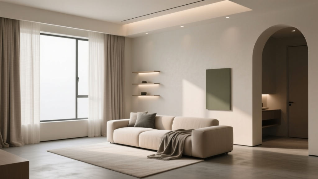
How to Create a Low Contrast Color Palette - The Decor Mag
A low contrast color palette is one of the fastest ways to make a home feel calm, cohesive, and quietly elevated. Instead of dramatic jumps between light and dark, low contrast interiors rely on gentle shifts in value (lightness/darkness) and soft variation in undertone. The result is a space that feels effortless—less visual noise, fewer “hard stops,” and a more architectural sense of flow from room to room.
This approach matters because most homeowners don’t live in perfectly styled rooms; real life includes toys, tech, artwork, and daily clutter. A low contrast color scheme creates a forgiving backdrop that still feels designed. It also supports color psychology: subtle transitions tend to read as soothing and stable, which is why you often see low contrast palettes in spas, boutique hotels, and serene modern homes.
If you’ve ever loved a room that felt “soft,” “airy,” or “pulled together” but couldn’t explain why, there’s a good chance the designer built it around low contrast paint colors, coordinated neutrals, and a thoughtful distribution of tones across walls, trim, textiles, and finishes. Here’s how to do it in your own home—without ending up with a space that feels flat or bland.
What Is a Low Contrast Color Palette?
Low contrast color design uses colors that are close together in value and often share similar undertones. You’re still working with a full palette—walls, trim, ceiling, furniture, rugs, and accents—but the difference between the lightest and darkest elements is intentionally modest.
Low contrast vs. monochrome vs. neutral
- Low contrast: A range of colors (often 3–7) with small value jumps; can be neutral, colorful, or both.
- Monochrome: Variations of one hue (like blue) across tints and shades; can be low or high contrast depending on value range.
- Neutral palette: Whites, creams, grays, greiges, browns; can still be high contrast (think bright white walls with charcoal trim).
Why it works (design principles)
- Visual continuity: Similar values minimize sharp edges and help the eye move smoothly.
- Perceived spaciousness: Reduced contrast can make walls recede and rooms feel larger, especially in open-plan layouts.
- Emotional effect: Softer transitions read as peaceful and grounded—ideal for bedrooms, living rooms, and primary suites.
The Building Blocks: Value, Undertone, and Saturation
1) Value: the “contrast dial”
Value is the main lever for a low contrast color scheme. When selecting paint colors and finishes, compare them in grayscale (many paint apps can do this, or take a photo and desaturate it). If your wall color and trim color become nearly the same in grayscale, you’re in low contrast territory.
Practical target: Aim for a difference of roughly 5–20 points in Light Reflectance Value (LRV) between major surfaces (walls vs. trim, walls vs. large upholstery). You don’t need to be exact; think “close cousins,” not “distant relatives.”
2) Undertone: the hidden driver of harmony
Undertone is what makes a beige feel pink, yellow, or green; what makes a gray feel blue, violet, or taupe. Low contrast palettes look most intentional when undertones align.
- Warm undertones: creamy whites, taupes, warm greiges, clay, camel
- Cool undertones: crisp whites, blue-grays, cool grays, slate
- Soft green undertones: many popular “neutral” paints (especially greiges) lean subtly green; repeat that note elsewhere for cohesion
3) Saturation: keep it quiet
Saturation is the intensity of a color. Low contrast doesn’t require everything to be neutral, but it usually favors muted colors over bright ones. Think dusty blue instead of cobalt, sage instead of emerald, blush instead of hot pink.
How to Choose a Low Contrast Palette (Step-by-Step)
Step 1: Start with one anchor color you already own
Pull from a fixed element: a rug, sofa, countertop, or flooring. Identify two traits:
- Temperature: warm or cool?
- Depth: light, mid-tone, or deep?
Step 2: Pick a wall color with a gentle mid-range value
Mid-tone walls (not stark white, not dark) make low contrast easier. They create a forgiving canvas for trim, furniture, and textiles without huge value jumps.
Paint color ideas (designer-favorite neutrals):
- Benjamin Moore Classic Gray OC-23 (soft warm-leaning light greige)
- Sherwin-Williams Agreeable Gray SW 7029 (balanced greige that plays well with many finishes)
- Farrow & Ball Skimming Stone No. 241 (warm stone neutral with depth)
- Benjamin Moore Pale Oak OC-20 (creamy greige, great for serene whole-home schemes)
Step 3: Decide on trim and ceiling strategy
Low contrast trim is the secret to that soft, tailored look.
- Option A: Same color, different sheen (walls in eggshell; trim in satin). This creates a “wraparound” feel and minimizes contrast.
- Option B: One to two steps lighter in the same undertone family for gentle definition.
- Option C: Color-drenched (walls, trim, and even doors in the same color) for modern calm.
Trim/ceiling pairings that stay soft:
- Walls: Benjamin Moore Pale Oak OC-20 + Trim: Benjamin Moore White Dove OC-17 (creamy, not stark)
- Walls: Sherwin-Williams Agreeable Gray SW 7029 + Trim: Sherwin-Williams Alabaster SW 7008 (warm, approachable)
- Walls: Farrow & Ball Skimming Stone No. 241 + Trim: Farrow & Ball School House White No. 291 (softened white)
Step 4: Build a 60-30-10 palette—but soften the “10”
The classic interior design formula still applies, but in a low contrast interior, the accent color is usually muted and closer in value to the rest.
- 60% dominant: walls + large rugs
- 30% secondary: upholstery, drapery, major furniture
- 10% accent: pillows, art, decor—choose subtle contrast (tone-on-tone) rather than high contrast (black/white)
Low Contrast Color Palette Ideas (With Paint Color Recommendations)
1) Warm, creamy neutrals (inviting and timeless)
This is the go-to low contrast color scheme for traditional, transitional, and modern organic interiors. It supports a cozy color psychology: warmth, comfort, and ease.
- Walls: Benjamin Moore Classic Gray OC-23
- Trim/Ceiling: Benjamin Moore White Dove OC-17
- Supporting tones: natural linen, oat, light oak, soft tan leather
- Accent ideas: aged brass, warm white ceramics, sandy artwork
2) Greige + taupe layering (polished and versatile)
Greige is popular because it bridges warm and cool. Keep it low contrast by choosing neighboring values and repeating undertones through textiles.
- Walls: Sherwin-Williams Agreeable Gray SW 7029
- Trim: Sherwin-Williams Alabaster SW 7008
- Secondary tone: Sherwin-Williams Accessible Beige SW 7036 (great on built-ins or a mudroom bench)
- Accents: mushroom velvet pillows, warm gray boucle, smoked oak
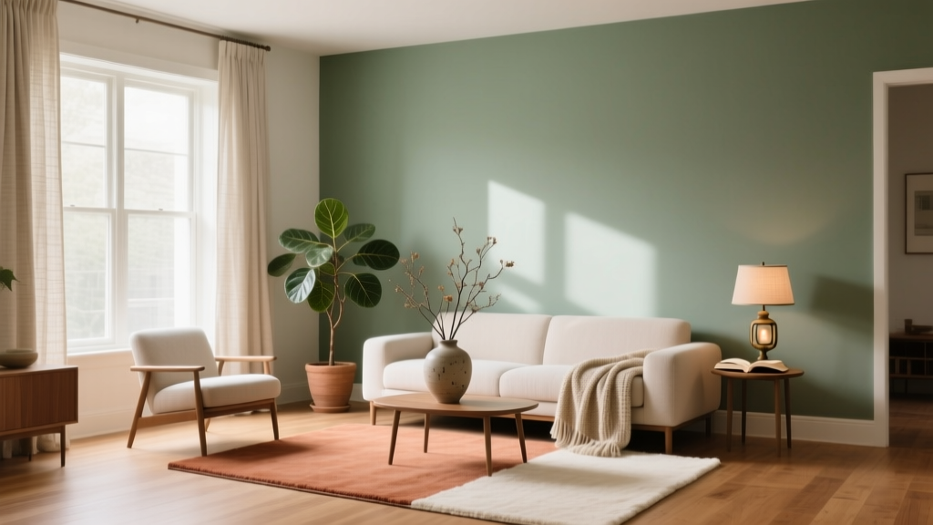
3) Soft sage and off-white (calm, nature-inspired)
Green-based neutrals are restorative and quietly energizing—great for kitchens and bedrooms. The key to a low contrast palette is choosing a sage that’s muted rather than bright.
- Walls: Sherwin-Williams Sea Salt SW 6204 (soft blue-green, airy)
- Alternative wall: Benjamin Moore Saybrook Sage HC-114 (deeper, more traditional sage)
- Trim: Benjamin Moore White Dove OC-17 or Sherwin-Williams Alabaster SW 7008
- Accents: light wood, creamy stone, olive textiles, matte black used sparingly
4) Dusty blue-gray (serene and tailored)
Blue-grays can read sophisticated and calming, ideal for offices and bedrooms. Low contrast comes from pairing with softened whites and similar-value textiles.
- Walls: Benjamin Moore Boothbay Gray HC-165 (muted coastal blue-gray)
- Trim: Benjamin Moore Simply White OC-117 (works best if your room has warm light; sample first)
- Secondary tone: a soft putty or light greige in upholstery and rugs
Real Room Applications: How Low Contrast Looks in Practice
Living room: soft layering that still feels designed
Scenario: You have a beige sectional and medium-tone wood floors, and you want a calmer, more cohesive space.
- Walls: Benjamin Moore Pale Oak OC-20
- Trim: Benjamin Moore White Dove OC-17
- Rug: ivory + warm gray pattern (avoid stark white + black)
- Textiles: boucle, linen, and knit throws in oat, mushroom, and warm gray
- Contrast control tip: keep frames and hardware in soft metals (antique brass, warm nickel) instead of glossy black everywhere
Bedroom: a low contrast palette that promotes rest
Scenario: You want a bedroom that feels quiet and cocooning, not cold.
- Walls + trim (color-drench option): Farrow & Ball Skimming Stone No. 241 in two sheens
- Bedding: cream sheets, oatmeal duvet, a slightly darker taupe quilt
- Nightstands: light oak or painted in a neighboring tone
- Lighting: warm bulbs (2700K) to keep the palette creamy rather than gray
Kitchen: low contrast without looking flat
Scenario: You like the softness of an all-neutral kitchen but worry it’ll feel bland.
- Cabinets: Sherwin-Williams Accessible Beige SW 7036 or Benjamin Moore Pale Oak OC-20 (sample for undertone)
- Walls: a softened white like Sherwin-Williams Alabaster SW 7008
- Counters: warm white quartz or honed stone with subtle veining
- Backsplash: creamy zellige or matte subway tile in an off-white
- Depth tip: add contrast through texture—reeding, woven stools, honed finishes—rather than high-contrast color
Bathroom: spa-like and cohesive
Scenario: You want a soothing bath that doesn’t rely on harsh white/black contrast.
- Walls: Sherwin-Williams Sea Salt SW 6204
- Trim: Sherwin-Williams Alabaster SW 7008
- Tile: warm white with a soft grout (avoid bright white grout if you want low contrast)
- Finishes: brushed nickel or champagne bronze for a softer read
Practical Tips for Getting Low Contrast Right
- Sample large: Paint 2' x 2' swatches (or use peel-and-stick samples) and view morning, afternoon, and night.
- Use sheen to create “quiet contrast”: matte walls + satin trim adds depth without changing color.
- Repeat undertones: If your wall paint has a green-gray undertone, echo it in a rug pattern, art, or pillows.
- Choose soft-edged patterns: watercolor, heathered, tonal stripes, and low-contrast geometrics reinforce the palette.
- Control the darkest note: Limit very dark elements to small, intentional moments (a faucet, a frame, a lamp base).
Common Low Contrast Color Mistakes to Avoid
- Mixing warm and cool whites randomly: A bright, cool white trim can make warm walls look dingy. Keep whites in the same temperature family.
- Going too close in value without adding texture: When everything is the same value and finish, the room can feel flat. Add contrast through materials—linen, wood grain, boucle, stone, rattan.
- Forgetting fixed elements: Flooring, counters, tile, and large furniture drive undertone. Choose paint colors that harmonize with what can’t be changed.
- Using stark black as the default accent: Black creates instant high contrast. If you want softness, try bronze, warm charcoal, or dark taupe instead.
- Ignoring lighting temperature: Cool LEDs can make greiges look gray and lifeless. Warm lighting helps low contrast palettes feel inviting.
- Overdoing “safe beige” without variation: A successful low contrast interior still has range—just in smaller steps. Layer two to four neighboring tones.
FAQ: Low Contrast Color Palettes
What’s the easiest way to create a low contrast paint color scheme?
Choose one wall color you love, then select trim and ceiling paints that are either the same color in a different sheen or 1–2 shades lighter with the same undertone. Keep major furnishings in neighboring values (no extreme white/black jumps).
Are low contrast color palettes good for small rooms?
Yes. Low contrast interior color design can make small rooms feel more spacious because the eye doesn’t stop at hard color boundaries. Soft trim and similar-value textiles help walls visually recede.
How do I add depth if I don’t want high contrast?
Use texture and finish: matte walls, satin trim, nubby textiles, wood grain, honed stone, and tonal patterns. You can also add depth with a slightly deeper “shadow color” in the same undertone family (for pillows, drapery, or a painted vanity).
Can I use color in a low contrast palette, or does it have to be neutral?
You can absolutely use color. Muted hues—sage, dusty blue, clay, blush, smoky lavender—work beautifully when they’re close in value to the surrounding neutrals and repeated thoughtfully across the room.
What trim color works best with low contrast walls?
Soft whites are typically best: Benjamin Moore White Dove OC-17 and Sherwin-Williams Alabaster SW 7008 are popular because they’re not overly stark. For an even lower contrast look, paint trim the same color as the walls in a higher sheen.
How do I keep low contrast from looking “washed out”?
Ensure you have at least one mid-tone anchor (a rug, sofa, or wood tone), incorporate warm lighting, and include a few darker accents in small doses (hardware, frames, a side table). The palette should feel layered, not monochromatic by accident.
Next Steps: Build Your Palette with Confidence
Start by identifying your room’s fixed elements and undertones, then choose a mid-tone wall color and coordinate trim for a gentle value shift. Layer in two to four neighboring tones through textiles and finishes, using texture as your main source of depth. When you sample paint colors, view them throughout the day so the palette stays cohesive under real-life lighting.
For more paint color ideas, color scheme guides, and room-by-room decorating advice, explore the color library at thedecormag.com.
More Articles
 How to Test Paint Colors Before Committing - The Decor Mag
 How to Choose Colors for a Nursery - The Decor Mag
 Best Slate Blue Paint Colors - The Decor Mag
 Best Indigo Paint Colors - The Decor Mag
 Saturated Colors in Decor: Use Without Overwhelming
 How to Choose Colors for a Gym - The Decor Mag
 Best Blue Paint Colors for Every Mood - The Decor Mag
 Where to Place Outdoor Essentials: Strategic Placement for Safety, Function, and Longevity
 Bedroom for Beginners: A Practical, Step-by-Step Setup Guide
 Color Psychology in Home Design Guide - The Decor Mag