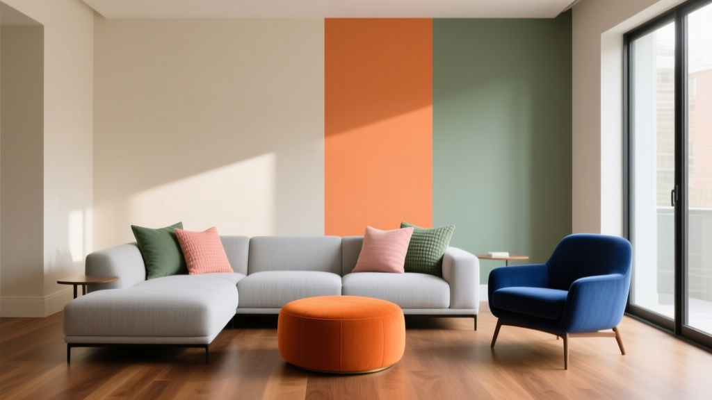
Split Complementary Color Palette Ideas - The Decor Mag
Color can make a room feel larger, calmer, brighter, warmer, more elegant—or more chaotic—often faster than any furniture swap. Yet many homeowners get stuck between “safe neutrals” and “too much color,” especially when they want a space to feel layered and intentional rather than flat.
A split complementary color scheme is one of the most designer-friendly ways to add energy without overwhelming a room. It brings contrast (so the space feels alive) while softening the sharp tension of direct complementary colors. If you love the idea of color but want it to feel livable, this is a color strategy worth learning.
This guide breaks down how split complementary palettes work, how to choose paint colors and finishes, and how to apply them in real rooms—plus common mistakes to avoid so your interior color design looks polished, not accidental.
What Is a Split Complementary Color Scheme?
A split complementary palette starts with one “base” color, then uses the two colors adjacent to its complement on the color wheel. This creates a triangle-like relationship: one main hue + two supporting hues that provide contrast without being as stark as a straight complement.
Why designers love split complementary palettes
- Balanced contrast: You get visual interest without the harsh “sports-team” look that pure complementary colors can create.
- Flexible styling: It’s easier to vary tints/shades (lighter/darker versions) for a layered, curated feel.
- Great for whole-home color schemes: The palette can travel from room to room with minor shifts in intensity.
Color psychology: the feel behind the palette
Split complementary schemes tend to feel energizing yet controlled. You’re pairing a dominant emotional tone (your base color) with two accents that add liveliness and movement. For example:
- Blue base (calm, trust, clarity) + yellow-orange and red-orange (optimism, sociability, warmth) reads “relaxed but welcoming.”
- Green base (balance, renewal) + red-violet and red-orange (creativity, warmth) reads “fresh with a sophisticated edge.”
How to Build a Split Complementary Palette That Works in a Home
Step 1: Choose your base color (the “anchor”)
Your base color is usually the wall color or a dominant element like a sofa, rug, or kitchen cabinetry. For homeowners, paint is the easiest anchor because it sets the room’s overall temperature and mood.
Popular anchor directions:
- Soft blues for bedrooms, offices, bathrooms
- Greens for living rooms, kitchens, dining rooms
- Warm neutrals (greige, tan, clay) for open plans
Step 2: Pick the two split complements (your “supporting cast”)
Instead of using the direct opposite of your base color, choose the two neighboring hues. Example: if your base is blue, its complement is orange—so your split complements are yellow-orange and red-orange.
Step 3: Decide on a ratio so the palette doesn’t fight
A reliable interior design ratio is:
- 60% base color (walls or large upholstered pieces)
- 30% secondary neutral/support (trim, rugs, drapery, larger accents)
- 10% accent colors (the two split complements via art, pillows, ceramics, small furniture)
For paint-heavy rooms, you can tweak to 70/20/10, especially if the accent colors are bright.
Step 4: Match undertones and lighting
Split complementary palettes can fall apart when undertones clash. A “blue” can lean icy (cool/gray) or inky (warm/navy). Your accent oranges can lean terracotta (earthy) or tangerine (bright).
- North-facing rooms: favor warmer versions of your base (e.g., smoky teal vs icy blue) to avoid a cold cast.
- South-facing rooms: you can handle cleaner, cooler paints because sunlight warms them naturally.
- Warm LEDs (2700K): intensify warm accents like coral and terracotta; watch that they don’t turn too orange.
- Cool LEDs (4000K+): can flatten warm accents; consider richer, earthier versions.
Split Complementary Color Palette Ideas (with Paint Color Recommendations)
1) Calm Blue + Amber + Soft Coral (welcoming, polished)
Best for: living rooms, entryways, family rooms, coastal-modern interiors.
Paint suggestions:
- Base (blue): Sherwin-Williams Sea Salt (SW 6204) for a soft blue-green, or Benjamin Moore Smoke (2122-40) for a muted blue-gray.
- Accent 1 (amber): Use through decor—think honeyed wood, rattan, brass, or a painted piece like Sherwin-Williams Golden Rule (SW 6383) in small doses.
- Accent 2 (coral): Benjamin Moore Coral Gables (2010-40) as artwork/pillows, or a softer coral textile instead of paint.
Room application: Paint walls in a muted blue, keep trim crisp (Benjamin Moore White Dove OC-17), then layer amber in lighting/wood tones and coral in textiles. This split complementary scheme feels upbeat without turning neon.
2) Sage Green + Dusty Rose + Terracotta (earthy, romantic, livable)
Best for: dining rooms, bedrooms, reading nooks, Mediterranean or modern organic style.
Paint suggestions:
- Base (sage/green): Sherwin-Williams Evergreen Fog (SW 9130) or Benjamin Moore Saybrook Sage (HC-114).
- Accent 1 (dusty rose): Farrow & Ball Setting Plaster No. 231 (soft, sophisticated) on a powder room vanity or a single piece of furniture.
- Accent 2 (terracotta): Benjamin Moore Terra Cotta Tile (2090-30) via pottery, throw pillows, a patterned rug, or an accent chair.
Room application: Pair sage walls with warm white trim and natural textures (oak, linen, jute). Use dusty rose as a gentle “bridge” color in drapery or bedding, and terracotta to add depth in smaller hits. Color psychology-wise, this palette supports restoration (green) with warmth and comfort (terracotta/rose).
3) Deep Navy + Mustard + Rust (classic contrast, library vibes)
Best for: home offices, dens, dining rooms, dramatic living rooms.
Paint suggestions:
- Base (navy): Benjamin Moore Hale Navy (HC-154) or Sherwin-Williams Naval (SW 6244).
- Accent 1 (mustard): Sherwin-Williams Cut the Mustard (SW 6384) for a vintage punch (best for pillows/bench upholstery).
- Accent 2 (rust): Benjamin Moore Burnt Sienna (1202) or a rust velvet textile.
Room application: If you’re painting walls navy, keep the ceiling a clean white to avoid a “low” feeling. Add mustard in lampshades, art, or a single accent chair. Rust reads grounded and grown-up; it’s excellent in leather, velvet, or patterned rugs.
4) Warm Greige + Teal + Berry (modern, flexible, whole-home friendly)
Best for: open concept spaces, hallways, transitional homes where you want color without repainting every room.
Paint suggestions:
- Base (greige): Sherwin-Williams Agreeable Gray (SW 7029) or Benjamin Moore Edgecomb Gray (HC-173).
- Accent 1 (teal): Sherwin-Williams Cascades (SW 7623) (moody teal) in a powder room or on built-ins.
- Accent 2 (berry): Benjamin Moore Raspberry Truffle (2080-10) through art, pillows, or a dining chair upholstery.
Room application: Use greige on the majority of walls for continuity, then bring teal and berry in a rotating way—seasonal pillows, artwork swaps, and accessories—so your color scheme stays dynamic without committing to bold wall paint everywhere.
5) Soft Lavender + Chartreuse + Warm Apricot (creative, light-filled, unexpected)
Best for: studios, kids’ rooms (elevated), guest rooms, craft rooms.
Paint suggestions:
- Base (lavender): Benjamin Moore Hint of Violet (2114-60) for a barely-there tint.
- Accent 1 (chartreuse): Use sparingly—try a botanical print, glassware, or a small painted stool like Sherwin-Williams Organic Green (SW 6732).
- Accent 2 (apricot): Benjamin Moore Apricot Blush (2017-70) in textiles for a gentle warmth.
Room application: Keep the foundation airy (white trim, light floors, reflective metals). This palette works best when the accents are softened—think “tinted” rather than saturated—so the room feels bright, not busy.
Real Room Examples: How Split Complementary Color Works Day to Day
Living room scenario: Blue walls that don’t feel cold
- Walls: Sherwin-Williams Sea Salt (SW 6204)
- Trim: Benjamin Moore White Dove (OC-17)
- Split accents: amber (brass floor lamp, oak coffee table) + coral (two pillows, one piece of art)
- Pro move: repeat coral at least twice (pillows + art) so it reads intentional.
Bedroom scenario: Sage + terracotta that feels restful
- Walls: Sherwin-Williams Evergreen Fog (SW 9130)
- Bedding: cream base with a dusty rose throw
- Accents: terracotta bedside lamp base, warm clay-toned rug pattern
- Pro move: keep patterns low-contrast to maintain a calm mood.
Kitchen scenario: Neutral cabinets with split complementary personality
- Cabinets: warm greige like Benjamin Moore Edgecomb Gray (HC-173)
- Split accents: teal barstools + berry-toned runner
- Metal finish: brass bridges greige to teal beautifully
- Pro move: use berry mostly in removable pieces (runner, art) to keep the kitchen timeless.
Common Split Complementary Color Mistakes (and How to Fix Them)
- Using all three colors at full saturation: This can look loud and chaotic.
Fix: choose one color to be muted (gray-leaning) or use two accents only in small doses. - Ignoring undertones: A cool blue with a warm orange and a pinkish coral can clash if one reads neon.
Fix: keep the accents “dirtier” (more earthy) or “cleaner” (more pure) consistently. - Forgetting neutrals: Without a neutral buffer, the palette has no place to rest.
Fix: add warm whites, natural wood, black accents, or soft grays to stabilize the scheme. - Too many competing focal points: Three colors used everywhere can fragment the room.
Fix: assign roles: base on walls, accent A in textiles, accent B in art/objects. - Not testing paint in the room’s lighting: A color that looks perfect online can shift dramatically.
Fix: sample on multiple walls and view morning/day/evening before committing.
Practical Tips for Choosing Paint Colors and Finishes
- Sample smart: Paint 12"x12" swatches (or use peel-and-stick samples) on at least two walls—one bright, one shadowed.
- Pick sheen strategically:
- Matte/flat: great for walls; softens bold colors like navy.
- Eggshell: durable for living spaces; reflects a bit more light.
- Satin/semi-gloss: ideal for trim/doors; helps crisp up a split complementary scheme.
- Repeat accents in 2–3 places: repetition is what makes a color scheme look planned.
- Use black or charcoal as a “design punctuation”: picture frames, hardware, or a small table can keep colorful rooms from feeling too sweet.
FAQ: Split Complementary Color Schemes at Home
Is a split complementary color scheme good for open concept homes?
Yes. Use a consistent base (often a neutral or muted color) across the main area, then introduce the two split complements in smaller, repeatable accents—art, textiles, stools, and accessories—so the space feels cohesive.
How do I choose the “right” split complements if I’m starting with a sofa or rug?
Identify the dominant hue in the sofa/rug as your base, then choose the two neighboring hues to its complement. If your rug reads blue-green (teal), your split complements will typically land in warm red-orange and warm yellow-orange territory. Pull those from the rug’s pattern or add them through decor.
Can I use split complementary colors without painting any walls?
Absolutely. Use a neutral wall paint (like Benjamin Moore White Dove or Sherwin-Williams Alabaster) and build the palette through a large rug (base color), then accents in pillows, curtains, and art (split complements).
What’s the easiest split complementary palette for beginners?
Muted blue walls with warm wood/brass (amber) and a small amount of coral is very forgiving. The warm accents flatter most skin tones and make blue rooms feel welcoming.
How much accent color is too much?
If your eye doesn’t know where to rest, it’s usually too much. Aim to keep the two accent colors to about 10% combined in a room, and use neutrals to create breathing room.
Next Steps: Make Your Palette Feel Intentional
Start by choosing one anchor color you genuinely love living with, then select two split complementary accents you can introduce gradually. Test paint samples in your actual lighting, commit to a clear color ratio (60/30/10 is a strong default), and repeat your accents so the room feels designed rather than decorated.
For more paint color ideas, color scheme guides, and room-by-room palettes, explore the latest color articles on thedecormag.com.
More Articles
 Best Midnight Blue Paint Colors - The Decor Mag
 Best Apple Green Paint Colors - The Decor Mag
 How to Choose Colors for a Terrace - The Decor Mag
 How to Create a High Contrast Color Scheme - The Decor Mag
 Best Prussian Blue Paint Colors - The Decor Mag
 How to Choose Colors for South-Facing Rooms - The Decor Mag
 How to Create a Playful Color Palette - The Decor Mag
 The Ultimate Reading Guide: Science-Backed Strategies for Faster Comprehension, Retention, and Lifelong Engagement
 Best Lavender Paint Colors for Relaxation - The Decor Mag
 Best Wisteria Paint Colors - The Decor Mag