Jewel Tone Color Scheme Ideas - The Decor Mag
Jewel tones have a special talent for making a home feel intentional. They’re saturated, light-absorbing colors inspired by gemstones—emerald, sapphire, amethyst, ruby, citrine—and they bring instant depth that softer palettes sometimes struggle to achieve. When homeowners say a room feels “flat” or “unfinished,” the fix is often contrast and undertone clarity—two areas where jewel tone color schemes shine.
These rich hues also offer flexibility. A jewel tone palette can read traditional (think emerald walls with brass accents), contemporary (inky navy paired with crisp white), or eclectic (layered plum, teal, and patterned textiles). The key is knowing how to balance intensity with neutrals, choose the right finish, and coordinate undertones so the scheme looks curated rather than chaotic.
This guide breaks down practical jewel tone color scheme ideas—paint color recommendations, room-by-room scenarios, pairing tips, and common mistakes—so you can bring bold color into your home with confidence.
What Counts as a Jewel Tone (and Why They Work)
Jewel tones sit on the deeper, more saturated end of the color spectrum. They’re not muted pastels or dusty earth tones; they’re “clear” colors with enough pigment to feel velvety and substantial. From a color psychology perspective, jewel tones tend to feel:
- Grounding and secure: deep blues and greens can lower visual “noise” and create calm.
- Confident and luxurious: rich reds, plums, and teals signal drama and sophistication.
- Inviting and intimate: darker hues visually “pull in” walls, making large rooms feel cozier.
Design-wise, jewel tones excel because they provide high color contrast against common neutrals (white, cream, greige, charcoal) and elevate everyday finishes like matte black hardware, warm brass, or natural wood.
How to Build a Jewel Tone Color Scheme That Looks Cohesive
Start With One Anchor Color
Pick one hero hue to lead the room—often a wall color, large rug, or sofa. Then use supporting jewel tones in smaller doses.
Strong anchor paint color ideas (brand references included):
- Emerald/Deep Green: Sherwin-Williams Emerald Isle (SW 2939), Benjamin Moore Essex Green (HC-188)
- Inky Navy: Benjamin Moore Hale Navy (HC-154), Sherwin-Williams Naval (SW 6244)
- Plum/Aubergine: Farrow & Ball Brinjal (No. 222), Benjamin Moore Shadow (2117-30)
- Wine/Ruby: Sherwin-Williams Cordovan (SW 6274), Benjamin Moore New London Burgundy (HC-61)
Use the 60-30-10 Rule (Adjusted for Saturation)
Jewel tones are intense, so keep the largest percentage either neutral or a single deep color you truly love.
- 60%: walls (neutral or one jewel tone), plus large upholstery
- 30%: secondary color (another jewel tone or a warm wood tone)
- 10%: accents (metal finishes, art, pillows, lampshades)
Balance Undertones: Warm vs. Cool
Most jewel tones lean cool, but you’ll get better flow if you intentionally mix temperature:
- Pair cool emerald with warm brass and creamy whites.
- Pair navy with cognac leather or warm oak to avoid a chilly feel.
- Pair plum with soft greige and antique gold for a grown-up look.
Choose Finishes That Complement the Mood
- Matte/flat: best for jewel tone walls in living rooms and bedrooms (velvety, modern; hides unevenness).
- Eggshell/satin: practical for hallways and family rooms; still rich but easier to wipe.
- High-gloss: striking on trim, doors, built-ins, or a lacquer-style accent wall.
Jewel Tone Color Scheme Ideas (With Real Room Scenarios)
1) Emerald + Cream + Brass: Classic, Lush, and Timeless
Best for: living rooms, libraries, dining rooms, moody entryways
Paint pairing: Benjamin Moore Essex Green (HC-188) on walls + Benjamin Moore White Dove (OC-17) on trim
How it looks in a room: Picture a living room with emerald walls, creamy trim, and warm brass lighting. Add a camel leather sofa and a vintage-inspired rug with hints of burgundy and navy. The result feels layered and sophisticated without being overly formal.
Styling tips:
- Use brass or aged gold to warm up the green.
- Add natural textures (linen curtains, jute, rattan) to keep it from feeling heavy.
- Include at least one high-contrast element (white trim, light art mats, or a pale rug border).
2) Sapphire + Crisp White + Black Accents: Clean and Architectural
Best for: kitchens, bathrooms, modern living rooms, exterior doors
Paint pairing: Sherwin-Williams Naval (SW 6244) on cabinets or an accent wall + Sherwin-Williams Pure White (SW 7005) on walls/trim
How it looks in a room: In a kitchen, navy lower cabinets anchor the space, white uppers keep it bright, and matte black pulls sharpen the edges. Add a warm wood island stool or oak shelves for balance.
Pro move: If you want a jewel tone kitchen without committing to full cabinetry, paint a pantry door or built-in coffee bar in navy and keep the rest neutral.
3) Amethyst + Greige + Soft Gold: Cozy, Romantic, and Elevated
Best for: bedrooms, powder rooms, reading nooks
Paint pairing: Farrow & Ball Brinjal (No. 222) or Benjamin Moore Shadow (2117-30) + a warm greige like Benjamin Moore Balboa Mist (OC-27)
How it looks in a room: A bedroom with a plum accent wall behind the bed, greige side walls, and a soft ivory rug feels intimate but not dark. Finish with antique gold frames and creamy bedding for a high-end hotel vibe.
Textile guidance:
- Choose matte fabrics (washed linen, velvet) to complement the richness.
- Add pattern with muted botanicals or geometrics that include a touch of plum or mauve.
4) Teal + Cognac Leather + Walnut: Mid-Century Energy With Depth
Best for: dens, living rooms, offices
Paint pairing: Benjamin Moore Aegean Teal (2136-40) or Sherwin-Williams Cascades (SW 7623)
How it looks in a room: Teal walls with a cognac leather sofa create instant warmth. Walnut shelving and cream curtains keep the palette grounded. This scheme is especially effective in rooms with medium or low natural light because teal maintains color presence even in shade.
Accent recommendations:
- Layer in mustard/citrine via pillows or art for complementary contrast.
- Use off-white rather than stark white to avoid a cold edge.
5) Ruby + Blush + Charcoal: Dramatic Without Feeling Heavy
Best for: dining rooms, glam living rooms, statement foyers
Paint pairing: Sherwin-Williams Cordovan (SW 6274) on an accent wall or dining room walls + a soft blush textile + charcoal accents
How it looks in a room: In a dining room, wine-colored walls make art and lighting pop. Pair with upholstered chairs in a muted blush or taupe-pink and ground the look with charcoal drapery or a dark rug border.
Lighting tip: Ruby and burgundy can skew brown under warm bulbs. Use 2700K–3000K lighting and test at night to confirm the color stays rich.
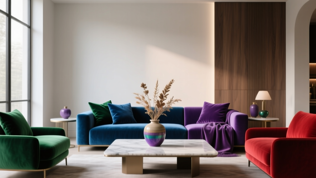
6) Jewel Tone “Collector” Palette: Emerald + Navy + Plum (Curated Maximalism)
Best for: eclectic living rooms, creative studios, upstairs hallways
Want multiple jewel tones in one space? It can look incredible if you control the neutrals and repeat each color at least twice.
Example layout:
- Navy on walls (Benjamin Moore Hale Navy)
- Emerald in a velvet chair and a piece of art
- Plum in pillows and a throw
- Neutral “breathing room”: ivory rug, white trim, warm wood coffee table
Rule of thumb: If you’re using three jewel tones, keep at least one major surface (rug, curtains, or trim) light and quiet.
Where Jewel Tones Work Best (Room-by-Room Guidance)
Living Room
- Try jewel tones on walls if you have decent natural light and lighter floors.
- For an easier commitment: a jewel tone sofa (navy, emerald) with neutral walls.
- Anchor with a rug that includes at least two colors from your palette.
Bedroom
- Choose calming jewel tones: navy, deep teal, smoky plum.
- Use matte paint for a cocoon effect.
- Balance with soft whites, oatmeal linens, and warm metals.
Kitchen
- Use jewel tones on lower cabinets, an island, or a pantry wall.
- Pair with simple countertops (white quartz, light stone) to avoid visual overload.
Bathroom
- Jewel tones are ideal for small spaces—try a deep green vanity or navy walls.
- Keep tile simple and let paint do the heavy lifting.
Practical Tips for Getting Jewel Tones Right
- Sample in the correct sheen: Jewel tones shift dramatically between matte and satin.
- Test on multiple walls: Morning and evening light can change navy to near-black or green to muddy.
- Repeat your accent metal: Choose one dominant metal (brass, black, chrome) and echo it 2–3 times.
- Use intentional contrast: Add crisp trim, light art mats, or pale upholstery to keep the room from feeling closed-in.
- Consider color-drenching: Painting walls, trim, and even ceiling in one jewel tone can look designer-level—especially in powder rooms and offices.
Common Jewel Tone Color Mistakes to Avoid
- Mixing undertones randomly: A cool emerald with a yellow-beige carpet can clash. Bridge with warm neutrals (ivory, camel, wood) or pick a green with warmer undertones.
- Too many competing “stars”: If walls, rug, sofa, and curtains are all saturated, the room feels busy. Choose one hero and let the rest support it.
- Ignoring lighting temperature: Very warm bulbs can turn jewel tones dull or brown. Aim for 2700K–3000K, and use dimmers for flexibility.
- Using stark white everywhere: Bright white can look harsh next to rich color. Creamy whites (like Benjamin Moore White Dove) often pair more naturally.
- Skipping a neutral “break”: Even maximalist spaces need negative space—think light ceiling, calm rug, or simple window treatments.
FAQ: Jewel Tone Paint Colors and Color Schemes
Are jewel tones good for small rooms?
Yes. Deep, saturated paint colors can make a small room feel cozy and polished rather than cramped—especially with good lighting, a lighter ceiling, and reflective accents like mirrors or brass.
What neutral colors go best with jewel tones?
Top choices include creamy whites, warm greiges, taupe, soft charcoal, and natural wood tones. For a crisp modern look, pair navy with bright white; for a softer look, pair emerald with ivory or mushroom.
How do I combine multiple jewel tones without overwhelming the room?
Use one jewel tone as the anchor, keep large background elements neutral, and repeat each additional jewel tone at least twice (for example: pillows + art). A rug that includes multiple colors can visually “tie” everything together.
Do jewel tones work with oak floors?
They can look fantastic. Warm oak pairs especially well with navy, teal, and burgundy. With very orange-toned oak, test greens carefully—some emeralds may skew too cool. Add a warm neutral rug to bridge the tones.
What’s the easiest way to try jewel tones if I’m nervous about bold color?
Start with a low-risk surface: an interior door, a powder room, a vanity, or built-in shelving. Alternatively, keep walls neutral and add jewel tones through a rug, velvet pillows, or curtains.
Next Steps: Bring Jewel Tones Into Your Home With Confidence
Choose one jewel tone you’re drawn to, then build a simple support system around it: a flattering neutral, a reliable metal finish, and one or two accent colors that repeat throughout the room. Order peel-and-stick samples or paint swatches, view them in day and evening light, and commit once the undertones look consistent across your key surfaces (floors, countertops, major furniture).
If you’re ready for more help picking paint colors and creating cohesive interior color design, explore more color guides and room-by-room palettes on thedecormag.com.
More Articles
 How to Choose Accent Wall Colors - The Decor Mag
 How to Create a Bold Color Story - The Decor Mag
 Best Candy Apple Red Paint Colors - The Decor Mag
 How To Match Aging With Space: Designing Environments That Support Lifelong Well-Being
 Cheap vs Premium Placement: What $0.12 CPM Really Costs Your Brand
 Best Steel Blue Paint Colors - The Decor Mag
 How to Create a Harmonious Color Palette - The Decor Mag
 Best Burnt Orange Paint Colors - The Decor Mag
 How to Incorporate Bold Colors Subtly - The Decor Mag
 How to Use Color to Define Spaces - The Decor Mag