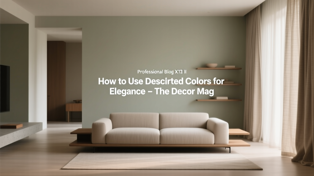
How to Use Desaturated Colors for Elegance - The Decor Mag
Desaturated colors—those beautifully softened hues that feel neither loud nor dull—are one of the most reliable tools for creating an elegant home. They’re the shades that look “designed” even when the room is simple: a misty blue instead of a primary blue, a clay-leaning blush instead of bubblegum pink, a muted olive rather than bright green. If you’ve ever walked into a space that felt calm, elevated, and timeless, chances are desaturated paint colors played a starring role.
This topic matters because most homes need color that can live with real life: changing daylight, mixed materials, open floor plans, and evolving decor. Highly saturated colors can be stunning, but they’re less forgiving—especially when you’re working with existing flooring, cabinetry, or upholstery. Desaturated color schemes offer a sweet spot: enough pigment to feel intentional, yet softened enough to layer with wood tones, stone, metals, and pattern without visual chaos.
Elegant interiors also rely on psychology. Softened color reduces visual noise, supports relaxation, and makes a room feel cohesive. When used thoughtfully, desaturated hues can read classic, contemporary, moody, or airy—depending on undertones, contrast, and finish choices.
What Are Desaturated Colors (and Why They Read Elegant)?
A desaturated color is a hue that’s been “grayed down” or muted. In color theory terms, saturation refers to intensity. Lower saturation means the color contains more neutral influence (gray, black, or its complementary color), which makes it calmer and more complex.
Color psychology: the quiet confidence effect
- Muted blues and blue-grays tend to calm the nervous system and feel tailored—great for bedrooms, offices, and living rooms.
- Soft greens and olives connect to nature, signaling balance and restoration—excellent for kitchens, dining rooms, and entryways.
- Dusty pinks, clay, and muted terracotta read warm, flattering, and welcoming—ideal for bedrooms, powder rooms, and layered living spaces.
- Greige and taupe families feel grounded and architectural, helping rooms look finished without feeling stark.
Design principle: complexity without chaos
Desaturated paint colors carry subtle undertones—green, violet, blue, or beige—that create depth. That nuanced “in-between” quality is what often reads as upscale. It’s the same reason heathered fabrics look richer than flat, pure colors.
How to Choose a Desaturated Paint Color That Won’t Turn Muddy
Muted color is forgiving, but it can go muddy if undertones fight the room’s fixed elements (flooring, countertops, tile) or if lighting is very warm. Use this quick process to stay in the elegant zone.
Step-by-step selection method
- Identify the room’s immovable finishes. Note whether your wood is red/orange, neutral, or cool; whether stone leans creamy or gray; whether metals are warm brass or cooler chrome.
- Check light direction. North light skews cooler; south light warms and brightens; east light is crisp in the morning; west light is golden and can intensify warmth later in the day.
- Pick an undertone that harmonizes.
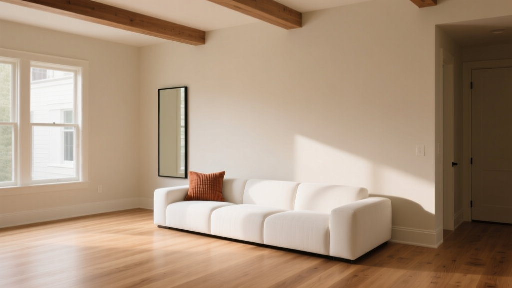
- Warm oak floors often love green-leaning greiges and soft clays.
- Cool gray tile pairs well with blue-grays and sage greens.
- Yellow-toned lighting favors warm whites and olive-based neutrals over icy grays.
- Test large samples. Paint a 2’x2’ area (or use peel-and-stick samples) on multiple walls and view it morning, afternoon, and night.
Pro tip: look at the color next to “true” versions
To judge whether a shade is desaturated enough, place it next to a bright, saturated version of the same hue. The muted option will look more complex and will “sit back” rather than shout.
Elegant Desaturated Paint Colors: Specific Recommendations
These designer-favorite paint colors work well for sophisticated interior color design. Always sample first—undertone shifts are real.
Soft whites and warm neutrals (for an elevated base)
- Benjamin Moore White Dove (OC-17): a warm, creamy white that layers beautifully with muted colors and natural textures.
- Sherwin-Williams Alabaster (SW 7008): soft, welcoming, and ideal for trim or whole-home walls when you want warmth without yellow.
- Farrow & Ball Skimming Stone (No. 241): a refined greige with gentle warmth; excellent for open-plan living.
Blue-grays and smoky blues (tailored elegance)
- Benjamin Moore Boothbay Gray (HC-165): a classic muted blue-gray that feels coastal without being theme-y.
- Sherwin-Williams Misty (SW 6232): a light, airy gray-blue that works in bedrooms and bathrooms.
- Farrow & Ball Parma Gray (No. 27): crisp yet softened; stunning on cabinetry or a library wall.
Sage, olive, and muted greens (natural sophistication)
- Sherwin-Williams Evergreen Fog (SW 9130): a modern, muted green with gray undertones—excellent for living rooms and built-ins.
- Benjamin Moore Saybrook Sage (HC-114): warmer and more traditional; gorgeous with brass and creamy trim.
- Farrow & Ball Pigeon (No. 25): a blue-green gray that reads quietly luxurious on walls or cabinetry.
Dusty pinks, clays, and muted terracotta (soft glam and warmth)
- Farrow & Ball Setting Plaster (No. 231): a refined blush-plaster tone that flatters skin and softens harsh light.
- Benjamin Moore First Light (2102-70): airy, pale pink with a modern, desaturated feel; lovely in bedrooms and powder rooms.
- Sherwin-Williams Redend Point (SW 9081): a grounded, clay-beige that feels current and cozy without looking rustic.
Greige, taupe, and mushroom (the backbone of timeless color schemes)
- Benjamin Moore Edgecomb Gray (HC-173): warm greige that plays well with both cool and warm accents.
- Sherwin-Williams Accessible Beige (SW 7036): soft, livable neutral that avoids the flatness of many beiges.
- Farrow & Ball Elephant’s Breath (No. 229): complex taupe with a gentle violet cast—especially elegant in dining rooms.
How to Build an Elegant Desaturated Color Scheme
Desaturated palettes shine when they’re layered with thoughtful contrast and repeated undertones. Use these strategies to create a cohesive interior color design.
1) Work in a “soft contrast” range
Elegant rooms rarely rely on harsh contrast alone. Instead, they blend mid-tones with a few deeper anchors.
- Walls: muted mid-tone (sage, blue-gray, greige)
- Trim: warm white (White Dove, Alabaster)
- Anchors: charcoal, deep olive, espresso wood, or inky navy accents
2) Repeat undertones across materials
If your paint has a green-gray undertone, echo it in a rug pattern, throw pillows, art, or stoneware. This repetition creates that “professionally designed” sense of order.
3) Pair muted color with tactile texture
Because desaturated colors are quiet, texture becomes the drama:
- linen, bouclé, wool, or velvet upholstery
- oak or walnut wood tones
- aged brass, blackened steel, or brushed nickel
- handmade tile, plaster finishes, or matte stone
4) Choose the right paint finish for the mood
- Matte/flat: soft, elegant, and forgiving; ideal for living rooms and bedrooms (great for desaturated colors).
- Eggshell/satin: slightly more wipeable; good for hallways, kitchens, and kids’ rooms.
- Semi-gloss: best for trim and doors; adds crisp definition against muted walls.
Real Room Examples and Application Scenarios
Living room: sophisticated calm with a green-gray
Scenario: You want a serene living room that works with warm wood floors and mixed metals.
- Walls: Sherwin-Williams Evergreen Fog (SW 9130)
- Trim: Benjamin Moore White Dove (OC-17)
- Accents: aged brass floor lamp, black-framed art, oatmeal linen sofa
- Textiles: rug with subtle olive/ivory pattern; pillows in clay, cream, and charcoal
Why it works: The muted green reads organic and upscale, while warm white trim keeps it crisp. Charcoal and black provide just enough contrast to feel intentional.
Bedroom: hotel elegance with a smoky blue-gray
Scenario: You want a restful bedroom that doesn’t feel cold.
- Walls: Benjamin Moore Boothbay Gray (HC-165)
- Ceiling: a softer white like Sherwin-Williams Alabaster (SW 7008)
- Headboard wall option: go one shade deeper in the same family for a gentle focal point
- Styling: warm wood nightstands, ivory bedding, and a muted rose or taupe throw
Why it works: Desaturated blue signals calm and sleep-readiness; warm accents prevent the “icy gray” problem.
Kitchen cabinets: timeless depth with muted green
Scenario: You’re repainting cabinets and want color that won’t feel trendy in two years.
- Cabinet color: Farrow & Ball Pigeon (No. 25) or Benjamin Moore Saybrook Sage (HC-114)
- Walls: soft warm white (White Dove or Alabaster)
- Hardware: unlacquered brass or aged bronze
- Countertops: white quartz with subtle veining or warm-toned stone
Why it works: Muted greens feel grounded and architectural, pairing well with wood, stone, and metal. They also hide everyday wear better than bright colors.
Bathroom: subtle drama with plastered blush
Scenario: You want a powder room that feels elevated, not loud.
- Walls: Farrow & Ball Setting Plaster (No. 231)
- Trim: warm white
- Mirror: antique brass or dark bronze
- Extra elegance: add a picture light and crisp white towels
Why it works: Muted pinks and clays are flattering and welcoming, and they play beautifully with warm metals for a boutique-hotel feel.
Color Combinations That Make Desaturated Palettes Feel Intentional
Use these pairings as a starting point for paint color schemes and whole-home planning.
- Blue-gray + warm white + walnut: Boothbay Gray + White Dove + medium-dark wood
- Sage + creamy white + aged brass: Saybrook Sage + Alabaster + brass accents
- Greige + black accents + linen: Edgecomb Gray + matte black + natural upholstery
- Clay + off-white + charcoal: Redend Point + warm off-white + charcoal textiles
- Muted olive + ivory + cognac leather: Evergreen Fog + ivory + warm leather
Common Mistakes to Avoid with Desaturated Colors
- Choosing a muted color without checking undertones. A violet-leaning taupe can clash with orange wood, while a green-gray can turn swampy under very warm bulbs.
- Going too light everywhere. A home full of pale desaturated tones can feel washed out. Add at least one deeper anchor (charcoal, deep olive, navy, or espresso wood).
- Using cool muted colors with very warm lighting. If your bulbs are 2700K and very yellow, some blue-grays can look dingy. Consider 3000K for a balanced warm-white glow.
- Ignoring sheen and texture. Muted color needs dimension. If everything is matte and flat with no texture, the room can read lifeless rather than luxe.
- Matching everything exactly. Elegance comes from nuance. Instead of matching paint to the sofa perfectly, vary tones within the same undertone family.
Practical Tips for Using Desaturated Colors Like a Designer
- Use the 60-30-10 guideline for balanced color schemes:
- 60% dominant (walls)
- 30% secondary (upholstery, rugs)
- 10% accent (art, pillows, accessories)
- Try a “color drench” in muted tones. Painting walls and trim in the same desaturated color (different sheens) can look incredibly high-end, especially in offices, dining rooms, and small lounges.
- Keep trim warm when walls are cool. Cool muted walls often look best with a warm white trim rather than a stark, bright white.
- Let one statement material lead. If you have a bold veined marble or dramatic wood grain, keep the paint desaturated to support it.
- Sample next to fabric and flooring. Bring home a cushion cover, rug swatch, or even a wood sample to test harmony.
FAQ: Desaturated Colors and Elegant Interior Design
Are desaturated colors the same as neutral paint colors?
Not exactly. Neutrals include whites, grays, beiges, and taupes, but desaturated colors can be any hue (blue, green, pink) softened with gray or complementary tones. Many desaturated colors function like neutrals because they’re easy to live with.
How do I keep muted paint colors from looking dull?
Build contrast with texture and a few darker notes. Add black or charcoal accents, warm wood, layered textiles, and intentional lighting. Muted walls love dimension—think linen curtains, woven rugs, and a mix of matte and reflective finishes.
What’s the best trim color with desaturated walls?
Warm whites are the safest and most elegant choice for most homes. Benjamin Moore White Dove (OC-17) and Sherwin-Williams Alabaster (SW 7008) pair beautifully with muted blues, greens, and greiges without feeling stark.
Do desaturated colors work in open floor plans?
Yes—often better than bright colors. Choose one main desaturated wall color for continuity (a greige or muted green-gray), then shift accent colors through textiles and art. This keeps sightlines calm and cohesive.
What lighting makes desaturated colors look best?
A balanced warm-white bulb (around 3000K) tends to flatter most muted paint colors, keeping them from turning too yellow or too icy. Use layered lighting—ambient, task, and accent—to prevent flatness.
Can I mix multiple desaturated colors in one room?
Absolutely. The key is a shared undertone story. For example, pair a muted sage wall with a greige rug that has a green base, then add dusty rose accents that also carry a softened, gray undertone.
Next Steps: Bring Quiet Luxury Home
Choose one room and start with a desaturated anchor color that suits your light and fixed finishes. Sample it on multiple walls, commit to a warm, compatible trim, and then layer in texture—linen, wood, stone, and metal—to elevate the palette. When the color feels calm, complex, and consistent throughout the day, you’ve found your elegant sweet spot.
Explore more paint color ideas, color scheme guides, and interior color design tips on thedecormag.com.
More Articles
 Best Purple Paint Colors for Sophistication - The Decor Mag
 Best Cantaloupe Paint Colors - The Decor Mag
 How to Use Color to Create Warmth - The Decor Mag
 How to Create a Playful Color Palette - The Decor Mag
 How to Create a Vibrant Color Palette - The Decor Mag
 How to Choose Colors for a Mudroom - The Decor Mag
 How to Create an Uplifting Color Palette - The Decor Mag
 Best Avocado Green Paint Colors - The Decor Mag
 Paint Colors That Work With Flooring (2026)
 Match Buying Guide: Safety, Performance, and Practical Selection Criteria