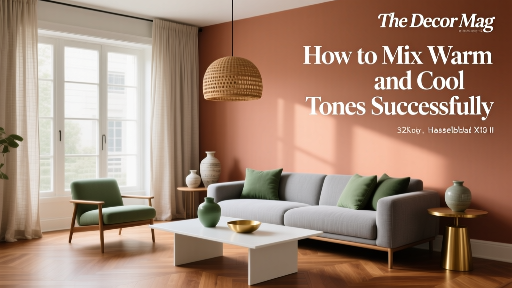
How to Mix Warm and Cool Tones Successfully - The Decor Mag
Some rooms feel instantly welcoming, while others feel calm, crisp, and focused—and often the difference comes down to temperature. Warm tones (think sunlit terracotta, creamy ivory, honeyed woods) bring comfort and energy. Cool tones (soft blues, misty greens, blue-leaning grays) create a sense of freshness and ease. Most homes need both.
Learning to mix warm and cool tones is one of the fastest ways to make your interior color design look intentional rather than accidental. It helps you avoid rooms that feel “flat” (all one temperature) or visually confusing (temperatures fighting each other). When you balance warm and cool paint colors, textiles, finishes, and lighting, you get depth, contrast, and a lived-in elegance that works across modern, traditional, and eclectic styles.
This guide breaks down the design principles behind color temperature, gives specific paint color recommendations, and shows real room scenarios—so you can build confident color schemes that feel cohesive from one space to the next.
Warm vs. Cool Tones: The Fastest Way to Tell the Difference
Warm tones
Warm colors contain yellow, red, or orange undertones. They tend to advance visually (feel closer), which makes them great for creating coziness and a flattering glow.
- Warm whites/creams: ivory, linen, bone
- Warm neutrals: beige, camel, greige (with a warm base)
- Warm colors: terracotta, rust, coral, golden yellows
- Warm woods: oak, cherry, walnut (especially with a red/gold cast)
Cool tones
Cool colors contain blue, green, or violet undertones. They tend to recede visually (feel farther away), which can make a room feel airy, calm, and more spacious.
- Cool whites: crisp white, blue-white
- Cool neutrals: gray (blue/green cast), taupe with a cooler base
- Cool colors: navy, teal, sage (blue-leaning), icy blues
- Cool metals: chrome, polished nickel
Why mixing temperatures works (color psychology + design)
Color psychology shows that warm hues often read as sociable and energizing, while cool hues feel restorative and focused. A room that includes both can support how you live: warm for comfort and connection, cool for clarity and balance. From a design perspective, temperature contrast creates visual hierarchy—your eyes know where to land because one temperature subtly “frames” the other.
The Core Rule: Choose a Dominant Temperature, Then Add a Counterbalance
The easiest way to mix warm and cool tones successfully is to avoid a 50/50 split. Instead, pick a dominant temperature (about 70–80% of the room) and a supporting counter-temperature (20–30%). This keeps your color scheme cohesive while still layered.
How to decide what’s dominant
- Fixed elements: flooring, stone, countertops, large furniture, brick, wood beams
- Light exposure: north-facing rooms read cooler; south-facing rooms read warmer
- Function: living rooms often benefit from warmth; offices and bedrooms often like cooler calm (with a warm touch for comfort)
Undertones: The Make-or-Break Detail in Paint Colors
When homeowners struggle with mixing warm and cool tones, undertones are almost always the culprit. Two paints can look “beige” on a swatch, but one is pink-leaning (warm) and one is green-leaning (cool). When paired, they can clash—even if both seem neutral.
Quick undertone checks
- Compare to true white: Hold a bright white paper next to the paint sample. Warm colors look creamy/yellow/red; cool colors look bluish/grayish.
- Use a black reference: Black makes undertones more noticeable (especially green or purple casts).
- Test large swatches: Paint 2’x2’ sections on multiple walls. Temperature can shift by time of day and lighting.
Reliable “bridge” colors that mix warm and cool
Bridge colors contain balanced undertones, helping you connect temperatures smoothly. Here are designer favorites (always sample first):
- Sherwin-Williams Agreeable Gray (SW 7029): a versatile greige that can play warm or cool depending on neighbors.
- Benjamin Moore Classic Gray (OC-23): a soft off-white/greige that transitions well between warm woods and cooler textiles.
- Farrow & Ball Cornforth White (No. 228): a nuanced mid-light gray that supports both warm brass and cool stone.
- Benjamin Moore Pale Oak (OC-20): a gentle greige with enough warmth for cozy spaces, yet calm enough for cool palettes.
Proven Warm + Cool Color Combinations (with Paint Recommendations)
These pairings work because they balance temperature and contrast while sharing a similar depth (lightness/darkness). Use them as full-room palettes or as starting points for your own interior color design.
1) Warm white walls + cool blue accents
- Walls: Benjamin Moore White Dove (OC-17) or Sherwin-Williams Alabaster (SW 7008)
- Accents: Sherwin-Williams Naval (SW 6244) or Benjamin Moore Hale Navy (HC-154)
- Best for: living rooms, entryways, kitchens with warm wood floors
Why it works: Warm white makes skin tones and wood look inviting; navy adds calm structure. This is a timeless color scheme for paint colors and decor.
2) Cool gray walls + warm terracotta and brass
- Walls: Benjamin Moore Stonington Gray (HC-170) or Farrow & Ball Ammonite (No. 274)
- Warm accents: terracotta pillows, rust rugs, cognac leather, brass lighting
- Best for: modern and transitional spaces, open-plan living
Why it works: Cool gray recedes, letting warm accents pop. Brass acts as a temperature “translator,” tying warm textiles to cooler walls.
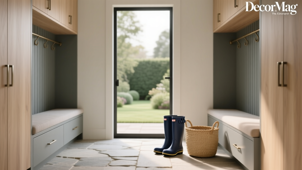
3) Warm greige walls + cool sage/teal cabinetry or built-ins
- Walls: Sherwin-Williams Accessible Beige (SW 7036) or Benjamin Moore Pale Oak (OC-20)
- Cabinetry/built-ins: Sherwin-Williams Evergreen Fog (SW 9130) or Benjamin Moore Saybrook Sage (HC-114)
- Best for: kitchens, mudrooms, libraries, breakfast nooks
Why it works: Greige keeps the room grounded; green-blue cabinetry brings freshness. This is one of the most livable interior paint color schemes right now.
4) Cool white walls + warm wood and camel textiles
- Walls: Benjamin Moore Chantilly Lace (OC-65) or Sherwin-Williams Extra White (SW 7006)
- Warm elements: oak floors, walnut coffee table, camel sofa, tan leather
- Best for: Scandinavian, minimalist, coastal, and gallery-like interiors
Why it works: Cool whites feel crisp; warm woods keep the room from feeling sterile. The contrast looks intentional and elevated.
Real Room Scenarios: How to Apply Warm + Cool Mixing at Home
Living Room: Cozy balance without looking “matchy”
Scenario: You have warm wood floors and a cool gray sofa you love.
Try this plan:
- Paint walls a bridging greige: Benjamin Moore Classic Gray (OC-23)
- Add warm textiles: an oatmeal rug, caramel throw, or cognac leather chair
- Repeat the cool tone in small ways: slate-blue pillows or a blue-gray art mat
- Anchor with a mixed-metal moment: black iron + warm brass (in lamps or hardware)
Result: The sofa feels integrated, the floor feels intentional, and the room gains depth through temperature contrast.
Kitchen: When countertops and cabinets fight each other
Scenario: Cool marble or quartz countertops (blue/gray veining) with warm wood floors.
Try this plan:
- Choose a soft warm white for cabinets: Sherwin-Williams Alabaster (SW 7008)
- Use cooler accents in backsplash grout, bar stools, or pendant shades
- Pick hardware based on your desired mood:
- Warmer: brushed brass or aged brass
- Cooler: polished nickel or chrome
Result: The warm floor reads welcoming, while the cool stone feels fresh and upscale.
Bedroom: Calm, but not cold
Scenario: You want a serene cool-toned bedroom, but you’re worried it will feel chilly.
Try this plan:
- Paint walls a soft cool-leaning color: Benjamin Moore Smoke (2122-40) or Sherwin-Williams Sea Salt (SW 6204)
- Warm it up with:
- creamy bedding (not stark white)
- oak nightstands or a walnut dresser
- a warm metallic table lamp (brass or antique gold)
Result: The paint color supports rest and clarity; the warm materials add comfort and a flattering glow at night.
Bathroom: Keeping tile and paint from clashing
Scenario: Cool white tile with a warm vanity, or vice versa.
Try this plan:
- If tile is cool, choose a neutral with minimal undertone shift like Farrow & Ball School House White (No. 291) (sample first under bathroom lighting).
- Add warmth through wood tones, woven baskets, and warm temperature bulbs (2700K–3000K).
Result: The space reads clean and spa-like, not icy.
Design Tools That Make Temperature Mixing Look Intentional
Use repetition to create cohesion
Repeat each temperature at least 2–3 times in a room so it looks like a plan, not a coincidence.
- Warm repeats: wood, brass, tan leather, cream textiles
- Cool repeats: blue-gray pillows, green artwork, nickel fixtures
Let lighting guide your paint choices
- North-facing rooms: often need warmer paint colors to counteract cool daylight (try BM White Dove or SW Alabaster).
- South-facing rooms: can handle cooler paint colors without feeling cold (try BM Stonington Gray or F&B Ammonite).
- Bulb temperature matters: 2700K feels warmer; 3000K is balanced; 3500K+ can skew cool and clinical at home.
Create contrast with finishes, not just paint
Even a neutral room benefits from temperature contrast through materials:
- Pair cool stone with warm wood
- Pair a cool paint color with warm linen curtains
- Pair a warm wall color with crisp white trim (or vice versa)
Common Color Mistakes to Avoid
- Mixing undertones blindly: A warm pink-beige next to a green-gray can look “off” even if both seem neutral.
- Overusing one temperature: All-cool can feel sterile; all-warm can feel heavy or dated. Balance creates sophistication.
- Choosing paint last (or first) without a plan: Start with fixed elements and key furnishings, then select paint colors to support them.
- Ignoring sheen and finish: A cool gray in high-gloss can look icier; a warm white in flat can feel dull. Use eggshell for walls in most living spaces; satin/semi-gloss for trim.
- Forgetting transition spaces: Hallways and open-plan sightlines need bridge colors so rooms don’t “argue” with each other.
A Simple Step-by-Step Method for a Balanced Color Scheme
- Identify your fixed warm/cool anchors: floors, counters, tile, large upholstery.
- Pick a dominant temperature: decide if the room should feel cozier (warm) or airier (cool).
- Select a bridge neutral: examples include SW Agreeable Gray or BM Classic Gray.
- Add 2–3 accents in the opposite temperature: pillows, art, rugs, or a painted piece of furniture.
- Check your lighting: test samples morning/day/evening; confirm bulb temperature.
- Repeat, then edit: repeat both temperatures, remove any color that introduces a third conflicting undertone.
FAQ: Mixing Warm and Cool Tones
Can you mix warm and cool tones in the same room?
Yes—and it’s often what makes a room feel designed. Choose a dominant temperature, then add the opposite temperature through accents, materials, or a secondary paint color (like cabinetry or an accent wall).
What’s the easiest “bridge” paint color when I’m stuck?
Many homeowners have success with Sherwin-Williams Agreeable Gray (SW 7029) or Benjamin Moore Classic Gray (OC-23) because they flex between warm and cool surroundings. Always sample in your lighting.
How do I know if my gray paint is warm or cool?
Look at undertones. A warm gray (greige) often shows beige, taupe, or a hint of red/yellow; a cool gray often shows blue, green, or violet. Compare your swatch to a true white sheet of paper and test it on multiple walls.
Do warm metals and cool metals need to match the room temperature?
Not necessarily. Mixed metals can be a smart way to blend temperatures. Brass warms up cool palettes; polished nickel or chrome can sharpen warm palettes. The key is repeating each metal at least twice so it feels intentional.
How can I warm up a cool color scheme without repainting?
Add warmth through textiles and lighting: a warm-toned rug, camel or cognac leather, brass accents, wood picture frames, and 2700K–3000K bulbs. Even one warm statement piece can shift the room’s feel.
What if my open floor plan has both warm and cool rooms?
Use a connecting neutral in the main sightline (often the hallway or great room). Then layer each room with accents in both temperatures so transitions feel natural rather than abrupt.
Next Steps: Build Your Warm-Cool Balance With Confidence
Start by reading your room’s fixed materials and natural light, then choose a dominant temperature. Add a bridge neutral to smooth transitions, and bring in the opposite temperature through repeatable accents—textiles, art, metals, and wood tones. With a few well-chosen paint colors and intentional repetition, your home can feel both inviting and refined.
Explore more paint color guides, color schemes, and interior color design advice on thedecormag.com to keep building a home that feels as good as it looks.
More Articles
 Small vs Step: Decoding the Critical Difference in Color Management for Print and Digital Workflows
 Best Champagne Paint Colors - The Decor Mag
 How to Choose Colors for a Loggia - The Decor Mag
 How to Choose Colors for a Mudroom - The Decor Mag
 Reading FAQ Answered: Evidence-Based Answers to 27 Common Questions About Vision, Eye Health, and Reading Performance
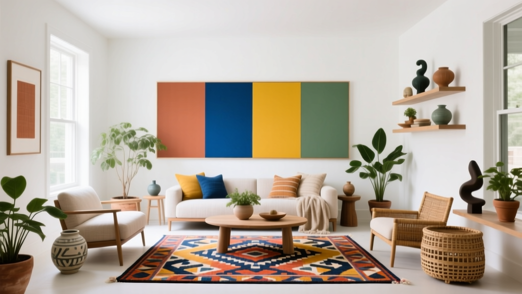 How to Create a Vibrant Color Palette - The Decor Mag
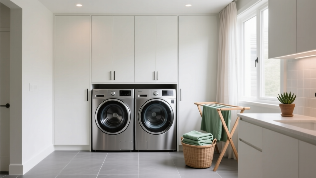 How to Choose Colors for a Laundry Room - The Decor Mag
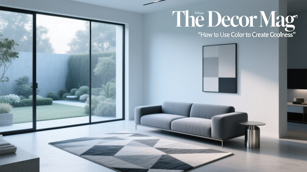 How to Use Color to Create Coolness - The Decor Mag
 Monochromatic Color Scheme Design Guide - The Decor Mag
 Best Blush Pink Paint Colors - The Decor Mag