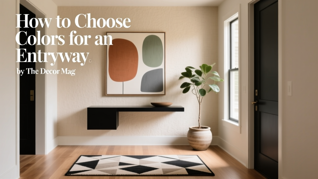
How to Choose Colors for an Entryway - The Decor Mag
Your entryway does more than welcome guests—it sets the emotional temperature for the entire home. Whether it’s a grand foyer or a tight apartment hall, this small zone forms a first impression in seconds. Color is the fastest way to shape that impression, influencing how spacious the area feels, how clean it reads, and how smoothly the rest of your home’s color scheme flows.
Entryways are also uniquely practical spaces. They endure scuffs, bags bumped against walls, and shifting light from open doors. A beautiful entry color has to work hard: flatter changing daylight, coordinate with adjacent rooms, and look great at night under warm bulbs. With a few design principles and smart paint color choices, your entry can feel intentional, elevated, and distinctly “you.”
This guide breaks down how to choose entryway paint colors, how to build a cohesive color scheme, and which real-world combinations work in everyday homes—plus common color mistakes and easy fixes.
Start With the Entryway’s Job: Mood, Flow, and Function
Before you sample a single swatch, clarify what you want your entry to do. Color selection becomes easier when you’re solving for a specific goal.
Choose the mood using color psychology
- Calm and grounded: Soft greens, warm greiges, muted blues, and clay neutrals reduce visual “noise” and feel restorative.
- Bright and optimistic: Creamy whites, pale yellows, and warm off-whites create a sunlit welcome even in low-light halls.
- Elegant and dramatic: Deep navy, charcoal, espresso, or saturated jewel tones feel curated—especially with good lighting and trim contrast.
- Warm and sociable: Terracotta, peachy beiges, and warm taupes read friendly and inviting, especially with wood tones.
Decide how the entry should connect to nearby rooms
Most entryways visually connect to a living room, staircase, kitchen, or hallway. Your entry color doesn’t need to match adjacent spaces, but it should relate—through undertone, intensity, or a repeated accent.
- Continuity approach: Use a lighter or darker shade of an adjacent room color.
- Transition approach: Use a neutral “bridge” color that links multiple rooms.
- Statement approach: Use a bold color in the entry while repeating it later (artwork, pillows, a runner) so it feels intentional.
Evaluate Light and Undertones (The Make-or-Break Step)
Entryways often have challenging lighting—north-facing windows, shaded porches, or no windows at all. That’s why understanding light and undertones is essential for interior color design.
Natural light: what direction is it?
- North-facing light: Cooler and dimmer. Warm up with creamy whites, warm greiges, or soft clay tones.
- South-facing light: Bright and warm. Many colors work; watch for overly yellow warm whites that can look too buttery.
- East-facing light: Bright in the morning, cooler later. Balanced neutrals and soft colors perform well.
- West-facing light: Cooler mornings, strong warm afternoon light. Colors can look more intense later in the day.
Artificial light: pick bulbs first
Your paint color will look different under 2700K warm light vs. 4000K neutral light. For most entryways, 2700K–3000K creates a welcoming glow. If you prefer crisp and modern, 3000K–3500K can work—just test samples at night.
Undertones: avoid the “mystery pink” or “surprise green” effect
Many popular neutrals have subtle undertones that show up strongly in an entryway. Compare samples against something truly white (printer paper works) to spot undertones.
- Warm undertones: yellow, red, orange (cozier)
- Cool undertones: blue, violet (crisper)
- Green undertones: can feel organic, but may look muddy in low light
Pick a Color Strategy: Neutral, Mid-Tone, or Bold
The best entryway paint colors depend on your architecture, ceiling height, and how much visual energy you want right at the front door.
1) Neutral entryways: timeless and flexible
A neutral entry can still feel designed when you choose the right undertone and add contrast in trim, doors, or furnishings.
- Creamy warm whites: welcoming, flattering, and great for lower light
- Greige and taupe: sophisticated bridge colors that connect warm woods and cool stone
- Soft gray-beige: modern, calm, and easy to decorate around
Paint color ideas (widely available brands):
- Benjamin Moore White Dove (OC-17): a classic warm white that rarely feels too yellow.
- Sherwin-Williams Alabaster (SW 7008): creamy, soft, and excellent for cozy entries.
- Farrow & Ball Skimming Stone (No. 241): an elevated greige that looks especially refined with warm metals.
2) Mid-tone colors: the sweet spot for most homes
Mid-tone hues add character without shrinking the space. They also hide scuffs better than bright white, which is a practical win for busy households.
Paint color ideas:
- Benjamin Moore Edgecomb Gray (HC-173): a warm greige that feels airy but grounded.
- Sherwin-Williams Accessible Beige (SW 7036): a balanced beige that bridges warm and cool décor.
- Benjamin Moore Smoke (2122-40): a soft blue-gray for a calm, tailored entryway.
3) Bold and dark colors: dramatic, curated, and surprisingly cozy
Dark colors can make an entryway feel rich and intentional—especially if your home has white trim, high ceilings, or a lot of natural light. In smaller, low-light entries, dark hues work best when lighting is layered and finishes add reflectivity (mirrors, satin paint, brass).
Paint color ideas:
- Benjamin Moore Hale Navy (HC-154): a perennial favorite for a sophisticated navy entry.
- Sherwin-Williams Iron Ore (SW 7069): a soft charcoal that feels modern and moody without reading pitch-black.
- Farrow & Ball Green Smoke (No. 47): a complex smoky green that feels historic and modern at once.
Design Principles That Make Entryway Color Look “Finished”
Use the 60-30-10 color scheme for instant balance
This classic interior design rule keeps your entry cohesive:
- 60% dominant: walls (your main paint color)
- 30% secondary: floors, runner, console, or wainscoting
- 10% accent: art, a lamp, front door color, greenery, hardware
Create contrast with trim and doors
Trim color affects how your wall color reads. Crisp trim makes colors look cleaner; softer trim makes the palette feel relaxed.
- High contrast: Deep wall color + bright white trim (e.g., Hale Navy + White Dove).
- Soft contrast: Greige walls + warm off-white trim (e.g., Edgecomb Gray + Alabaster).
- Modern monochrome: Walls, trim, and door in one color but different sheens for subtle definition.
Choose sheen based on traffic and texture
- Walls: eggshell or satin for durability and wipeability.
- Trim/doors: satin or semi-gloss for crisp definition.
- If walls are imperfect: avoid high sheen; it highlights bumps and patches.
Real Room Examples and Application Scenarios
Scenario 1: Small apartment entry with no windows
Goal: make it feel brighter and larger without looking sterile.
- Walls: Sherwin-Williams Alabaster (SW 7008)
- Trim/door: a clean white in semi-gloss (match to your existing trim white)
- Accent: matte black hooks + a warm wood mirror
Why it works: a creamy white reflects artificial light warmly, while black accents add definition so the space doesn’t feel bland.
Scenario 2: Traditional foyer with staircase and lots of wood
Goal: complement warm wood tones and make the entry feel established.
- Walls: Benjamin Moore Edgecomb Gray (HC-173)
- Trim: Benjamin Moore White Dove (OC-17)
- Optional: paint the front door (interior side) in Benjamin Moore Hale Navy (HC-154)
Why it works: warm greige supports wood, White Dove keeps it crisp, and navy adds a tailored focal point.
Scenario 3: Modern entryway with tall ceilings
Goal: add drama without making the space feel cold.
- Walls: Sherwin-Williams Iron Ore (SW 7069) in eggshell
- Trim: a bright white in semi-gloss
- Accent: brass lighting + oversized abstract art with warm neutrals
Why it works: charcoal creates architecture and depth; brass lighting warms the palette and prevents a flat, gloomy feel.
Scenario 4: Coastal-inspired entry that still feels grown-up
Goal: airy and calm, not overly themed.
- Walls: Benjamin Moore Smoke (2122-40)
- Trim: Benjamin Moore White Dove (OC-17)
- Accent: natural fiber runner + woven basket + soft oak console
Why it works: blue-gray reads serene and sophisticated, and natural textures keep it welcoming.
Winning Entryway Color Combinations (Copy-and-Paint Palettes)
- Warm welcoming neutral: SW Alabaster + camel leather accents + aged brass + warm oak
- Classic navy statement: BM Hale Navy + BM White Dove trim + jute runner + walnut console
- Earthy modern: F&B Green Smoke + cream trim + black metal + terracotta pottery
- Soft greige sophistication: BM Edgecomb Gray + off-white trim + muted artwork + linen textures
Common Entryway Color Mistakes (and How to Fix Them)
- Choosing a color from a screen: Phone images distort undertones. Fix: sample in your actual entry under day and night lighting.
- Ignoring adjacent rooms: A color can clash the moment you turn the corner. Fix: pull a shared undertone (warm with warm, cool with cool) or repeat an accent color nearby.
- Going too bright in low light: Stark whites can look gray or dingy without sun. Fix: choose a warmer white (Alabaster, White Dove) or a mid-tone greige.
- Picking a dark color without upgrading lighting: The result can feel cave-like. Fix: add layered lighting—overhead + lamp + sconce—and consider a satin finish for gentle reflectivity.
- Forgetting durability: Flat paint in a high-traffic hall shows marks fast. Fix: eggshell or satin on walls; washable paint lines if you have kids or pets.
- Undertone mismatch with floors: Cool gray walls with warm honey oak can feel “off.” Fix: choose a warm greige/taupe that relates to the floor.
How to Test Entryway Paint Colors Like a Designer
- Pick 3–5 contenders max: One safe neutral, one mid-tone, one bolder option.
- Use large samples: Paint 12"x12" (or larger) on poster board and move them around.
- Check at three times: morning, late afternoon, and night under your bulbs.
- Compare next to fixed finishes: flooring, trim, stone, and the interior side of your front door.
- Step back: Entryways are seen in motion. View from the front door and from the next room.
FAQ: Entryway Color Schemes and Paint Choices
What are the best paint colors for a small entryway?
Look for warm off-whites and light neutrals that reflect light without turning cold: Benjamin Moore White Dove and Sherwin-Williams Alabaster are reliable. If you want more character, a mid-tone greige like Benjamin Moore Edgecomb Gray can add warmth while still feeling open.
Should the entryway match the hallway or living room?
Matching isn’t required, but coordination is. Aim for a shared undertone or a repeated accent. If your living room is warm, keep the entry warm (cream, greige, taupe). If it’s cool and modern, lean into soft blue-grays or crisp whites.
Are dark colors a bad idea for entryways?
No—dark entryway paint colors can look high-end and welcoming when lighting is thoughtful. Pair deep hues like Benjamin Moore Hale Navy or Sherwin-Williams Iron Ore with bright trim, reflective accents, and layered lighting so the space feels intentional rather than dim.
What sheen should I use in an entryway?
Eggshell or satin on walls holds up best to fingerprints and scuffs. Use satin or semi-gloss on trim and doors for definition and easier cleaning. If your walls are very textured or imperfect, eggshell can be more forgiving than satin.
How do I choose an entryway color if I have warm wood floors?
Warm wood floors pair beautifully with warm whites, greiges, and earthy tones. Try Benjamin Moore Edgecomb Gray or Sherwin-Williams Accessible Beige. Avoid icy grays unless you intentionally balance them with warm textiles and lighting.
How can I make an entryway feel brighter without painting it pure white?
Choose a light warm neutral, add a mirror to bounce light, and use warm bulbs (2700K–3000K). A pale greige or soft clay-leaning neutral can read brighter than stark white in a windowless space.
Next Steps: Build Your Entryway Color Plan
To choose the right entryway paint color, start with the light you actually have, decide the mood you want to feel when you walk in, then select a color strategy—neutral, mid-tone, or bold. Test large samples, view them at night, and make sure the color connects to adjacent rooms through undertone or repeated accents.
Once your paint color is set, finish the look with contrast (trim and hardware), durability (eggshell or satin), and a simple 60-30-10 palette using a runner, a console, and one strong accent.
For more paint color ideas, color schemes, and room-by-room guidance, explore more color guides on thedecormag.com.
More Articles
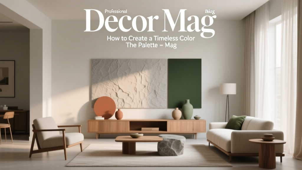 How to Create a Timeless Color Palette - The Decor Mag
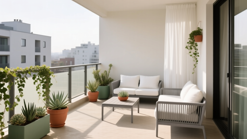 How to Choose Colors for a Balcony - The Decor Mag
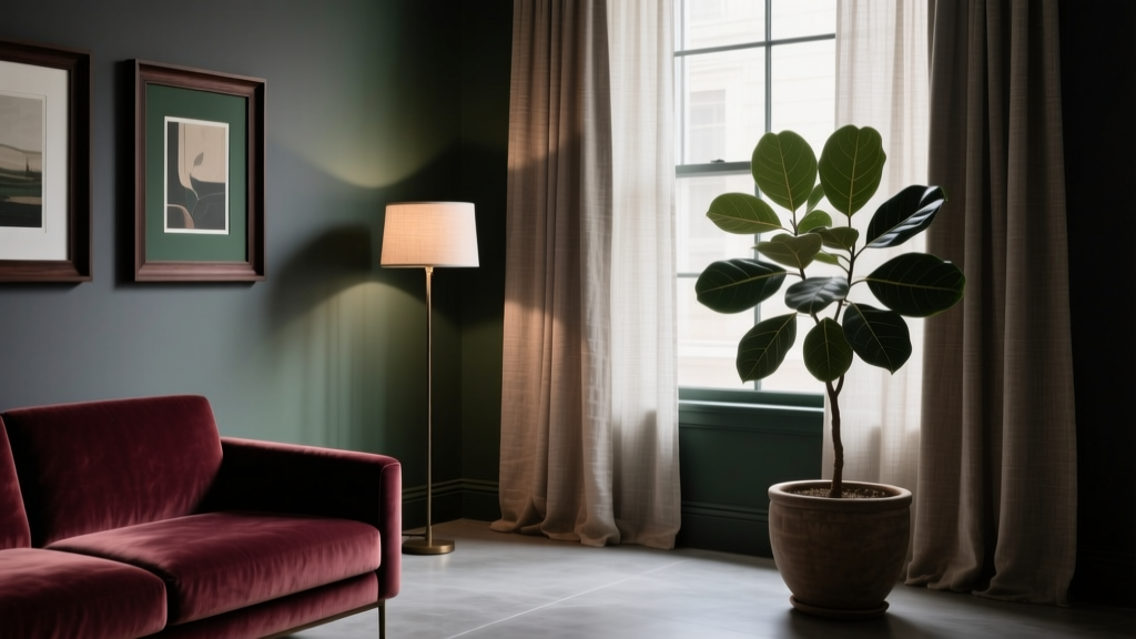 How to Create a Moody Color Palette - The Decor Mag
 Best Pistachio Paint Colors - The Decor Mag
 Best Scarlet Paint Colors - The Decor Mag
 Best Mango Paint Colors - The Decor Mag
 Best Fire Engine Red Paint Colors - The Decor Mag
 Studio Color Palettes That Expand Small Rooms
 Saturated Colors in Decor: Use Without Overwhelming
 Best Red Paint Colors for Drama and Warmth - The Decor Mag