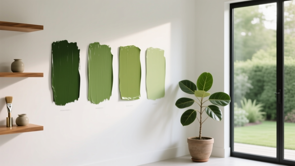
Best Chartreuse Paint Colors - The Decor Mag
Chartreuse sits at the intersection of green and yellow—bold, optimistic, and surprisingly versatile when you choose the right undertone. It can read fresh and botanical in daylight, then shift toward a warm glow under evening lamps. That color movement is exactly why chartreuse matters: it’s one of the few hues that can feel energizing without leaning overly primary, and it can add designer-level personality in a single coat.
Homeowners often shy away from chartreuse because they’ve seen it used too loudly—highlighter-bright walls, clashing decor, or lighting that turns it sour. The secret is understanding undertones (yellow-forward vs. green-forward), saturation (muted vs. electric), and where chartreuse performs best (accents, cabinetry, lacquered doors, or selective walls). Used well, chartreuse paint colors create crisp contrast with neutrals, make wood finishes look richer, and bring a “collected” feel to modern and traditional spaces alike.
What Counts as “Chartreuse” in Interior Paint?
In color theory terms, chartreuse lives between yellow and green on the color wheel—typically a yellow-green with medium to high chroma. In interiors, it can show up in three common “families,” each with different design outcomes:
- Yellow-leaning chartreuse: warmer, sunnier, often more welcoming in north-facing rooms.
- Green-leaning chartreuse: crisper, more botanical, pairs beautifully with blues and cooler neutrals.
- Muted chartreuse: a toned-down yellow-green that reads sophisticated and livable for larger surfaces.
Color psychology: Chartreuse borrows optimism and mental clarity from yellow and balance/growth from green. In many homes it works as a “creative energy” color—excellent for kitchens, studios, playrooms, and social areas—while still feeling grounded when paired with calm neutrals and natural materials.
How to Choose the Right Chartreuse for Your Home
Start With Lighting (It Changes Everything)
- North-facing rooms: light can be cool/flat. Choose a chartreuse with more yellow warmth to keep it from going gray-green.
- South-facing rooms: abundant warm light can intensify yellow. Consider a greener or slightly muted chartreuse for balance.
- East-facing rooms: bright mornings, softer afternoons—chartreuse can feel lively early and calmer later.
- West-facing rooms: warm late-day sun can push chartreuse toward golden. A green-leaning chartreuse helps it stay fresh.
Decide Where You Want the Drama
Chartreuse doesn’t have to mean four walls. Some of the most elevated applications are deliberate and architectural:
- Accent wall: behind built-ins, a headboard wall, or a fireplace surround.
- Cabinetry: lowers in a kitchen, a bar area, or a pantry door for a boutique look.
- Trim or interior doors: high-impact, small surface area—great for experimenting.
- Ceiling: in a breakfast nook or powder room for an unexpected glow.
Use Undertones to Create a Cohesive Color Scheme
Chartreuse is easiest to live with when it’s part of a planned interior color design story:
- With warm neutrals: ivory, greige, camel, warm taupe.
- With cool neutrals: crisp white, soft gray, graphite, blackened steel.
- With woods: walnut looks richer; oak looks sunnier; painted black or espresso grounds the brightness.
Best Chartreuse Paint Colors (Designer-Approved Picks)
These chartreuse paint colors are widely loved because they’re complex, flexible, and easier to style than neon yellow-green. Always sample first—chartreuse is highly sensitive to both natural and artificial light.
1) Farrow & Ball Yeabridge Green
Best for: cheerful kitchens, breakfast rooms, mudrooms, and vintage-inspired spaces.
- Undertone: yellow-leaning green with a lively, garden feel.
- Pairs well with: warm whites, honey oak, brass hardware, terracotta accents.
- Try it on: kitchen island cabinetry or a pantry door to add character without overwhelming the room.
2) Farrow & Ball Lichen
Best for: softer chartreuse moments—hallways, libraries, and rooms where you want “color” without shouting.
- Undertone: muted yellow-green, slightly earthy.
- Pairs well with: linen textiles, warm gray, aged wood, antique gold frames.
- Try it on: walls with crisp white trim for a calm but distinct color scheme.
3) Sherwin-Williams Citrine (SW 6390)
Best for: energized accent walls, creative studios, and modern spaces that can handle higher saturation.
- Undertone: bright yellow-green with a clean, modern punch.
- Pairs well with: matte black, bright white, clear maple, cobalt or navy accents.
- Try it on: a single wall behind open shelving or artwork to create a gallery-like backdrop.
4) Sherwin-Williams Jardin (SW 6446)
Best for: botanical-inspired interiors that want chartreuse energy but read more “leafy” than “neon.”
- Undertone: green-forward with a juicy, outdoorsy vibe.
- Pairs well with: warm whites, rattan, olive textiles, soft clay tones.
- Try it on: built-in bookcases, a bar nook, or bathroom vanity cabinetry.
5) Benjamin Moore Chartreuse (2024-10)
Best for: true chartreuse lovers—an unapologetic statement color.
- Undertone: classic yellow-green, high-chroma.
- Pairs well with: crisp white, lacquered black, polished nickel, graphic patterns.
- Try it on: an interior door or a powder room where bold color feels intentional.
6) Benjamin Moore Highlighter (AF-310)
Best for: artistic homes, playful spaces, and small architectural moments (not usually best for whole-room walls).
- Undertone: electric yellow with a green edge—very bright.
- Pairs well with: white tile, black grout, concrete, colorful art, chrome.
- Try it on: the back panel of a bookshelf or a niche to create depth and surprise.
7) Behr Bitter Lime (N390-4)
Best for: budget-friendly chartreuse style, especially for accents and DIY furniture updates.
- Undertone: zesty yellow-green, slightly softened compared to neon shades.
- Pairs well with: off-white, charcoal, mid-tone woods, woven textures.
- Try it on: a painted dresser, nightstands, or a front door for instant curb appeal.
Room-by-Room Ideas: Where Chartreuse Works Beautifully
Kitchen: Fresh, Social, and Surprisingly Timeless
Chartreuse can make a kitchen feel cleaner and more welcoming—especially when balanced with classic materials.
- Scenario: Chartreuse lower cabinets + warm white uppers + honed black countertops.
- Finishes to add: unlacquered brass pulls, creamy zellige backsplash, walnut stools.
- Pro tip: Use a slightly muted chartreuse if you have lots of warm lighting at night to avoid a “too-yellow” shift.
Living Room: A High-Design Accent That Feels Collected
If you love color but want a living room that stays comfortable, limit chartreuse to one architectural element.
- Scenario: Chartreuse built-ins around a fireplace with neutral walls and a patterned rug that includes small hits of yellow-green.
- Best pairings: creamy whites, camel leather, black accents, natural linen drapes.
- Pro tip: Repeat chartreuse 2–3 times in decor (a pillow, a vase, a piece of art) for a cohesive color scheme.
Bedroom: Use It as a “Spark,” Not a Floodlight
Most bedrooms benefit from calmer hues, but chartreuse can be a beautiful counterpoint when placed strategically.
- Scenario: Chartreuse on the headboard wall only, paired with warm white bedding and olive/khaki textiles.
- Alternative: Paint just the bedroom door in chartreuse for a playful pop without impacting sleep calm.
- Pro tip: Choose a green-leaning or muted chartreuse for bedrooms to keep the mood grounded.
Bathroom or Powder Room: Small Space, Big Payoff
Chartreuse is excellent in powder rooms because the space is small and often benefits from a mood-lifting jolt.
- Scenario: Chartreuse walls + white pedestal sink + vintage mirror + brass sconces.
- Tile pairing: white subway tile with dark grout or creamy stone tile for warmth.
- Pro tip: If your lighting is very warm (2700K), sample greener chartreuse options to prevent a yellow cast.
Home Office or Studio: Creativity Without Chaos
Color psychology suggests yellow-green hues can support alertness and idea generation. The key is managing contrast.
- Scenario: Chartreuse on a single wall behind the desk, with the rest in a soft white or light greige.
- Desk + decor: walnut desk, matte black lamp, neutral art mats with one chartreuse accent.
- Pro tip: Keep screens and task lighting in mind—chartreuse can reflect onto monitors. A muted version is easier on the eyes.
Winning Color Combinations for Chartreuse
Chartreuse plays best when the rest of the palette is intentional. Use these combinations to build confident, livable interior color design schemes:
- Chartreuse + Navy: crisp, classic contrast; great for kitchens and offices.
- Chartreuse + Warm White: fresh and clean; ideal for airy spaces.
- Chartreuse + Charcoal/Black: graphic and modern; perfect for doors, trim, and contemporary rooms.
- Chartreuse + Blush/Soft Pink: playful and sophisticated; works beautifully in powder rooms and dressing areas.
- Chartreuse + Terracotta/Clay: earthy and artistic; great for boho and Mediterranean-inspired homes.
- Chartreuse + Natural Wood + Brass: warm, organic, and timeless—an easy formula for cabinetry and built-ins.
Practical Application Tips (So It Looks Designer)
- Always sample in multiple spots: Paint large swatches on poster board and move them around the room morning to night.
- Choose the right sheen:
- Walls: eggshell or matte (matte looks richer, eggshell is easier to clean).
- Trim/doors: satin or semi-gloss for a crisp, intentional finish.
- Cabinetry: satin or a durable cabinet enamel—chartreuse looks especially elevated in a smooth finish.
- Balance with neutrals: Give your eye a resting place—white ceilings, neutral rugs, or toned-down upholstery keep chartreuse from dominating.
- Repeat the color thoughtfully: Echo chartreuse in art, books, pillows, or ceramics so it feels integrated, not random.
- Mind the bulbs: If chartreuse looks harsh, try a slightly cooler bulb (3000K) or add layered lighting to soften shadows.
Common Chartreuse Color Mistakes (and How to Avoid Them)
- Using a high-chroma chartreuse on every wall in a large room: It can feel frantic. Fix: use it as an accent or select a muted chartreuse for full-room coverage.
- Ignoring undertones in surrounding finishes: Warm floors + warm bulbs + yellow-leaning chartreuse can turn overly golden. Fix: switch to a greener chartreuse or cool down adjacent whites.
- Pairing with the wrong white: A stark blue-white can make warm chartreuse look muddy. Fix: match whites by undertone—warm chartreuse with creamy whites, green chartreuse with crisper whites.
- Forgetting about reflection: Chartreuse bounces onto ceilings and nearby walls. Fix: keep adjacent colors calm and test near large white surfaces.
- Underestimating nighttime lighting: Many chartreuses shift warmer after sunset. Fix: evaluate samples under lamps, not just daylight.
FAQ: Chartreuse Paint Colors
Is chartreuse a good choice for a whole room?
Yes, especially in smaller rooms (powder rooms, breakfast nooks) or in muted chartreuse tones. For large living areas, many homeowners prefer chartreuse on cabinetry, a single wall, or built-ins to keep the palette balanced.
What neutral colors go best with chartreuse?
Warm whites, soft greige, taupe, and light natural wood tones are the easiest partners. For a modern look, pair chartreuse with crisp white and charcoal or black accents.
Does chartreuse work with brass hardware?
Very well. Brass emphasizes chartreuse’s warmth and makes it feel intentional and elevated—especially on cabinet doors, a bar area, or a statement interior door.
How do I keep chartreuse from looking neon?
Choose a muted chartreuse, use it on smaller surfaces, and surround it with grounded materials (wood, stone, woven textures). Also test under your actual lighting—some bulbs exaggerate brightness.
What colors complement chartreuse on the color wheel?
Chartreuse sits between yellow and green. Complementary directions include purples (from aubergine to soft lavender) and deep blues (navy is a favorite). These pairings create strong contrast without feeling chaotic.
Is chartreuse trendy or timeless?
Chartreuse can feel timeless when it’s treated like a classic accent color—similar to how designers use deep teal or oxblood. The most enduring approach is pairing it with warm neutrals, natural materials, and simple, well-proportioned design.
Next Steps: Make Chartreuse Work in Your Space
Pick two or three chartreuse paint colors from the list, test them on large sample boards, and view them across a full day of lighting. Decide whether your home wants chartreuse as an accent (doors, built-ins, cabinetry) or a fuller moment (powder room, nook, hallway). Then build a supporting color scheme with one strong neutral, one dark anchor (charcoal, navy, or black), and warm metals or natural textures to bring it all together.
For more paint color ideas, undertone guides, and room-by-room color schemes, explore the latest color guides on thedecormag.com.
More Articles
 Reading FAQ Answered: Evidence-Based Answers to 27 Common Questions About Vision, Eye Health, and Reading Performance
 Best Red Paint Colors for Drama and Warmth - The Decor Mag
 Best Green Paint Colors for Nature Lovers - The Decor Mag
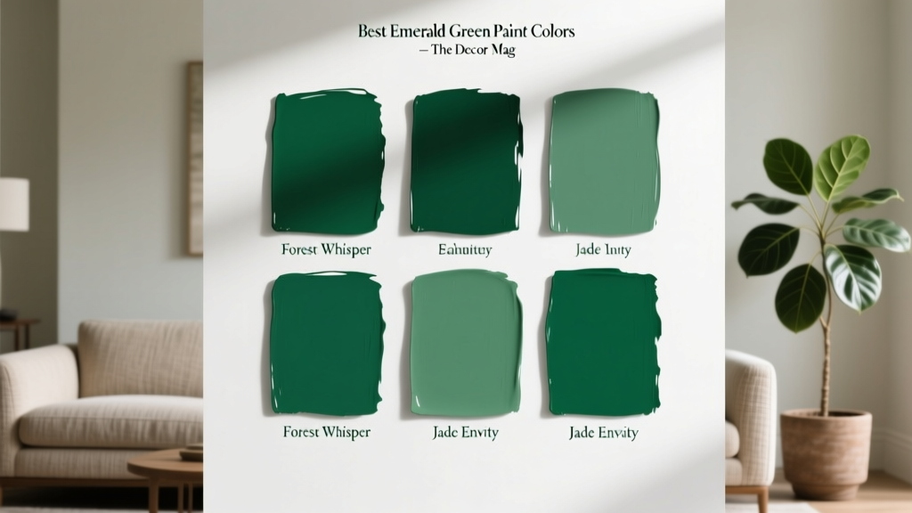 Best Emerald Green Paint Colors - The Decor Mag
 Triadic Color Scheme Applications - The Decor Mag
 Studio Color Palettes That Expand Small Rooms
 How to Use Color to Create Flow - The Decor Mag
 Best Oxblood Paint Colors - The Decor Mag
 Bedroom vs. Open Concept: Functional, Psychological, and Design Realities
 How to Create a Timeless Color Palette - The Decor Mag