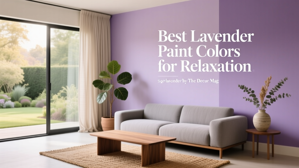
Best Lavender Paint Colors for Relaxation - The Decor Mag
Lavender sits in a sweet spot of interior color design: it’s soothing like blue, uplifting like pink, and nuanced enough to feel grown-up when used thoughtfully. When homeowners want a calming bedroom, a spa-like bathroom, or a soft, welcoming living room, lavender paint colors offer a gentle alternative to the usual neutrals—without turning a space cold or sleepy.
From a color psychology standpoint, lavender is often associated with tranquility, restoration, and emotional balance. Its slight warmth (especially in pink-leaning lavenders) can make a room feel comforting, while cooler, blue-leaning lavenders read airy and serene. The key is choosing the right undertone for your lighting and finishes so your “relaxing lavender” doesn’t drift into gray, babyish pastel, or unexpectedly purple.
This guide breaks down the best lavender paint colors for relaxation, including specific paint color names, room-by-room ideas, foolproof color schemes, and common mistakes to avoid—so you can use lavender with confidence in real homes.
Why Lavender Feels So Relaxing: Color Psychology Meets Design Principles
Lavender is a light value (pale) purple, and that matters. Lighter values reflect more light, which reduces visual weight and helps rooms feel open and breathable. Purple itself is a blend of blue (calm, introspective) and red (energy, warmth). Lavender tempers both, creating a peaceful middle ground—especially when paired with soft textures and low-contrast palettes.
What makes a lavender “relaxation” shade?
- Muted chroma: Softer lavenders feel restful; highly saturated purples can feel dramatic or stimulating.
- Balanced undertones: Pink-leaning lavenders feel cozy; blue-leaning lavenders feel crisp and airy.
- Low to medium contrast: Pairing lavender with gentle neutrals (warm whites, greiges, pale wood) keeps the mood calm.
How to Choose the Right Lavender Paint Color (Undertones + Lighting)
Lavender can shift dramatically from morning to evening and from room to room. Before you commit, consider how light interacts with undertones.
Lighting cheat sheet
- North-facing rooms: Cooler, grayer light can make lavender look more blue or slightly gray. Choose a lavender with a touch of warmth (pink or beige undertone).
- South-facing rooms: Warm, abundant light can make lavender appear brighter. Muted lavenders keep things relaxed.
- East-facing rooms: Morning light is bright and cool; the shade may look fresher early and softer later.
- West-facing rooms: Afternoon light is warm and intense; some lavenders can read more pink or purple at sunset.
Sampling tips that prevent regret
- Paint large swatches (at least 12" x 12") on multiple walls.
- Check color next to your fixed finishes: tile, flooring, countertops, and upholstery.
- View at three times: morning, afternoon, and night under your actual bulbs.
- Test sheen: eggshell vs matte can change how “glowy” lavender feels.
Best Lavender Paint Colors for Relaxation (Designer-Approved Picks)
These lavender paint colors are widely loved for their calming presence and livable undertones. Always sample first—batch and lighting differences matter.
1) Benjamin Moore Violet Mist (1437) — airy, spa-like lavender
Violet Mist is a gentle, pale lavender that reads calm and clean, especially in bathrooms and bedrooms. It’s a great option if you want lavender that doesn’t feel sugary.
- Best for: Bathrooms, serene bedrooms, meditation corners
- Pairs well with: White marble, brushed nickel, pale oak, soft gray textiles
- Style match: Transitional, coastal, modern classic
2) Benjamin Moore Lavender Mist (2070-60) — soft, romantic, light-filled
This shade leans delicate and luminous. It’s pretty without being juvenile, especially when anchored with warm whites and natural textures.
- Best for: Guest bedrooms, nurseries (gender-neutral when styled with warm neutrals), reading nooks
- Pairs well with: Creamy whites, linen, cane, light brass
3) Sherwin-Williams Light Lavender (SW 6554) — cheerful calm with a clean finish
Light Lavender has a fresh, optimistic feel that still reads restful when you keep surrounding colors soft. It’s a strong choice for spaces that need a mood lift without becoming energizing.
- Best for: Bedrooms with limited natural light, craft rooms that still need calm
- Pairs well with: Pure whites, pale gray, light maple, soft blush accents
4) Sherwin-Williams Veiled Violet (SW 6268) — muted lavender-gray for sophisticated relaxation
If you love lavender but want it grown-up, Veiled Violet leans into a hazy, grayish violet. It creates a cocooning effect that feels quiet and elevated.
- Best for: Primary bedrooms, dressing rooms, moody powder rooms
- Pairs well with: Warm greige, taupe, antique brass, walnut, creamy off-whites
5) Farrow & Ball Calluna (No. 270) — heathered lavender with depth
Calluna is inspired by heather and reads complex: lavender, gray, and a whisper of earthiness. It’s particularly relaxing in rooms with layered textiles and traditional details.
- Best for: Libraries, bedrooms, sitting rooms
- Pairs well with: Slubby linens, stone, aged woods, warm whites
6) Farrow & Ball Brassica (No. 271) — stronger lavender for statement serenity
Brassica is a bolder lavender-purple that can still feel restorative when used with restraint. Consider it for an accent wall, built-ins, or a small room where a jewel-toned hug feels comforting.
- Best for: Accent walls, dining rooms used in the evening, dramatic powder rooms
- Pairs well with: Deep greens, warm whites, natural wood, matte black accents
Real Room Examples: How to Use Lavender Paint Colors at Home
Bedroom: a restful lavender envelope
For maximum relaxation, prioritize low contrast and warm textures. A pale lavender wall color with creamy trim feels calm, not stark.
- Wall color: Benjamin Moore Violet Mist (1437)
- Trim: Warm white (avoid icy whites that make lavender look cold)
- Textiles: Oatmeal linen bedding, plush ivory rug, soft gray throw
- Design move: Paint the ceiling a lighter tint of the wall color for a gentle “cocoon” effect.
Bathroom: spa lavender with stone and metal
Lavender in a bathroom works beautifully with marble-like surfaces and brushed metals. The goal is clean serenity, not candy pastel.
- Wall color: Sherwin-Williams Light Lavender (SW 6554)
- Finishes: Brushed nickel or soft brass, white or gray-veined tile
- Pro tip: Use satin or eggshell for moisture resistance; keep lighting at 2700K–3000K to avoid a harsh, blue cast.
Living room: subtle lavender as a new neutral
In living spaces, lavender works best when it behaves like a neutral—muted, slightly gray, and paired with grounded materials.
- Wall color: Sherwin-Williams Veiled Violet (SW 6268)
- Furniture: Warm gray sofa, oak or walnut coffee table
- Accents: Soft sage green pillows, cream curtains, matte black frames
- Design principle: Keep most large pieces in calm neutrals; let lavender be the atmosphere.
Home office or studio: creative calm (not sleepy)
Lavender can support focus by keeping the room emotionally soft without feeling sterile. Choose a cleaner lavender and introduce a crisp white for clarity.
- Wall color: Benjamin Moore Lavender Mist (2070-60)
- Balance with: White shelving, light wood desk, minimal contrast decor
- Add: One deeper anchor color (charcoal, navy, or deep olive) in small doses for structure
Best Color Schemes to Pair with Lavender (Relaxing Combinations)
Lavender looks most restful when paired with gentle, nature-inspired tones and soft neutrals. Use these palettes to build cohesive interior color schemes.
Soft and serene: lavender + warm white + pale wood
- Lavender walls
- Creamy white trim and ceiling
- White oak or maple furniture
- Natural linen and woven textures
Modern calm: lavender + greige + matte black
- Muted lavender walls (lavender-gray works best)
- Greige upholstery
- Matte black lighting or frames
- Stone or concrete accessories
Nature-forward: lavender + sage green + warm brass
- Lavender as the main wall color
- Sage in textiles or cabinetry
- Warm brass hardware
- Botanical prints and real greenery
Gentle romance: lavender + blush + ivory
- Pink-leaning lavender on walls
- Blush accents (pillows, art)
- Ivory rugs and curtains
- Soft gold metals
Sheen, Trim, and Finish Choices That Make Lavender Look Expensive
- Walls: Matte for bedrooms (soft, velvety), eggshell for living spaces (wipeable), satin for bathrooms (durable).
- Trim: Satin or semi-gloss in a warm white keeps edges crisp and clean.
- Ceilings: Flat white for a classic look, or a 50% tint of the wall color for a calming envelope effect.
- Metals: Brushed nickel cools lavender; brass warms it; matte black adds modern contrast.
Common Lavender Paint Mistakes (and How to Avoid Them)
-
Choosing lavender without checking undertones.
Fix: Compare swatches against a true white and a warm cream. Lavender that suddenly looks gray or too pink is telling you about its undertone. -
Using a stark, icy white trim.
Fix: Choose a slightly warm white to keep lavender from turning cold or clinical, especially in north-facing rooms. -
Over-saturating the room with purple accents.
Fix: Keep accents grounded—wood, ivory, stone, sage—so the room feels restorative, not themed. -
Ignoring nighttime lighting.
Fix: Warm bulbs (2700K–3000K) generally flatter lavender and maintain a relaxing feel. Very cool LEDs can push lavender toward gray-blue. -
Too much contrast in a “relaxation” room.
Fix: Limit high-contrast pairings (bright white + dark black) and choose softer transitions for bedrooms and baths.
FAQ: Lavender Paint Colors and Relaxing Color Schemes
Is lavender a good bedroom color for sleep?
Yes—especially muted, pale lavender paint colors with soft undertones. They’re calming like blue but often feel warmer and more comforting, which helps bedrooms feel restful rather than chilly.
What colors go best with lavender walls?
For relaxing interior color schemes, pair lavender with warm whites, greige, taupe, pale wood tones, sage green, and soft metals like brushed nickel or warm brass. Keep contrast gentle for a serene look.
Will lavender paint look too “kids’ room”?
It can if the shade is overly sweet or bright. Choose a gray-muted lavender (like a lavender-gray) and style it with mature materials—linen, oak, stone, and thoughtful lighting—to keep it sophisticated.
How do I stop lavender from looking gray?
Grayness often comes from cool lighting or a lavender with strong gray undertones. Try a slightly warmer lavender, use warmer bulbs, and pair it with creamy whites instead of stark whites.
Should I paint trim lavender too?
Usually, trim looks best in a warm white to frame lavender walls cleanly. If you love a soft, enveloping feel, paint the trim 50% lighter than the wall color rather than matching exactly.
Next Steps: Bring Relaxing Lavender Into Your Home
Start by choosing one room where you crave calm—typically a bedroom, bathroom, or reading nook—then test two to three lavender paint colors that fit your lighting. Build a relaxing palette around warm whites, soft neutrals, and natural textures, and let lavender act as the quiet mood-setter rather than the only statement.
- Pick your room and identify the lighting direction (north/south/east/west).
- Sample 2–3 lavender paint colors on multiple walls.
- Select a coordinating warm white for trim and ceiling.
- Finish the look with calming textures: linen, wool, pale wood, and soft metals.
For more paint color guides, coordinating color schemes, and interior color design ideas, explore the latest color articles on thedecormag.com.
More Articles
 How to Create a Grounded Color Palette - The Decor Mag
 How To Match Aging With Space: Designing Environments That Support Lifelong Well-Being
 Reading for Options: How Visual Literacy Drives Strategic Decision-Making in Design and Branding
 How to Use Color to Change Room Perception - The Decor Mag
 How to Use Color to Create Emphasis - The Decor Mag
 Best Steel Blue Paint Colors - The Decor Mag
 Best Moss Green Paint Colors - The Decor Mag
 Best Slate Blue Paint Colors - The Decor Mag
 Best Pine Green Paint Colors - The Decor Mag
 Best Sage Green Paint Colors for Serenity - The Decor Mag