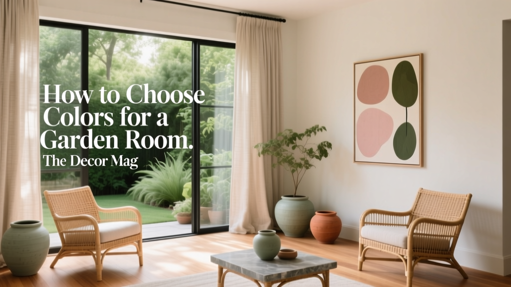
How to Choose Colors for a Garden Room - The Decor Mag
A garden room sits at a special crossroads: it’s indoors, but it should feel like it belongs to the landscape. Whether yours is a glazed extension, a converted shed, or a purpose-built backyard studio, color is the element that determines whether the space reads as a serene retreat, a bright entertaining nook, or a productive work zone with a view.
The right garden room color scheme doesn’t just look good—it manages light, supports comfort across seasons, and builds a visual connection between your interiors and the greenery outside. With a few color theory basics (undertones, value, saturation) and some practical paint color guidance, you can create a garden room that feels intentional all year, not just on sunny days.
This guide walks you through choosing paint colors for walls, trim, ceilings, and accents, with specific recommendations and real-room scenarios—plus the most common garden room color mistakes to avoid.
Start With the Garden: Let Nature Set Your Palette
Garden rooms work best when their interior color design echoes what you see through the glass. A cohesive relationship between inside and outside reduces visual “noise” and makes the room feel larger.
Take a seasonal snapshot
Before choosing paint colors, note what dominates your view for most of the year:
- Evergreens and hedging: deep, cool greens; stable year-round
- Gravel, stone, and paving: warm greiges, cool grays, taupes
- Flowering borders: shifting accent colors; better as accessories than wall color
- Wood fencing/decking: warm browns; can pull paint undertones warmer
Choose a “bridge color”
A bridge color is the interior paint shade that visually connects to the garden. Often this is a muted green, a soft clay, or a complex neutral that picks up natural tones.
- For leafy gardens: sage, olive, eucalyptus, mossy green
- For stone-heavy gardens: warm greige, putty, soft mushroom
- For coastal or airy yards: chalky whites, pale blue-grays, misty aquas
Understand Light in a Garden Room (It Changes Everything)
Garden rooms tend to have more glazing than standard rooms, which makes light both abundant and unpredictable. Paint colors can swing dramatically depending on time of day, orientation, and surrounding reflections (lawns cast green; brick casts red; water features cast cool flicker).
Orientation guidelines for paint colors
- North-facing: Cooler, flatter light. Choose warmer whites and warm-leaning neutrals to avoid a chilly feel.
- South-facing: Bright, warm light. You can use cooler hues (blue-grays, crisp whites) without them feeling cold.
- East-facing: Bright mornings, softer afternoons. Balanced neutrals and gentle greens work well.
- West-facing: Warm late-day glow. Watch for overly yellow paint; choose grounded tones to prevent “orange hour” overload.
Color theory that helps you choose with confidence
- Undertone: The subtle temperature (yellow, pink, green, blue) beneath a color. It decides whether a “neutral” looks creamy, gray, or slightly green.
- Value: How light or dark a color is. Lower value (darker) adds coziness; higher value (lighter) expands space.
- Saturation: Intensity. In a bright garden room, slightly muted colors often look more sophisticated than fully saturated ones.
Pick Your Mood: Color Psychology for Garden Rooms
Color psychology matters in a space designed for restoring, socializing, or focusing. Decide the primary use, then choose a base scheme that supports it.
Relaxing retreat
Soft greens and warm neutrals lower visual stress and blend seamlessly with planting.
- Best hues: sage, olive-gray, warm white, muted taupe
- Accent ideas: brushed brass, oak, linen, terracotta pottery
Entertaining and dining
Warmer, deeper tones make evenings feel intimate and flattering.
- Best hues: clay, mushroom, smoky blue, deep green
- Accent ideas: matte black, candles, woven textures, patterned cushions
Work-from-garden studio
Balanced neutrals and blue-greens support focus without feeling sterile.
- Best hues: blue-gray, eucalyptus, light greige
- Accent ideas: crisp white trim, organized shelving, limited high-contrast patterns
Go-To Garden Room Color Schemes (With Paint Color Recommendations)
These interior color schemes are reliable starting points. Always test samples on multiple walls; in a garden room, reflections can make the same paint color read differently across the space.
1) Soft Green + Warm White (the classic “garden link”)
Why it works: Green is literally outside your window, and a softened version inside feels calm, natural, and timeless.
- Walls: Farrow & Ball Mizzle (a delicate gray-green) or Benjamin Moore October Mist (muted sage)
- Trim/Ceiling: Farrow & Ball School House White or Sherwin-Williams Alabaster
- Accents: terracotta, rattan, aged brass, off-black details
Application scenario: In a small garden room reading nook, paint walls in Mizzle, keep the ceiling light (to bounce daylight), and add a natural linen sofa with olive and clay cushions. The view becomes part of the palette rather than a competing focal point.
2) Warm Greige + Charcoal (modern, architectural, grounded)
Why it works: Greige connects to stone paths, gravel, and timber; charcoal adds a crisp outline that looks great against greenery.
- Walls: Benjamin Moore Edgecomb Gray (warm greige) or Farrow & Ball Skimming Stone
- Trim/Details: Sherwin-Williams Iron Ore (soft charcoal) for window frames, shelving, or one feature wall
- Ceiling: a warm white like Sherwin-Williams Alabaster
Application scenario: In a garden room used for dining, keep walls in Edgecomb Gray, add Iron Ore on built-in bench seating or cabinetry, and bring in oak and stoneware. The contrast reads contemporary without feeling stark.
3) Misty Blue-Gray + Crisp White (airy, coastal-leaning, light-enhancing)
Why it works: Blue-gray balances intense sunlight and feels fresh during summer while still reading clean in winter.
- Walls: Sherwin-Williams Sea Salt (blue-green light neutral) or Farrow & Ball Pale Powder
- Trim: Benjamin Moore Chantilly Lace (clean, bright white)
- Accents: navy textiles, striped patterns, pale oak, glass lighting
Application scenario: For a yoga/meditation garden room, use Pale Powder on walls, keep trim crisp, and add a natural jute rug. The palette keeps the room quiet and breathable even with lots of glass.
4) Deep Green Feature + Neutral Surround (dramatic, cozy, evening-friendly)
Why it works: A dark green adds depth and pairs beautifully with plants; using it selectively prevents the room from feeling heavy.
- Feature wall or built-ins: Farrow & Ball Studio Green or Sherwin-Williams Ripe Olive
- Main walls: a soft neutral like Farrow & Ball Ammonite or Benjamin Moore Classic Gray
- Metals/woods: antique brass, walnut, blackened steel
Application scenario: In a garden bar or entertaining space, paint the back wall behind shelves in Studio Green, keep the other walls light, and add warm lighting. At dusk, the room feels enveloping rather than reflective.
Where to Use Color: Walls, Trim, Ceiling, and Floors
Walls: choose your base and manage reflections
- In very green gardens, avoid ultra-cool grays; lawn reflections can turn them slightly green and murky.
- If you want white walls, choose a warm white to counteract green cast (try Sherwin-Williams Alabaster or Farrow & Ball Pointing).
- For a cocoon effect, take the wall color slightly deeper than you would in a typical living room.
Trim and window frames: outline the view
Trim color impacts how the garden view reads. White trim frames the outdoors like artwork; dark trim creates a contemporary “glass box” feeling.
- White trim: clean, classic, maximizes brightness
- Charcoal/black trim: modern, reduces glare, makes greenery pop
Ceiling: don’t default to bright white without a reason
- If the room is glassy and bright, a softer white ceiling feels calmer than stark white.
- For a cozy snug, consider a ceiling in the same color as the walls (a color-drench approach), especially with darker greens or greiges.
Flooring and rugs: anchor the palette
Garden rooms often deal with foot traffic and indoor-outdoor living, so flooring color should be practical and grounding.
- Light oak/LVP: warms up cool schemes
- Slate/charcoal tile: pairs well with greige and deep green
- Natural fiber rugs: soften acoustics, add warmth, hide minor dirt
Real Room Color Recipes (Copy-and-Paste Palettes)
Palette A: The “Botanical Calm” reading room
- Walls: Benjamin Moore October Mist
- Trim: Sherwin-Williams Alabaster
- Accent color: muted terracotta in cushions and planters
- Materials: oak, linen, woven cane
Palette B: The “Modern Garden Studio” home office
- Walls: Benjamin Moore Classic Gray
- Built-ins/desk wall: Sherwin-Williams Iron Ore
- Trim: Benjamin Moore Chantilly Lace
- Materials: matte black task lamp, light wood desk, minimal patterns
Palette C: The “Evening Entertainer” garden dining room
- Main walls: Farrow & Ball Ammonite
- Feature wall: Farrow & Ball Studio Green
- Accents: amber glass, brass, deep burgundy flowers as seasonal decor
- Lighting: warm LEDs (2700K) for flattering, cozy glow
How to Test Paint Colors (So You Don’t Regret It)
- Sample at least 3 shades in the same family (one lighter, one true, one slightly deeper).
- Paint large swatches (at least 12x12 inches) on multiple walls or use peel-and-stick samples.
- Check at 3 times: morning, mid-day, and evening with lights on.
- Look next to fixed elements: flooring, window frames, brick walls, large furniture.
- Decide your “white” early (trim/ceiling). Whites have undertones too, and they can clash with your wall color.
Common Garden Room Color Mistakes to Avoid
- Choosing a color in isolation: A paint chip can’t show how grass reflection will shift a neutral. Always test in the room.
- Going too bright too fast: Saturated greens, teals, or yellows can feel intense in a glass-heavy space. If you love bold color, use it on a feature wall or cabinetry.
- Ignoring undertones in “simple” neutrals: A cool gray beside warm wood can look bluish; a warm beige beside gray stone can look yellow.
- Overusing stark white: Bright white can create glare and feel clinical, especially with lots of daylight. Softer whites are often more livable.
- Forgetting evening lighting: Garden rooms are often used at night. A color that looks perfect at noon can feel flat under cool bulbs. Choose warm lighting and test your paint with lamps on.
FAQ: Choosing Paint Colors for a Garden Room
What are the best paint colors for a small garden room?
Light, slightly muted shades help a small garden room feel open: soft sage (Benjamin Moore October Mist), warm greige (Benjamin Moore Edgecomb Gray), or a gentle blue-green (Sherwin-Williams Sea Salt). Keep trim in a warm white to bounce light.
Should a garden room be painted the same color as the main house?
Not necessarily. Matching can look seamless, but a garden room often benefits from a palette that bridges the home interior and the outdoor landscape. A related tone (same undertone family) is usually more successful than an exact match.
Do dark colors work in a garden room with lots of windows?
Yes—dark colors can look rich and sophisticated because natural light keeps them from feeling oppressive. Try a deep green like Farrow & Ball Studio Green on a feature wall or built-ins, balanced with lighter surrounding walls.
What white paint is best for a garden room?
A warm, soft white is often the easiest choice because it counters green reflections from the garden. Popular options include Sherwin-Williams Alabaster and Farrow & Ball School House White. If you want a crisper look, Benjamin Moore Chantilly Lace works well in bright, south-facing rooms.
How do I choose colors if my garden has lots of flowers in different colors?
Use a quiet base (warm white, greige, soft sage) and let the flowers be the “art.” Pull one or two accent colors from the garden for textiles—pillows, throws, planters—rather than committing to a highly specific floral hue on the walls.
What paint finish is best for garden rooms?
For walls, an eggshell or durable matte is practical and forgiving. For trim and window frames, satin or semi-gloss is easier to wipe clean. If the room gets high traffic from the yard, choose washable finishes designed for scuffs.
Next Steps: A Simple Plan to Choose Your Garden Room Colors
- Step 1: Identify the dominant outdoor tones (greens, stone, timber) and pick a bridge color.
- Step 2: Decide the mood (calm, social, focused) and choose a complementary color scheme.
- Step 3: Select your trim/ceiling white first, then finalize wall color.
- Step 4: Test samples on multiple walls in changing daylight and under evening lighting.
- Step 5: Add depth with accents—textiles, rugs, lighting—rather than relying on one dramatic paint choice.
If you’re ready for more ideas—from whole-home paint color palettes to room-by-room color schemes—explore the rest of our color guides on thedecormag.com.
More Articles
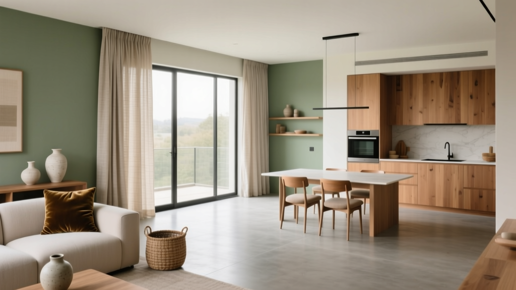 Cohesive Color Flow Between Rooms | The Decor Mag
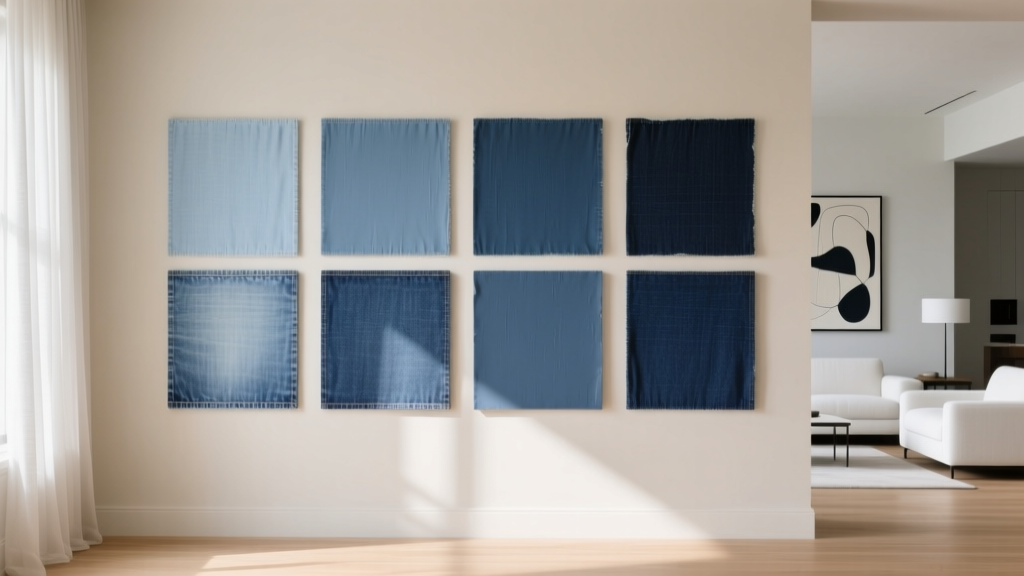 Best Denim Blue Paint Colors - The Decor Mag
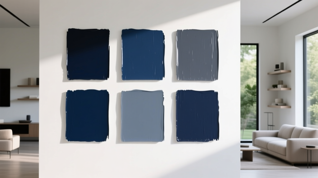 Best Navy Paint Colors for Every Style - The Decor Mag
 Best Black Paint Colors for Dramatic Spaces - The Decor Mag
 How to Choose Colors for a Loggia - The Decor Mag
 Best Rust Red Paint Colors - The Decor Mag
 Best Charcoal Paint Colors for Modern Spaces - The Decor Mag
 How to Use Color to Create Coolness - The Decor Mag
 How to Use Undertones to Match Colors - The Decor Mag
 How to Use Color to Create Rhythm - The Decor Mag