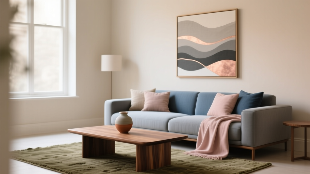
How to Use Undertones to Match Colors - The Decor Mag
Have you ever brought home a “perfect” paint swatch—warm white, soft gray, classic beige—only to watch it turn pink, green, or slightly purple once it hits your walls? That shift isn’t your imagination. It’s undertone at work, and it’s one of the biggest reasons homeowners struggle with paint colors and cohesive color schemes.
Undertones are the quiet color influences hiding beneath the surface of a paint color. They determine whether a neutral feels crisp or creamy, whether a blue reads coastal or moody, and whether your flooring and countertops look harmonious or oddly off. Once you learn to spot undertones, you can match colors with confidence, build interior color design palettes that feel intentional, and avoid expensive repainting mistakes.
This guide breaks down undertones in a practical, homeowner-friendly way—using real room examples, paint color recommendations, and straightforward design principles—so you can create a home that looks pulled together in every light, from morning sun to evening ламplight.
What Undertones Are (and Why They Change Everything)
Every paint color has an undertone: a subtle bias toward another hue. Even “neutral” paint colors aren’t truly neutral. A beige may lean yellow, pink, or green. A gray may lean blue, violet, or green. That underlying lean is what makes the same paint look calm and modern in one home and muddy or mismatched in another.
Undertone vs. Mass Tone
- Mass tone is what you see at first glance (e.g., “light gray”).
- Undertone is the hidden temperature or hue that emerges next to other finishes (e.g., “light gray with a green undertone”).
Why Undertones Look Different on Your Walls
Undertones reveal themselves based on context. A paint color is always “in conversation” with its surroundings.
- Lighting: North-facing rooms often emphasize cool undertones; warm bulbs pull out yellows and reds.
- Fixed finishes: Flooring, countertops, tile, brick, and cabinetry will push paint toward harmony or contrast.
- Adjacent colors: A gray near a beige can suddenly look blue; next to a true white it may look green.
- Sheen: Higher sheen (eggshell, satin) reflects more light and can amplify undertones.
How to Identify Undertones Like a Designer
Matching paint colors successfully starts with learning how to “read” undertones in both paint and finishes. These methods are quick, reliable, and don’t require a perfect eye.
1) Compare to a True White
Hold your paint sample next to a crisp, clean white. True white acts like a neutral backdrop that exposes undertones.
- Try Sherwin-Williams High Reflective White (SW 7757) or Benjamin Moore Chantilly Lace (OC-65) as comparison whites.
2) Compare to a True Gray or Greige
Use a known neutral as an anchor so you can spot whether your color leans warm or cool.
- Benjamin Moore Classic Gray (OC-23) (soft greige) is helpful for “is this warm?” checks.
- Sherwin-Williams Passive (SW 7064) (cooler gray) can reveal green/violet leanings nearby.
3) Check the Undertone of Your Fixed Elements First
Before choosing wall paint, identify the undertones in what you can’t easily change:
- Wood floors: red/orange (oak), yellow (maple), neutral brown (walnut), cool/gray (weathered oak).
- Stone counters: warm creams/golds, cool blue-grays, pink-beige, green-gray.
- Tile: bright white (cool), creamy white (warm), taupe (warm), cement gray (cool/green).
4) Sample Correctly (Bigger Than You Think)
Undertones are easier to see at scale.
- Paint at least 2' x 2' on two walls (one in brighter light, one in shadow).
- View morning, midday, and evening.
- Hold the sample next to flooring, cabinetry, and major upholstery.
Warm vs. Cool Undertones: The Fast Matching Framework
Most paint color decisions get easier when you sort undertones into warm and cool families. This doesn’t limit creativity—it gives you a structure for building a cohesive interior color design.
Warm Undertones
Warm undertones include yellow, red, orange, and many pink-beige influences.
- Best with: honey oak, warm whites, brass, terracotta, warm stone, cream textiles.
- Color psychology: warmth feels welcoming, energizing, and cozy—ideal for living rooms, dining rooms, and gathering spaces.
Cool Undertones
Cool undertones include blue, green, and violet influences.
- Best with: cool whites, chrome, polished nickel, charcoal, marble with blue-gray veining, cooler woods.
- Color psychology: cool palettes feel calm, airy, and restorative—great for bedrooms, baths, and home offices.
What About “Neutral” Undertones?
Some paint colors are more balanced and flexible, often called “neutral” or “true greige.” These are excellent bridge colors for open floor plans.
- Try Benjamin Moore Edgecomb Gray (HC-173) (warm greige) or Sherwin-Williams Accessible Beige (SW 7036) (balanced greige that can read warm depending on light).
Undertones in Popular Paint Color Families (with Recommendations)
Here’s how undertones typically show up in the colors homeowners search for most: white paint colors, gray paint colors, beige/greige, and popular blues and greens.
White Paint Colors: Crisp vs. Creamy
- Crisp, cooler whites (blue/gray undertone):
- Benjamin Moore Chantilly Lace (OC-65)
- Sherwin-Williams Extra White (SW 7006)
- Soft, warmer whites (yellow/cream undertone):
- Benjamin Moore White Dove (OC-17)
- Sherwin-Williams Alabaster (SW 7008)
Where it works: Use a creamy white with warm wood floors to avoid a “cold cast.” Use a crisper white with marble, gray tile, or modern finishes for a clean look.
Gray Paint Colors: The Hidden Green and Purple Problem
Grays are notorious for surprise undertones—especially green and violet. That’s why “gray gone wrong” is one of the most common interior color design issues.
- Cool, blue-leaning grays:
- Sherwin-Williams Passive (SW 7064)
- Benjamin Moore Stonington Gray (HC-170)
- Warm, taupe-leaning grays:
- Benjamin Moore Balboa Mist (OC-27) (greige with soft warmth)
- Sherwin-Williams Agreeable Gray (SW 7029) (popular greige that adapts to many homes)
Pro tip: If your room has lots of greenery outside the windows, many grays will pull greener. In that case, consider a greige with a warmer base to counterbalance the green cast.
Beige and Greige: The Undertone “Bridge” Colors
Beige and greige paint colors are workhorses for open layouts because they connect warm and cool elements more smoothly than stark gray or strong beige.
- Benjamin Moore Edgecomb Gray (HC-173): warm, soft, flattering in living spaces.
- Sherwin-Williams Accessible Beige (SW 7036): balanced, reads calm and grounded.
- Benjamin Moore Classic Gray (OC-23): light, airy, ideal for a soft-neutral whole-home palette.
Blues and Greens: Mood + Undertone Precision
Blues and greens are powerful for color psychology—blues soothe, greens restore—yet undertones still matter. A “green” can be earthy and warm (yellow undertone) or crisp and cool (blue undertone).
- Blue-green, spa-like (cool and calming):
- Benjamin Moore Smoke (2122-40)
- Sherwin-Williams Sea Salt (SW 6204) (can read more green or gray depending on light)
- Deep, sophisticated blue (classic and grounding):
- Benjamin Moore Hale Navy (HC-154)
- Sherwin-Williams Naval (SW 6244)
- Earthy greens (warm, organic, cozy):
- Sherwin-Williams Evergreen Fog (SW 9130) (green-gray with a soft warmth)
- Benjamin Moore Saybrook Sage (HC-114) (warm, classic sage)
Real Room Examples: How Undertones Solve Common Design Problems
Scenario 1: Open-Concept Main Floor with Warm Oak and Cool Quartz
The challenge: Honey oak floors bring warmth; some quartz counters read cool and slightly gray. A paint color that leans too yellow can make quartz look icy; a paint color that leans too blue can make floors look orange.
Undertone strategy: Choose a balanced greige as a bridge, then echo undertones through textiles.
- Wall paint: Sherwin-Williams Agreeable Gray (SW 7029) or Benjamin Moore Classic Gray (OC-23)
- Trim: Benjamin Moore White Dove (OC-17) for a warm, soft contrast
- Accents: oatmeal linen, black metal, warm wood accessories, and a rug that mixes beige + soft gray
Scenario 2: North-Facing Bedroom That Makes Everything Look Cool
The challenge: North light can emphasize cool undertones, making many neutrals look flat or slightly icy.
Undertone strategy: Use warmer undertones to restore comfort and support sleep-friendly color psychology.
- Wall paint: Sherwin-Williams Alabaster (SW 7008) (warm white) or Benjamin Moore Edgecomb Gray (HC-173)
- Color scheme: warm white + camel + muted olive + soft black
- Lighting tip: choose 2700K bulbs to keep the room cozy and reduce grayness
Scenario 3: A Gray Tile Bathroom That Looks Green Next to the Wall Color
The challenge: Some “gray” tiles carry a green undertone. Pair them with the wrong gray wall paint and everything goes swampy.
Undertone strategy: Either commit to a gray with a similar undertone (coordinated) or shift warmer (contrast) to neutralize the green effect.
- Option A (coordinated cool): Benjamin Moore Stonington Gray (HC-170) with crisp white trim
- Option B (soft warm balance): Benjamin Moore Balboa Mist (OC-27) to calm green casts
- Trim/ceiling: Benjamin Moore Chantilly Lace (OC-65) for a clean, fresh bathroom feel
Scenario 4: Living Room with a Beige Sofa That Suddenly Looks Pink
The challenge: A wall paint with pink or red undertones can exaggerate pink in beige upholstery.
Undertone strategy: Counterbalance with a neutral that leans slightly green or yellow (without going too golden).
- Wall paint: Sherwin-Williams Accessible Beige (SW 7036) or Benjamin Moore White Dove (OC-17) for a lighter look
- Color scheme: warm neutral walls + beige sofa + olive accents + walnut woods + soft ivory textiles
Designer-Approved Undertone Matching Rules
Use these principles to build paint color schemes that feel cohesive throughout your home.
- Match undertones first, then choose depth. Decide warm vs. cool, then pick light/medium/dark.
- Repeat an undertone at least three times. Example: if your countertop has warm beige veining, echo it in a rug, throw pillows, and wall paint.
- Use contrast intentionally. A cool wall can work with warm wood if you add bridging neutrals (greige, natural fibers) between them.
- Keep whole-home flow consistent. In open plans, stay within a tight undertone family for main spaces, then add personality in bedrooms and powder rooms.
Common Color Mistakes to Avoid
- Choosing paint under store lighting. Always test at home; undertones shift dramatically in your specific light.
- Ignoring the undertone of white trim. A creamy trim next to a cool wall (or vice versa) can make both look “dirty.”
- Matching by name instead of undertone. Two “warm grays” can still fight if one is violet-leaning and the other is green-leaning.
- Forgetting about reflective surfaces. Glossy cabinets, mirrors, and polished stone bounce color and can amplify undertones.
- Using too many unrelated neutrals. A mix of pink-beige, green-gray, and blue-gray in one open space often reads chaotic rather than layered.
FAQ: Undertones and Matching Paint Colors
How can I tell if a paint color has a green undertone?
Compare it to a true white and a known neutral gray. If the paint starts to look slightly earthy, muddy, or “sage” next to those references—especially in shadow—it likely has a green undertone. Also check it near green landscaping outside; that reflection can intensify green shifts.
Why does my gray paint look purple?
Many grays are made with violet pigments. In rooms with warm lighting (2700K), at sunset, or next to warm wood floors, violet undertones can become more noticeable. Try a greige like Benjamin Moore Balboa Mist (OC-27) or a more neutral-leaning option like Sherwin-Williams Agreeable Gray (SW 7029).
Can I mix warm and cool undertones in the same room?
Yes—when it’s controlled. Use a “bridge” neutral (greige, soft white) and repeat accents that tie the temperatures together. For example: warm oak + cool white walls works better when you add a rug that includes both warm beige and cool gray threads.
What undertones go best with honey oak cabinets or floors?
Honey oak typically has warm yellow-orange undertones. Look for warm whites (Sherwin-Williams Alabaster) and soft greiges (Benjamin Moore Edgecomb Gray). Avoid icy grays and stark blue whites unless you add strong bridging elements.
How many paint samples should I test before deciding?
For most rooms, test 3–5 paint colors in the same family (same general depth). Choose one “safe” option, one slightly warmer, one slightly cooler, and one wildcard. Undertones reveal themselves through comparison.
Next Steps: Build Your Undertone-Smart Color Scheme
If you want paint colors that stay beautiful from room to room, start with what can’t change—floors, counters, tile—then choose a wall color that shares or gently bridges those undertones. Test large samples, view them across the day, and choose trim paint that supports your wall color rather than fighting it. Once the undertones align, your home instantly feels calmer, more intentional, and more you.
For more paint color guides, color schemes, and interior color design how-tos, explore the color library at thedecormag.com—your next favorite shade is waiting.
More Articles
 Best Burnt Orange Paint Colors - The Decor Mag
 Best Plum Paint Colors for Drama - The Decor Mag
 Sage Green Paint: Most Versatile Neutral (2026)
 The Science-Backed Best Sleep Textiles: Thread Count, Fiber Physics, and Real-World Performance Data
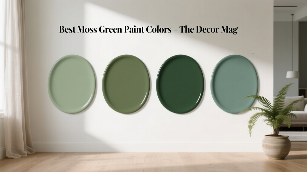 Best Moss Green Paint Colors - The Decor Mag
 Best Cucumber Paint Colors - The Decor Mag
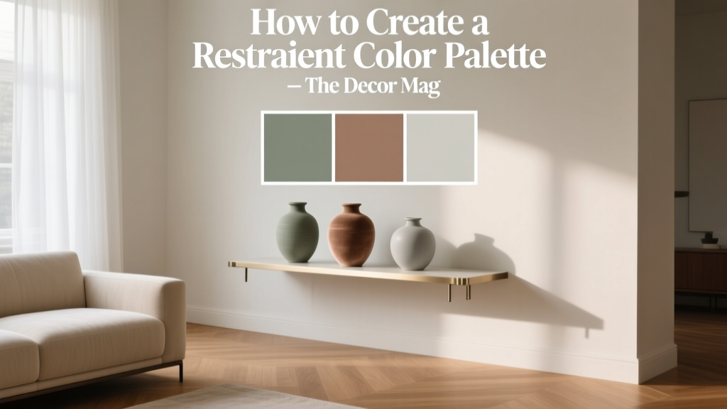 How to Create a Restraint Color Palette - The Decor Mag
 How to Create a Grounded Color Palette - The Decor Mag
 How to Create a Sophisticated Color Palette - The Decor Mag
 How to Create a Contemporary Color Palette - The Decor Mag