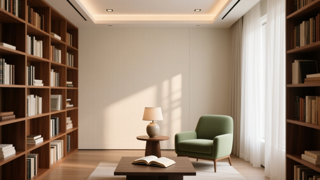
How to Choose Colors for a Library - The Decor Mag
A home library is one of the few rooms designed for a specific mood: focus, comfort, and time slowing down. Color plays an outsized role in that experience. The right paint color can make shelves feel curated rather than cluttered, create a cozy glow for nighttime reading, and help a space feel grounded even when it’s filled with visual detail—from book spines to art to textiles.
Choosing library colors can feel trickier than picking a living room palette because a library is naturally “busy.” Books bring hundreds of hues and values into the room, which means your wall and trim colors must support them. When the backdrop is right, books look richer, wood tones look warmer, and the entire room feels intentional. When it’s wrong, the space can skew flat, harsh, or visually noisy.
This guide breaks down library color schemes using color psychology, lighting basics, and interior design principles—plus specific paint color recommendations and real-world application ideas so you can move from inspiration to confident decisions.
Start With the Mood: Color Psychology for Libraries
Before you sample paint colors, define how you want your library to feel. Libraries are often used for reading, working, and decompressing—so your palette should support those behaviors.
- Deep blues and blue-greens (calm + concentration): Reduce visual “buzz,” ideal for reading rooms and study libraries.
- Rich greens (restorative + timeless): Associated with nature and balance; pairs beautifully with wood shelves and brass.
- Warm neutrals (inviting + flexible): Great for mixed-use rooms and homes with open floor plans.
- Charcoal and near-black (intimate + dramatic): Create a cocooning effect, especially in libraries with art lighting.
- Warm reds and aubergines (heritage + warmth): Historically used in studies; best when balanced with lighter trim and layered lighting.
Design principle: Libraries benefit from slightly lower contrast and higher saturation than many other rooms. Because books already add pattern, stronger wall colors help “absorb” visual variety and create a calm backdrop.
Read the Room: Light, Size, and Existing Finishes
Assess Natural Light (North, South, East, West)
- North-facing libraries get cooler, grayer light. Choose warmer versions of your target color (olive greens, warm taupes, inky blue with a hint of violet).
- South-facing libraries get strong, warm light. You can use cooler, deeper colors (navy, emerald, charcoal) without the room feeling chilly.
- East-facing libraries are bright in the morning and softer later. Mid-tone colors work well; test at both times.
- West-facing libraries shift dramatically from neutral to golden late afternoon. Watch for colors that turn too orange or too muddy.
Choose a Finish That Supports Use
Libraries get touched—walls near reading chairs, built-ins, ladders, and doorways. Use finishes that clean well and flatter trim details.
- Walls: matte or eggshell for a soft, low-glare look; eggshell is best if you want easier wipe-down.
- Trim and built-ins: satin or semi-gloss for durability and subtle contrast.
- Ceiling: flat/matte to reduce glare; consider a tinted ceiling for extra coziness in dark schemes.
Work With Wood Tones, Floors, and Shelving
Wood introduces warmth and undertones that influence paint perception.
- Walnut/cherry (reddish): looks elegant with deep greens and complex neutrals; avoid icy grays.
- Oak (golden): pairs well with blue-greens, creamy whites, and warm charcoals.
- Painted shelves: can go tone-on-tone with walls for a built-in, enveloping look.
Pick a Strategy: 5 Library Color Schemes That Always Work
1) Classic Deep Green Library
Green is a library favorite for good reason: it’s restful, historically rooted, and flattering to both warm and cool materials.
Paint color ideas:
- Benjamin Moore Essex Green (PM-11) (very deep, traditional)
- Farrow & Ball Calke Green No. 34 (heritage, moody)
- Sherwin-Williams Ripe Olive (SW 6209) (olive-leaning, cozy)
Best pairings:
- Trim: Benjamin Moore Simply White (OC-117) for crisp contrast, or White Dove (OC-17) for softer warmth
- Metals: antique brass, aged bronze
- Textiles: camel leather, rust velvet, patterned kilim rugs
Application scenario: A den with walnut shelves and a reading chair. Paint walls and built-ins the same green in satin, then add picture lights above bookcases for a layered, library-like glow.
2) Moody Navy or Ink Blue
Deep blues support concentration and feel tailored. They also make books pop without competing with cover art.
Paint color ideas:
- Benjamin Moore Hale Navy (HC-154) (bold, reliable, slightly warm)
- Sherwin-Williams Naval (SW 6244) (inky, modern)
- Farrow & Ball Hague Blue No. 30 (blue-green depth, dramatic)
Best pairings:
- Trim: creamy off-white (BM White Dove) for softness, or a matching navy at different sheen for tone-on-tone
- Accents: cognac leather, ivory boucle, dark oak
- Art: gold frames or black gallery frames
Application scenario: A spare bedroom converted into a library/office. Use navy on the walls, keep the ceiling a warm white, and install a large, warm-toned rug to prevent the room from feeling too cool.
3) Warm, Book-Friendly Neutrals
If your library shares space with a living room or hallway, warm neutrals create continuity while still feeling elevated. The key is choosing a neutral with enough depth to stand up to shelves.
Paint color ideas:
- Benjamin Moore Edgecomb Gray (HC-173) (warm greige, flexible)
- Sherwin-Williams Accessible Beige (SW 7036) (soft, balanced)
- Farrow & Ball Skimming Stone No. 241 (elegant, gentle warmth)
Best pairings:
- Trim: same color lightened (or a warm white) to keep contrast low and calm
- Accents: blackened metal, natural linen, medium oak
- Layering: add depth via textiles and art rather than wall contrast
Application scenario: Open-plan “library wall” in a family room. Paint the wall a warm greige and the built-ins the same color in semi-gloss. This reduces visual breaks and makes the shelving feel architectural.
4) Charcoal, Near-Black, and Smoke
Dark neutrals create intimacy and sophistication. They’re especially effective in libraries used at night and rooms with controlled lighting.
Paint color ideas:
- Benjamin Moore Wrought Iron (2124-10) (soft black with depth)
- Sherwin-Williams Iron Ore (SW 7069) (charcoal, popular for built-ins)
- Farrow & Ball Railings No. 31 (inky charcoal with blue undertone)
Best pairings:
- Trim: match the wall for a seamless envelope, or use a warm white if you want a more traditional contrast
- Lighting: warm bulbs (2700K), layered sources (table + floor + picture lights)
- Finishes: matte walls reduce glare; satin on trim adds polish
Application scenario: Small library nook under stairs or in a hallway alcove. Go near-black on walls and shelves for a jewel-box effect, then add a brass sconce and a small upholstered bench.
5) Heritage Red, Oxblood, or Aubergine Accents
Red-based schemes can feel historic and comforting, but they require a careful hand. Use them as accents or in rooms with plenty of texture and warm lighting.
Paint color ideas:
- Farrow & Ball Preference Red No. 297 (classic, library-like)
- Benjamin Moore Eating Room Red (CW-266) (saturated, traditional)
- Sherwin-Williams Merlot (SW 2704) (deep wine tone)
Best pairings:
- Trim: creamy white or warm neutral to keep it grounded
- Materials: dark wood, velvet, leather, aged brass
- Balance: use art and textiles with some blue/green to calm the palette
Application scenario: A formal study with wainscoting. Paint the upper walls a deep red and keep wainscoting and trim warm white. Add a patterned rug with navy and rust to tie everything together.
How to Choose the Right Color Depth for Your Library
Color depth (value) matters as much as hue. Libraries can handle darker paint colors because they’re inherently textural and layered.
- If your shelves are packed, go deeper on walls (navy, green, charcoal). Dark walls visually “compress” the background and make spines look more curated.
- If your shelves are sparse, choose a mid-tone or warm neutral so the room doesn’t feel cavernous.
- If the library is also an office, aim for mid-to-deep tones in blue/green families to support focus without feeling sleepy.
- If you entertain in the space, consider slightly warmer undertones (olive, warm navy, complex taupe) for a welcoming effect.
Real Room Examples: Library Color Ideas You Can Copy
Example 1: A Bright Room That Needs Coziness
- Problem: South-facing library feels too bright and a bit sterile.
- Solution: Benjamin Moore Hale Navy on walls; trim in Simply White.
- Why it works: The navy absorbs excess brightness, books read as richer color blocks, and white trim keeps details crisp.
Example 2: A Dark Room That Needs Lift
- Problem: North-facing library feels dim; gray paint looks flat.
- Solution: Sherwin-Williams Ripe Olive or a warm greige like Accessible Beige, plus warm lighting.
- Why it works: Warm undertones counter cool daylight. Olive plays well with wood and leather, maintaining a cozy, study-like mood.
Example 3: Built-In Shelves as the Star
- Problem: White built-ins look busy once books are added.
- Solution: Paint built-ins and walls the same color: Benjamin Moore Wrought Iron or Sherwin-Williams Iron Ore.
- Why it works: A single color unifies architecture. Books become the highlight, not the shelf edges.
Sampling and Testing: A Simple Process That Prevents Regret
Paint colors change dramatically next to books, wood tones, and lamplight. Test before committing.
- Pick 3–5 candidate colors in the same family (for example: three deep greens and two blue-greens).
- Test in large swatches (at least 12" x 12", bigger is better) or use peel-and-stick samples.
- Place samples behind shelves, near a window, and near your reading chair.
- Check in three lighting conditions: morning daylight, late afternoon, and evening with lamps on (2700K is ideal for cozy libraries).
- Compare undertones against your dominant wood tone and your largest rug or upholstery piece.
Common Library Color Mistakes to Avoid
- Choosing a cool gray without checking undertones: Many cool grays turn bluish or lifeless in north light and can fight warm wood shelves.
- Too much contrast everywhere: Bright white trim + dark walls + multicolored spines can feel chaotic. Consider softer whites or tone-on-tone built-ins.
- Ignoring lighting temperature: Cool 4000K bulbs make deep colors look harsh and flatten warm tones. Use warm 2700K lighting for a traditional library glow.
- Skipping sheen planning: Matte on trim scuffs; semi-gloss on large walls can glare. Match finish to function.
- Forgetting the ceiling: A bright ceiling can “float” in a dark library. Try a warm white or a ceiling tinted 50% of the wall color for cohesion.
- Not accounting for book spine color: If you own many bright dust jackets, deeper wall colors calm the scene. If your books are mostly neutral, you can go warmer and lighter.
Actionable Next Steps for Choosing Your Library Paint Colors
- Decide your library mood: tailored (navy), restorative (green), airy (warm neutral), dramatic (charcoal).
- Choose one anchor element: rug, wood tone, or a key upholstery fabric—and let it guide undertones.
- Select a wall color and a trim/built-in plan: contrast (wall vs trim) or tone-on-tone (enveloping).
- Buy samples and test in daylight and lamplight before purchasing gallons.
- Finalize lighting: prioritize warm, layered sources to support reading and highlight shelves.
FAQ: Choosing Colors for a Home Library
What are the best paint colors for a library?
Deep greens and navies are top choices because they support focus and make books look richer. Popular picks include Benjamin Moore Hale Navy, Sherwin-Williams Naval, Benjamin Moore Essex Green, and Sherwin-Williams Ripe Olive.
Should library walls be dark or light?
Both can work, but dark paint colors often feel calmer in a book-filled room because they reduce visual noise. If the room has limited natural light, choose a warm mid-tone neutral or a warm-leaning deep color rather than a cool gray.
Do I need to paint built-in shelves the same color as the walls?
No, but it’s a strong design move for a cohesive library. Tone-on-tone (same color, different sheen) makes shelves feel architectural and lets book spines stand out. Contrast (white shelves, colored walls) reads more traditional and crisp.
What trim color looks best with dark library walls?
Soft warm whites tend to look more elegant than stark bright whites. Try Benjamin Moore White Dove or Simply White. For a modern look, match trim to the wall color in satin or semi-gloss.
How do I keep a dark library from feeling too small?
Use layered lighting (overhead + lamps + picture lights), add a lighter rug, and keep contrast controlled. Painting walls and built-ins the same deep color can actually feel smoother and less choppy than multiple contrasting surfaces.
What color scheme works best for a library/office combo?
Mid-to-deep blue-greens and greens are excellent for concentration and comfort. Consider Farrow & Ball Hague Blue, Sherwin-Williams Iron Ore (for a serious, tailored feel), or Benjamin Moore Edgecomb Gray if you prefer a lighter backdrop.
For more help refining paint colors, color schemes, and interior color design choices room by room, explore the full library of color guides on thedecormag.com.
More Articles
 How to Choose Colors for a Rental Property - The Decor Mag
 Pastel Color Palette Design Guide - The Decor Mag
 How to Incorporate Bold Colors Subtly - The Decor Mag
 Best Berry Red Paint Colors - The Decor Mag
 Best Cobalt Blue Paint Colors - The Decor Mag
 Monochromatic Color Scheme Design Guide - The Decor Mag
 How to Create a Serene Color Palette - The Decor Mag
 Whole-House Color Scheme: How to Choose (2026)
 Best Aqua Paint Colors - The Decor Mag
 Best Olive Green Paint Colors (2026) | The Decor Mag