
How to Use Color to Create Warmth - The Decor Mag
Warmth is one of those design qualities you feel before you can fully describe it. It’s the room that makes you exhale when you walk in, the corner that invites you to sit, the hallway that feels welcoming instead of stark. While texture, lighting, and furnishings all contribute, color is often the deciding factor—because it shapes how we perceive temperature, comfort, and intimacy at a glance.
Many homeowners chase warmth by adding more lamps, more throws, more wood tones—then wonder why the space still reads “cold.” The missing ingredient is usually the color scheme: undertones that fight each other, whites that skew icy, or a palette that’s too high-contrast for the room’s natural light. When you understand warm vs. cool undertones, value (lightness/darkness), and saturation (intensity), you can use paint colors and finishes to create warmth even in north-facing rooms, open plans, and modern spaces.
This guide breaks down the color psychology behind cozy interiors and shows how to apply warm paint colors strategically—walls, trim, ceilings, cabinetry, and accents—so your home feels welcoming year-round.
What “Warmth” Means in Interior Color Design
Color psychology: why warm palettes feel inviting
Warm colors—reds, oranges, yellows, and warm-leaning neutrals—are associated with energy, comfort, sociability, and nourishment. They tend to feel closer to the viewer (a phenomenon called “advancing”), which can make a large room feel more intimate. Cooler colors—blue, green, violet—often feel calming and airy, but in the wrong undertone or light they can read stark or distant.
Warmth isn’t only about picking “warm colors”
A truly warm interior balances:
- Undertone harmony: warm with warm (or carefully balanced warm/cool for contrast).
- Value control: medium values (not too bright, not too dark) often feel cozier.
- Saturation strategy: muted, complex colors typically feel more sophisticated and livable than highly saturated brights.
- Light awareness: north/south exposure and bulb temperature can shift paint colors dramatically.
Start With Light: The Fastest Way to Predict Warmth
Match paint undertones to your home’s natural light
- North-facing rooms: light is cooler and can make colors look grayer or bluer. Choose warmer whites, greiges, and clay tones to counteract the chill.
- South-facing rooms: warm, strong light can make warm colors feel more intense. Consider softer warm neutrals or warm colors with a touch of gray to keep them grounded.
- East-facing rooms: warm morning light, cooler later. Warm neutrals and gentle earth tones stay consistent.
- West-facing rooms: cooler mornings, golden afternoons. Great for warm paint colors; test samples at multiple times of day.
Use warm lighting to reinforce warm paint colors
For most living spaces, warm white bulbs (around 2700K–3000K) make warm color schemes feel intentional and cozy. Cooler bulbs (3500K+) can flatten warm neutrals and turn them dull or slightly green.
Warm Paint Colors That Make a Home Feel Cozy (With Brand References)
Warm whites that don’t look yellow
A warm white is the foundation of many inviting interiors—bright enough to feel clean, warm enough to feel comfortable.
- Benjamin Moore White Dove (OC-17): a soft, creamy white with gentle warmth; excellent for walls and trim in open plans.
- Sherwin-Williams Alabaster (SW 7008): warm and calming, ideal for living rooms and bedrooms.
- Farrow & Ball Pointing (No. 2003): a warm off-white with a classic, plaster-like softness.
Welcoming greiges and warm neutrals
Greige is a go-to for warmth because it bridges beige and gray—perfect for modern homes that still want softness.
- Benjamin Moore Edgecomb Gray (HC-173): a warm greige that reads cozy without feeling heavy; great for main areas and hallways.
- Sherwin-Williams Accessible Beige (SW 7036): warm, balanced, and forgiving with many floors and fabrics.
- Benjamin Moore Revere Pewter (HC-172): a classic, slightly deeper greige that adds warmth and depth.
Earthy, warmth-boosting hues (terracotta, clay, ochre)
Earth tones are warmth in its most natural form. They pair beautifully with wood, leather, linen, and matte black accents.
- Farrow & Ball Red Earth (No. 64): a grounded terracotta-red that feels rich and historic.
- Benjamin Moore Terra Cotta Tile (2090-30): bold and saturated; best as an accent wall or in a dining room.
- Sherwin-Williams Cavern Clay (SW 7701): warm, sunbaked clay that looks stunning in afternoon light.
- Benjamin Moore Audubon Russet (HC-51): a warm, spicy brown-orange that adds instant coziness.
Warm, cozy blues and greens (yes, cool colors can feel warm)
Not all blues and greens feel chilly. Choose complex shades with warm undertones—think teal, olive, and smoke.
- Benjamin Moore Smoke (2122-40): a soft blue-gray that can feel gentle and cocooning with warm woods and creamy trim.
- Sherwin-Williams Evergreen Fog (SW 9130): a warm green-gray that reads calm and inviting, not cold.
- Farrow & Ball Green Smoke (No. 47): moody, warm, and timeless for studies and dining rooms.
How to Build Warm Color Schemes That Look Designer-Level
Use the 60-30-10 rule for comfortable balance
A reliable approach for interior color design:
- 60% dominant color: walls (often warm white, greige, or a muted earth tone).
- 30% secondary color: upholstery, rugs, curtains, or cabinetry (a deeper neutral or warm hue).
- 10% accent color: art, pillows, florals, and decor (rust, brass, deep green, inky blue).
Warm color combinations that work in real homes
- Warm white + camel + black: clean, modern warmth. Try SW Alabaster walls, camel leather, black metal lighting.
- Greige + terracotta + cream: earthy and inviting. Pair BM Edgecomb Gray with rust-toned textiles and creamy trim.
- Clay + olive + natural oak: grounded and sophisticated. SW Cavern Clay with olive accents and light-to-medium wood.
- Soft warm blue + brass + warm white: calming warmth. BM Smoke with brass hardware and BM White Dove trim.
Repeat undertones for a “wrapped” feeling
Warmth increases when your finishes echo each other. If your paint has a pink/peach undertone, repeat that warmth in:
- wood tones (oak, walnut, warm-stained finishes)
- metals (brass, bronze, champagne nickel)
- textiles (ivory, camel, rust, warm taupe)
Real Room Examples: Where Warmth Shows Up Fast
Living room: cozy without going dark
Scenario: An open-plan living room with gray floors and a large TV wall feels stark.
Color approach:
- Walls: Benjamin Moore White Dove (OC-17) to warm the gray flooring.
- Feature/TV wall: Sherwin-Williams Evergreen Fog (SW 9130) in a matte finish to soften contrast.
- Trim: the same warm white in a satin or semi-gloss for a subtle glow.
Why it works: Warm white lifts the room; a warm green-gray adds depth without feeling heavy; matte absorbs glare for a more intimate mood.
Kitchen: warm neutrals that flatter cabinets and counters
Scenario: White cabinets and cool quartz feel clinical.
Color approach:
- Walls: Sherwin-Williams Accessible Beige (SW 7036) or BM Edgecomb Gray (HC-173).
- Island option: Farrow & Ball Green Smoke (No. 47) for a warm, moody anchor.
- Hardware: brushed brass or warm bronze to enhance warmth.
Why it works: A warm wall color offsets cool countertops; a deeper island color creates a welcoming focal point.
Bedroom: cocooning warmth for better rest
Scenario: A bedroom painted cool gray feels flat and less restful.
Color approach:
- All-over walls: Benjamin Moore Revere Pewter (HC-172) for a soft, enveloping neutral.
- Accent wall alternative: Farrow & Ball Red Earth (No. 64) behind the headboard for a boutique-hotel vibe.
- Ceiling: keep it warm—use the wall color at 50% strength or a warm white like SW Alabaster.
Why it works: Medium values and warm undertones help the space feel protective and calm, supporting the psychology of rest.
Bathroom: warm and clean (not beige and dull)
Scenario: A small bath with white tile feels icy.
Color approach:
- Walls: Benjamin Moore White Dove (OC-17) or Farrow & Ball Pointing (No. 2003).
- Vanity: Sherwin-Williams Cavern Clay (SW 7701) for a warm, earthy punch.
- Accessories: wood stool, woven basket, and warm metal mirror frame.
Why it works: Warm whites keep it fresh; earthy accents counteract hard tile surfaces.
Application Tips: Make Warm Paint Colors Look Intentional
Choose the right sheen for warmth
- Walls: matte or eggshell reads warmer and more sophisticated (less glare).
- Trim and doors: satin or semi-gloss adds crispness without looking cold when paired with a warm white.
- Ceilings: flat helps the room feel calm; consider a slightly warmed ceiling white in rooms that feel stark.
Test paint colors the smart way
- Sample at least 3 warm paint colors (light, medium, deeper) in the same family.
- Paint large swatches (at least 12" x 12") or use peel-and-stick samples.
- View morning, afternoon, and evening, and under your actual bulbs.
- Check next to fixed elements: flooring, countertops, tile, and large upholstery.
Use color to visually “warm up” proportions
- To make a large room feel cozier, use a mid-tone warm neutral instead of bright white.
- To lower a tall ceiling visually, paint it one step deeper than the walls (or use a warm tint of the wall color).
- To add warmth without repainting everything, paint one focal area: a fireplace surround, built-ins, or an entryway.
Common Color Mistakes That Keep Rooms Feeling Cold
- Choosing a white that’s too cool: many “clean” whites have blue/gray undertones that read sterile, especially in north light. Swap to warm whites like BM White Dove or SW Alabaster.
- Ignoring undertones in fixed finishes: a warm beige next to a cool gray tile can look pink or muddy. Match undertones first, then pick the shade.
- Overusing high-contrast schemes: stark black-and-white palettes can feel harsh. Soften with warm neutrals, wood, and muted accents.
- Going too saturated too fast: bright orange or red on all walls can feel overwhelming. Try muted clay tones, or use saturated color as a 10% accent.
- Forgetting the ceiling and trim: a warm wall with a cool, bright ceiling white can create a chilly “cap.” Keep whites in the same temperature family.
FAQ: Using Color to Create Warmth
What are the best warm paint colors for a north-facing room?
Look for warm whites and greiges that resist going gray: Benjamin Moore White Dove (OC-17), Sherwin-Williams Alabaster (SW 7008), and Benjamin Moore Edgecomb Gray (HC-173). For color, try muted clay tones like Sherwin-Williams Cavern Clay (SW 7701) as an accent.
How can I make a gray room feel warmer without repainting everything?
Add warmth through a tighter warm-neutral palette: ivory curtains, camel/rust textiles, warm wood, and brass lighting. If you can paint one surface, choose a warm focal wall (Evergreen Fog or a warm greige) or repaint trim in a warmer white.
Do warm colors make a room feel smaller?
Warm colors can feel closer and more intimate, but they don’t automatically make a room feel small. The key is value: lighter warm colors (warm whites, light greiges) keep spaces open, while deeper warm hues (terracotta, chocolate) create cozy enclosure.
What warm white works best with oak floors?
Benjamin Moore White Dove (OC-17) and Sherwin-Williams Alabaster (SW 7008) are strong choices because their warmth harmonizes with oak’s golden undertones without turning overly yellow.
How do I keep a warm color scheme from looking dated?
Choose warm colors with complexity (a touch of gray or earthiness), avoid overly yellow beiges, and balance warmth with crisp elements: clean-lined furniture, matte black accents, and layered textures like linen and wool.
What’s a simple warm color palette for an open-concept home?
Use one warm white throughout (White Dove or Alabaster), one warm greige for depth (Edgecomb Gray or Accessible Beige), and one grounded accent color (Evergreen Fog or Cavern Clay). Repeat the accent in small doses to keep flow consistent.
Next Steps: Bring Warmth Into Your Home With Confidence
Pick one room you want to feel more inviting, then do three things: (1) identify the room’s natural light direction, (2) choose a warm white or greige that matches your fixed finishes, and (3) add one deeper warm accent color through paint or textiles. Test samples, observe them under your lighting, and commit once the undertones look harmonious morning to night.
For more paint color ideas, color schemes, and interior color design guidance, explore the latest color guides on thedecormag.com.
More Articles
 How to Create a Vibrant Color Palette - The Decor Mag
 Best Sky Blue Paint Colors - The Decor Mag
 How to Create an Eclectic Color Palette - The Decor Mag
 Best Apple Green Paint Colors - The Decor Mag
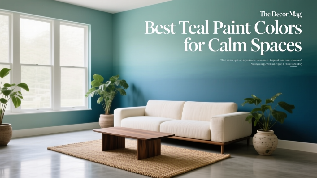 Best Teal Paint Colors for Calm Spaces - The Decor Mag
 Trends vs Island: How Color Forecasting and Brand Identity Diverge in Commercial Design
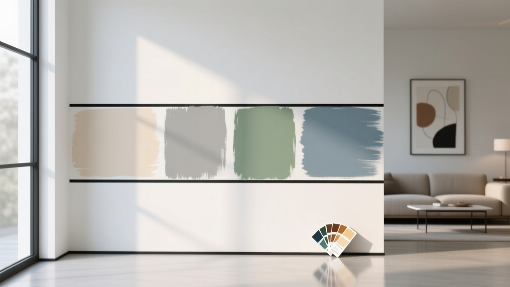 How to Test Paint Colors Before Committing - The Decor Mag
 How to Choose Colors for a Music Room - The Decor Mag
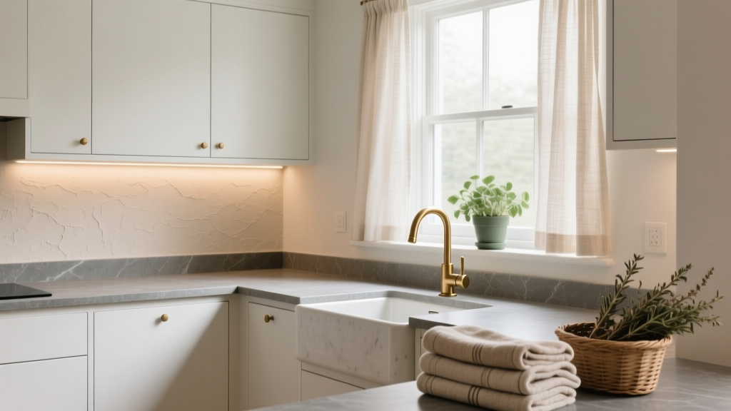 How to Choose Colors for a Scullery - The Decor Mag
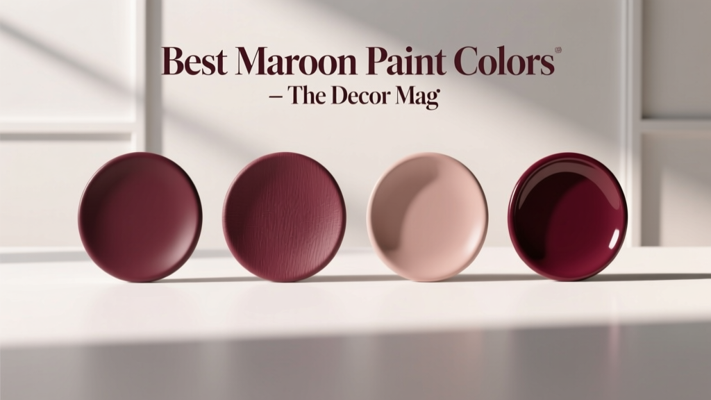 Best Maroon Paint Colors - The Decor Mag