There’s a reason sage green has quietly ruled interior design for years—it’s not just trendy, it’s *timeless*. Calming without being dull, earthy without feeling heavy, and sophisticated without demanding attention, this nuanced hue bridges nature and nurture in the most elegant way. As a senior home decor editor who’s swatched more than 200 greens (yes, really), I can tell you: choosing the right sage isn’t about chasing a “perfect” shade—it’s about matching its undertones, depth, and light response to your room’s rhythm.
Living Rooms: Warmth with Quiet Confidence
For open, social spaces, lean into sage greens with subtle golden or greige undertones—they soften hard edges and invite conversation. Benjamin Moore’s October Mist (OC-52) is my top pick: a mid-tone sage that reads fresh by day and velvety at dusk. Pair it with natural fiber rugs (think jute or undyed wool from The Citizenry), warm brass accents, and olive-toned linen sofas. Avoid cool-leaning sages here—they can mute energy in large, airy rooms.
Bedrooms: Serenity That Supports Sleep
Your bedroom deserves a sage that breathes like a forest floor at dawn—soft, layered, and deeply restorative. Farrow & Ball’s Mizzle (No. 266) delivers with its delicate gray-green base and whisper of charcoal. It’s especially luminous in north-facing rooms. For south-facing bedrooms, try Sherwin-Williams’ Clary Sage (SW 6178), which holds its softness without washing out. Layer with matte black hardware, raw oak nightstands, and washed cotton bedding in oat or stone.
Kitchens: Earthy Elegance Meets Function
In kitchens, durability and tone matter equally. Go for a slightly deeper, clay-infused sage that stands up to daily life while keeping things grounded. Benjamin Moore’s Tranquility (AF-490) offers gentle depth and resists yellowing over time—ideal for cabinets or island walls. Pair with honed Calacatta Viola quartz countertops and unlacquered brass pulls from Schoolhouse Electric. Pro tip: Test samples on all three walls—you’ll see how lighting shifts the color across morning, noon, and evening.
Bathrooms: Spa-Like Clarity Without Coldness
Moisture-resistant formulas are non-negotiable. Behr’s Sage Leaf (PPU10-14) is an affordable, zero-VOC winner with a balanced blue-gray undertone that stays serene—not clinical—even under fluorescent light. Use it on walls paired with white subway tile and matte black fixtures. For small powder rooms, consider painting the ceiling the same sage—it creates a cozy, enveloping effect.
Avoid pairing sage with stark white trim—opt instead for warm off-whites like BM White Dove or SW Alabaster.
Always test paint in natural and artificial light—and observe it at 8 a.m., 2 p.m., and 7 p.m.
When layering textures, lean into tactile contrasts: nubby bouclé, smooth ceramic, rough-hewn wood.
“Sage green doesn’t shout—it listens. It meets your space where it is, then gently lifts it.” — Interior designer and longtime collaborator, Elena Ruiz
Whether you’re refreshing a rental or reimagining a forever home, sage green remains one of the most forgiving, flattering, and emotionally intelligent colors we have. It’s less a trend and more a quiet invitation—to slow down, settle in, and let your surroundings breathe with you.
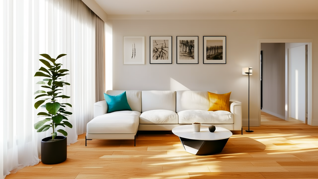
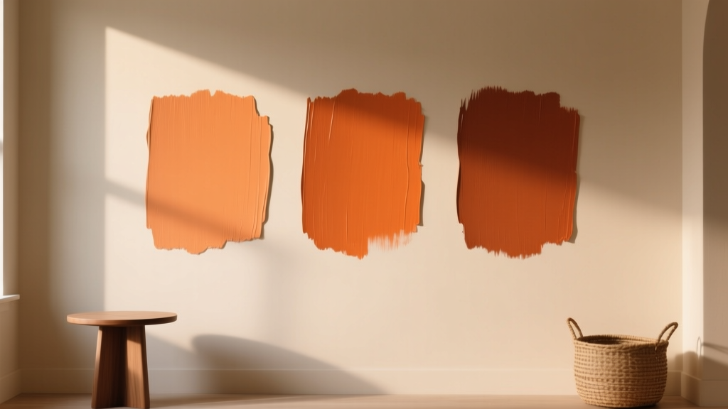 Best Burnt Orange Paint Colors - The Decor Mag
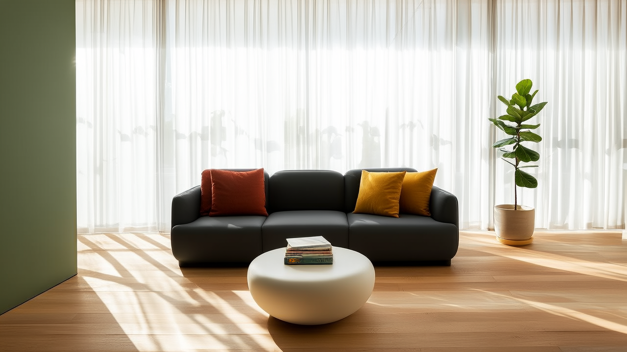 Warm Neutral Color Palettes for Every Room
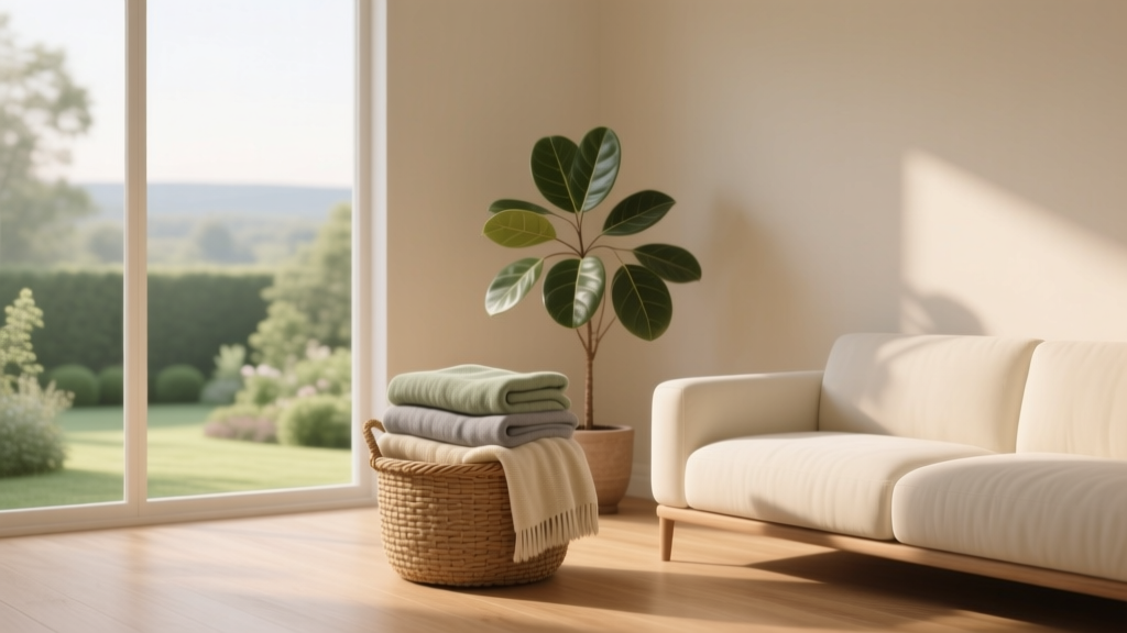 How to Use Color to Create Calm - The Decor Mag
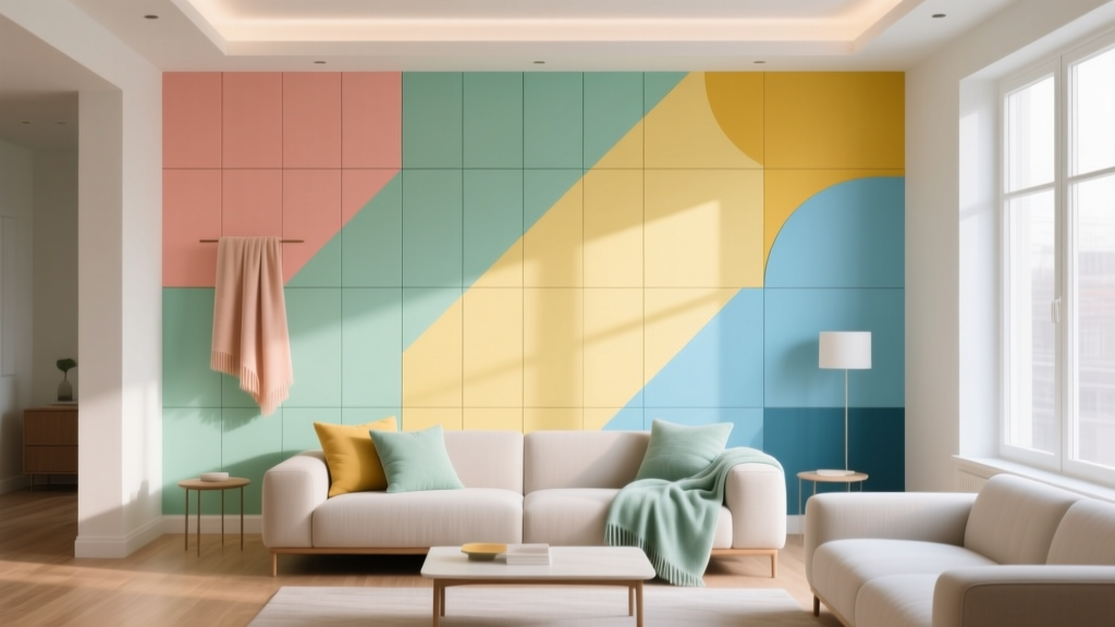 How to Create a Playful Color Palette - The Decor Mag
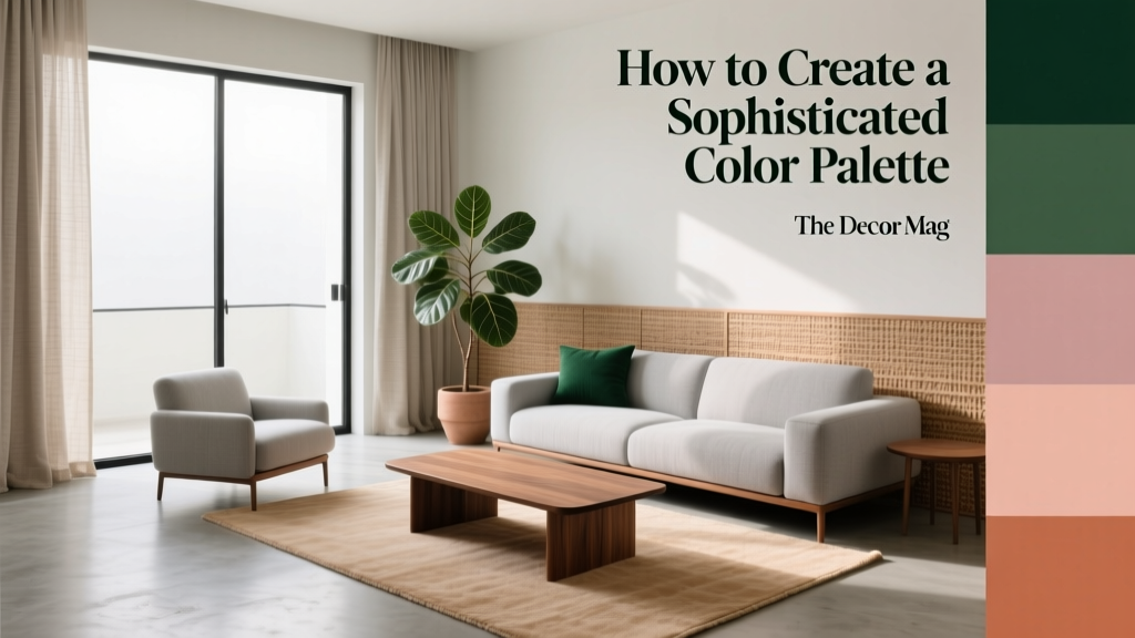 How to Create a Sophisticated Color Palette - The Decor Mag
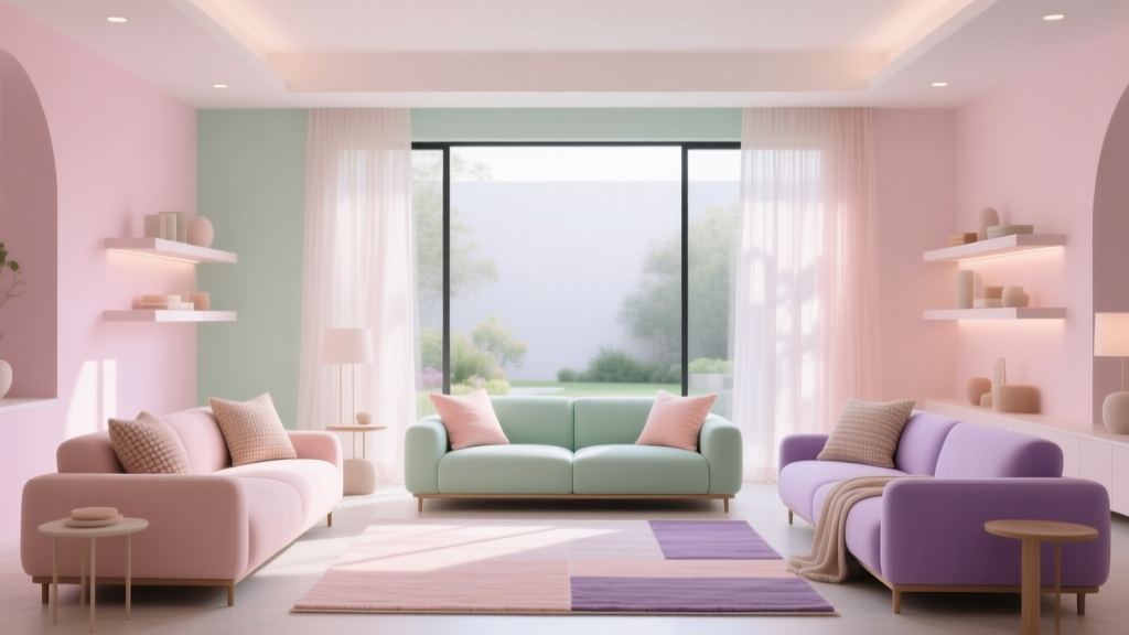 Pastel Color Palette Design Guide - The Decor Mag
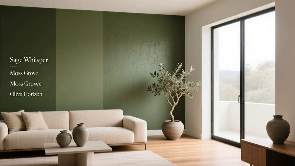 Best Olive Green Paint Colors (2026) | The Decor Mag
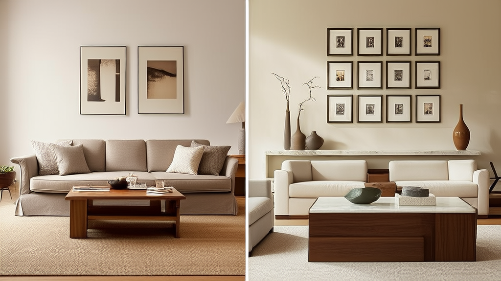 Cheap vs Premium Decor: What You Are Paying For
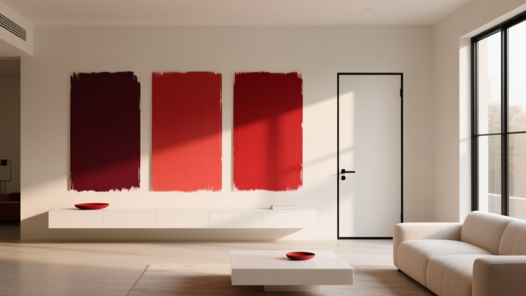 Best Cherry Red Paint Colors - The Decor Mag
 Step Alternatives to Functional: Evidence-Based Movement