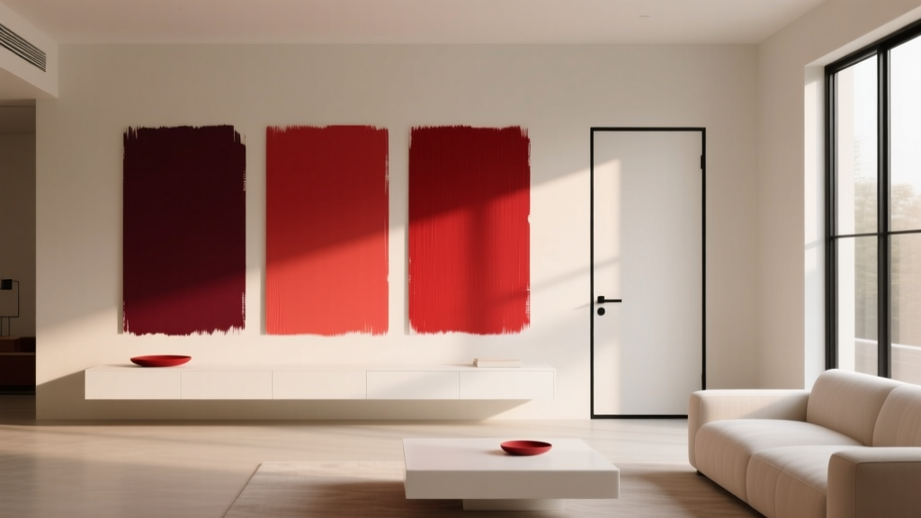
Best Cherry Red Paint Colors - The Decor Mag
Cherry red is one of those rare paint colors that feels both classic and daring. It can read as lively and upbeat in a sunny breakfast nook, glamorous in a dining room, and surprisingly refined on millwork or a front door. When homeowners search for the “best cherry red paint colors,” they’re usually looking for more than a pretty swatch—they want a red that feels intentional, flattering under real lighting, and easy to pair with the rest of the home.
Red has powerful color psychology: it’s associated with energy, appetite, warmth, and confidence. Used well, cherry red creates a focal point that makes a space feel designed rather than merely decorated. Used poorly, it can skew harsh, juvenile, or overwhelming. This guide breaks down cherry red paint options across popular brands, plus practical tips for choosing the right undertone, coordinating a color scheme, and applying red in ways that look polished.
If you’re ready for a room with presence—or a small detail that makes your home feel more “you”—cherry red is a color worth understanding.
What Counts as “Cherry Red” in Interior Design?
Cherry red sits in the sweet spot between true primary red and deeper, wine-leaning reds. Think of ripe cherries: bright, saturated, and slightly juicy. In paint terms, cherry reds typically:
- Have a clean red base with a subtle blue undertone (cool cherry) or orange undertone (warm cherry).
- Feel vibrant without tipping into neon.
- Read richer and more dimensional in interior lighting than a flat “stop sign” red.
Undertones: The Detail That Makes or Breaks a Red
Undertone determines whether cherry red looks crisp and modern or cozy and traditional.
- Blue-based cherry reds feel sophisticated and slightly dramatic. They pair well with crisp whites, cool grays, and jewel tones.
- Orange-based cherry reds feel warm, welcoming, and often more forgiving in lamplight. They pair beautifully with creamy whites, warm woods, and brass.
Best Cherry Red Paint Colors (Designer-Approved Picks)
These cherry red paint colors are widely used by designers because they behave well on walls, cabinetry, and accents—and because they have enough depth to look intentional in real rooms.
Benjamin Moore: Go-To Cherry Reds
- Benjamin Moore Classic Red (CC-184): A bold, iconic red that reads festive in December and timeless the rest of the year when balanced with neutrals. Great for front doors, dining rooms, and lacquer-like built-ins.
- Benjamin Moore Heritage Red (HC-181): A slightly deeper, heritage-leaning cherry red with a refined feel. Works beautifully in traditional homes, libraries, and dining rooms with warm wood tones.
- Benjamin Moore Raspberry Truffle (2080-10): A saturated red with a hint of berry depth. Ideal when you want cherry red energy without a “bright primary” look—stunning for powder rooms and accent walls.
Sherwin-Williams: High-Impact, Versatile Reds
- Sherwin-Williams Cherry Tomato (SW 6864): Lively and punchy, this is a modern cherry red that thrives in bright spaces. Excellent for a statement door, playful mudroom cabinetry, or a color-drench moment in a small room.
- Sherwin-Williams Heartthrob (SW 6866): A slightly deeper, moodier cherry red with a romantic edge. Great for dining rooms, velvet-upholstered vibes, and dramatic built-ins.
- Sherwin-Williams Show Stopper (SW 7588): A confident, stage-ready red. Best as an accent (door, island, furniture) unless you love maximum saturation on walls.
Farrow & Ball: Cherry Reds with Old-World Character
- Farrow & Ball Incarnadine (No. 248): A rich, classic red that feels elevated and historic. Gorgeous in dining rooms, entryways, and on paneling with soft, warm lighting.
- Farrow & Ball Radicchio (No. 96): A deeper red with earthy undertones—still cherry-adjacent, but more grounded. Ideal when you want red that feels mature and architectural.
Behr: Accessible Cherry Reds for Real Homes
- Behr Cherry Cola: A deeper cherry with a cozy richness, great for accent walls, offices, and furniture pieces where you want bold color without high glare.
- Behr Fireworks: A brighter red that reads cheerful and energetic. Works best in small doses—front doors, stools, or a single focal wall.
Best Cherry Red Paint Colors by Use Case
Not sure where to start? Match the red to the job.
- Best cherry red for a front door: Benjamin Moore Classic Red; Sherwin-Williams Show Stopper
- Best cherry red for dining rooms: Farrow & Ball Incarnadine; Benjamin Moore Heritage Red
- Best cherry red for accent walls: Sherwin-Williams Heartthrob; Benjamin Moore Raspberry Truffle
- Best cherry red for cabinetry: Sherwin-Williams Cherry Tomato; Benjamin Moore Classic Red (in a lower sheen for softness)
How to Use Cherry Red Paint in Different Rooms
Cherry red can be a lead actor or a supporting role. The most successful interiors treat red as part of a color scheme, not an isolated statement.
Living Room: A Focal Point That Feels Curated
Cherry red in a living room often works best as a deliberate anchor rather than four fully red walls—unless you’re intentionally creating a maximalist room.
Try these application scenarios:
- Fireplace surround or built-ins: Paint the surround in Benjamin Moore Heritage Red and keep walls a warm white (like a creamy off-white) for balance.
- Single accent wall behind the sofa: Sherwin-Williams Heartthrob paired with light greige walls and textured neutrals.
- Painted furniture moment: A cherry red console table or bar cabinet in Behr Cherry Cola gives impact without permanence.
Dining Room: Where Red Shines (and Flatters Everyone)
Red is a classic dining room paint color because it’s tied to appetite and conviviality. It also looks particularly good in evening light.
- For a dramatic, intimate dining room: Farrow & Ball Incarnadine on walls with a satin or matte finish; pair with warm brass and a creamy ceiling.
- For a brighter, modern look: Sherwin-Williams Cherry Tomato on an accent wall with white oak furniture and crisp white trim.
Real room vibe: Incarnadine walls + a walnut table + linen drapery + a vintage rug with small hints of red for cohesion.
Kitchen: Cherry Red as a Controlled Statement
Kitchens benefit from red in measured amounts. Because kitchens have hard surfaces and brighter task lighting, the wrong red can look aggressive or overly glossy.
High-impact ways to use cherry red in a kitchen:
- Kitchen island: Benjamin Moore Classic Red with warm white perimeter cabinets and unlacquered brass hardware.
- Lower cabinets only: Sherwin-Williams Heartthrob grounded with light countertops and simple tile.
- Pantry door or interior pantry walls: Behr Fireworks for a cheerful surprise moment.
Bedroom: Romantic, Not Restless
Because red is energizing, bedrooms typically look best with cherry red used as an accent or as a deeper, slightly muted cherry.
- Headboard wall: Benjamin Moore Raspberry Truffle paired with soft ivory bedding and warm wood nightstands.
- Trim or doors: Paint the bedroom door in Sherwin-Williams Show Stopper for a boutique-hotel feel with neutral walls.
Powder Room: A Small Space Made Memorable
Powder rooms are ideal for saturated color. Cherry red can feel glamorous and intentional when paired with the right finishes.
- Color-drench approach: Paint walls and trim the same cherry red (try Farrow & Ball Incarnadine), add a vintage mirror, and use warm lighting to soften shadows.
- Wallpaper + red vanity: Choose a wallpaper with tiny red notes, then paint the vanity Sherwin-Williams Cherry Tomato for continuity.
Cherry Red Color Schemes That Work
A strong color needs a strong supporting cast. These pairings help cherry red feel sophisticated rather than chaotic.
Timeless Neutrals with Cherry Red
- Warm white + cherry red + natural wood: Cozy, approachable, and great for kitchens and dining rooms.
- Crisp white + cherry red + black accents: High-contrast and modern—excellent for doors, stair rails, and graphic spaces.
- Greige + cherry red + linen textures: Softens red and makes it feel livable in open-plan homes.
Elevated Color Pairings (Designer Favorites)
- Cherry red + deep navy: Traditional-meets-tailored; beautiful for dining rooms and studies.
- Cherry red + blush or dusty pink: Playful, fashion-forward, and surprisingly sophisticated in bedrooms or dressing rooms.
- Cherry red + forest green: Rich, classic, and grounded—great in homes with vintage rugs and warm woods.
- Cherry red + teal: Energetic and eclectic; best when one color is dominant and the other is an accent.
Finish, Lighting, and Placement: Pro Tips for Red Paint
Cherry red is sensitive to sheen and lighting. These guidelines help you avoid the most common “why does it look so different?” surprises.
Choose the Right Sheen
- Matte/flat: Best for walls when you want a velvety, saturated look (especially in dining rooms and bedrooms).
- Eggshell/satin: Great for living spaces and hallways; balances washability with a softer look.
- Semi-gloss/high-gloss: Ideal for doors and trim, but can amplify undertones and surface imperfections.
Test Cherry Red Like a Designer
- Paint a large sample (at least 12" x 12", bigger is better) on multiple walls.
- View it in morning light, midday, and evening with lamps on.
- Check it next to fixed elements: flooring, countertops, tile, and upholstery.
- Hold up your “whites” (trim paint, countertop samples). Reds can make whites look yellow, gray, or stark.
Real Room Examples: Where Cherry Red Looks Fantastic
Example 1: Cherry Red Front Door with Classic Curb Appeal
- Paint color idea: Benjamin Moore Classic Red (CC-184)
- Pair with: Crisp white trim, charcoal porch floor, and black hardware
- Why it works: High contrast creates instant architecture and a welcoming focal point.
Example 2: Dining Room with Warm Woods and Soft Lighting
- Paint color idea: Farrow & Ball Incarnadine (No. 248)
- Pair with: Walnut dining table, cream linen drapes, brass chandelier
- Why it works: Warm materials round out the intensity of red, making it feel rich and intimate.
Example 3: Kitchen Island as the “Jewelry” of the Room
- Paint color idea: Sherwin-Williams Heartthrob (SW 6866)
- Pair with: Warm white cabinets, light quartz counters, simple ceramic tile
- Why it works: The island becomes a centerpiece without overpowering the full kitchen.
Common Cherry Red Paint Mistakes to Avoid
- Picking a red without considering undertone: A warm cherry can clash with cool marble; a cool cherry can look sharp next to honey oak.
- Using high-gloss red on large walls: It can feel like a showroom and highlight every wall flaw. Save high-gloss for doors or furniture.
- Ignoring lighting temperature: Warm bulbs make reds feel cozier and sometimes more orange; cool bulbs can make them feel harsher.
- Not balancing with neutrals: Red needs breathing room—trim color, ceiling color, and adjacent rooms matter.
- Forgetting about adjacent sightlines: In open layouts, cherry red should connect to nearby colors (through rugs, art, pillows, or repeated accents).
- Skipping primer: Reds often need a tinted primer for even coverage and true color depth.
FAQ: Best Cherry Red Paint Colors
What is the best cherry red paint color for a front door?
For a classic, universally appealing look, Benjamin Moore Classic Red (CC-184) is a strong choice. If you want something a bit more modern and bold, Sherwin-Williams Show Stopper (SW 7588) delivers high impact.
Does cherry red make a room look smaller?
Cherry red can feel visually forward, which may make walls feel closer. Use it strategically—an accent wall, built-ins, or a dining room with lower light often feels cozy rather than cramped. Pair with lighter ceilings and trim to keep the room open.
What trim color goes best with cherry red walls?
Most homeowners prefer a soft warm white for trim to prevent the red from making the white look icy. For a modern look, a crisp white trim can work beautifully—especially with blue-based cherry reds.
How do I keep cherry red from looking too bright?
Choose a cherry red with more depth (like Benjamin Moore Raspberry Truffle or Sherwin-Williams Heartthrob), use a matte or eggshell finish, and bring in grounding elements like warm wood, darker metals, or deep neutrals.
Is cherry red a good choice for kitchen cabinets?
Yes, especially for an island, lower cabinets, or a pantry door. Keep the rest of the kitchen light and simple, and select durable finishes. Saturated reds can be stunning on cabinetry when balanced with warm whites, natural stone, or white oak.
How many coats of cherry red paint will I need?
Often two coats minimum, sometimes three depending on the brand, sheen, and what color you’re painting over. A tinted primer helps reds look richer and more even while reducing the number of top coats.
Next Steps: Choose Your Cherry Red with Confidence
Start by deciding where cherry red belongs in your home: a front door for curb appeal, an island for a kitchen focal point, or a dining room for a warm, memorable gathering space. Narrow your selection by undertone (cool vs. warm), test large samples in your lighting, then build a supporting color scheme with the right whites, woods, and metals.
For more paint color inspiration, color schemes, and interior color design guides, explore the latest color articles on thedecormag.com.
More Articles
 Best Bathroom Floor Solutions: Performance, Safety, and Style Compared
 Jewel Tone Color Scheme Ideas - The Decor Mag
 Best Wisteria Paint Colors - The Decor Mag
 Best Beige Paint Colors That Aren't Boring - The Decor Mag
 How to Choose Colors for a Sunroom - The Decor Mag
 Best Jade Green Paint Colors - The Decor Mag
 Best Sapphire Blue Paint Colors - The Decor Mag
 12 Practical DIY Furniture Ideas You Can Build in a Weekend (With Exact Materials & Dimensions)
 How to Choose Colors for a Playroom - The Decor Mag
 Best Sage Green Paint Colors for Serenity - The Decor Mag