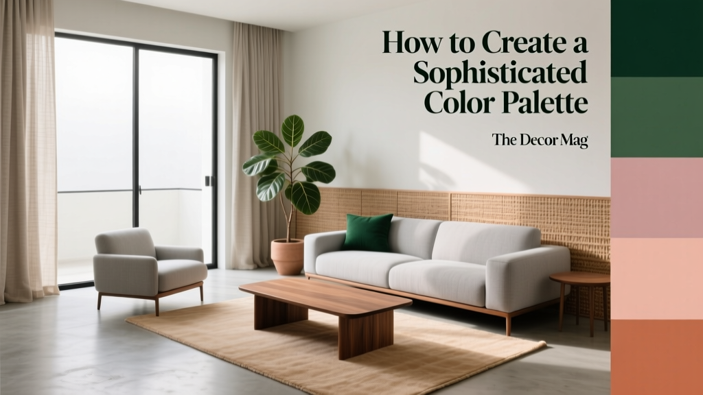
How to Create a Sophisticated Color Palette - The Decor Mag
A sophisticated color palette can make a home feel calmer, more cohesive, and quietly luxurious—even if the furniture is simple and the square footage is modest. The difference isn’t about choosing “expensive” colors; it’s about creating harmony, controlling contrast, and repeating tones in a way that feels intentional. When a palette is well-planned, rooms photograph better, art and textiles look richer, and transitions from one space to the next feel seamless.
Color also shapes how you experience your home. Warm neutrals can make evenings feel inviting, cooler hues can sharpen focus in a home office, and soft greens can ease visual fatigue in busy family spaces. Color psychology matters, but sophistication comes from design principles: balance, proportion, undertone control, and thoughtful restraint.
If you’ve ever chosen paint chips that looked perfect in the store but “off” on your walls, you’re not alone. This guide breaks down how to build an elevated interior color scheme with practical steps, specific paint color recommendations, and real-room applications that work in everyday homes.
What Makes a Color Palette “Sophisticated”?
Sophisticated doesn’t mean muted or boring. It usually means:
- Controlled contrast (high contrast, but not chaotic; or low contrast, but not flat)
- Undertone harmony (warm with warm, cool with cool, or a deliberate mix that’s balanced)
- Layered neutrals (more than one neutral, each with a purpose)
- Strategic accent use (accents that repeat across the home rather than appearing once)
- Consistency in sheen (flat/matte on walls, satin on trim, and intentional gloss where you want highlight)
Color psychology, refined
Sophisticated palettes often lean into psychological comfort while keeping the eye engaged:
- Neutrals signal calm and longevity, making spaces feel timeless.
- Deep blues and greens read confident and grounded, often associated with stability and restoration.
- Warm earth tones feel nourishing and welcoming, excellent for social spaces.
- Black and near-black add clarity, structure, and a modern edge when used with restraint.
Start with Your Non-Negotiables
Before choosing paint colors, anchor your palette to fixed or high-investment elements. This prevents the common mistake of painting first and then struggling to match everything else.
- Flooring: wood tone (golden, red, gray), tile undertone, carpet warmth
- Stone surfaces: veining and background color in countertops, fireplaces, and tile
- Large upholstery: sofa, sectional, headboard
- Cabinetry: especially in open-plan homes where kitchen color influences adjacent rooms
Practical tip: Pull 2–3 colors from these elements (not just one) and use them as your palette’s “truth.” If your stone has warm beige plus charcoal veining, your palette can elegantly include both warm neutrals and a dark grounding shade.
Choose a Palette Framework That Guarantees Balance
The 60-30-10 rule (and how to modernize it)
This classic interior color design principle helps you distribute color so it feels composed:
- 60% = dominant color (usually walls or large background elements)
- 30% = secondary color (upholstery, rugs, curtains, cabinetry)
- 10% = accent color (pillows, art, lamps, décor)
For a more sophisticated look, shift to a 70-20-10 approach and let the dominant field be quieter. Then bring dimension through texture (linen, wool, wood grain, plaster finishes) rather than lots of competing hues.
The “2 neutrals + 1 color + 1 metal” method
This is a reliable formula for elevated, livable rooms:
- Neutral 1: wall color
- Neutral 2: trim/cabinet/major textile neutral
- Color: a mid-tone or deep shade that repeats at least 3 times
- Metal: one dominant finish (brass, polished nickel, bronze) + one minor finish if needed
Master Undertones: The Shortcut to a Cohesive Home
Undertones are the “hidden” bias in a paint color—yellow, red, green, blue, or violet—beneath the surface. Most color mismatches happen because undertones clash.
How to tell if a neutral is warm or cool
- Warm whites/greiges lean creamy, beige, or slightly rosy.
- Cool whites/grays lean crisp, bluish, or slightly green.
Try this: Compare your paint sample to a sheet of bright white printer paper. If it looks creamy next to the paper, it’s warmer. If it looks icy or bluish, it’s cooler.
Sophisticated neutral paint colors to consider
These are designer favorites because they behave well in many lighting conditions:
- Benjamin Moore White Dove (OC-17): soft, warm white; excellent for trim and walls in open plans
- Sherwin-Williams Alabaster (SW 7008): creamy white that feels calm and inviting
- Farrow & Ball Ammonite (No. 274): refined light neutral with a modern softness
- Benjamin Moore Classic Gray (OC-23): a light greige that reads airy rather than beige
- Sherwin-Williams Agreeable Gray (SW 7029): balanced greige; works well when you need flexibility
Application guidance: If your home has lots of warm wood floors (honey or reddish oak), start with a warm white or warm greige. If your floors are cooler (gray-washed or very dark espresso), cooler whites and taupe-grays often look more tailored.
Build Depth: Neutrals Alone Rarely Look Sophisticated
A common misconception: “All-neutral” automatically equals elegant. In reality, a sophisticated palette uses value contrast (light to dark) and textural contrast (matte to sheen; smooth to nubby) to keep the space from feeling flat.
Choose one anchor “dark”
Even bright homes benefit from a grounding shade used in small doses—on interior doors, built-ins, a kitchen island, or a powder room ceiling.
- Benjamin Moore Hale Navy (HC-154): classic, confident navy that reads timeless
- Sherwin-Williams Iron Ore (SW 7069): soft black with a modern warmth
- Farrow & Ball Railings (No. 31): inky blue-black with elegant depth
- Benjamin Moore Wrought Iron (2124-10): charcoal-black that feels velvety in matte
Pro tip: Use your darkest color at least twice in a space (or once in multiple rooms) to make it feel integrated, not random.
Color Combinations That Read Elevated (With Real Room Scenarios)
1) Warm white + camel + deep olive
Why it works: Warm whites feel welcoming, camel adds richness, and olive brings a natural sophistication that pairs beautifully with wood tones.
Try these paint colors:
- Walls: Sherwin-Williams Alabaster (SW 7008)
- Accent/cabinet option: Farrow & Ball Olive (No. 13) or Benjamin Moore Saybrook Sage (HC-114)
- Trim: Benjamin Moore White Dove (OC-17)
Living room scenario: Alabaster walls, White Dove trim, a camel leather sofa, olive velvet pillows, and black metal accents (picture frames, a floor lamp). Add a woven jute rug to bridge warm and earthy tones.
2) Soft greige + dusty blue + crisp white
Why it works: Greige keeps things grounded, dusty blue adds calm, and crisp white delivers contrast that feels fresh rather than stark.
Try these paint colors:
- Walls: Benjamin Moore Classic Gray (OC-23)
- Bedroom accent wall or built-ins: Benjamin Moore Boothbay Gray (HC-165)
- Trim/ceiling: Sherwin-Williams Pure White (SW 7005)
Bedroom scenario: Classic Gray walls, Pure White trim, Boothbay Gray on a dresser or headboard wall, layered white bedding, and warm brass hardware. The warm metal prevents the blues from feeling chilly.
3) Creamy white + charcoal + muted blush
Why it works: Charcoal provides structure, blush adds softness, and creamy white keeps the overall feel airy and polished.
Try these paint colors:
- Walls: Benjamin Moore White Dove (OC-17)
- Accent: Sherwin-Williams Iron Ore (SW 7069) (doors or built-ins)
- Blush option: Farrow & Ball Setting Plaster (No. 231) (powder room or bedroom)
Dining room scenario: White Dove walls, Iron Ore lower cabinetry or a painted sideboard, blush linen drapery, and a large black-framed mirror to echo the charcoal. The blush should appear at least twice (drapery + art) to feel deliberate.
4) Tonal monochrome: layered taupes and browns
Why it works: Tonal palettes are inherently sophisticated because they rely on subtle shifts in value and texture, not loud color changes.
Try these paint colors:
- Walls: Sherwin-Williams Accessible Beige (SW 7036)
- Trim: Sherwin-Williams Alabaster (SW 7008)
- Depth: Benjamin Moore Pashmina (AF-100) (accent cabinetry or office wall)
Home office scenario: Accessible Beige walls with Pashmina built-ins, leather chair in cognac, woven shades, and a black task lamp. The result feels warm, focused, and high-end.
How Lighting Changes Paint Color (and How to Test Like a Designer)
Lighting is the make-or-break factor for paint colors and color schemes. North-facing rooms tend to cool colors down (more gray/blue). South-facing rooms amplify warmth and can make creams look yellower.
A simple paint testing routine
- Choose 3–5 candidates in the same family (for example, warm whites).
- Order peel-and-stick samples or paint large poster boards.
- Move samples around the room: near windows, in shadows, and behind furniture.
- Check morning, afternoon, and evening.
- Evaluate next to your fixed finishes (flooring, stone, upholstery).
Sheen tip: Matte/eggshell walls look richer and more forgiving. Satin trim adds a subtle highlight that reads tailored. High gloss is best reserved for front doors or special architectural details.
Common Color Mistakes to Avoid
- Picking paint from a tiny chip: undertones and depth reveal themselves on large surfaces.
- Ignoring undertones in “white”: a white can look pink, green, or gray depending on the room.
- Using too many unrelated accent colors: sophistication comes from repetition. Repeat an accent at least 3 times (art, textiles, décor).
- Forgetting value contrast: if everything is mid-tone, the room feels bland. Add a dark anchor or brighter highlight.
- Not coordinating open-concept spaces: you don’t need one color everywhere, but undertones should connect.
- Overusing trendy bold colors: trends are best in easily changed items (pillows, rugs) unless you’re committed long-term.
Actionable Steps to Create Your Sophisticated Palette
- Inventory your fixed elements (floors, stone, cabinetry) and identify warm vs. cool undertones.
- Select your base neutral for the largest visual area (often walls): one white, cream, or greige.
- Choose a secondary neutral for trim, large textiles, or cabinetry to create subtle contrast.
- Add one depth shade (charcoal, navy, deep green) to ground the home.
- Pick one accent color and plan where it repeats (pillows + art + a vase; or a rug + drapery + bedside lamps).
- Test in your lighting and commit only after viewing the samples for 48 hours.
FAQ: Sophisticated Color Palettes
What are the best paint colors for a sophisticated neutral home?
Look for neutrals with balanced undertones and enough depth to avoid looking flat. Popular choices include Benjamin Moore White Dove, Sherwin-Williams Alabaster, Benjamin Moore Classic Gray, and Benjamin Moore Pashmina for added richness.
How many colors should a whole-house color scheme include?
A strong whole-house interior color design often uses 4–6 core colors: one wall neutral, one trim white, one secondary neutral, one deep anchor shade, and 1–2 accent colors. Repetition across rooms is what makes it feel sophisticated.
What’s the easiest way to make bold colors look more elegant?
Use bold color in a controlled way: choose a complex, slightly muted version (like dusty blue instead of bright cobalt), keep surrounding neutrals quiet, and repeat the color in small doses. A deep shade like Hale Navy or Iron Ore often looks more refined than a bright primary.
Should trim match walls for a sophisticated look?
Matching can look modern and enveloping, especially in matte. For a more classic tailored look, use a trim color 10–20% brighter or a cleaner white. A common pairing is White Dove trim with warm white walls.
How do I choose an accent color that won’t feel trendy next year?
Choose accents inspired by nature and aged materials—olive, ink navy, clay, ochre, charcoal, or muted terracotta. These hues have historical staying power and pair well with both warm and cool neutrals.
What if my home has mixed undertones (warm floors, cool countertops)?
Bridge the gap with a “mediator” neutral—often a greige that leans neither too yellow nor too blue. Then repeat both warm and cool elements intentionally (for example, warm wood + warm brass; cool stone + black accents) so it reads layered rather than mismatched.
Bring It All Together
A sophisticated color palette is less about chasing the perfect paint color and more about building a system: undertones that agree, contrast that feels intentional, and accents that repeat. Start with your fixed finishes, select one strong neutral foundation, then add depth with a dark anchor and texture-rich layers. Once you’ve tested paint colors in your real lighting, you’ll feel confident making choices that look elevated every day—not just on a sample card.
If you’re ready for the next step, explore more paint color roundups, room-by-room color schemes, and interior color design guides on thedecormag.com.
More Articles
 Best Burnt Orange Paint Colors - The Decor Mag
 How to Create a Grounded Color Palette - The Decor Mag
 Best Tomato Red Paint Colors - The Decor Mag
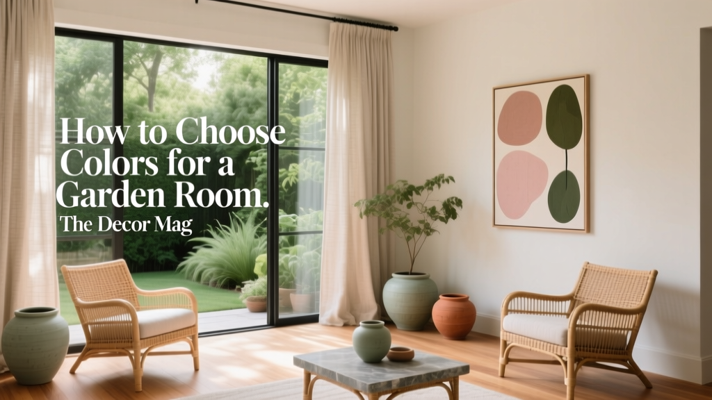 How to Choose Colors for a Garden Room - The Decor Mag
 How to Use Color to Create Warmth - The Decor Mag
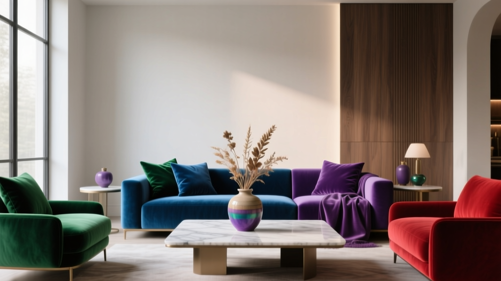 Jewel Tone Color Scheme Ideas - The Decor Mag
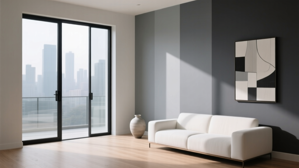 Best Gray Paint Colors for 2026 - The Decor Mag
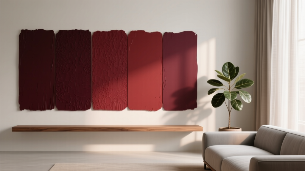 Best Oxblood Paint Colors - The Decor Mag
 Best Sustainable Solutions: Proven, Scalable, and Impact-Driven Approaches for 2024
 How to Choose Colors for a Laundry Room - The Decor Mag