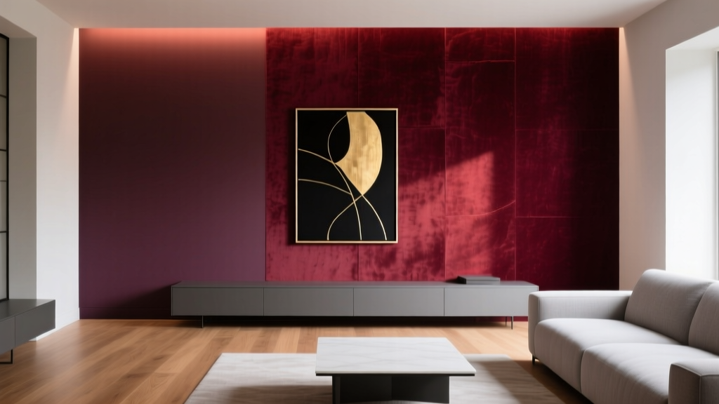
Best Wine Red Paint Colors - The Decor Mag
Wine red is one of those rare paint colors that feels both timeless and daring. It carries the mood of a candlelit dinner, the richness of aged leather, and the confidence of a well-tailored blazer. Used well, wine red paint instantly elevates a room—making it feel warmer, more layered, and more intentional than the typical neutral backdrop.
This topic matters because wine red sits in a tricky sweet spot: it’s deep enough to read as dramatic, yet nuanced enough to work in everyday spaces when the undertones are right. The difference between “luxurious and inviting” and “heavy and dated” often comes down to lighting, sheen, and pairing it with the right trim, metals, and textiles. If you’ve ever tested a burgundy and wondered why it looked brown, purple, or flat, you’re not alone.
Below you’ll find expert wine red paint color recommendations, guidance for choosing the best undertone for your home, real-world room scenarios, and the most common mistakes that make red paint feel overwhelming. The goal: help you use wine red with confidence—whether you’re painting a dining room, a powder bath, or a single statement wall.
What Counts as “Wine Red” in Interior Design?
Wine red paint colors live in the family of deep reds with brown, purple, or black undertones. You’ll see names like burgundy, merlot, oxblood, garnet, and cabernet. True wine reds usually feel more sophisticated than fire-engine red because their undertones mute the brightness and add depth.
Wine Red Undertones: The Key to Picking the Right Shade
- Brown-leaning wine reds feel earthy and traditional; they pair beautifully with warm woods and creamy whites.
- Purple-leaning wine reds feel velvety and romantic; they love brass, marble, and cooler whites.
- Blackened/oxblood wine reds feel modern and moody; they pair well with matte black, walnut, and linen textures.
Color Psychology: Why Wine Red Feels So Good
Red is associated with energy, appetite, and connection—one reason it’s a classic dining room color. When red is deepened into wine territory, it adds emotional warmth without feeling “loud.” It can make large rooms feel more intimate and small rooms feel enveloping (especially in lower light).
How to Choose the Best Wine Red Paint Color for Your Space
Start With Lighting (Natural + Artificial)
Wine red changes dramatically throughout the day. Use this quick guide:
- North-facing rooms: Cool light can pull purple undertones forward; choose a warmer, brown-based wine red to keep it grounded.
- South-facing rooms: Warm, strong light can brighten reds; you can go deeper (oxblood) without it feeling too dark.
- East-facing rooms: Morning light may make wine red glow; check that it doesn’t turn too rosy by afternoon.
- West-facing rooms: Afternoon/evening light intensifies warmth; wine reds can look extra rich—perfect for dining rooms and dens.
Pick the Right Sheen
- Matte/flat: Most forgiving for deep colors; gives wine red a velvety, modern look.
- Eggshell: Great for living spaces where you want a slight wipeable finish without glare.
- Satin: Works well in hallways and family rooms; can show imperfections on darker walls.
- High-gloss: Best used intentionally (doors, trim, cabinetry). Wine red in gloss can feel dramatic and high-end, but it’s less forgiving.
Decide: Statement Wall or Full Room?
Wine red is versatile, but the “right” approach depends on the room’s purpose.
- Accent wall: Ideal for open-plan homes, first-time red users, and spaces with lots of art.
- Full-room color: Best for dining rooms, powder baths, libraries, and bedrooms where you want cocoon-like depth.
- Color-drenching: Painting walls, trim, and even ceiling the same wine red can look custom and architectural—especially in small rooms.
Best Wine Red Paint Colors (Designer-Approved Picks)
These wine red paint colors are widely loved because they read rich rather than “Christmas red,” and they play well with common interior finishes.
Sherwin-Williams Wine Red Paint Colors
- SW 6305 Rambling Rose: A muted, dusty red with a soft, wine-like warmth. Great for bedrooms and living rooms where you want red without heaviness.
- SW 7599 Brick Paver: A deeper red-brown that reads grounded and traditional. Works beautifully with warm woods, terracotta, and cream trim.
- SW 2801 Rookwood Dark Red: Historic and sophisticated; a classic wine red for dining rooms, libraries, and front doors.
- SW 7048 Urbane Bronze (as a pairing): Not wine red, but a favorite companion for wine tones in adjacent rooms or cabinetry for a moody palette.
Benjamin Moore Wine Red Paint Colors
- BM HC-68 Burgundy Wine: A true, traditional wine red with depth. Excellent for dining rooms and studies; pairs well with crisp white trim and brass.
- BM 2005-20 Raspberry Truffle: A rich, dessert-like berry-wine that leans slightly purple. Lovely in powder rooms and jewel-box spaces.
- BM 2130-10 Iron Mountain (pairing idea): A deep charcoal that creates a tailored, masculine contrast next to wine red.
Farrow & Ball Wine-Like Reds
- Farrow & Ball Preference Red No. 297: A deep, heritage red that feels lush and architectural. Stunning with paneling and traditional millwork.
- Farrow & Ball Brinjal No. 222 (for purple-leaning wine lovers): More aubergine than red, but gives a similar velvet-wine mood in low light.
Behr Wine Red Paint Colors
- Behr Merlot PPU1-2: A wearable wine red that works for accent walls and cozy dining spaces.
- Behr Bordeaux (name varies by collection/retailer): Look for a deep, muted bordeaux with brown-black undertones for a modern, moody effect.
Tip for accuracy: Paint formulas can vary by sheen and store mixing. Always sample with peel-and-stick samples or a quart before committing.
Real Room Examples: Where Wine Red Looks Best
Wine Red Dining Room: Warm, Elevated, and Social
Wine red is a natural fit for dining rooms because it supports conversation and appetite while creating intimacy. For a classic look, try a full-room application (walls only) with crisp trim.
- Try: Benjamin Moore HC-68 Burgundy Wine on walls
- Trim: Warm white like BM White Dove
- Metals: Aged brass chandelier or candle-style sconces
- Textiles: Linen drapes, patterned rug with cream and muted red
Wine Red Bedroom: Cozy Without Feeling Overstimulating
For bedrooms, choose a muted wine red or use it behind the bed only. Pair it with soft neutrals to keep the mood restorative.
- Try: Sherwin-Williams Rambling Rose as an accent wall
- Pair with: Warm taupe bedding, cream boucle, and walnut nightstands
- Art: Black frames or sepia photography to keep it calm
Wine Red Powder Room: The Perfect “Jewel Box” Moment
Small spaces are where wine red truly shines. A powder room can handle drama—and the payoff feels intentional and design-forward.
- Try: BM Raspberry Truffle in a matte finish
- Ceiling: Match the walls for a wrapped effect
- Mirror: Antique gold or black metal
- Lighting: Warm bulbs (2700K) to enhance the richness
Wine Red Living Room: A Grounded Statement
If you’re hesitant, start with one wine red focal wall behind built-ins or a sofa. The key is to balance it with lighter elements and texture.
- Try: SW Rookwood Dark Red as an accent wall
- Pair with: Cream sofa, woven rug, natural oak coffee table
- Layer: Camel leather, black accents, and greenery
Wine Red Front Door or Built-Ins: High Impact, Low Commitment
Wine red is an excellent color for front doors, interior doors, and built-in cabinetry. It reads classic from the curb and tailored indoors.
- Try: SW Rookwood Dark Red in satin or gloss for a door
- Hardware: Aged brass or matte black
- Exterior pairing: Warm white siding, charcoal trim, or natural brick
Wine Red Color Schemes That Always Work
Wine red is easiest to use when the supporting palette is intentional. These combinations show up again and again in professional interior color design because they balance temperature, contrast, and saturation.
1) Wine Red + Cream + Warm Wood
- Vibe: Traditional, welcoming, timeless
- Best for: Dining rooms, living rooms, older homes
- Materials: Oak, walnut, jute, antique brass
2) Wine Red + Charcoal + Crisp White
- Vibe: Modern, tailored, high-contrast
- Best for: Offices, media rooms, entryways
- Materials: Matte black, polished nickel, marble
3) Wine Red + Blush + Deep Green
- Vibe: Romantic, layered, artistic
- Best for: Bedrooms, powder rooms, eclectic spaces
- Materials: Velvet, brass, warm-toned art
4) Wine Red + Navy + Camel Leather
- Vibe: Classic club, sophisticated and cozy
- Best for: Libraries, dens, studies
- Materials: Leather, dark wood, vintage rugs
Practical Application Tips for Painting With Wine Red
- Sample large: Paint a 2' x 2' swatch (or two) on different walls. Deep reds shift in corners vs. direct light.
- Use a tinted primer: Many wine reds cover better with a gray or red-tinted primer, reducing coats and streakiness.
- Expect 2–3 coats: Especially if you’re covering white or a bright color.
- Mind the edge lines: Dark colors highlight imperfect cut-ins. Use quality painter’s tape and a steady angled brush.
- Warm bulbs win: 2700K–3000K lighting typically flatters wine red walls and keeps them from feeling muddy.
Common Wine Red Paint Mistakes (and How to Avoid Them)
-
Choosing a red that’s too bright
If it reads “primary,” it won’t feel like wine red. Look for muted, deep reds with brown/black undertones. -
Ignoring undertones in existing finishes
Wine red can clash with pink-beige carpet, orange-toned tile, or cool gray floors. Test next to your flooring and countertops. -
Pairing with the wrong white
A cool, stark white can make wine red look purplish or harsh. For many homes, a softer warm white trim looks more cohesive. -
Under-lighting the room
Wine red absorbs light. Add layered lighting: overhead + table lamps + sconces to keep it rich rather than gloomy. -
Using too many competing bold colors
Let wine red be the star. Support it with quieter neutrals, natural textures, and one or two strong accents (like navy or deep green).
FAQ: Wine Red Paint Colors
What’s the difference between burgundy, wine red, and maroon?
Burgundy and wine red often overlap and lean slightly purple or brown for depth. Maroon typically leans more brown and can read heavier. The best choice depends on your lighting and whether you prefer a velvety (purple) or earthy (brown) undertone.
Is wine red a good color for a small room?
Yes—especially in powder rooms, hallways, and cozy offices. Use a matte finish and add warm lighting. Small rooms can look intentionally “designed” when drenched in a deep color.
What trim color looks best with wine red walls?
Soft warm whites (often called creamy whites) are a safe, classic choice. If you want a modern look, try a deeper trim in charcoal or even color-drench the trim in the same wine red.
Does wine red make a room feel darker?
It can. Deep reds absorb light, which is why they feel cozy and intimate. Balance with layered lighting, reflective finishes (mirrors, metallics), and lighter furnishings.
What colors go with wine red for a whole-house palette?
Strong companions include warm white, camel, taupe, charcoal, navy, and deep green. For an easy flow, use wine red in one “destination” room (dining room or powder bath) and keep adjacent spaces in warm neutrals.
Should I use warm or cool lighting with wine red paint?
Warm lighting (2700K–3000K) usually makes wine red look richer and more inviting. Cooler bulbs can push the color toward purple or make it feel flatter.
Next Steps: How to Bring Wine Red Home
Choose one wine red paint color to sample, then test it on multiple walls for a full day. Evaluate it with your flooring, trim, and nighttime lighting. If you’re new to deep reds, start with an accent wall, a powder room, or a front door—small changes that deliver a high-end result.
For more curated paint color guides, color scheme ideas, and room-by-room inspiration, explore the latest color stories on thedecormag.com.
More Articles
 How to Choose Colors for a Garage Conversion - The Decor Mag
 How to Create a Bold Color Story - The Decor Mag
 Small vs Step: Decoding the Critical Difference in Color Management for Print and Digital Workflows
 Best Cerulean Blue Paint Colors - The Decor Mag
 Triadic Color Scheme Applications - The Decor Mag
 Best Peach Paint Colors for Warmth - The Decor Mag
 Best Red Paint Colors for Drama and Warmth - The Decor Mag
 How to Match Colors to Furniture and Fabrics - The Decor Mag
 How to Choose Bedroom Colors for Sleep - The Decor Mag
 Best Turquoise Paint Colors - The Decor Mag