How to Use Color to Change Room Perception - The Decor Mag
Color is one of the most powerful (and affordable) tools in interior design. Before you move a wall, buy new furniture, or invest in custom window treatments, paint color can reshape how a room feels—brighter, calmer, taller, wider, cozier, or more energetic. The secret is perception: our brains interpret hue, value (lightness/darkness), and saturation (intensity) as spatial cues.
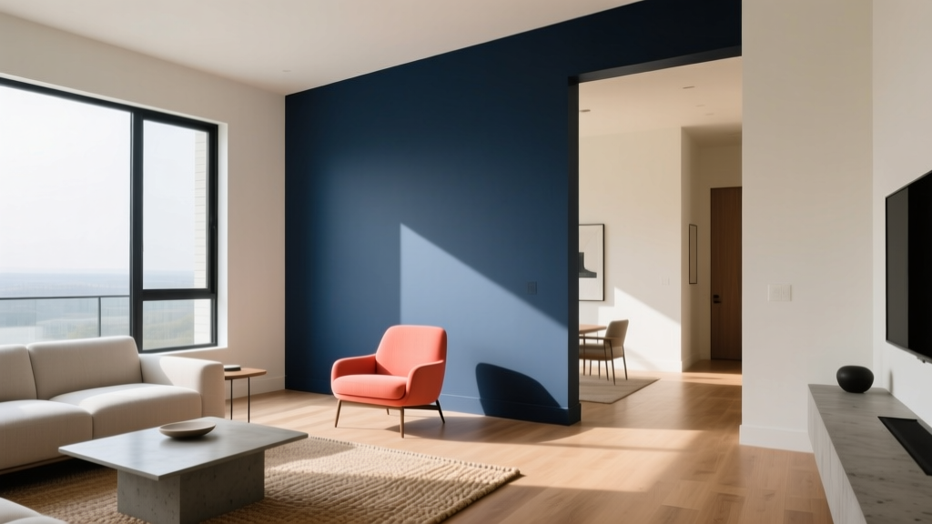
That’s why the “right” color isn’t only about personal preference—it’s about what you want a space to do. A soft off-white can visually push walls outward, while a deep, velvety blue can make a large room feel intimate. Warm neutrals can counteract chilly north light; cooler tones can calm a sun-drenched space. When you understand a few design principles and color psychology basics, you can make paint colors work like architecture.
This guide breaks down practical, homeowner-friendly ways to use color to change room perception—complete with specific paint color recommendations, room scenarios, and common mistakes to avoid.
The Design Principles Behind Color and Space
Value: The #1 driver of spacious vs. cozy
Value refers to how light or dark a color is. In most rooms:
- Lighter values reflect more light, making walls feel farther away (airier, more open).
- Darker values absorb light, visually pulling walls inward (cozier, more enveloping).
If you’re choosing between two similar colors, the lighter one usually reads larger and brighter.
Undertone: Why “white” isn’t just white
Undertones are subtle color casts (yellow, pink, green, blue) that show up depending on lighting and adjacent finishes. Undertones can change the entire mood:
- Warm undertones (yellow, red, peach) feel welcoming and can soften harsh daylight.
- Cool undertones (blue, violet) feel crisp and can visually recede.
- Green undertones can feel fresh—or slightly muddy—depending on surrounding materials.
Saturation: Calm neutrals vs. high-energy color
Highly saturated colors (bright, vivid) feel closer and more stimulating. Muted colors (grayed, softened) tend to feel more expansive and restful—great for bedrooms, open plans, and rooms where you want longevity.
Color psychology: How we experience hue
- Blues and blue-greens often feel calming and can make walls recede.
- Greens read balanced and restorative; many work well across lighting conditions.
- Warm tones (creams, terracottas, warm beiges) feel sociable and cozy.
- Reds and bold oranges can energize a room—best used intentionally or in smaller doses.
Use Color to Make a Room Look Bigger
Choose light neutrals with the right undertone
When homeowners search for “paint colors to make a room look bigger,” the best answers are usually light neutrals that complement the room’s natural light and fixed finishes (floors, countertops, tile).
Go-to paint colors:
- Benjamin Moore Chantilly Lace OC-65 (clean, bright white; crisp in many spaces)
- Sherwin-Williams Alabaster SW 7008 (soft warm white; forgiving and inviting)
- Farrow & Ball Wimborne White No. 239 (creamy, classic; excellent in traditional homes)
- Benjamin Moore Classic Gray OC-23 (a barely-there greige that expands spaces without feeling stark)
Minimize contrast to blur edges
High contrast creates strong boundaries that can make a room feel smaller. For a more open look:
- Paint walls and trim in the same color (or within 1–2 shades).
- Use low-contrast color schemes: soft white walls + warm white trim, or pale greige walls + slightly deeper greige doors.
Application scenario: A narrow living room feels chopped up with bright white trim against mid-tone beige walls. Repaint trim in the wall color (in semi-gloss) to quiet the edges. The room feels wider immediately.
Use an LRV strategy (light reflectance value)
LRV measures how much light a paint color reflects (0 = absorbs most light, 100 = reflects most). For a “bigger room” effect, look for:
- Walls: LRV 60–85
- Ceiling: often LRV 80–95 (not always pure white)
Use Color to Make a Room Feel Cozier (Without Making It Gloomy)
Embrace deeper, warmer mid-tones
Cozy doesn’t have to mean dark cave. Many mid-depth colors feel enveloping while still holding light.
Paint colors that create warmth and intimacy:
- Benjamin Moore Edgecomb Gray HC-173 (warm greige; cozy in living rooms and halls)
- Sherwin-Williams Accessible Beige SW 7036 (warm neutral with broad appeal)
- Farrow & Ball Jitney No. 293 (earthy, linen-like warmth)
- Benjamin Moore Hale Navy HC-154 (classic deep navy; dramatic yet timeless)
Try color-drenching for an enveloping effect
Color-drenching means painting walls, trim, and sometimes the ceiling in the same color. It reduces visual breaks and creates a cocoon-like atmosphere—excellent for bedrooms, studies, and dining rooms.
Real room example: A large, open dining room feels a bit echo-y and formal. Painting the walls, trim, and ceiling in Farrow & Ball Hague Blue No. 30 (or a similar deep blue-green) makes the space feel intentional, luxe, and inviting for evening gatherings.
Use Color to Make Ceilings Look Higher (or Lower)
To make ceilings feel higher
- Paint the ceiling 1–2 shades lighter than the walls.
- Use a flat or matte finish on the ceiling to reduce glare and visual “weight.”
- Extend wall paint slightly onto the ceiling (a soft halo effect) in rooms with awkward ceiling lines.
Color pairing idea: Walls in Benjamin Moore Pale Oak OC-20 with a ceiling in Benjamin Moore White Dove OC-17—soft contrast that lifts the ceiling without starkness.
To make ceilings feel lower and cozier
- Paint the ceiling the same color as the walls or slightly darker.
- Use a mid-tone (not the darkest color in the room) to avoid heaviness.
Application scenario: A tall bedroom feels less restful. Paint walls in Sherwin-Williams Evergreen Fog SW 9130 and carry it onto the ceiling to create a calm, grounded atmosphere.
Use Color to Make a Room Look Wider, Longer, or More Balanced
Widen a narrow room
A classic optical trick: keep the long walls light and put slightly deeper color on the short end walls.
- Long walls: light neutral (expands)
- Short walls: slightly deeper tone (brings them forward)
Example palette:
- Long walls: Sherwin-Williams Alabaster SW 7008
- Short walls: Sherwin-Williams Natural Linen SW 9109
Shorten a very long room (bowling alley effect)
To make a long room feel more proportionate, place a deeper color on the far wall to visually pull it closer.
Example: Walls in Benjamin Moore Classic Gray OC-23 with the far wall in Benjamin Moore Boothbay Gray HC-165 for a gentle focal point.
Fix an awkward room with one anchoring wall
If a room has odd angles or too many openings, a single accent wall can provide “visual architecture.” Choose a color that relates to nearby finishes (wood tones, stone, textiles).
- For warm wood floors: try a muted clay like Farrow & Ball Red Earth No. 64
- For cooler modern finishes: try a smoky blue like Benjamin Moore Smoke 2122-40
Use Color to Brighten a Dark Room (Even With Limited Natural Light)
Pick warm, light-reflective colors
North-facing rooms and shaded spaces can look flat with cool grays. Warm off-whites and gentle greiges help bounce light and add life.
- Benjamin Moore White Dove OC-17 (warm, versatile, not too yellow)
- Sherwin-Williams Creamy SW 7012 (soft warmth; flattering in low light)
- Benjamin Moore Balboa Mist OC-27 (pale greige; sophisticated in dim rooms)
Use sheen strategically
- Walls: eggshell or satin can add subtle reflectance in darker rooms.
- Trim: satin or semi-gloss to bounce light around the perimeter.
- Ceilings: flat for most rooms; consider matte if you want a soft glow without highlighting imperfections.
Create Depth and Calm With Smart Color Schemes
Monochromatic schemes (easy, elegant, spacious)
Monochromatic color schemes use one hue in different values. They read calm and cohesive—excellent for open-plan living.
Example: A serene blue family room:
- Walls: Benjamin Moore Boothbay Gray HC-165
- Trim: Benjamin Moore White Dove OC-17
- Accents: deeper textiles in Hale Navy HC-154
Analogous schemes (soft contrast with designer polish)
Analogous color schemes use neighboring hues (blue/green, yellow/orange). They feel layered but not jarring.
Example: Blue-green + warm neutral:
- Walls: Sherwin-Williams Sea Salt SW 6204
- Trim: Alabaster SW 7008
- Accent: muted terracotta pillows or art to keep it grounded
Complementary schemes (high energy, best in controlled doses)
Complementary pairings (blue/orange, green/red) create punchy contrast. Use them when you want a focal point—often through decor, not full walls.
Real Room Scenarios: What to Paint and Where
Scenario 1: Small bedroom that feels cramped
- Goal: make it feel larger and more restful
- Walls: Benjamin Moore Pale Oak OC-20 (soft, airy greige)
- Trim: White Dove OC-17
- Tip: keep bedding in similar values (creams, soft taupes) to reduce contrast and visual clutter
Scenario 2: Open-plan living area with no definition
- Goal: create zones without chopping up the flow
- Main walls: Sherwin-Williams Accessible Beige SW 7036
- Dining zone (feature wall or color-drench): Evergreen Fog SW 9130
- Tip: repeat the accent color in textiles (rug, art, drapery) for a cohesive interior color design
Scenario 3: Long hallway that feels like a tunnel
- Goal: shorten and warm the perspective
- Hall walls: Benjamin Moore Classic Gray OC-23
- Far end wall: Benjamin Moore Hale Navy HC-154 (or a deep olive for a warmer feel)
- Tip: add a mirror or picture light on the end wall to reinforce the focal point
Common Color Mistakes to Avoid
- Choosing paint color before evaluating light. A perfect warm white in one home can look yellow or gray in another. Always test in your lighting.
- Ignoring undertones in fixed finishes. Floors, cabinets, stone, and tile have undertones that can clash with the wrong white or greige.
- Overusing stark bright white. In many interiors, pure white feels harsh—especially with warm woods or beige stone.
- Too much contrast in small spaces. High-contrast trim and bold accent walls can “outline” a room, making it feel smaller.
- Picking a color from a screen. Digital swatches are unreliable; use physical paint samples or peel-and-stick samples.
- Forgetting finish and sheen. The same color looks different in matte vs. satin. Sheen also affects how spacious or imperfect a surface appears.
Practical Tips for Testing Paint Colors at Home
- Sample at least 2–4 options in the same color family (one lighter, one deeper).
- Paint large swatches (at least 12" x 12", ideally larger) on multiple walls, or use peel-and-stick samples.
- Check morning, afternoon, and evening to see how color temperature shifts.
- View next to key materials (sofa fabric, flooring, cabinetry, countertops).
- Decide based on undertone and value, not the name on the label.
FAQ: Color and Room Perception
What paint colors make a room look bigger?
Light neutrals with balanced undertones are the most reliable: Benjamin Moore Chantilly Lace OC-65 for a crisp look, Sherwin-Williams Alabaster SW 7008 for soft warmth, and pale greiges like Benjamin Moore Classic Gray OC-23 for gentle depth without shrinking the space.
Do dark colors always make a room feel smaller?
No. Dark colors absorb light and can visually bring walls closer, but they also blur corners and create a sophisticated “wraparound” effect. In a large room, a deep color like Benjamin Moore Hale Navy HC-154 can make the space feel appropriately scaled and cozy.
Should ceilings always be painted white?
White ceilings are common, but not mandatory. A ceiling painted slightly lighter than the walls can feel higher; a ceiling painted the same color as the walls can feel calm and tailored—especially in bedrooms and studies.
How do I choose the right white paint?
Match undertones to your finishes and light. Warm whites (like SW Creamy 7012) suit warm woods and low light; cleaner whites (like BM Chantilly Lace OC-65) suit modern spaces with cooler finishes. Always sample in your room.
What’s the easiest color scheme for a cohesive home?
A monochromatic or low-contrast palette is the easiest to live with. Use one main neutral across common areas, then shift 1–2 shades deeper or add one supporting hue (like a muted blue-green) for bedrooms or accents.
How can I add color without overwhelming the space?
Use muted, lower-saturation colors, keep values closer together, and add color in “repeatable” ways: an accent wall, built-ins, a painted door, textiles, and art. This creates a controlled, designer-like color story.
Next Steps: A Simple Plan for Using Color with Confidence
To change room perception with paint colors, start with the outcome you want—brighter, wider, taller, calmer, or cozier—then choose colors based on value, undertone, and contrast. Keep your test process practical and visual, and let lighting guide your final decision.
- Pick one room and define the goal (bigger, cozier, higher, brighter).
- Select 3–5 paint samples within the right value range.
- Test on multiple walls and evaluate across the full day.
- Finalize a simple color scheme (monochromatic or analogous for easy cohesion).
For more paint color ideas, room-by-room color schemes, and interior color design guides, explore the latest articles on thedecormag.com.
More Articles
 How to Choose Colors for an Attic Room - The Decor Mag
 Best Rust Red Paint Colors - The Decor Mag
 Best Beige Paint Colors That Aren't Boring - The Decor Mag
 Best Melon Paint Colors - The Decor Mag
 Best Denim Blue Paint Colors - The Decor Mag
 Best Steel Blue Paint Colors - The Decor Mag
 How to Create a Low Contrast Color Palette - The Decor Mag
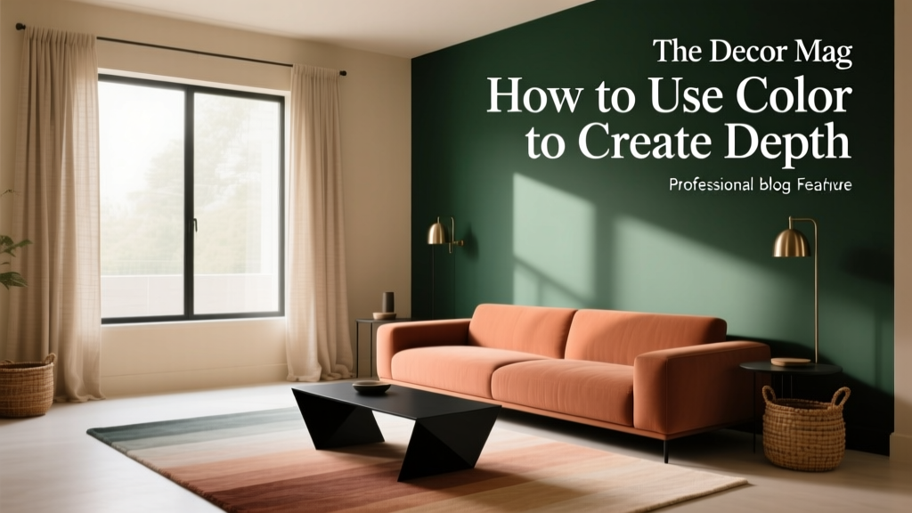 How to Use Color to Create Depth - The Decor Mag
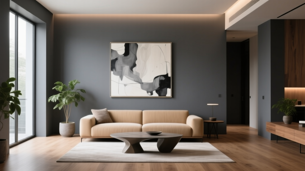 Best Charcoal Paint Colors for Modern Spaces - The Decor Mag
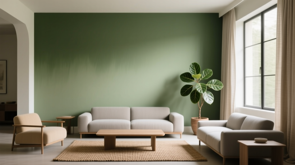 Best Avocado Green Paint Colors - The Decor Mag